While American University’s campus plan is a net benefit for Ward 3, the architecture currently proposed for the campus is mediocre at best. Beyond the land-use planning, East Campus and North Hall’s proposed buildings offer little in terms of aesthetics. The spaces are disorganized and the forms are uninspiring. On the outside, the buildings don’t relate the street well, and the facades present foggy contextualism.
Instead of well-executed buildings, the design revolves around appeasing neighbors while important aspects are left undeveloped.
For East Campus and some of the Main Campus buildings, AU hired Little Diversified Architectural Consulting, a Charlotte-based firm with offices in Alexandria. They have designed a large dorm at Catholic University, Opus Hall, similar in style and form to AU’s proposed facilities. Other design work was executed by the university’s large in-house architectural group and the firm of McKissack & McKissack.

All of the work the architects have done so far is difficult to judge because the documentation provided by the university is limited and filled with inconsistencies.
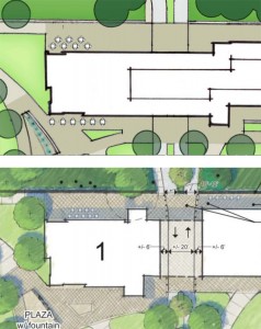
Take, for example, the main dormitory building on Nebraska Avenue, Building 1. In site plans presented to the Zoning Commission, the protrusion containing the stairs and common spaces is to the north of the building, but in the floor plans, those spaces are to the south. I can’t tell which is accurate. Frustratingly, nearly all drawings are rendered in a faux-sketch style that fudges important details.
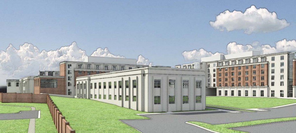
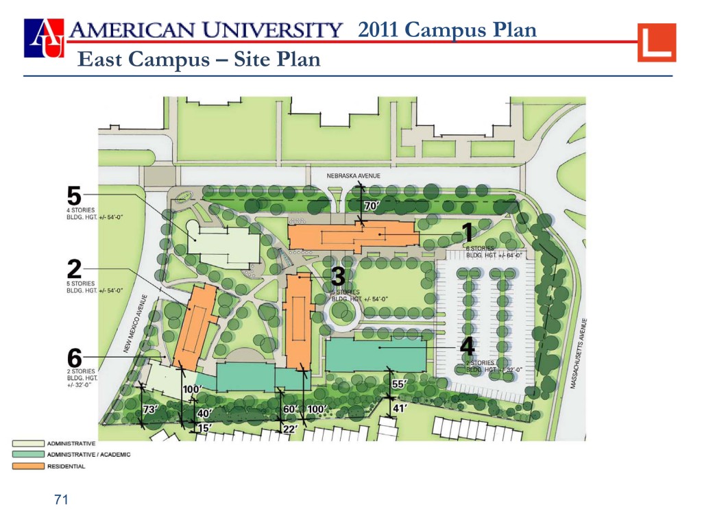
But there is enough content to see that the current design is flawed at a scale below the site. That same building along Nebraska Avenue (#1) runs as an extruded block – a slab – lengthwise against the street, routing pedestrians to the corner crosswalks.
To break up the monotony of the building, the architects jagged the building about halfway. This shift, however, has no relation to the rhythms of the main campus across the road. Instead, the design relates only to the driveway AU is trying to retain from the current parking lot.
Loosely tied to the streets, the slabs and boxes float in the site plan, generally aligned to each other but without any juxtaposition or inflection. They are only linked together along the southern edge of the campus, where buildings are used to hide students from Westover Place.
Elsewhere, gaps between buildings form simple cuts without any compression or release. Where the odd angles of Buildings 2 and 5 come close, the architects simply sliced off part of Building 5 to keep the distance from wall to wall consistent.
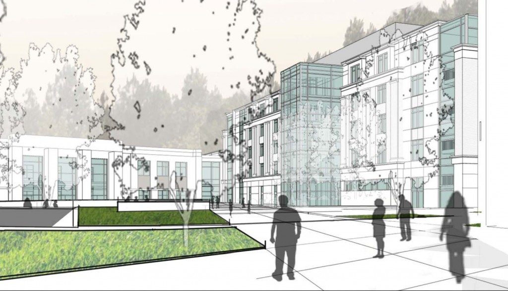
Within the campus, the internal courtyards do not relate too well the buildings that define them, particularly on the interior organization. In the dormitories, the bedrooms line ,hallways of varying lengths. The circulation and social spaces in each building cross the grain, protruding as glass boxes at arbitrary points. Considering that these volumes mark the dormitories’ front doors, it’s baffling that they have no relation to one another.
Along the perimeter, the slabs meet the streets unsuccessfully. At the café spot, a slim, continuous canopy is meant to add a human scale to a Starbucks. Instead, the uninterrupted ribbon just heightens the sensation of flatness.
Because the sidewalks are separated by a buffer, there is no experience of approaching the building head on, again exacerbating the flatness. The only relief from the slab is some halting ornamentation thrown around the buildings, and even that is still maddeningly flat.

The aesthetics are modernistic in their slipping proportional relationships, and they’re traditionalistic in the formal quotations. However, it has neither the clear proportions of a good modernist building, nor the interconnected part-to-whole relationship of a building of Greco-roman classicism. You can see the design as a series of layers meant to soften the impact of the building: a “contextual” brick facade on a precast one on a glass volume.
The word is overused, but these buildings are pastiches: a jumble of diluted appliqués to a mass designed in a fundamentally different way, like a Soviet housing block lovingly rendered in loose watercolor. None of the wit or polemic of Venturi’s paper facades exissts when the only reason to so explicitly drape the building is to make it blend in halfheartedly.
At East Campus, style is window dressing, another kind of buffer against undesired effects. Hiding a poster of Bruce Lee with an errant molding. The students in the dorms seem to understand that the administration does not: that the best style is no style. The best design manifests itself as useful spaces and memorable buildings that stimulate the students as much as the curriculum does.
The design of public and communal spaces is part of the culture of AU, and they embody the values of the university.
American has been successful architecturally in its sustainable design. The school has maintained and grown its campus greenery and a significant arboretum, and has eliminated car traffic from the heart of campus. Hartman-Cox’s Business School addition and William McDonough’s SIS building are both exemplary in their design for energy use and environmentally friendly materials.
Additionally, the 2011 Plan goes further with its commitment to LEED Gold certification for all of the buildings on east campus and LEED Silver on the main campus buildings. By 2021, this level of sustainability will be standard, if not a necessary. Whether a building still has an endearing affect and whether it works well will remain an asset.
In the end, the main issue may not be the result of poor architects, but of a poor client. In meetings, AU’s representatives have not expressed the cultural or political relevance of their building projects. Again and again, the emphasis is that nothing is changing, or at least, no one will notice it. The design reflects this attitude, and East Campus’s proposed architecture is an architecture of desperate stasis at the expense of good design.


