Designed by British architect David Adjaye, who’s also designing the Museum of African American History, the libraries are a reminder that it’s possible for a work of world-class architecture to also be a comfortable third place.
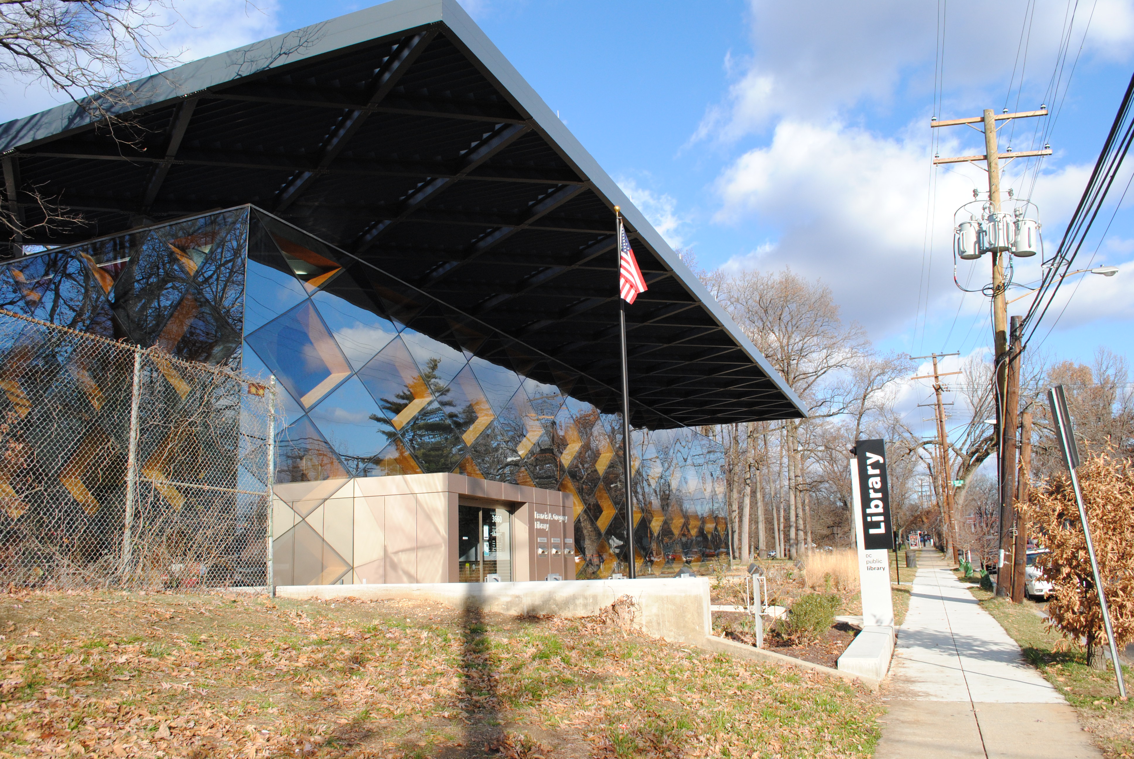
Francis Gregory Library.
When the first renderings of the new libraries were published, I was unimpressed by them. But after a day-long excursion to see all of the libraries built under the tenure of library director Ginnie Cooper, I have to admit that I was surprised at how brilliant Bellevue and Francis Gregory are.
The other new libraries at Benning, Anacostia, Tenleytown, and Shaw, which were designed by Freelon Group and Davis Brody Bond are still great additions to DC’s architectural culture. However, Adjaye’s libraries are practically counter-cultural: they don’t have an immediately recognizable, iconic look.
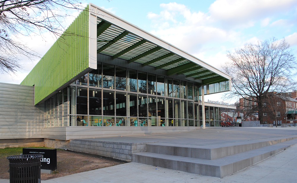
Anacostia Library was designed by Phil Freelon principally as a landmark.
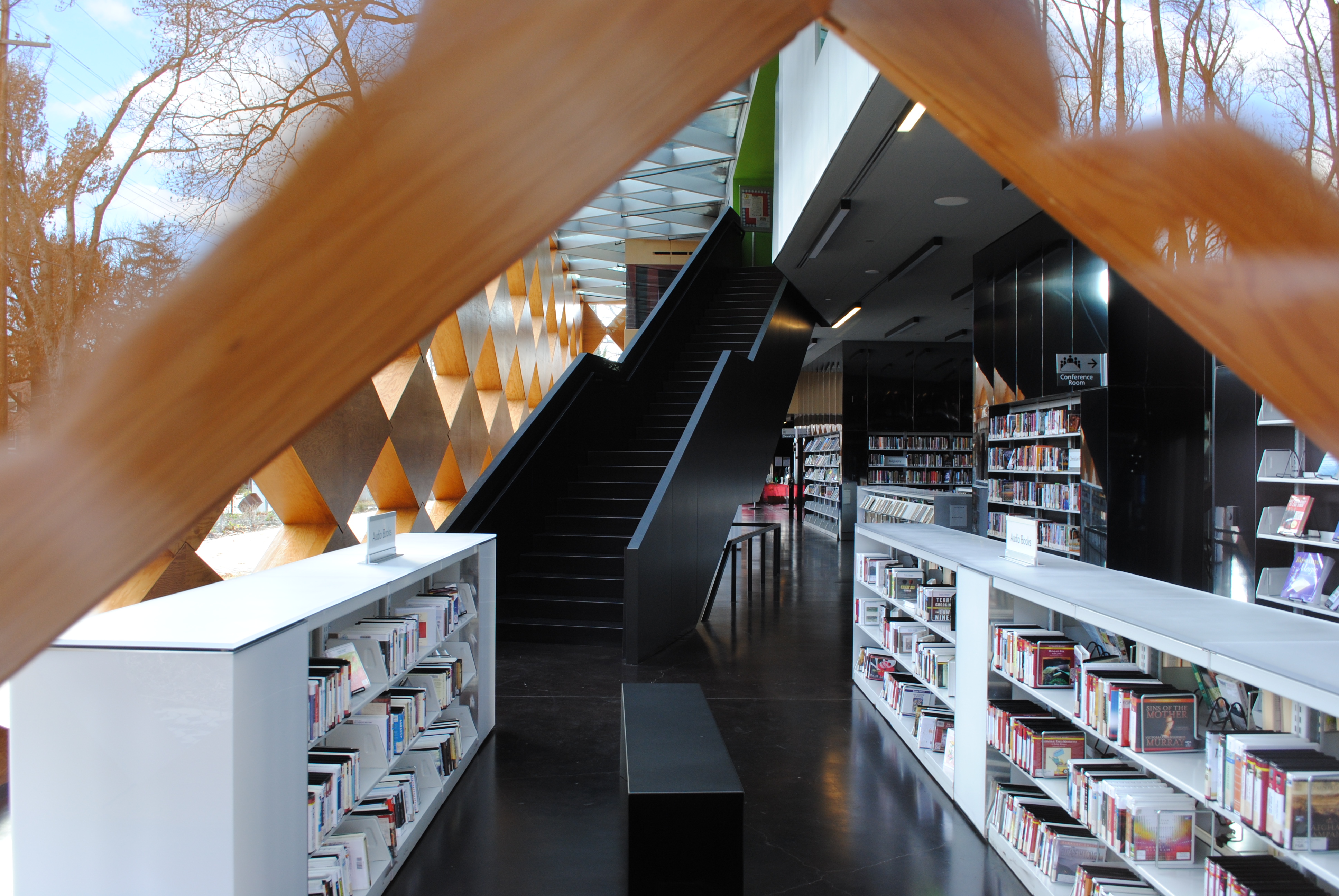
The other libraries have strong architectural gestures, open floorplates, and uniform lighting. Adjaye lights the spaces in his buildings more carefully. Adjaye’s massing can be seen as strange or even awkward. Bellevue Library is a box pierced with skylight shafts and a few large “pods” in front. Francis Gregory library is a diamond-patterned box, filled with blocks to divide the space. What distinguishes them is how Adjaye and the associate architect, Wiencek+Associates, divide the spaces with layers of books, glass, and glossy surfaces that produce a warm, flexible environment.
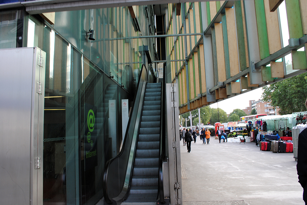
The “commercial” look prompted the designers to include an escalator to the main reading room of the Whitechapel Idea Store, also separating adults from kids, who are on the first floor. Photo by the author.
Glass is an important part of Adjaye’s recent projects, like Moscow’s Skolkovo School of Management, the Museum of Contemporary Art Denver, or the Whitechapel Idea Store in London, which like Bellevue and Gregory is a library in a disadvantaged minority neighborhood. It was at Whitechapel that Adjaye began to investigate the qualities of glass, which, because of its use in glitzy commercial architecture, represented wealth and upward-mobility to the local population. Adjaye made the glass hipper and more than just bling at Whitechapel. Here, his design goes further.

Interior and Exterior are united on the facade of Gregory Library.
Adjaye doesn’t use glass to erase a building’s form, like the designers of so many modern office buildings. The architects typically want the building to be transparent, minimizing the difference between outside and inside. Unfortunately, this effect only works under the right light. Otherwise it’s either a mirror or it’s so dark outside you can’t see the building as anything other than glowing interiors. This is why we see so many depictions at the twilight “rendering hour.” Dusk is the only time when, because the interior of a building is as bright as the exterior, the glass disappears and viewers sense the modernist unity of interior and exterior.
In Washington, Adjaye explores the characteristics of glass that have aggravated K Street’s architectural tedium. Instead, Adjaye uses what are usually undesired reflections to amplify the sense of context. Viewing the Gregory Library from dead on, the alternating diamonds of gray mirror and clear glass playfully juxtapose reflections of the neighborhood with views of the interior, suggesting that they are both public spaces.
Where the building needs to disappear, it does. Photo by the author.
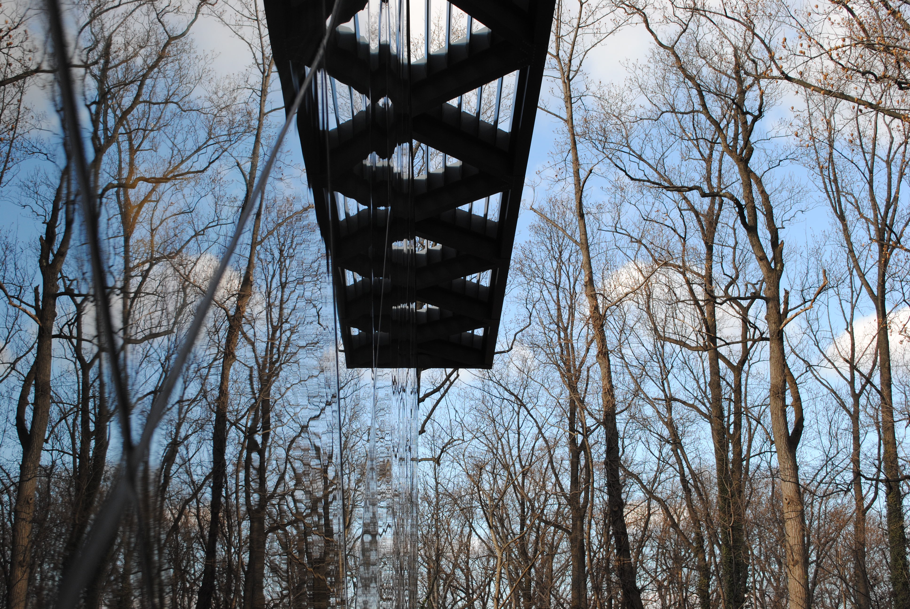
Moving to the side, the reflectivity of the clear glass increases, and the diamonds, the walls, and the building disappear more and more into its wooded site, leaving a steel canopy soaring above a symmetrical forest. In the back, the building disappears. In the front, inside and outside are superimposed on each other, reminding viewers that both are public spaces.

Bellvue Library. Photo by Eric Fidler.
The Bellevue library has a stronger figure on the outside, but it makes up for it with meticulous play with openness and transparency. The large floorplates are divided by sheets of glass that reflect and distort visitors’ views. Like the opaque walls, the translucent partitions are brightly multicolored: black glass hides the bathrooms on the first floor while dark yellow glazing hides the glare from a skylight on the second. The transparency and acoustical deadening lets patrons see the spaces beyond, but the distortions remind readers that they still have the privacy of a smaller room. The hall-of-mirrors effect that typically deadens streetlife instead adds to the intimacy and sense of place in each individual room.
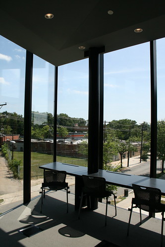
Moving to the perimeter of the building, windows provide clear views out onto the sidewalk. Glu-lam beams screen the interior, enhancing the transparency by cutting solar glare. Like a sidewalk cafe, the front rooms are wonderful places to observe city life while feeling comfortably separate from it.
Inside the Bellevue Library, the wide-open spaces are divided by different-colored sheets of glass that reflect and distort views. Because of the glass partitions you can see to the other end of the library – only through several sheets of glass. However, because each pane is also reflecting its surroundings, you see transparent images of the space you’re in, with other reflections giving readers the feeling of being in an intimate, private room, while also avoiding claustrophobia.
In both libraries, dark, reflective walls also add to the sense of place. They use the well-worn trick of implying space behind the wall’s surface, “opening it up,” while avoiding the hokiness of an optical mirror. They bring light in from outside, mixing it with the colors of the room they contain. Both the dark walls and the translucent glass let readers sense their surroundings, but loosen the figure of reflected individuals. A viewer can perceive a presence without having to worry about staring or even looking up. To have that kind of casual awareness while focusing on a book felt very relaxing.
The most astonishing use of reflective surfaces is in the story room at the Gregory library. Physically, it’s just an oval room bounded by walls of vertical lumber. Every other piece is removed at a child’s eye level and the resulting slots are painted gloss black. Within these gaps in the wall, trees, books, and structure appear, as if it drew the street scenes into an animation. As you move around, the angles change and the reflections move and blur.
Neither the Bellevue or Gregory libraries have a “wow” moment. They are very much about the experience of individuals in the spaces the building creates. Because the architecture relies on a person’s physical presence, it’s hard to understand through a photograph. But here I am writing an opinion piece and posting photos.
Pentagonal light fixtures imply rooms, even when there aren’t walls. Photo by the author.
In 2013, architecture is seen mostly through carefully curated images. An architect’s largest audience is often readers on the web, who will consume and discard architecture through images. Renderings, because they look almost real, can be the most misleading. Even photographs are taken under perfect conditions with special lenses to ensure that the building looks impossibly good when it appears in an architecture magazine. This emphasis on the photograph feeds back on itself to aggravate a fixation on “iconic” buildings, whose memorable images can be telegraphed around the world. But the people who are most affected by a work of architecture, whether positively or negatively, are the ones who live with the building. Dramatic architectural gestures are only so relevant to the creation of great urban spaces. Often, they’re detrimental to to the sense of place.
Unsurprisingly, if you are compare the images of many buildings to the things themselves, you’re let down. At the least, there are always differences between how a building is represented and how it looks in real life. At Adjaye’s libraries, on the other hand, the images I’ve seen are less beautiful than the ambiance of the building. The architecture succeeds because the architects were able to elevate prosaic interactions with the building into a substantial spectacle through the sensitive use of glass. That’s hard to imagine and hard to capture for a wide audience.
More than anything, Adjaye’s buildings remind me that to understand a work of architecture, you have to visit it. The basic architectural elements of space, program, and material are so interrelated that the quality of the buildings is impossible to capture. Don’t trust me, and don’t try to form an opinion during your lunch break. Go east of the river and see for yourself.
Cross-posted on Greater Greater Washington.
1 thought on “For Adjaye’s libraries, seeing is believing”