To make an unwarranted generalization, DC architects like their buildings heavy and somber. Even in the recent fad of light and clean glass facades, the buildings have been rather self-serious and blockish looking, a consequence of clients demanding efficient floorplans from architects who themselves were trying to be cool and modern without upsetting the polished and poised look DC has in the collective consciousness and legal structure. This fretful indecision can be a bit like the jeans and sportcoat look – crisp but comfortable, hip but conservative.
McInturff Architects offer a wholly different approach. They’re (post)modern(ist) but a little witty and also aiming for comfort. Their mostly residential oevure consists of excellently-composed buildings that respond coyly to the conditions of the site. In doing so, it avoids falling into limpid styles while also carefully respecting historic and distinctive architecture elsewhere. As for aesthetics, the practice cleverly contrasts gentle and warm elements with bold minimalism in beautiful light-filled spaces. As their projects are primarily private, it’s trickier to see their work than Esocoff & Associates‘. But down in Georgetown, anyone can at least see three buildings, and go into one of those.

First up is a small house that overlooks Key Bridge. The front is a nondescript postmodern thing with a garage at the bottom (shame!), but the rear is where McInturff added a gorgeous transition between the house and the breathtaking views. Architecturally, the project replaced an addition with a stiff steel frame that acts as a screen for the view. Composed of thick mullions, cantilevered balconies, and teak brise-soleils, the wall is highly visible when someone looks out the window. The black steel adds security to what could otherwise be a vertigo-inducing cliff and also adds produce a strong pattern reminiscent of the Maison Verre. The sunshades, with the balconies, reinforce the transparency of the wall, by passing through and emphasizing distance in a way that a simple glass sheet never could. Lastly, both the exterior and interior contain multiple scales in several materials, ranging from the grain of the wood to the bulk of the steel frame, all in harmony with steps in between. It looks comfortable.

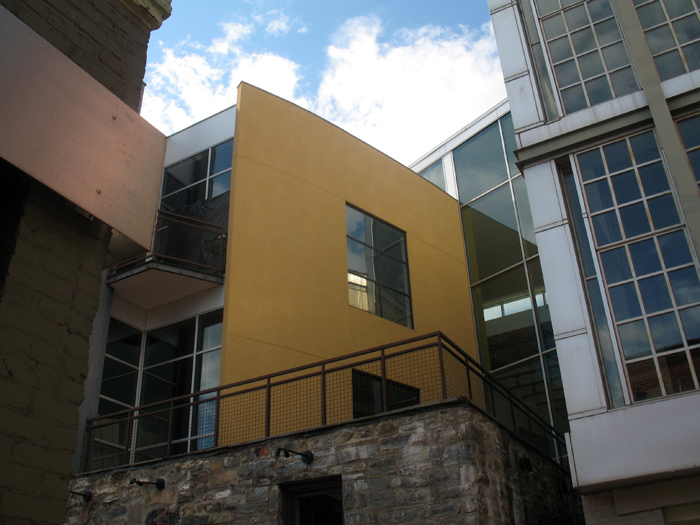
Moving eastward, there’s an ultra-chic commercial space in Cady’s Alley. Cady’s Alley is a semi-private shared street, complete with a chicane, textured walkways, a central guiding stripe, and speed bumps, but more on that some other time. Facing corner of the chicane-like joint is an duckling-yellow wall, curving out of the mass of the building and ending in a shadow joint against a corrugated metal wall. The whole composition sits behind a federal storefront on M Street, and atop a fairly industrial stone wall. The corrugated wall emulates the rough, functional look of the low stone wall, but for a culture where central distribution facilities have replaced canal warehouses. The effect certainly works, however the metal comes across as too severe, lacking the scale and rhythm of the rock but also the purity of the yellow wall. Still, it works as an ensemble because the building was designed for unity, with the yellow curve extending its arc through to the front door of the historic facade, finally expressed in the yellow mullions and beams in front. (This is the one you can go into.)

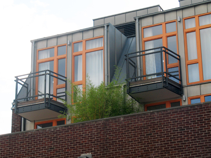
Finally, just north of the battleground of Apple, Inc. vs Georgetown, et al., a subtle door treatment on a historic building doesn’t give away the great building behind it. Actually, this one is difficult to see, with McInturff’s content standing primarily on the roof. There, above the buses and bustle of Wisconsin Avenue, a handful of apartments open up onto simple roof gardens. In the rear, the structure begins with a brick wall and glass doors, but the third and fourth floors consist of zinc roofing and wooden-framed windows, once again containing several scales. The contrast between the metal and glass is exciting here. But McIntuff went beyond pure thrill, placing subtle gutters over over the balconies. The gutters themselves blur the boundaries between flashing, gutter, and cornice, unifying the three units by going up and down along the edges of the dormers. It’s subtle so one can imagine countless pedestrians simply missing it. That’s the kind of detail that makes these buildings so compelling, that they reward careful examination, without requiring it.
Here’s a Google map of the three locations. Take a look at their site – or if you’re not in the area, you can see the Wooly Mammoth Theatre or the restored Majestic Cafe in Alexandria.
