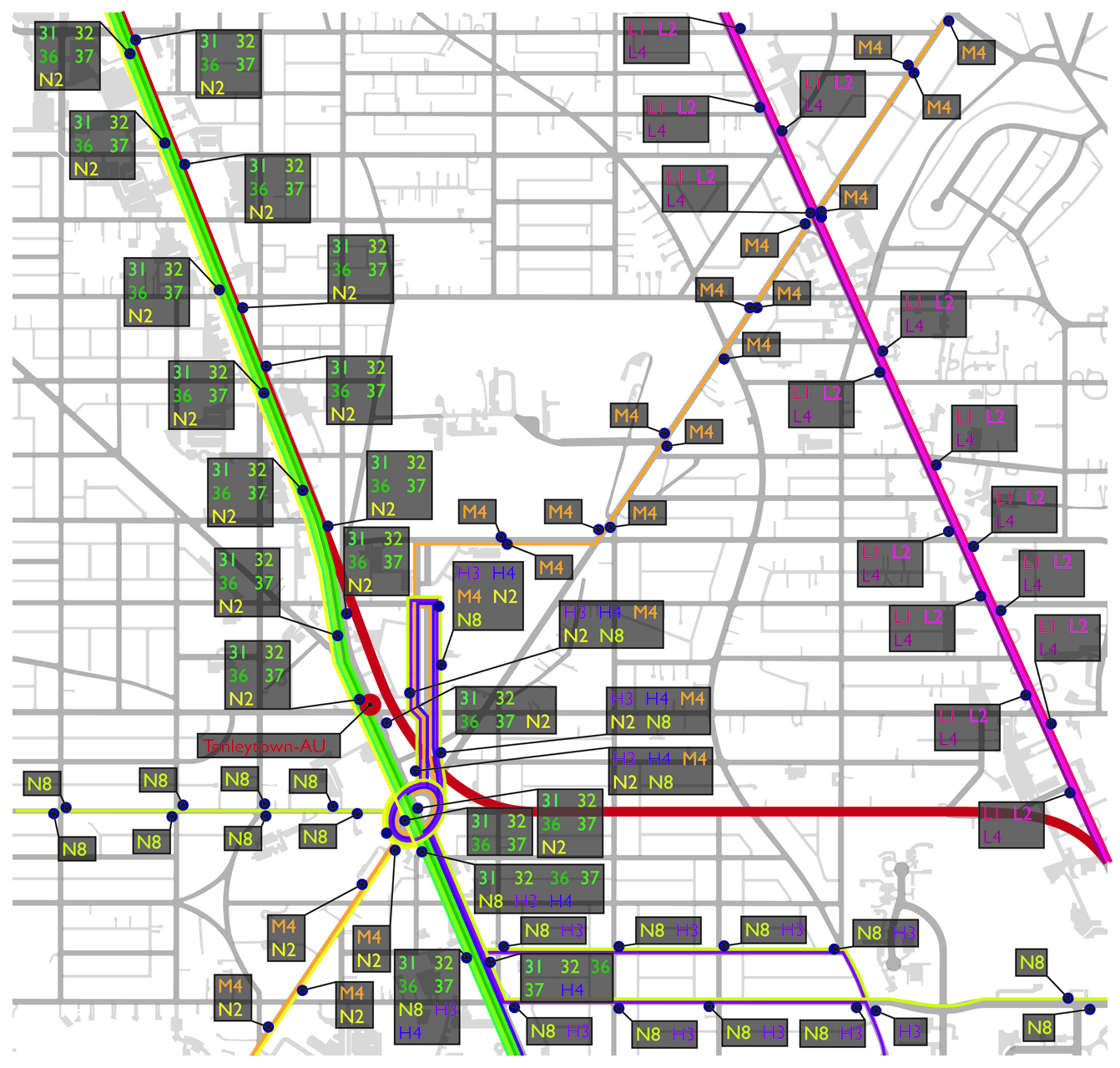
I’m still working on the buildings and pedestrian maps, but I took a break to chart out the public transportation resources. I’ve included all public transportation resources, but not AU shuttles or the W45/47. Those aren’t accessible to 90% of potential park users, so I’m not interested. So, to start, here’s a route map. Clearly, it gets kind of insane around Tenleytown.
Note: These drawings are in an Adobe CMYK color space, so may look wacky on some computers.
So that’s a good beginning. These are obvious facts. Under the fold is an analysis of the walksheds for each stop, station, and line.
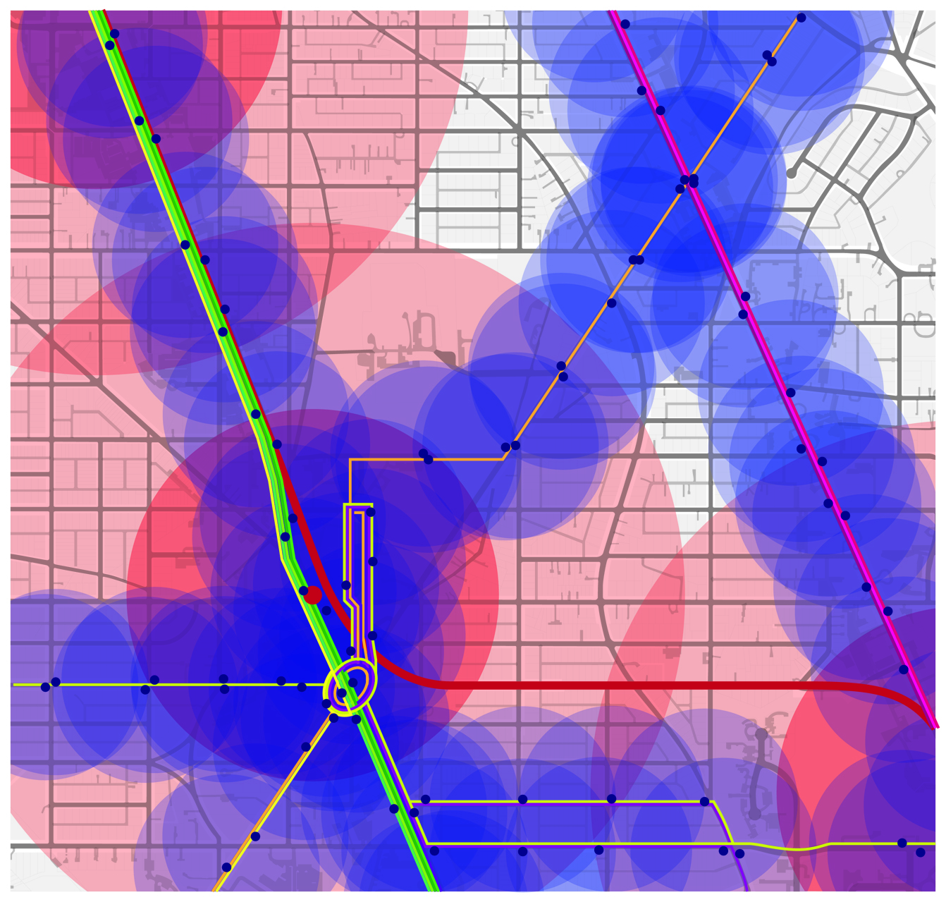
I’ve given a 1/2 mile radius and 1/4 mile radius for Metrorail walksheds. For Metrobus walksheds, I’ve given each stop (on both sides) a 1/8 mile radius. Most planners would use a 1/2 mile radius for busses as well, but I don’t think many people are willing to walk more than 1/8 of a mile for a bus in this neighborhood. Finally, here’s an overlay of just the walksheds on top of the height of the building. It’s not a damnation of human nature to assume people are more willing to walk downhill to transit, so this is interesting to examine.
Again, the options and flexibility of Tenleytown, Tobago, and Van Ness are obvious. Taking transit from there is so simple. Why isn’t there more density? So, later today (noon, say) I’ll put up the next set of analyses. The more sections I have, the more mashups of visual data I can make. Some of the stuff is great, or at least looks really freakin’ cool. Stay tuned.


