Drawing is Dead, Long Live Drawing

This past March, Yale hosted a conference on the role of drawing in architecture in an age where most design occurs in the head and on the computer. “Is Drawing Dead?” I don’t have too much to add, but if you have a few hours of thoughtless labor, listening to it can be surprisingly informative and you don’t really need to see what’s going on. The third session, “The Critical Act,” is much more oriented toward architects themselves.

The highlight of the series, for me, was (go straight to it) was Andrew Witt’s discussion of the much longer use of computer drawings than the architecture profession typically admits. Witt is director of research at Gehry Technologies, and spent a few years studying 19th-century mechanical tools to reliably draw the complex shapes desired by Beaux-arts architects but very challenging to obtain with the accuracy or precision needed to actually construct a building. So it’s a very interesting talk. Patrik Schumacher, on the other  hand, does nothing but embarrass himself and bloviate.

Here are links to all of the sessions, each three hours long, except for the keynote, #4.

  1. The Voice of Drawing: The history of and an apologia for hand drawing.
  2. Burning Bridges, Questioning Practice: New technologies and scientific developments in design.
  3. The Critical Act: What are we trying to do when we design?
  4. Real is Only Halfway There: Peter Cook on how architects draw for each other.

The answer to the question, BTW, was that drafting is dead, but sketching will be around as long as we have bodies. Seems simple enough, right?

Don’t Just Preserve History at Tenley Campus, Interpret It.

With a more creative approach to preservation, American University’s plan for its Tenley Campus could produce better urban design and a more compelling presentation of the site’s history.

Capital Hall and its lawn. Image: Wikipedia.

AU has agreed to preserve several structures on the site: the a former farmhouse called Dunblane House, Capital Hall the main building visible from Tenley Circle, and a Chapel. Together, these buildings form an axis that the Historic Preservation Office has insisted on preserving.

The Historic Preservation Office is right to emphasize this axis; it is probably the most interesting part of the site. The architects at SmithGroup have worked within these requirements to create a private quadrangle between the old house and Capital Hall, which looks good so far.

But AU has also decided to build on the footprints of the existing 1950s buildings and not construct anything that would obscure Capital Hall. The buildings are preserved, but no part of the campus will feel different from the others, even if they are in a slightly different style. The new buildings offer no key to understand on the site they inherit.


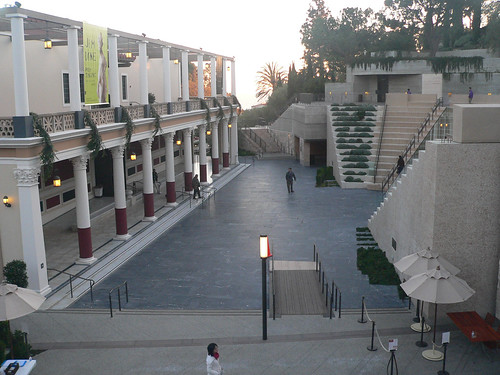
An abstracted amphitheater frames the Getty Villa. Image: The Consortium/Flickr

To understand what I mean by interpretation, take a look at Machado & Silvetti’s renovation of the Getty Villa. They combined the pragmatic need for an an entry stairway with architectural promenade that helps visitors understand the museum’s curatorial approach. Treating the 1970s replica of a roman villa as an object in a collection, stairs and pathways frame the building in a sequence that calls to mind an excavation. The stair gives visitors a lens with which to understand the building and clears their minds of the drive out to Malibu.

A look at the new Czech Embassy

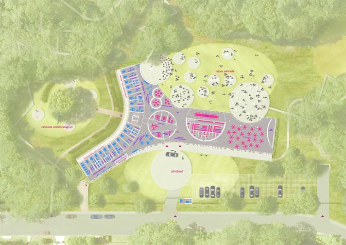
The Embassy of the Czech Republic has announced a design for a new building to replace an aging facility on Tilden Street in Northwest Washington. The current embassy is a not-quite-modernist structure at the edge of Rock Creek Park near Peirce Mill. The new structure will be a postmodern landscraper in a y-shape that clings to the site, in a flattened valley. The architects are Prague-based Chalupa Architekti; I think this is a definite improvement.

This is going to be a really great building for nighttime parties. The designers conceived of a theatrical center for élite receptions. I like the circular pods that are scattered inside and out and in between. They refresh the old Modernist idea of dissolving barriers between the interior and exterior, nature and environment, by bringing it back to the original idea of passing volumes through an envelope. The front (north) façade is a beautiful composition of frosted glass formed into a curtain. From the side of practicality, the east-facing façade of the office wing is fenestrated and shaded reasonably well for actual daylighting.

The architects fell into some contemporary tropes I dislike. I find some of the lines to be arbitrarily harsh and unanimated. The glass curtain in front ends bluntly at the roof slab. Likewise, the entrance doesn’t stand out on a building that already doesn’t address the street well. Admittedly, it is a diplomatic building, so security concerns will cause designers to skew fortress-like and the surrounding neighborhood is hilly and wooded, full of detached mansions like the Hillwood.

So, maybe disappearing into the environment is the best course here. The grass roof slips the building into its site. And if it’s not near public transit, it is near great bicycle resources. The shady Rock Creek trail is just feet from the entrance. If the Czechs get on the same bike as the Danes and install some changing facilities (it’s not clear from the published images if they have them), then it could be a pretty forward-thinking building.

What do you think?

As seen on Dezeen.


Reno Park Update 091206: Bad Names

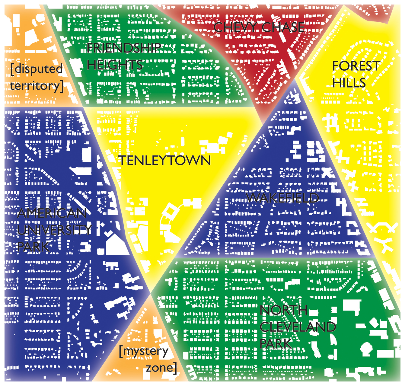
So neighborhoods. The issue of neighborhoods is not a small issue here at цarьchitect, so I want to explore how the nominal neighborhoods in DC, are relatively arbitrary. Whereas Cleveland Park is a coherent collection of period houses clustered around the summer home of our favorite philandering and mustachioed head of state. The same is relatively true of Chevy Chase. But other areas, such as AU Park or Tobago lack legible borders, character, nodes, or strong community sentiment. With these flaws in mind, I asked the internet where neighborhoods began and ended. For example, Wikipedia:

wiki neighborhoods

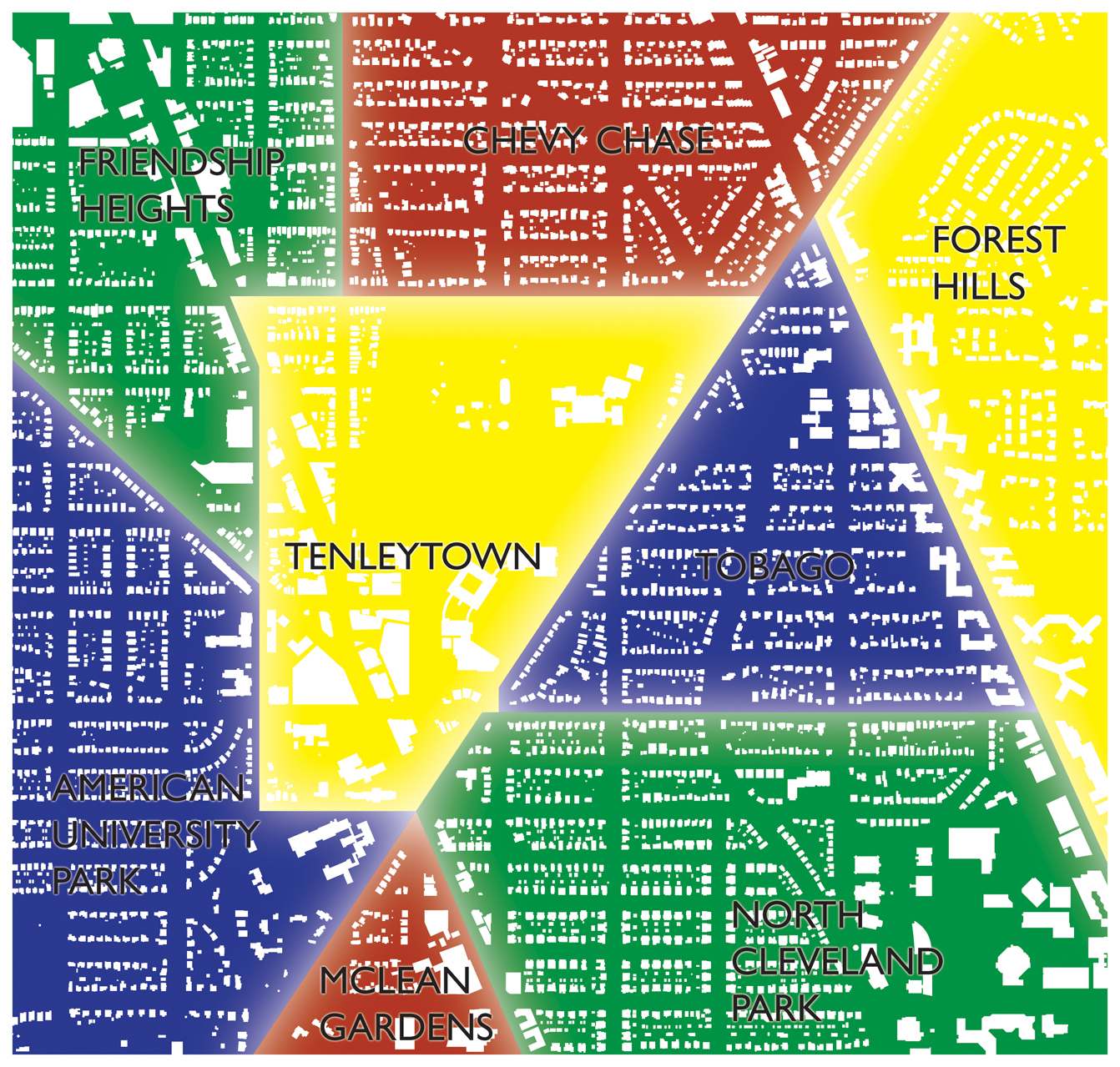
As you can see, there are some flaws to this map – some areas aren’t exactly stuck into boxes and others are claimed by two neighborhoods. Moreover, Tenleytown has, maybe, 100 residents and its borders rest, like the ANCs, along corridors where there is precisely the most activity, along Wisconsin. It also perpetuates the myth that there is a neighborhood called “Wakefield.” The name is a myth created by realtors, and you will not find anyone who actually calls it that, except perhaps some serpent or monster who wishes only to deceive you. . Clearly, it’s totally unsatisfactory. So, based on an informal poll and my own views, I’ve revised it:

formal neighborhoods

Reno Park Update 091028: Driver’s Perception

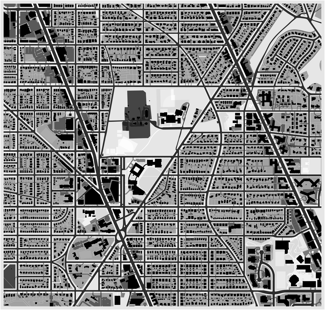
driver-buildings

In the last two updates, I showed that the disconnect between physical and social boundaries complicates any analysis of the spatial architecture of the Tenleytown-Tobago area. Of course, it’s worth looking at the vehicular perception of space.  

Reno Park Update 091022: Property as Figure

pedestrian-fg-buildings3

In the last post, I showed this map of the neighborhood, which expressed the gradients of permeability the T-T area. But this might not perfectly show how different the city looks without property laws. Look after the break.