The Bridge Park is really more of an elevated park than a bridge. But its bridge-like form means it can be much more than just a deck with greenery. Since it’s elevated over water, it offers something special related to depth. Its section can go up into the sky and down into the water in ways that no other park can. No excavation is required, and people on the deck can interact with what’s below.
Since there is only one precedent for such a structure, the Providence Greenway, perhaps it’s worth looking a things that are typologically adjacent: bridges, linear parks, and buildings that address the water in noteworthy ways.
Bridges
The first kind of bridge that’s worth noting is one that carefully frames the intersection of the stream and a road. The Ponte Alexandre III is a well-known example. It’s a tetrapylon, a marker of the intersection of two equal routes.

Another interesting type is a bridge that’s asymmetrical along the axis of the flow. If you have a road, there typically are two directions of traffic. Each one is usually equal in value. A river, however, does have a direction: downstream, downhill. That by itself can be a source of impressive architectural effects – as how water rushes around bridge piers.
With symbolism, you get something very poetic. Otto Wagner’s Nussdorf bridge-wier seems to fight the force of the water coming down to it. Massive stone pylons, scrolling up against a sturdy truss, support columns topped by lions. The design expresses the strength of the flood protection it offered Vienna.


Linear Parks
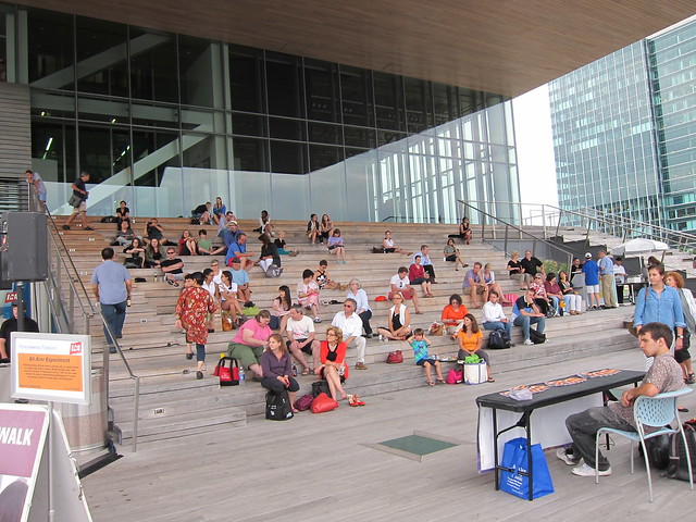
In the article, I suggested that the High Line was an inappropriate comparison to the Bridge Park, because one is through dense neighborhoods, while the other is over a river. The level of activation influences the level of activity. The High Line has the luxury of limiting access to create a nice level of calm in the city. The Bridge Park will only ever have two entrances.

But – James Corner: Field Operations and Diller Scofidio + Renfro, the designers of the High Line, made a few design decisions that are worth examining. For one, they distributed little spaces along the way that focus your attention on city life. Even the most jaded visitors end up gawking at the flow of traffic and people-watching.
Waterfront Buildings
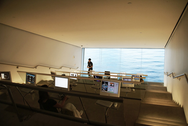
At the ICA Boston, a museum on the outer harbor, DS+R turned guests’ attention to the horizon. Every space, like comfortable main porch to the disorienting research room, makes you look at the sky and the water with fresh eyes.


 The City’s Department of Transportation has announced