Roger Lewis on the Height Limit

Greater Greater Washington asked accomplished architects to weigh in on the positives and negatives of the height limit. This testimony from the NCPC hearings on the Height Limit is part of that series.  

Thanks to these historic limits, the nation’s capital has remained a uniquely memorable, low- and mid-rise city. From many places in the city, views of America’s most iconic, symbolically significant structures – the U.S. Capitol, the Washington Monument, the Lincoln and Jefferson memorials, the White House – have been preserved because downtown skyscrapers cannot be erected.

Yet there are places in the District of Columbia where height limits established decades ago are today inappropriate and unnecessarily constraining, a reflection of outdated planning and zoning practices from the early and mid-20th century. These practices were characterized most notably by designation of large areas – land use zones – within the city limited to predominantly one use and uniform height limit. Broad-brush, one-size-fits-all planning and zoning failed to take into account, within each land use zone, locational variations in topography, solar orientation, views and vistas, proximity to parks, adjacency to civic open spaces, and infrastructure, especially transit. It did not differentiate between mid-block properties and properties at major intersections.

Today’s city planning, urban design and architectural principles and techniques – such as computer-based Geographic Information Systems (GIS) – are far more sophisticated and effective. Broadbrush strategies of the past are obsolete. We now can engage in fine-grain planning, urban design and zoning. We can identify, analyze and designate specific sites in the city where increased building height and density make great sense aesthetically, environmentally, functionally, socially and economically. This “smart growth” approach can enhance the city’s urban and architectural qualities while yielding fiscal benefits for the city. Furthermore, enacted as an incentive bonus overlaying existing zoning in appropriate locations, increased building height limits – and density – can engender development of much needed affordable housing.

Where should height limits change? In the downtown l’Enfant Plan area of the District, including traditional residential neighborhoods, height limits should remain substantially unchanged to preserve the center city’s dominant character and skyline. But there are specific sites – such as the Southwest and Anacostia River waterfronts – where upward adjustment of height limits would be beneficial without jeopardizing the city’s historic profile. Outside the l’Enfant Plan area, many sites could be suitable for higher buildings, especially near Metro stations and major roadways.

The only equitable, professionally responsible method for identifying places to raise height limits, and for determining new height limits, is to create a detailed, city-wide plan, prior to any rezoning, based on a rigorous, comprehensive study. This is essential to avoid piecemeal, property-by-property relaxation of height limits through variances, exceptions and ad hoc rezonings, a process too often influenced by political and financial pressures. Because municipal and federal interests are involved, the building height study and plan should be prepared collaboratively and transparently by the D.C. Office of Planning and the National Capital Planning Commission.

Many Washingtonians are apprehensive when anyone suggests modifying D.C. height limits. They envision Rosslyn-like skyscrapers rising all over town, ruining the capital’s historic image. Some believe that raising D.C. height limits anywhere would set precedents invariably opening the proverbial “barn door” to greedy developers in league with corrupt politicians, enabling high-rise buildings throughout the city.

But skeptical citizens need to understand that, through fine-grain urban design, prudent legislation and precisely targeted, well enforced land use regulation, the barn door will not and cannot be thrown open. Therefore, revisiting D.C. height limits requires not only a credible, city-wide planning effort, but also an on-going public education effort to help citizens recognize that legislation adopted over a century ago can be improved.

Roger Lewis, FAIA, is a registered architect and professor emeritus at the University of Maryland. For over twenty years, he has written a column for the Washington Post. 

This post is a version of Lewis’ July 19th, 2013 testimony before Congress.  


Three Soviet Memorials to Massacres

Sov-arch continues to continues to offer up unknown treasures of the FSU. Take a look at these three incredible memorials built during the Brezhnev era, published by LJ user dariuss.


The first is a monument to the victims of the Salaspis concentration camp, not far from Riga, Latvia. The photographs are evocative enough to not need the Russian text in the original post, but I’ll provide a short description for non-slavofils.


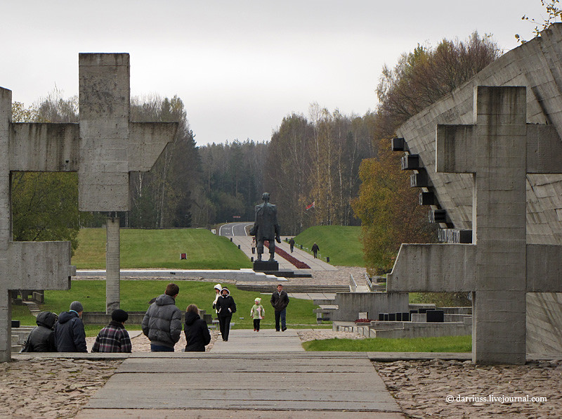
You enter the complex through the woods and travel under a massive concrete bar, which appears to have come to rest askew on a black granite block. It is referred to as the “Border between Life and Death.” Beyond it is a set of allegorical statues, including “Humiliation,” “The Mother,” and “Unbroken.”  The concrete foundations of the barracks remain in the ground, contrasting with brutalist concrete beams that hover, cantilevered from memorial markers. Permeating the site is the deep ticking of a metronome, meant to evoke the passage of time, a heartbeat, and death.

Having walked around the site, the massive concrete beam reveals itself to be a building. Passing over a razor-thin concrete stairway, you enter a long, skylit hall, walking up a monumental stair to a viewing area and back down into a small exhibit. The allegory is a little too heavy-handed for my taste, but I think the images speak for themselves.

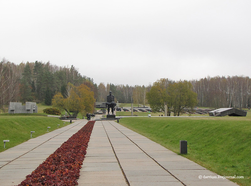
The second site is Khatyn, in Belarus. The site is a little bit more complex, covering the extents of a former town named Khatyn, which was obliterated by the invading Nazi army for harboring partizan activity in 1943. The site should not be confused with the location of the Katyn massacre – more on that later.

Khatyn is explicitly a landscape memorial, employing the strong gestures of Brezhnev-era architecture over large expanses of ground and without a strong central focus. It’s less iconic than Salaspils, but its architecture still has the same grim impact.

Down a ramp, visitors are greeted by a monumental statue of a man holding a dead child, entitled the “Unconquered Man.” The image is apparently based on the one survivor of the down, a blacksmith, who found his son shot in a barn. So, you have a great example of socialist realist use of a real person idealized to represent a larger population. The whole site, in fact, is a synecdoche for all of the towns massacred by the German army. A man is to Man as Khatyn is to the Motherland.

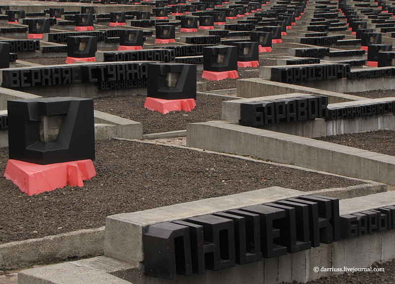
Adjacent to the statue is a white slab that caps the mass grave and there is a bent slab of black marble meant to remind visitors of the barn where most of the town was burned. Beyond this is a wall of remembrance and a “Cemetery of Villages” commemorating the 186 Belorussian towns lost during World War II. 186 black marble urns filled with ground from their respective villages stretch out into a huge field. A black platform contains three birch trees and an eternal flame to symbolize the 1/4 of all Belorussians who died during the war.

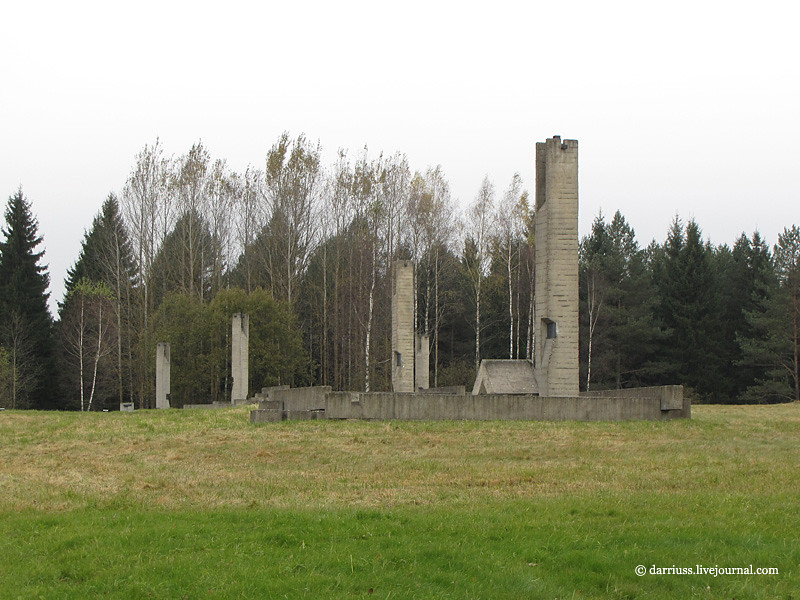
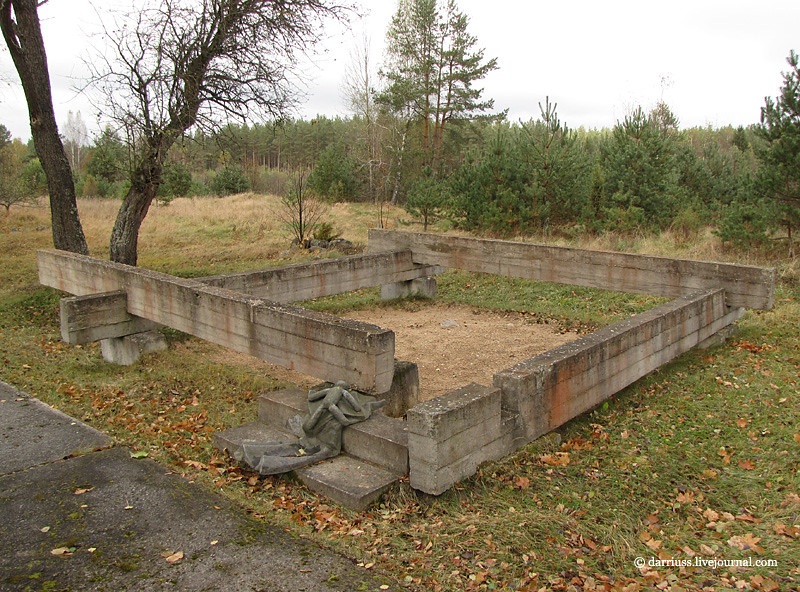
All around the memorial axis are monuments on the site of each structure that existed at the time of the massacre. Paths follow the original streets, symbols of an index, like the Cretto di Burri. The former house sites are bounded by concrete beams. Bell towers inscribed with the names of residents stand in for the chimneys. Even wells are marked with marble platforms and concrete roofs.

Finally, The third is the tiny Dalva complex, located about ninteen miles to the north. Its architectural elements are similar to Khatyn’s, but I think that the concrete beams surrounding former sites are more elegantly abstract. On the other hand, the beam assemblages are punctuated with bronze recreations of household objects like vases or teddy bears.

Photos from Khatyn and Dalva are in the same post.

These three memorials, built from 1967-1973 are emblematic of Soviet design at that time. What distinguishes these memorials from earlier Stalinist is the emphasis of human suffering and the effort to instill a sense of loss in other people. The strong emphasis on representation seen in Stalinism remains, but the new generation adds expressionist gestures and compositional abstraction to Socialist Realism.

Like all memorials, they also reflect the political ideology of the time. Part of the purpose of building such extravagant memorials was to focus regional antagonism towards German Fascism and away from Stalinist repression without overtly denying that anything happened. This is particularly in the case of the Khatyn memorial, where the names were similar enough between Katyn (Катынь) and Khatyn (Хатынь) to misdirect people.

Yet on the other hand, these sites mark legitimate sites of atrocities that occurred to people who were caught in world history. So, the ambiguity of architecture, that it generally means nothing external to its own form, works to its advantage. Even as the ambiguity between Khatyn and Katyn casts a shadow over the memorial, the ambiguity also prevents it from being simply a political tool of the regime. Compare this to the Stalinist memorials in the Tiergarten or Vienna, whose message and representation cannot be mistaken.

A simpler design will strengthen the Bond at Tenley

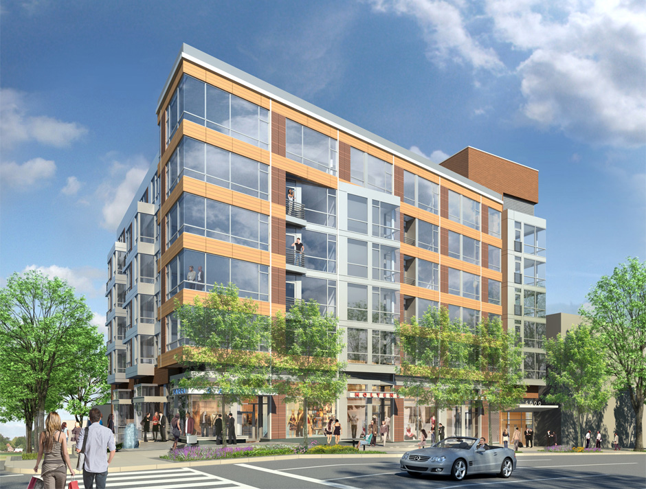
Douglas Development’s planned building at Brandywine and Wisconsin NW.

A building proposed for Tenleytown deserves praise for putting density in the right spot, but its design is too fragile to contribute to the character of Tenleytown. Although the building fills the majority of the lot and is lined with retail, its architecture misses the mark. Consisting of a set of boxy volumes organized through contextual relationships, the building is neither an interesting work of architecture nor a quiet background building.

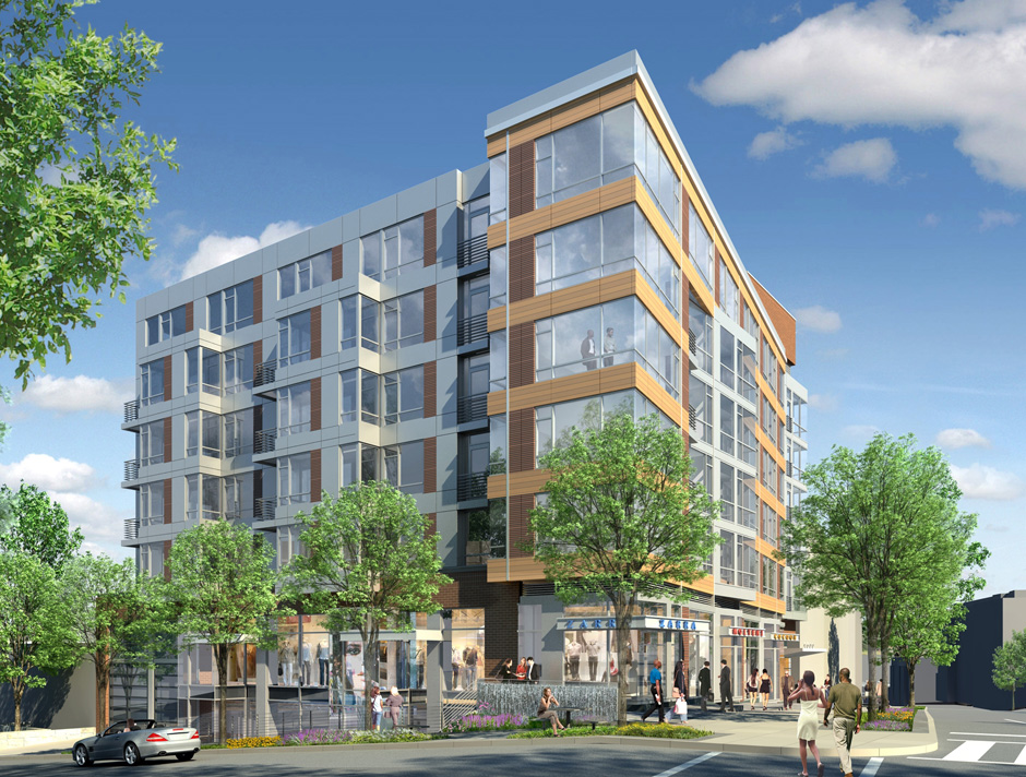
The Bond at Tenley suffers from overcomposition. In order to break up the bulk, designers at Shalom Baranes Associates have used large-scale overlapping formal figures to break down the sense that the building is a single, solid object. These shapes mostly refer to differences in the urban context. The architects, Shalom Baranes and Associates, then intersected and manipulated them into each other in order to diminish the presence of the building’s mass.

However, at smaller scales and different locations, the same figures are repeated: blocks and grids that overlap and glance by each other, repeating the same general patterns. Rather than using the shifts of scale to contradict figures or develop simplicity, Baranes have jostled oversized parts to produce the architecture.

PUD filings and renderings made available on the project’s website show the facades forming principally forming a thick bar along Wisconsin Avenue. From this block a pane of gray metal splits out to match the north-south orientation of the city’s grid and the Brandywine Street façade. By itself, he scissor neatly registers the odd angle formed between the old Georgetown Pike and the city’s grid, while opening up to the street. But then there’s the brick elevator tower and a separate set of bay windows and the parapet, and a dozen different windows.

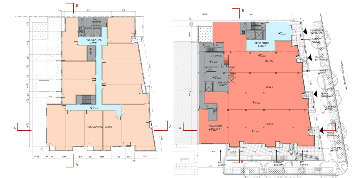
But that’s not it. The retail strip is articulated as entirely separate from the top of the building. A second color of terracotta runs up the middle of the Wisconsin side, implying another, imaginary volume. Then, there are several tiny balconies protruding from the front, some of which are created by the formal moves, and others seem arbitrary. A look at the floorplans reveals a tortured façade that generally adds up to nothing in particular.

With all of these inflections, what do any of them mean? What part of the context or urban form does the building highlight? A more limited number of operations, with a greater depth of detail would produce a better environment for passers-by. A building with more depth would stand on its own, even as other buildings fill up the neighboring lots and residents become inured to its presence.

Consider the difference between the sounds of two popular summer pastimes: crashing waves and fireworks. One is a repetitive, muffled noise with numerous subtleties, such that the slightest change in timing can make you hold your breath. The other is loud, arranged for variety and effect, and very, very loud. Worse, Baranes’ design is like a fireworks show where every explosion is meant to drown out the noise of every other explosion, so you can’t pin a boom to a flash or react to one before the other. Which one would you rather live in?

It’s not entirely fair to pick on this building, but it is representative of the city’s reputation. When national publications criticize Washington for its conservatism, they are not talking about the traditionalist works, they are talking about the endless formalized reference to context, uncommitted postmodernism, high-end banal glass, and the architectural equivalent of the Rickey, the plaid grid of featureless panels.

However, the towards something more lively is already embedded in the design. The architects at SBA have called for a terracotta rainscreen for the Wisconsin Avenue facade. The systems used offer opportunity for more variety and greater sustainability. Baranes have already successfully employed this kind of exterior curtainwall system at Waterfront Station. On a smaller project like this one, they could be more experimental.

Modern terracotta screen systems have the potential to permit greater architectural variation than what is be possible with glass panels or brick veneer. In addition to a variable texture over the surface, dimensions and spacing and profile of each individual panel can vary. It is possible to use well-established fabrication technology to control the variability precisely, what architects tend to call “parametric.” These mass-producible systems that permit subtle differentiation along the façade, such that buildings could take on an approach with roots as much in the Singer Loft Building as 290 Mulberry Street.

The design of this particular building is important, because it will set the tone for the coming development of this neighborhood, as it diversifies and intensifies. More generally, the building represents a particular fixation of Washington architects: design from context. SBA is one of the a-list architecture firms of the DC area, and already has a presence in Tenleytown, the excellent Cityline. A clean design that develops complexity without ostentatiousness is entirely possible.

If Tenleytown is to look different from Downtown, this is where the distinction can start to be made. This is the first building of a coming regeneration. The importance of setting the tone is important. Tenleytown needs transit oriented development with enough cohesion and activity to maintain grow its identity. Simply deferring to the mediocre context will not develop the neighborhood, but merely perpetuate the present state in nicer materials.

Rather than use its influence to oppose all design, ANC 3E and Tenleytown should work with the developer to produce a better design, one with rhythms and scale that relate to the street and surroundings while bringing something new and vital to the area. In a phrase, the building should be the amenity.


Details, Details: Gizmeaux

In response to a post on Greater Greater Washington, I wondered why the contemporary neotraditionalist movement is so averse to accepting or even embracing technology and innovation. Using, sure, but it’s hidden and tucked away, as if it is an embarrassment among the other monumental parts of the building. This has not always been the case; when traditionalism was not an ideological position but a method, architects were open to experimentation.

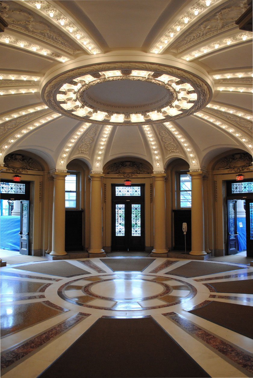
Just as an example, consider the way Carrère and Hastings used what was then the relatively modern gizmo of the light bulb in their 1902 rotunda at Yale. C&H’s calculated eclecticism certainly represents the practice that the Modern Movement considered its antagonist, but here, their flexibility paid off. Without going into theatrical crassness, they play light and molding off of each other in a way that adds intensity to the conventional architectural manipulation of space and articulation. Light, for the designers of this space, was becoming a material and not just an condition taken for granted.

Where is this expansive, flexible attitude now?