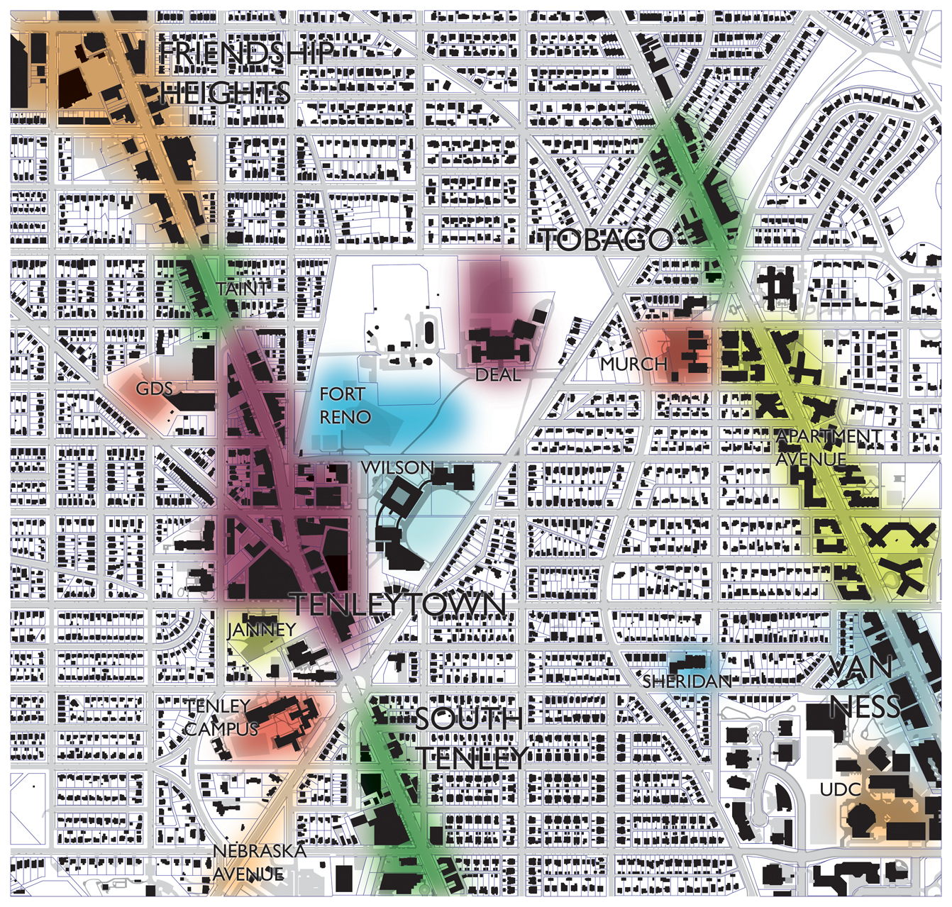
So in the last post, I pointed out that it was easiest to demonstrate that some location is a place by showing the density of people there. That’s what this map is. It’s an imprecise but useful tool to map and note the actual behaviors of pedestrians in the T-T area. I’ve made a point of making it blurry and gradated. There are not borders, so much as dips in circulation and public activity that result from the popularity of one area and the amount of effort pedestrians are willing to exert to get from one place to another.
Take, for example, Friendship Heights. Most people arrive by Metro or driving to the retail district. But within only two or blocks of that hub of activity, the circulation patterns change: there are fewer people and they are generally more local. The walkable distance matters more. It’s clear that the locality ends, even if it is slight and gradual.
The character of the architecture changes slightly as one travels south on Wisconsin. It’s shorter, somewhat dinkier. But at Fessenden Street, the entire block is suddenly small, two-story local retail. It looks like little to the north, but also seems slightly different from Tenleytown, up a steep hill to the south. Someone who lived a block to the south would feel like it might be part of Tenleytown, and someone who lives a block to the north might feel it’s Friendship Heights. This is hard to define; just like foot traffic, it comes in gradients. However, due to its higher pedestrian traffic, small public park, and consistent look, I would argue it is effectively a between-place. So let me show you what I’ve come up with:
I’ve invented some names for certain areas to indicate subtle distinctions. In particular, the line of apartments along Connecticut Ave gets the name “Apartment Avenue,” a boring name for a boring place. The area south of Tenley Circle is less urban and gets a slightly different cohort of feet, so I’ve forked it and the area around Nebraska Avenue that sees a lot of AU students and employees of the Department of Homeland Security NAC. Likewise, I’ve split out the schools from the neighborhoods, because although they do see a lot of activity during the day, they’re pretty hermetic.
Use also colors the locations. Perhaps because they encourage people to be out of the house, locations with commercial uses tend to have more evidence of popularity, hence more locality. Fort Reno Park and other sports fields likewise see a distinct locality because they are relatively distinct areas.
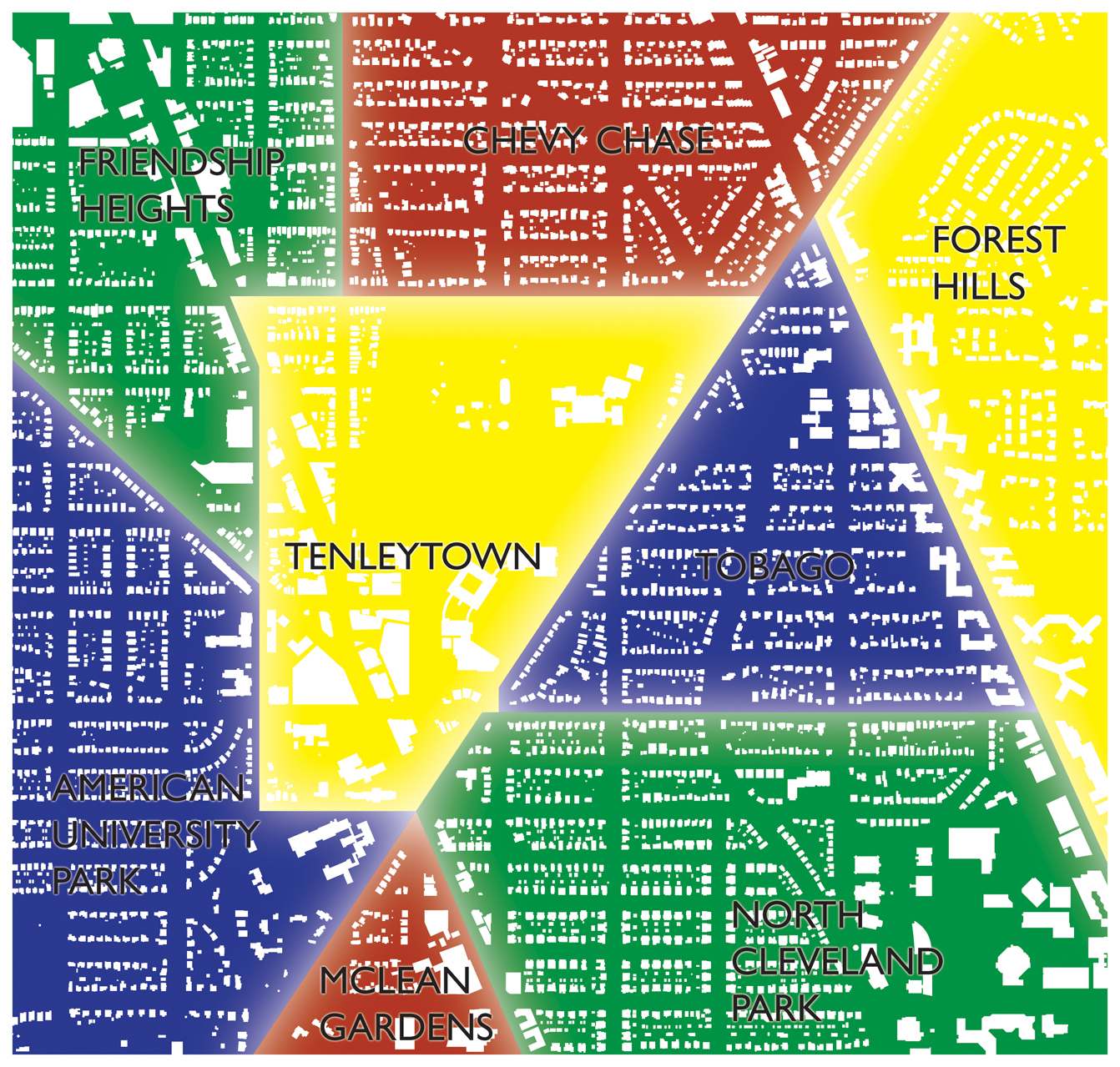
Some areas don’t get place names at all. They don’t have enough traffic or memorable content to deserve something named. That’s not a bad thing, but it just reflects the reality of what is effectively a place versus what gets called a place for the sake of labeling everything. Compare the locality map above to the neighborhood map below.
I think you can see that the concept of neighborhoods is remarkably simplistic. Particularly, it forces realtors to put everything in a box, to be certain about every location. But because place follows fuzzy and gradual differences in activity it actually can be totally misleading about actual relations to destination areas. The division of the functional Tenleytown into four areas in the Wikipedia map represents this phenomenon perfectly.
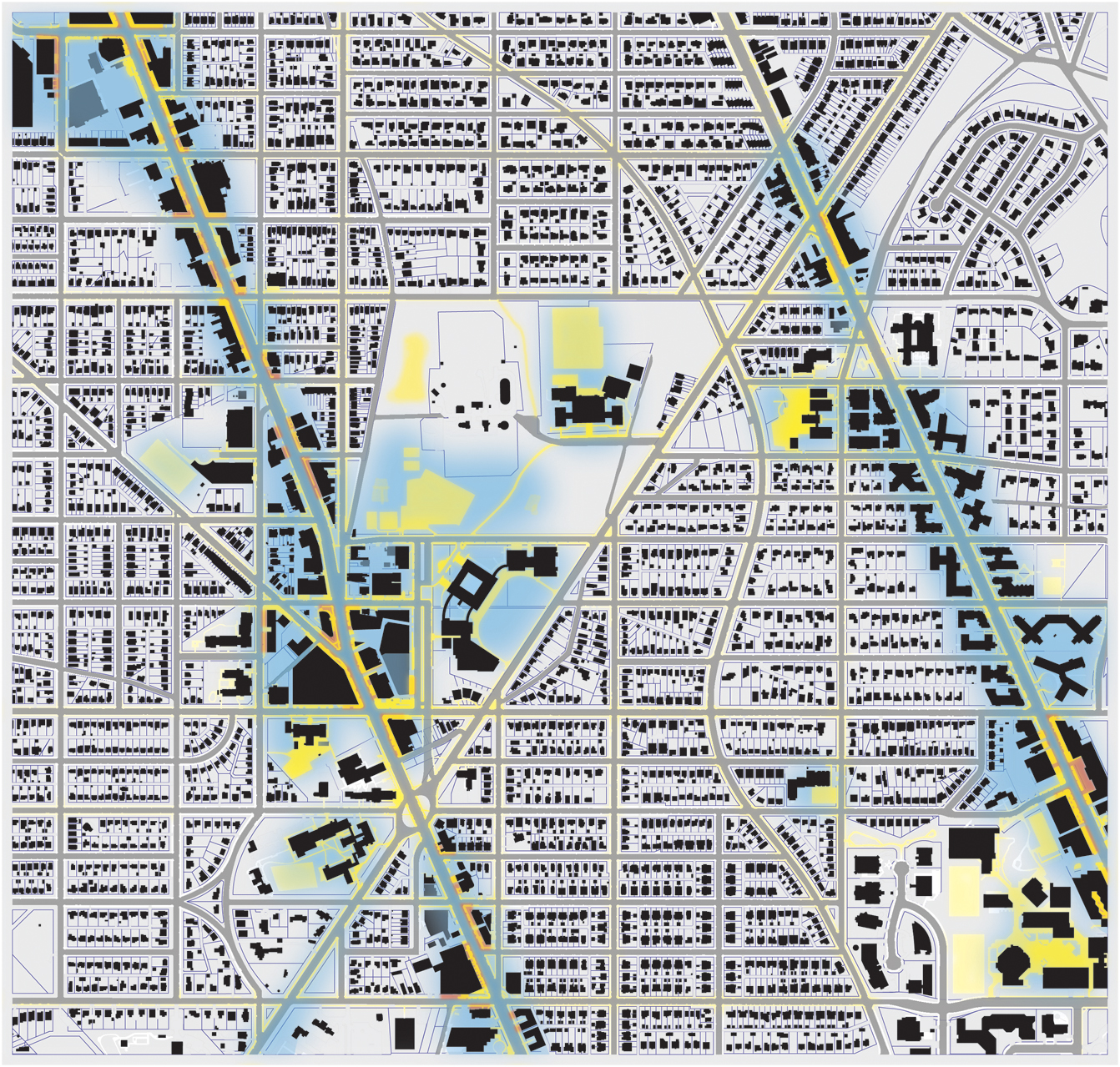
So, what I’m trying to show with locality is that social and community networks really cluster around destinations, or nodes. Most of the major ones are located at Metro stations: Tenleytown, Friendship Heights, and Van Ness. This spurs agglomeration of businesses, residences, and restaurants. That builds on itself, and it gets as dense as market or zoning makes feasible. Zoning, in fact, is another reason for the clustering, since it forces specific uses – and specific building types into particular locations. I’ll take a look at that later. Just quickly, take a look at this map of activity, street retail, and the localities I’ve outlined:


1 thought on “Reno Park Update 091212B: Finding Place”