Socialism in One Building: Moscow, 1930


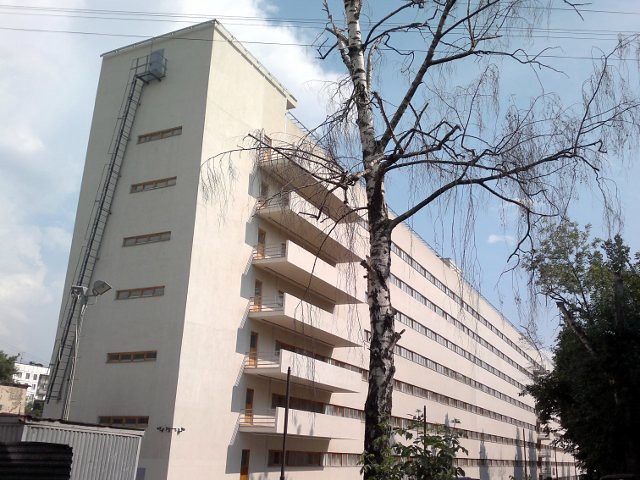
The Commune-House on Ordzhonikidze street in south-central Moscow is one of those Soviet projects is a hidden gem of Soviet Rationalist architecture, with heavy Corbusian influences. Designed by Ivan Nikolayev when he was 27, it neatly encapsulates the ideological goals of the revolutionary avant-garde. take a look at the first and second floor plans:

Via sovarch


The Commune-House is not just a communal apartment. It’s a type that only flourished for a few years during the radical period of the Soviet Union, when architects saw a need to reproduce the collectivized society of the kolkhoz in urban settings. All of the employees of a bureaucracy, factory, or university would live and work together as a mass collective. The most famous is the Narkomfin Building, which was built to house the workers of the Commissariat of Finance. NarKomFin is an abbreviation of the Russian name.

This dormitory was built for the State Institute of Textiles, to be “socialism in one building,” where people would act collectively, in a mass. As a result, the building’s functions are completely segregated. The plan above shows how Nikolaev divided the building into three sections. One: a 200-meter-long, eight-story bar of 1000 10-square-foot apartments, each meant for two students. Two: a three-story building containing classrooms, a cafeteria, a library, and physical culture facilities. Three: Joining and perpendicular to the two main buildings was a “sanitary wing” containing all of the bathrooms, the showers, balconies for mass exercises, and a set of ramps.

So, the building is laid out much like an apartment, only at the scale of thousands of people. Emerging from their rooms at a set time, the students would perform a mass exercise, shower, dress, and proceed to classes. All food was prepared in the cafeteria, liberating women from “kitchen slavery.” All bedrooms had sliding doors, like train compartments, because privacy needed to be minimized. Compared to the Narkomfin building’s family units and distributed bathrooms and kitchens, Nikolaev’s building is much more radical.

Nikolaev described his program this way:

Eradication of coercion from a man’s life is the first step. Household collectivization and reorganization of study is the second. The third step is the improvement of hygiene and daily life. The fourth the transition to self-sustainence in the home and the mechanization of harvesting. The fifth step is the socialization of the child rearing.

This kind of attitude was common among theoreticians at the time. Unfortunately, it was unpopular with most of the public, who didn’t complain when the ideological underpinnings of mass housing changed under Stalin.

Aesthetically, I think Nikolaev captured the relentless uniformity as beautifully as possible on the exterior, but it is now just a shell. After years of neglect, the building is being restored, with 12-person suites containing bathrooms and kitchens.

Check out the original post at SovArch.

Also take a look at these photographs of the ruined building in 2007.

And, don’t forget the Nazi equivalent! Do you see why Leon Krier deems Nazi architecture modernist architecture?
Something old and something new in Southwest

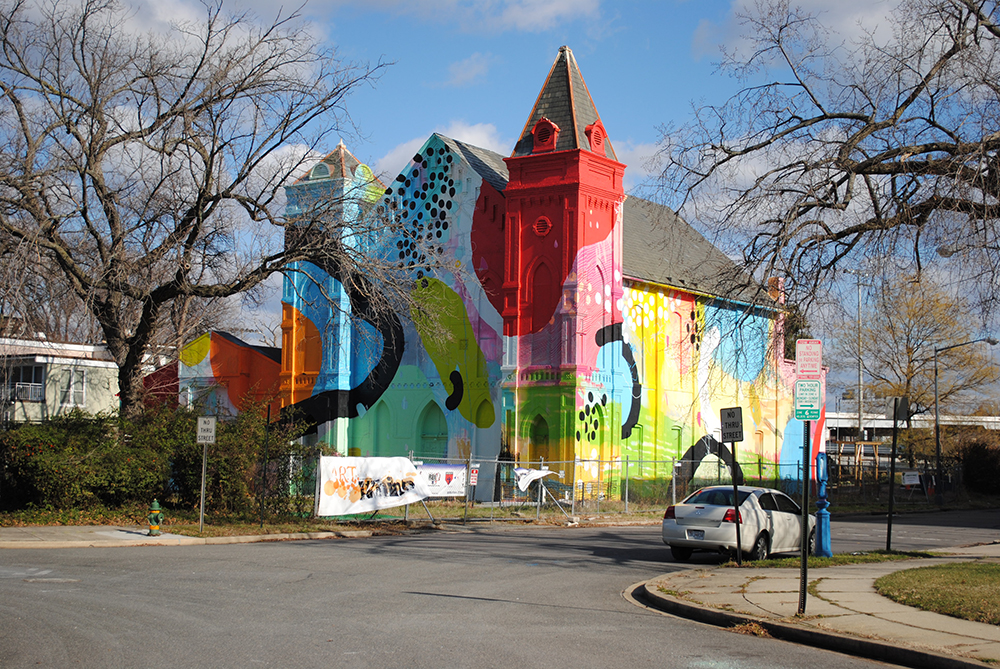
While back in DC recently, I took a look around Southwest DC. There’s much to see, but not much to say. So let me highlight two interesting projects. The first is Hense Brewer’s repainting of the Friendship Baptist Church building behind the old Randall School. I think it’s a pretty cool way to wait out a development project, at the least.

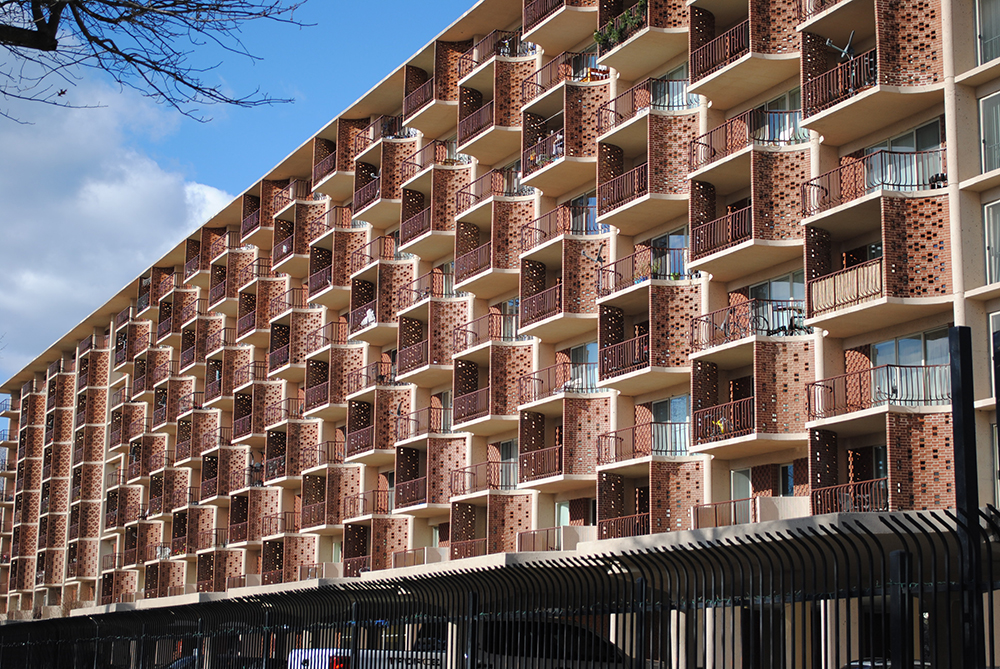
The Randall School itself has been intermittently poised to become a boutique something or another since 2006, when the Corcoran and Monument Realty bought it. Neither of those institutions is doing so well right now, but Telesis and the Rubell Foundation, a major contemporary art collection,  have plans to put an apartment-museum building behind the heritage buildings, with Bing Thom designing. We shall see, yes? The other is Capitol Park Plaza, a midcentury building, which has a surprisingly warm facade for the period.

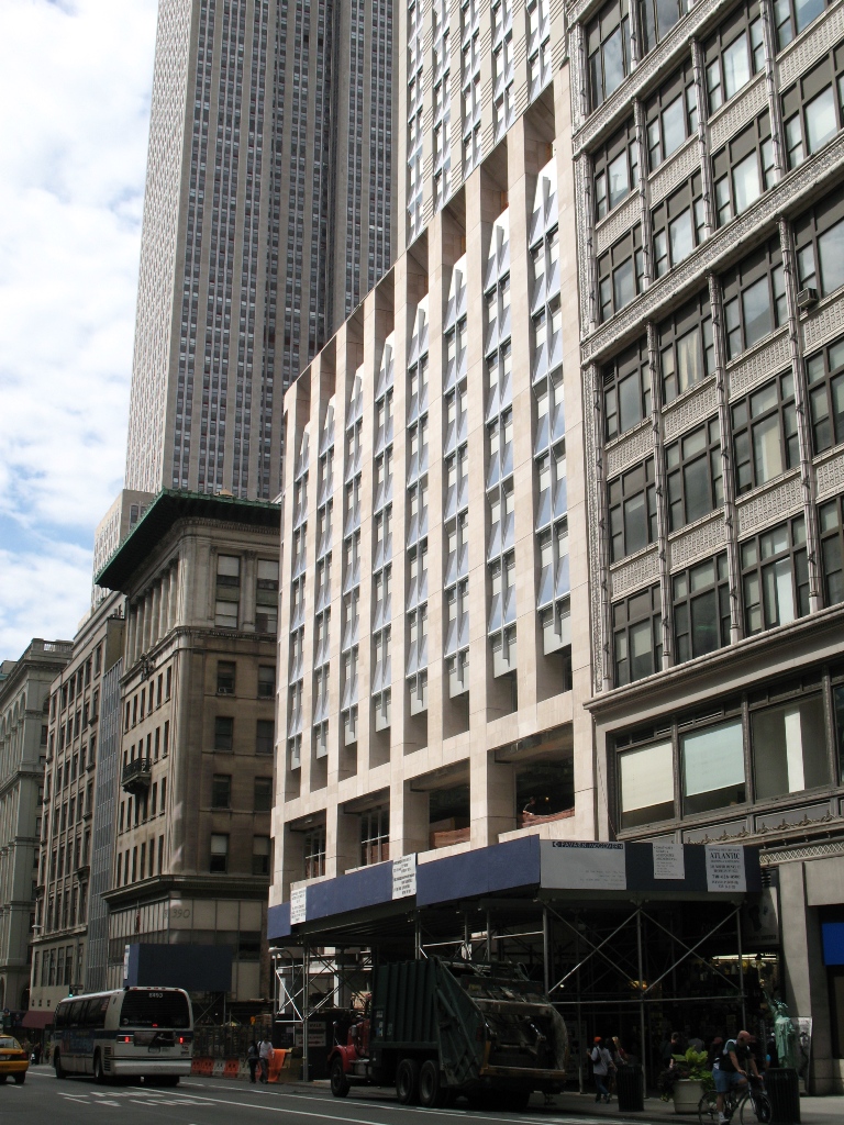
No surprise to discover that this is one of the buildings in the area designed by Chloethiel Woodard Smith. A noted local architect who happened to be a woman at the time when that raised eyebrows, Smith was quite shrewd here, registering the slab form with details that let humans comfortably occupy austere forms. First, she used tiles to enclose private porches. These balconies are massed in vertical lines at either end and staggered in the middle. This detail diminishes the monotony and overwhelming scale of the building without losing the exhilaration of long lines. The balconies also allow the roof to extend over the building envelope, reducing leaks, while keeping a strong outer volumetric edge that expresses the modernist formal fixation of a flat, uniform edge.  The pure geometry of modernist architecture can be difficult or expensive to register in actual building, so in a compromise, Smith simply implies it.


Details, Details: Light & Shadow

white brick

A lot of architectural design deals with modifying light and shadows to make an interesting form. For example, the moulding on a neoclassical building is designed to create a specific shadow profile. Meanwhile, glass buildings tend to play with reflections. But you don’t see much of them together, like you do here.

After the GGW Meetup

At the GGW meetup this past week, Dan Reed or Matt Johnson reminded me of the segment of Koyaanisqatsi that shows the results of bad parts of civilization and… well just watch – with the volume up.

Oh, and this brings up all the year-end album collections getting thrown around. I’m going to spare the bloviation, and just give you some lyrics tangentially related to Pruitt-Igoe:

Now, Ourousoff is just clueless

Nicolai Ourousoff, the architecture critic (or something) for the New York Times, has lately been letting out evidence of what a lightweight polywanker he really is. The most recent evidence that he has no idea what is going on in the architecture profession came in a reflection on the death of Charles Gwathmey, in which he lamented the lack of heroes in the New York architecture scene. First off, it’s ludicrous to whine about New York losing its hegemony over the design field, like rich white men whining about discrimination. Secondly, it shows ignorance of the many cutting-edge practices in New York he claims do not exist or otherwise do not count. Finally, it’s backwards to wax nostalgic over the handful of heroes whose primary accomplishment was to separate formal Modernism from its revolutionary social program.

Gwathmeys final building, one of his best. Click for more pictures
Gwathmey's final building, one of his best. Click for more.

Luckily, цarьchitect favorite Andrew Bernheimer, defended fair Manhattan’s honor. Bernheimer mentions a number of practices that perfectly suit Ourousoff’s criteria, except that the architects have remained committed to teaching and social issues, in addition to formal investigation and self-promotion. This is just basic research he could do – he doesn’t even mention Diller Scofidio + Renfro, even as they drive the East Coast architecture scene. Besides, it sounds like Ourousoff is simply looking for new autonomous heroes to worship, rather than supporting teams of architects that manage to maintain their individuality while also accepting responsibility for the environment, the public, and the context. After all, the New York Five made their careers through wealthy patrons with large, auto-centric houses. The future cannot sustain those kinds of heroes. That period is over.

Just fire the kid already, he won’t learn unless he fails.

Forest Hills’ Brown House

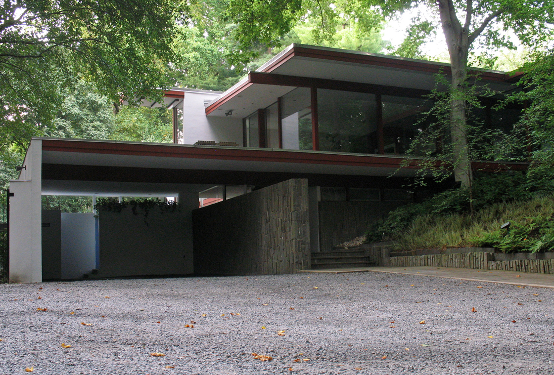
Upper Northwest has a reputation for having bland architecture, with the exception of pre-Depression Chevy Chase. But that’s proving itself to be a not completely true perception.  Down at the eastern end of Audubon Terrace in Forest Hills there’s a real treasure of modern architecture, almost completely buried the trees of  Soapstone Valley.  Although it’s been a house I’ve admired since a stopping a run in the valley back in high school, Modern Capital clued me in to the house’s authorship by the definitive SoCal architect, Richard Neutra.

neutra-graham-house-1

The residence, known as the Brown House, was built in 1968, only two years before the architect’s death. It is the only example of that architect’s work in DC, and one of only a few on the East Coast. More photos under the fold.

Great Interview with Ada Louise Huxtable

Click Here (Sorry, no embedding)

Charlie Rose is one of the few people on TV who actually gives any attention to architecture. At the same time, he’s still a dilettante, so it’s interesting to see him gush over buildings while she cooly discharges years of wisdom. There’s some good chatter about Gehry and Mies, and why they’re much better than even their fans think.

At the end of the Mall, hope.


foster1

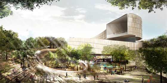
The six finalists for the design of the National Museum of African-American History and Culture have been revealed, with some very promising and also very disappointing results. There’s not nearly enough information available to see which is really the best building, so I picked the one that I think can be improved upon in a productive way. Remember as you are reading my thoughts that these are in the conceptual design phase, so the architects will be revising the buildings considerably even before the NCPC and CFA get around to prodding the architect for greater contextuality. 

I’ve ranked these in ascending order of quality and appropriateness and then got my buddy Sam Rothstein to handicap each one’s chance at selection. The images are linked to high-res versions on the Smithsonian site