This is a long post, so click through…
Tag: preservation
DC HPO says the Tenley Campus is a District
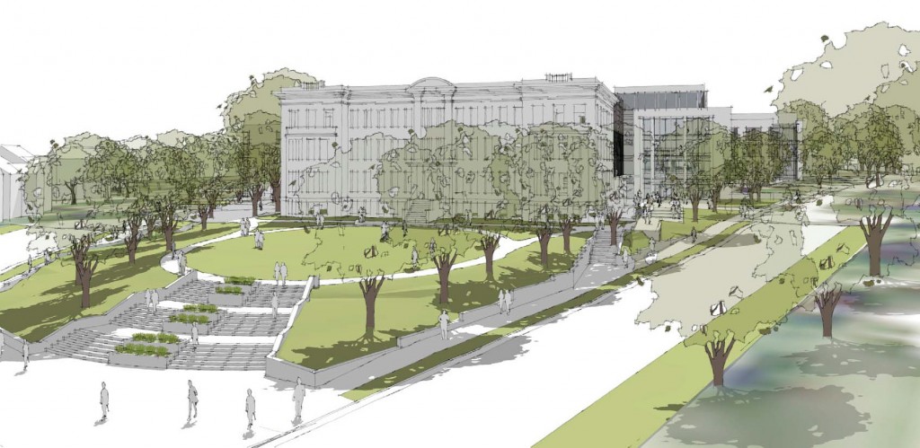
The Historic Preservation Office has released their recommendations for the Tenley Campus ahead of this Thursday, the 27th’s, HPRB hearing. In an unusual decision, they have advised the HPRB to approve the current design, and also to declare the entire campus as a historic district. The Tenleytown Historical Society’s nomination did not ask for an all-encompassing district, but rather a single landmark designation for the entire campus. Their reasoning:
Guidance provided by the National Register suggests that campuses should generally be considered districts, although there are smaller campuses that consist of little more than a central building or two and surrounding space. In the present instance, a district better accommodates the different origins and ages of the major contributing elements of Immaculata, in a manner similar to the often varied neighborhood historic districts.
I find this reasoning plausible at face value. It’s also not unprecedented. Gallaudet’s campus is a historic district, and Georgetown University may be. The details are more complicated, however. Gallaudet’s district covers much more territory and more historic buildings. Other, similarly sized properties that are not schools have been named landmarks. Indeed, the district only includes three-and-a-half buildings:
The historic district should be designated with the following three buildings considered to contribute to its historic character: the original Immaculata Seminary, i.e., [the 1904] Capital Hall, including its 1921 rear wing; the 1921 Chapel; and Dunblane. The three 1955 buildings should be considered non-contributing, as beyond the campus’s period of significance and representing a phase of school expansion distinctly different architecturally and functionally from the founding era. The 1921 garage should also be considered non-contributing because an addition has considerably altered it and diminished its integrity, nearly doubling its size and closing its original vehicular openings. The sense of clustering campus buildings surrounded by and enclosing landscape, as well as the site’s traditional orientation of, and relationship between, buildings should also be maintained and preserved
Dunblane has been renovated multiple times and burned once. It is unrecognizable from whatever form it may have had. I am fine with leaving a form or mark on the campus, but there is no reason to preserve the building itself if the equally altered garage can go.
I do not necessarily understand why they chose this designation. I have some conjectures:
- It is the result of negotiations between AU and the other parties. A district designation would most likely preserve the rear green space in perpetuity, but give some design flexibility to AU.
- This gives the HPRB more latitude in deciding what happens to the property.
- It is easier to justify a district designation than a full landmark designation, given the historic resources.
I do not know the minds of the HPO, but I hope that the reasons for the designation are closely interrogated before the HPRB makes a decision.
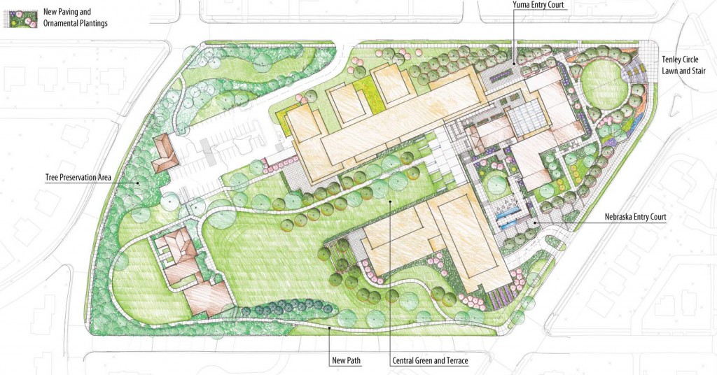
As seen in the images, AU recently revised their plans to include a common area at the front of the building, released a traffic report, and also revealed a much-improved (planometrically) North Hall. Both images courtesy AU.
Don’t Just Preserve History at Tenley Campus, Interpret It.

AU has agreed to preserve several structures on the site: the a former farmhouse called Dunblane House, Capital Hall the main building visible from Tenley Circle, and a Chapel. Together, these buildings form an axis that the Historic Preservation Office has insisted on preserving.
The Historic Preservation Office is right to emphasize this axis; it is probably the most interesting part of the site. The architects at SmithGroup have worked within these requirements to create a private quadrangle between the old house and Capital Hall, which looks good so far.
But AU has also decided to build on the footprints of the existing 1950s buildings and not construct anything that would obscure Capital Hall. The buildings are preserved, but no part of the campus will feel different from the others, even if they are in a slightly different style. The new buildings offer no key to understand on the site they inherit.
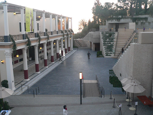
To understand what I mean by interpretation, take a look at Machado & Silvetti’s renovation of the Getty Villa. They combined the pragmatic need for an an entry stairway with architectural promenade that helps visitors understand the museum’s curatorial approach. Treating the 1970s replica of a roman villa as an object in a collection, stairs and pathways frame the building in a sequence that calls to mind an excavation. The stair gives visitors a lens with which to understand the building and clears their minds of the drive out to Malibu.
Continue reading ➞ Don’t Just Preserve History at Tenley Campus, Interpret It.
AU’s Tenley Campus is Pinned to the Past
While AU continues to present its east campus plan before the Zoning Commission, they left out plans for the Law School campus at Tenley Circle, promising to submit them in August. But even with that deadline far off, it is possible to tell that the design is wrongheaded. The site is more urban and has more potential than the East Campus site, so it must be held to a higher standard.
Last year, when AU announced a plan to relocate the two blocks from the Tenleytown Metro and at the intersection of Wisconsin and Nebraska Avenues, the potential for progressive campus seemed overwhelming. As at East Campus, political expediency got in the way of good design. The plan is a recapitulation of suburban design principles hemmed in by unwarranted preservation concerns.
What is good about the design is how it pairs the program to the site. The law school has a non-residential program, where faculty and students live off campus and commute to the school. Many maintain jobs downtown, requiring a direct link into the city, which the metro can provide. Bus lines in eight directions fill in the transit gaps including an express bus on Wisconsin Avenue, which received a TIGER grant for more improvements. It would be very easy to graduate without ever parking a car on local streets.
It is near two functional but underdeveloped commercial strips on Wisconsin Avenue. These have been struggling for years, although most storefronts are occupied as of July 2011. The project could energize the South Tenley and Tenleytown strips by creating a bridge of activity where there is now just a narrow sidewalk and an empty field. The project might add a few customers too, since most students don’t have a meal plan.

Change in lot coverage. Blue areas are new area, yellow is removed, gray is no change. Dark gray represents preserved buildings.
As of July, the designs do not meet of the location’s potential. AU asked the architects, SmithGroup, to mass the building in the footprints of the 1950s campus: objects in relation to each other, but not in relation to the city. As the ground plan has evolved, its forms have become more sophisticated, but its relationship to the streets has remained pinned to the footprints and the outdated ideologies that prescribed them.
I AM A FORTRESS
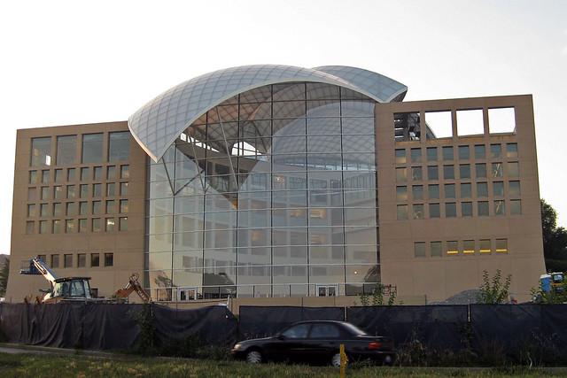
I don’t buy his assessment of Safdie’s career (namely that his only good building was Habitat ’67) or that Safdie is somehow different than Terragni, OMA, Yeang or any other architect that has produced institutional work for a statist client. If anything, his work for these groups is a less seductive option simply by virtue of his staidness. Regardless, Kennicott hones in on the idea that the building is a duck: a work of architecture where all formal characteristics are subsumed into an “overall symbolic form.” Yes, the dove-shaped roof is easily the worst formal decision in the building. Except that in a more important sense, the building is not a duck.
The idea of the duck was developed by Robert Venturi, Denise Scott Brown, and Steven Izenour while teaching at Yale and eventually published. The main target of the critique was not the literal use of symbolism in vernacular structures, but rather the abstracted formal symbolism of “heroic, original” buildings that totalized structure and program into an exploration of space, form, or ideas. This, they said, was more insidious than the overtly ridiculous Long Island Duck.
What the building is not is a security duck. Contrast this with Safdie’s other work in DC, the ATF Headquarters Building. That fortress in Northeast is a security system for itself, where its defensive features become an architectural statement. The grand gesture is an enormous, inaccessible pergola developed from the moat, fence, setback, and blast walls required. Other features, like the gateway-within-a-gateway front entrance and the row of shops on 2nd St. reflect the primary design concept: security. Security subsumes form gloriously. But the ATF building has taken enough of a critical beating, so let’s examine two other examples:
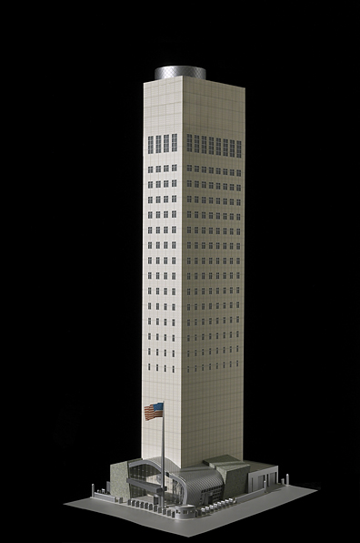
Gwathmey Siegel’s US Mission to the UN indexes the required distance for blast resistance through the size of its windows. The walls of the building simply could not be further from the edge of the small urban site to meet US embassy requirements, so the architects manipulated the windows on a tower already set back into absurd slenderness. The only way you know it’s not the bitter provocation of a grad student is its desperate banality.
More recently, KieranTimberlake’s US Embassy in London, scheduled to be completed in 2017, improves on the ugliness of buffering, but is unable to escape duckhood. The building is set upon a plinth that creates private assembly spaces above, and a security perimeter below. By emphasizing the severe cubic form set within a circle and again in the middle of a field, the architects have called all the attention to the space between the building and its context, at least compared to the looser glancing forms some of the other competitors’ entries. Richard Meier’s design is particularly distinguished because the renderings show bollards: discrete, non-architectural supplements that do not change the fabric or utility of the building.

Venturi & Scott Brown’s alternative to the duck was the decorated shed: a relatively banal structure, with a highly articulated facade conceptually detached from the overall functional design. His examples were renaissance palazzos and the Vegas Strip: big, bold facades loosely related to the interior. Now, Meier’s design may be a formal duck, but the security is attached loosely, a protected shed. The same is true of the USIP building, where Kennicott’s review demonstrates that security was not a conceptual concern for the project. The building has large, clear atria one can get close to. It has relatively good permeability, and its security pavilion is prosthetic to the main building. Perhaps it does not need the security of the Pentagon. But even many of the most effective safety measures at DOD headquarters have not been grand design choices, but rather building system details like laminated glass in windows and column casings.
This applied, rather than integral, security is already common. Like the Las Vegas Studio, we have to look at the disreputable defenses of Washington: the bollards, the planters, and the barriers that are almost all right. Those dumb little planters are an embarrassing icon of Washington, but they have their virtues. Ugly and ordinary, they offer both protection and the symbolism of security. They’re not part and parcel with the architecture, letting designers focus on expressing more important things. Maybe most importantly, they’re temporary. Eventually (theoretically) we can get rid of them and the buildings will not be compromised.

These not-so-great forms of security do not have to be so ugly and haphazard. The classicist bollards and walls around the Capitol and congressional office buildings are an attractive and historically sensitive application to the buildings they defend. They’re not ideal, but for something more innovative, take a look at the IMF’s Headquarters 2 in Foggy Bottom. For all the banality of the aesthetics, Pei Cobb Freed combined the barrier structures with small-scale elements like planters, benches, bike racks, street lights, and even a water feature. It creates a livelier streetscape than setbacks and walls.
The formalization of security is a tempting venue for architectural expression. The culture of the past twenty years has been one where institutions have had to fortify and militarize against threats both real and perceived. Making architecture of that defensibility is a tacit acceptance – if not embrace – of a perpetual security culture. That public buildings need protection against specific threats is undeniable. But that those protections need to exist forever and be manifested significantly in buildings, I believe, is an irresponsible and sad architectural position.
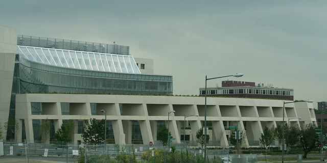
Is there a building you think is a security duck? Suggest it in the comments.
North of Tilden: Construction Phases
It’s spring, and that means it’s construction season. Particularly in Tenleytown, a number of big projects have finally started, some after 6 years of delays. The headlines:
- Planning: AU presents their twenty-year plan to ANC 3F meeting. Hilarity ensues.
- Design: Shalom Baranes designing Babes site.
- Approvals: Chevy Chase Park will gain field lights.
- Demolition: If the Van Ness Walgreens is coming in, the gas station has got to go.
- Staging: Fences are up at Wilson.
- Site Preparation: Janney sets up temporary classrooms.
- Foundation: A 4-story condo is going up on Harrison street
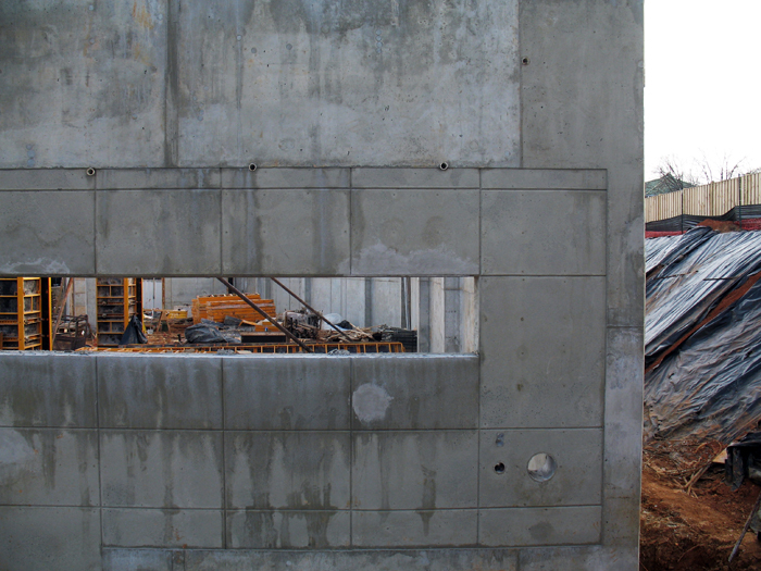
- Structure: The Tenley-Friendship Library is no longer a hole.
- Commissioning: The placeholder building at Tenleytown is complete.
- Commercial Fit-out: The 4900 block is getting a pizza place.
And the stories below…
Small-Town Politics: Everything but Safeway
After the crime report and some perfunctory zoning adjustments, a manager at Maggiano’s in Friendship Heights discussed their mandatory re-application for valet parking. The loss of parking is one of DC’s bugaboos, but he assuaged the concerns with cold, hard facts about where they park. Friendship Heights’ traffic is particularly bad and people from nearby neighborhoods complain about visitors parking in along the narrow streets to the east. So it was a huge surprise to learn that the garage under that block is largely empty most of the time. That suggests that most people will take the stress of driving around Jenifer Street over paying to store their cars, have parked in one of the other garages, or that a good number of the shoppers crowding the streets have arrived on transit. It definitely requires further study. The application was approved, and they moved on to the Reno School.
Jane Maroney, the newly elected Deal PTA chair spoke on behalf of the school in regard to the future of the Jesse Reno School. She explained Deal’s intents for the building in general: that it will be used as a performing arts facility and school nursery that could double as public meeting location. Apparently the two major goals are to keep the main building secure at night and reserve the dulcet tones of the band for infants who will only remember the experience subconsciously.

The Jesse Reno building is unquestionably a historic structure, so the debate came down to whether to landmark it now and then renovate, or to renovate and then landmark it. Either way, renovations have to undergo Historic Preservation review because the structure was built in 1903. Deal received money from the city to renovate it, but hasn’t yet hired an architect. Board Member Waldmann of the Tenleytown Historical Society explained a little about its history as a segregated school and the lone survivor of the town of Reno, but her justification for why landmarking was so essential with everyone on board could only be justified with shadows of reckless demolitions during Barry years, so eventually the board voted 3-2 against the nomination. Oddly, the Bender-Frumin-Serebin and Eldredge-Sklover split is the same way they voted on the Janney application.
So, that was the lesser part of the meeting. The rest comes tomorrow.
North of Tilden: Old wounds

I. The city has declared that they will begin construction of the new Freelon-Group-designed library in September. However, out on the Tenleytown Listserv, discussion flared up when it became clear that the department of economic development was asking the architect to add structural columns that could support multistory residential. This practice is not uncommon, but it would be a wasteful expenditure if the Tenleytown Historical Society succeeds in landmarking the school, and adding to the structure becomes more difficult. Both properties sit on the same lot.
II. The HPRB has agreed to review a preservation application for the 1925 elementary school. Built by the city architect, Albert Harris, it’s a decent example of the stripped-down Beaux-arts Georgian style he developed for the rapid expansion of public facilities in the early 20th Century. Although it was the first of all the schools built in the area, I don’t see how the 84-year-old school merits perpetual legal protection, at least not at this point. Especially considering that the building is not in any danger of demolition or permanent alteration. Moreover, landmarking could seriously delay the much-needed renovation of the aging school needlessly.
III. The department of education is proceeding, however, with the development. They’ve hired Devrouax + Purnell to design a wing to the west of the current building. Part of the planning framework requires that DP respect the historical structures of the area. I have no doubt that they will. Their work in DC has been humane and sensitive, while also adding innovating modern elements. Freelon and DP’s buildings will be coups for the architecturally stagnated area, so it’s in the neighborhood’s interest to support their work.
IV: On the site of the former Oakcrest School at 4101 Yuma Street, a new religious center for women and girls will be opening this fall. The Yuma Study Center, a vaguely defined but Opus-Dei-affiliated religious institution will itself be renovating and expanding the old Bon Secours covenant. The current structure is dilapidated, so renovation will be welcome, once I can figure out exactly what the institution does.
Van Ness: This past weekend saw the second-ever farmers’ market on the plaza in front of UDC. The market is a twofer fer the residents of condograd across the street, putting the large plaza to use and getting farm-fresh goods onto a public street.
Hawthorne: The Post covers the ongoing slapfest in the very northern neighborhood of Hawthorne, a small collection of 1950s houses that was built in the fashion of the times: without sidewalks. DC has been improving and adding sidewalks throughout the city, improving pedestrian safety and encouraging walking, however, some residents of the area northeast of Utah Avenue won’t have any of that filthy urban nonsense. They moved there because they wanted to be in DC without being in the city.
What, they stayed in DC for the schools? Or for the lack of voting rights?
The arguments against sidewalks sort of tumble out of opponent’s mouths, with all kinds of illogic. This is like country in the city, yes, and a ranch house makes your .2 acre lot a ranch. Nobody walks around here, uh, ever wonder why? We need curbs, not sidewalks, so pedestrians can’t get out of the way of cars? Lastly, the venerable, but that’s the way it’s always been! makes its appearance, proving opponents to be examples of a certain five-letter acronym. You can hear how literally incoherent their arguments are in this video.
On the other hand, there are almost as many proponents, since many residents do see the public obligation to make the streets safe and accessible for all modes of traffic. It’s heartening to see proponents of reasonable growth out and advocating their position. There’s not much of a worry that Hawthorne will become infected with the dread contagion of urbanism, since it’s pretty far from any sort of rapid transit and unsuitable for larger growth. It’s always going to be a side neighborhood, one whose character will not be negatively altered by allowing people to walk comfortably around their neighborhood.
At the end of the Mall, hope.
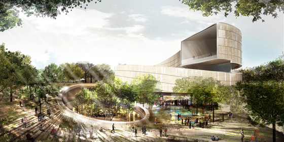
The six finalists for the design of the National Museum of African-American History and Culture have been revealed, with some very promising and also very disappointing results. There’s not nearly enough information available to see which is really the best building, so I picked the one that I think can be improved upon in a productive way. Remember as you are reading my thoughts that these are in the conceptual design phase, so the architects will be revising the buildings considerably even before the NCPC and CFA get around to prodding the architect for greater contextuality.
I’ve ranked these in ascending order of quality and appropriateness and then got my buddy Sam Rothstein to handicap each one’s chance at selection. The images are linked to high-res versions on the Smithsonian site.
Streets through time and place
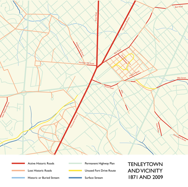
 I noticed yesterday that DC has re-signed Murdock Mill Road, down off River Road in Tenleytown. It’s a nice little reminder of history – and of natural geography – among the rationalist streets of the city plan laid down in 1897. While those straight, predictable lines make navigating the city easy, they did erase the context and history of what was Washington County. By its perseverance, this little snippet of prior use reminds residents of the pre-urban past, adding quiet character to the neighborhood.
The road itself is no larger than an alley – its form preexists both the automobile age and the dreams of a residential garden city, so there are neither sidewalks nor setbacks. It is discontinuous, with one part behind the old Sears Building and the other appearing a few blocks to the west before becoming Butterworth Street. It’s also completely secondary: Where the narrow eastern section intersects with 42nd Street, the heavy grading on the latter route necessitates a concrete retaining wall and a stairway down from Murdock Mill Road, ten feet above. It is very dislocated; left inexplicably during the changes of urbanization, along with the Methodist Cemetery, its only active address.
The road once headed down in the direction of Massachusetts Avenue, following a creek of the same name. Before the imposition of the 1897 Permanent Highway Plan, Murdock Mill Creek began at the west of Tenleytown, and cut through a subdivision of small farms registered as part of Friendship, and finally into what is now the Dalecarlia reservoir. Now, the stream is undergrounded, emerging only from underneath 52nd Place in northern Spring Valley. Other streams have been buried; still more roads have disappeared when developers carved up the farms they existed to serve. Murdock Mill Road is only one of these many streets, some of which are still used.
