Taller buildings, better architecture?

Would lifting the height limit lead to better architecture? It’s not that simple, say architects. There are many people and forces, both cultural and economic, shape the built environment, not just height.

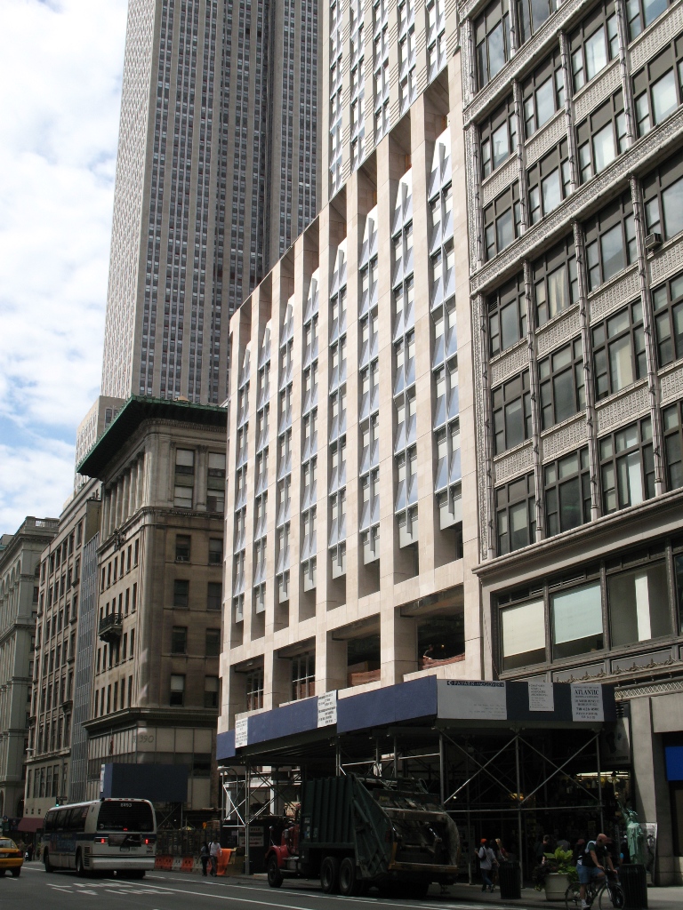
Proponents of relaxing the height limit say that it would improve the quality of architecture, but they usually mean that new buildings will be less boxy if there’s less pressure to maximize floor area. Yes, this might encourage more setbacks, deeper walls, more varied patterns, and richer textures. It might also lead to buildings that are just taller versions of the same boxes.

We asked several experienced architects to weigh in on the topic. Some oppose revisions and others support them. But they all note how aesthetics, human comfort, and building performance get trapped in between money and the law, and offer tangible ways to improve the urban environment with or without relaxed height restrictions.

L'Enfant's Tomb by AlbertHerring on Wikimedia

Form follows finance

It may be helpful to think of a speculative office building as a machine for making money. In order to provide a very high level of service to a large amount of floor space, modern office buildings are packed with mechanical equipment and consist of highly engineered assemblies from structure to skin. We can see when money has been spent on high-quality finishes and beautiful details, but the real luxury is empty space.

North of Tilden: Checking in.

In the intervening years between my departure from DC and the moment that you are reading these words, a number of things have changed in Tenleytown. So it’s worth showing how upper northwest has unfrozen and opened up to a modest amount of growth. Rather than focus on the ongoing political developments, take a look at projects that have finally become buildings.

This is a long post, so click through…

Quick Thought: Generation X-over-Y

While writing about AU expansion, I’ve been getting a sense that one reason I’ve been having a hard time writing arguments that will resonate  is that the opposing perspective is approaching the topic with a totally different paradigm of what it is.

My (undeveloped) conjecture is: the older generation sees environmental problems from an intuitive (fishkills & pesticide) perspective, whereas the later generations see the issue in terms of abstractions (%CO2 over 10,000 years). I think I can say that ecology is based on systems thinking. “Ecosystem,” after all, precisely refers to an interrelated organization. That complex activity can only be understood through abstractions that make consequences more intuitively threatening.

But the older generation seems to approach an environmental issue as perceptible, in that anyone can readily see the links and the loops and understand their consequences. You cut down a tree, and this directly harms the environment and limits one’s access to it. A particular, standing in for the general, is irrevocably lost. Building where there once was a grassy patch is paving over paradise, and a building that brings any cars to the neighborhood is causing pollution.

The primary enemies of the 1960s were intensely graphic horrors such as the burning Cuyahoga, broken bird eggs, and the disfiguration wrought by thalidomide. The problems were so obvious, you could see them with your eyes, and that his how we noticed in the first place. For the generation brought up during an era of global warming, the agents are more nefarious. How does one picture a rise of water over decades? How do you draw the cancer cluster caused by dioxins in an aquifer? You have to rely on the numbers.

Thus, cutting one tree here can save ten elsewhere, the understory is better than a lawn, and a building that brings traffic to one area might reduce car trips on a regional scale is a ethical imperative.

I don’t want to nail the intuitive position as inferior. The aesthetics of an environment contribute to its quality, particularly trees and greenery. They’re an essential part of good urban design, and remembering that humans have an inborn relationship to nature, they almost certainly contribute to the well-being of residents.

However, it is much easier to accommodate the perceivable sense of nature within an abstracted framework than vice versa. I.e., you can plant trees in a city where you don’t have to drive, but it’s hard to fix the numbers on pollution when you have to drive everywhere to and from your 2.3 acres.

A look at the new Czech Embassy

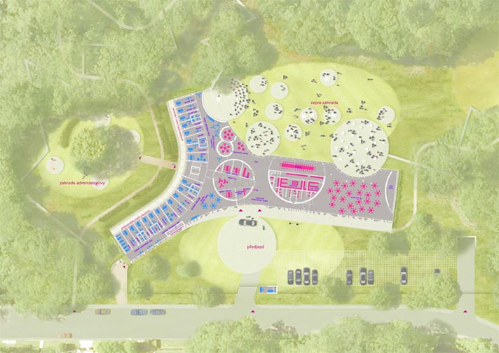
The Embassy of the Czech Republic has announced a design for a new building to replace an aging facility on Tilden Street in Northwest Washington. The current embassy is a not-quite-modernist structure at the edge of Rock Creek Park near Peirce Mill. The new structure will be a postmodern landscraper in a y-shape that clings to the site, in a flattened valley. The architects are Prague-based Chalupa Architekti; I think this is a definite improvement.

This is going to be a really great building for nighttime parties. The designers conceived of a theatrical center for élite receptions. I like the circular pods that are scattered inside and out and in between. They refresh the old Modernist idea of dissolving barriers between the interior and exterior, nature and environment, by bringing it back to the original idea of passing volumes through an envelope. The front (north) façade is a beautiful composition of frosted glass formed into a curtain. From the side of practicality, the east-facing façade of the office wing is fenestrated and shaded reasonably well for actual daylighting.

The architects fell into some contemporary tropes I dislike. I find some of the lines to be arbitrarily harsh and unanimated. The glass curtain in front ends bluntly at the roof slab. Likewise, the entrance doesn’t stand out on a building that already doesn’t address the street well. Admittedly, it is a diplomatic building, so security concerns will cause designers to skew fortress-like and the surrounding neighborhood is hilly and wooded, full of detached mansions like the Hillwood.

So, maybe disappearing into the environment is the best course here. The grass roof slips the building into its site. And if it’s not near public transit, it is near great bicycle resources. The shady Rock Creek trail is just feet from the entrance. If the Czechs get on the same bike as the Danes and install some changing facilities (it’s not clear from the published images if they have them), then it could be a pretty forward-thinking building.

What do you think?

As seen on Dezeen.


A Look at the Janney Expansion

Janney Rendering 1 SE_09 SMALL

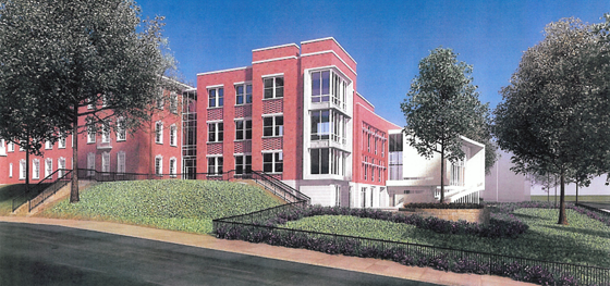
I finally got some images of the proposed Janney School extension. I like it – but it could have been better. With a few objections, I like its conception. Devrouax + Purnell, best known for the Washington Convention Center, the Pepco Building, and Nationals Park, here produced an interesting and attractive school building. However, the location where they have chosen to place the wing results in a lost opportunity for Janney and the community in general. Like too many developers and architects, they approached Tenleytown planning to not upset the status quo. However, any public facility should be designed with an eye to the future – and the current state of Tenleytown cannot last.

The building steps down.

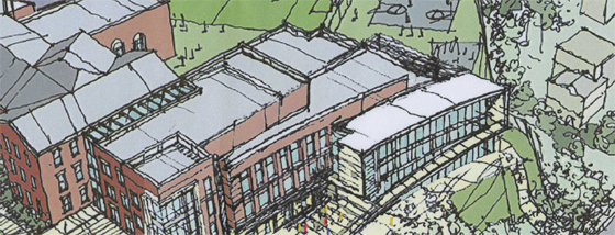
Beginning with the generous setback along 42nd street, the architects attempted to hide the building as much as possible, so as not to intrude on the neighborhood. Although the Albemarle façade extends to the cornice line of the 1923 building, the masses of the building gently diminish into a low white structure that encloses the gym. Moving south along the western face, the building curves gently, from a tower to the first private residence down the block. The architects employed the shape subtly, repeating the curve in each mass to limit its effects. It does successfully integrate into the site.

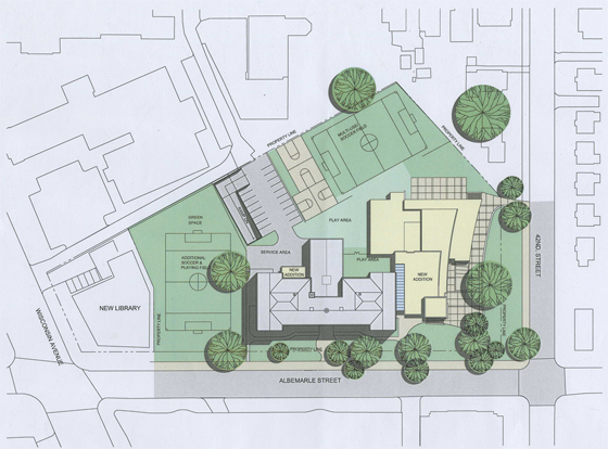
However, this hesitant approach is not appropriate here. The architects should not have set the building back from the street so much. In doing so, they have reduced the feeling of enclosure afforded by a consistent streetwall, produced an marginally useful green space, and missed an opportunity to relocate the playing field at the center of the Tenley Library Public-Private Partnership debacle.

JES_Design_Schematic_20091110-1 SMALL

For the 2007 plan to build a library with several floors of condominiums on top focused on the loss of recreation space (the rightmost field in the image above) for Janney Students. Some of that space would be consumed in the footprint of the condominium structure. However, had the architects located the new wing closer to the property line, they might have opened up space to relocate the eastern soccer field. In a political environment as vicious as Tenleytown’s, a mutually agreeable solution would have been a rare happy ending.

That lost opportunity is my main complaint – but there’s much more review below.

North of Tilden: In the name of the Father, the Builder and Community Spirit

The Tenleytown area has been a hub of hubbub for the past two weeks, and more is to come. Four long awaited projects made great strides, however, opportunities are still being lost.

First the good news: The Tenleytown Library will break ground today, September 23rd at 10:30 AM, with Mayor Fenty and perhaps some protesters in attendance. The Economic Development office decided to spend $650K-1M to build stronger girders in the rear of the building, to permit future growth above and to the rear of the library. Across Wisconsin, the renovated and restored fields at Fort Reno Park will open on October 3rd. Another contentious site, the three athletic pitches look great. I can’t wait to see people enjoying the park and all its earthly delights again.

The new structure is on the left. Pray for a good contractor.
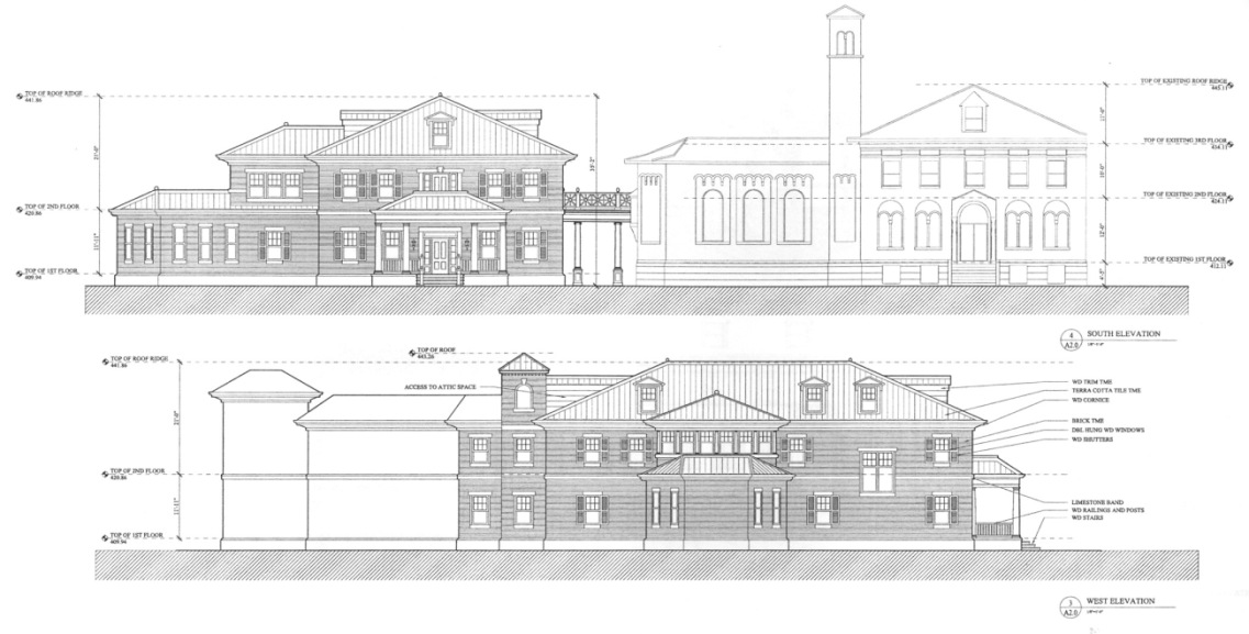
Top: Yuma Elevation, new structure at left. Bottom: Western elevation. (Image via DCMud)

Opus Dei revealed more details about their plan for the Yuma Study Center, a residential and educational facility behind St. Ann’s Catholic Church. Going before the HPRB, Moses of the Anacostia Nir Buras presented a handsome traditional home that would stand west of the Covenant of the Bon Secours building. Alvin Holm‘s design for the building is in a humbler strand of Classicism than the grandiose variety that Washington is known for, and that’s really good to see. As you can see, the new building would have nearly identical proportions and mass, but would use a more Chesapeake style and add a porch to indicate a residential character. However, I think the building would be better to stand on its own rather than be a redecorated twin. Still, positive.

And below, the ARD gives us Barabbas.

Details, Details: Sustainability is so 1983

In the recent controversy over the energy efficiency of LEED-rated buildings, most commentary placed blame on glass, users, the LEED credit system, ASHRAE, expectations, models, etc.  Few people mentioned simple design decisions. Take a look at this picture of 4250 Connecticut Avenue:

van-ness-windows

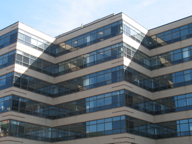
Designed by Hartman+Cox before they went traditional, it’s pretty unremarkable – except that it shows an uncommon sensitivity to site particulars. In the picture, you can see that about 3/4 of each wall is window space and mullions. Elsewhere on the building, however, less than half of the floor height is glass. Why? The above side faces North-Northwest, with the angled shape exposing most of the wall area to due north. The primary energy problems with glass walls cresults from solar heat gain and glare, but daylighting can also save a lot of energy. On the north side of the building, where there is rarely any direct light, the offices can get some daylight but not catch too much heat.

Now, Ourousoff is just clueless

Nicolai Ourousoff, the architecture critic (or something) for the New York Times, has lately been letting out evidence of what a lightweight polywanker he really is. The most recent evidence that he has no idea what is going on in the architecture profession came in a reflection on the death of Charles Gwathmey, in which he lamented the lack of heroes in the New York architecture scene. First off, it’s ludicrous to whine about New York losing its hegemony over the design field, like rich white men whining about discrimination. Secondly, it shows ignorance of the many cutting-edge practices in New York he claims do not exist or otherwise do not count. Finally, it’s backwards to wax nostalgic over the handful of heroes whose primary accomplishment was to separate formal Modernism from its revolutionary social program.

Gwathmeys final building, one of his best. Click for more pictures
Gwathmey's final building, one of his best. Click for more.

Luckily, цarьchitect favorite Andrew Bernheimer, defended fair Manhattan’s honor. Bernheimer mentions a number of practices that perfectly suit Ourousoff’s criteria, except that the architects have remained committed to teaching and social issues, in addition to formal investigation and self-promotion. This is just basic research he could do – he doesn’t even mention Diller Scofidio + Renfro, even as they drive the East Coast architecture scene. Besides, it sounds like Ourousoff is simply looking for new autonomous heroes to worship, rather than supporting teams of architects that manage to maintain their individuality while also accepting responsibility for the environment, the public, and the context. After all, the New York Five made their careers through wealthy patrons with large, auto-centric houses. The future cannot sustain those kinds of heroes. That period is over.

Just fire the kid already, he won’t learn unless he fails.

Reburbia and the future of suburbs

Frogs Dream, the winner, brings back the wetlands
Frog's Dream, the winner, brings back the wetlands

Beginning with this post, I’ll be writing on some local and urbanism-related issues at Greater Greater Washington from time to time.

In “Eyes That Do Not See,” Le Corbusier noted that airplane designers were unable to achieve heavier-than air flight until they understood the underlying issues of aeronautics – until they had posed the problem correctly. Until the tinkerers stopped imitating birds and kites and began investigating lift in a scientific way, they just produced spectacular failures and beautiful dreams. So, when looking through the finalists to the Reburbia suburban redesign contest, it was curious to see how, although many projects owe a debt to the Swiss architect, a great deal show confusion about the problems of “suburbia.”

Reburbia was a design competition where designers were invited to remodel, reuse, redevelop, and restructure the landscape of suburban development. Sponsored by Inhabitat and Dwell, the contest presented 20 finalists and a number of other notable entries for public viewing. Although they’ve already announced winners, the issues that appear in the submissions deserve more discussion. These open competitions are like fashion shows, where the offerings exist as inspiration for other designers more than practical solutions. Some of the ideas tossed around here might make their way into an abandoned mall, but the ideas that grow out of Reburbia are more important. As architects, planners, and citizens look for solution, we have to keep in mind what the problems are to judge any given solution.

Edible Parking? Bumper Crop
Edible Parking? "Bumper Crop"

Declaring that the suburbs need to be re-burbed begs the question of how much, and which kinds, of suburban development are unsustainable, undesirable, or inefficient.  Following that line of thought, designers need to consider whether mitigation of costs can solve an issue, whether simply pulling out unfair subsidies would help, or whether a total revamp has to occur. The projects in Reburbia revolved around a handful of issues that are unique to automobile-dependent sprawl, as well as others that all cities face. The entrants posed their problems around land use, energy waste, sustainable energy production, loss of natural habitats, low density, unappealing or unwalkable street design, transportation inefficiency, water runoff, and the legal mandates for development.

ConX: Modular steel construction

ConXTech is a Bay Area company that has finally brought the steel frame into the 21st century.

Now, that phrase trite, but what they have mass-customized the design of steel beams and then greatly simplify the assembly. It reduces design time, reduces the amount of labor needed, reduces energy expenditures, and provides a sturdier and more flexible alternative to wooden frame structures. Those stick-built structures are the most common design of 1-5 story residential construction, however, ConXTech is looking to make 5-12 story structures affordable as well. To do so, they have approached the whole building process in a slightly different way.

With ConX, the architect must involve the manufacturer in the design process, as the company custom builds the structure offsite in a factory. ConXTech needs to schedule the amount of work and materials necessary, while the architect needs access to their computer components at the schematic design phase. Still, it’s really not unlike the conventional process in which plans are sent to a structural engineer for engineering work, just that the engineer is the manufacturer too. Integrating the manufacturer reduces overhead, while entering the design development phase with a working model of the structure keeps the building lean and reduces the number of design changes that result from unexpected structural revisions.

So, once the project does reach construction, the CNC robots cut out pre-designed structure members to specification, as each piece is needed on the job site, delivering the product only as necessary. The system consists of vertical and horizontal beams, joining elements, wall panels, whole flights of stairs, and various other parts for specialized situations. Because the factory environment allows for meticulous control and use of accurate cutting, the frame and all other elements are extremely precise, resulting in better quality and speedy assembly. The frame itself is put together using snap-in-place fittings that a steelworker then bolts into place to meet code.

It’s a persistent myth, perpetuated by traditionalists, that steel is not a sustainable construction material, due to its embodied energy, which is around eight times that of wood. However, embodied energy, that is, the amount of energy required to make the materials and then assemble them on-site, rarely exceeds 20% of the total energy required for a building torn down after only 50 years. Steel frames overwhelmingly outlast that timeframe (steel-framed buildings from the 1880s are still around, and we have no idea how long they will ultimately last), so the percent of energy the frame requires diminishes in relation to heating, cooling, and interior renovation costs. They also use much less material, allow for greater density, and when they are torn down they can be wholly recycled, but I’m digressing here.