Painting iconoclasm

After the reformation, the darkness of medieval churches came to symbolize pagan superstition as much as the icons. So, many churches were painted white, from the stone or from previous colored patterns. The bright, flat spaces were so cool painters, couldn’t help themselves.

 Pieter Saenredam, 1649.

 Pieter Saenredam, 1650.

Emanuel de Witte, 1661.

Emanuel de Witte, 1668.

Dirk van Delen, 1645.

Or, When the Cathedrals Were White, actually.

Concerning Stalin’s Fructification of the Earth

If you have ever wanted to see Joseph Stalin masturbate victoriously onto the fields of the Zalesye while Jonathan Meades muses on the barrenness of totalitarian art, well son, here is your one chance.

Joe Building: The Stalin Memorial Lecture (2006)

A few posts on Greater Greater Washington

The more I’ve written for Greater Greater Washington, the more I’ve realized that I need to write for a different audience here than I do there. At the least, I’d like to be more specific about architectural issues here and write about its intersections with DC and Upper Northwest on Greater Greater Washington.

So, I’ve decided to stop cross-posting articles from GGW other than ones that are themselves pretty specific to discussions of architecture, for example, the Architects on the Height Limit series. However, I will periodically link to the articles I’ve contributed to for readers who don’t read GGW. 

Stuff I wrote:

I also had comments in four group discussions:

Taller buildings, better architecture?

Would lifting the height limit lead to better architecture? It’s not that simple, say architects. There are many people and forces, both cultural and economic, shape the built environment, not just height.

Proponents of relaxing the height limit say that it would improve the quality of architecture, but they usually mean that new buildings will be less boxy if there’s less pressure to maximize floor area. Yes, this might encourage more setbacks, deeper walls, more varied patterns, and richer textures. It might also lead to buildings that are just taller versions of the same boxes.

We asked several experienced architects to weigh in on the topic. Some oppose revisions and others support them. But they all note how aesthetics, human comfort, and building performance get trapped in between money and the law, and offer tangible ways to improve the urban environment with or without relaxed height restrictions.

L'Enfant's Tomb by AlbertHerring on Wikimedia

Form follows finance

It may be helpful to think of a speculative office building as a machine for making money. In order to provide a very high level of service to a large amount of floor space, modern office buildings are packed with mechanical equipment and consist of highly engineered assemblies from structure to skin. We can see when money has been spent on high-quality finishes and beautiful details, but the real luxury is empty space.

See Toyo Ito speak at the NBM

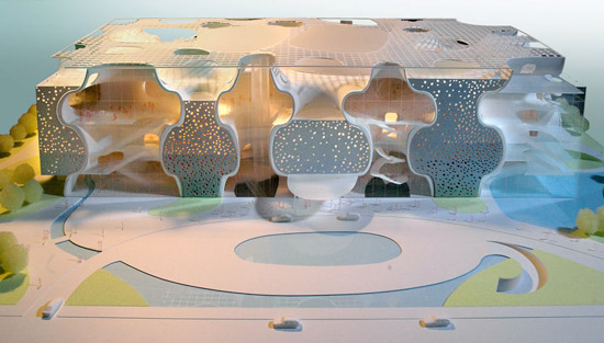
ito_taichung

I think it’s worth the time of every Washingtonian who thinks they know what’s up in architecture to hear Toyo Ito speak at the National Building Museum. Ito won the 2013 Pritzker Prize, and has produced some pretty astonishing buildings, most notably the Taichung Opera House, sponge-like chunk of an infinite minimal surface algorithmically drawn around the program. Were it not for a few doors, the building would be two separate spaces, absolutely enmeshed in each other. Even with the breaks, the surface segregates spaces so that there’s neither figure nor ground and there is no evidence for the other mirror-image space. There’s a similar manipulation of space in the unbuilt Berkeley Art Museum.

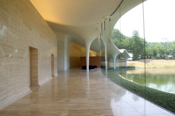
ito_meiso

The Meiso no Mori funeral hall  (above) was a point of departure for one of my projects, along with other projects by Ito, Akihisa Hirata, SANAA, and Junya Ishigami’s KAIT workshop.  Their buildings precisely emulate natural phenomena with a spare aesthetic. Their anti-iconic and open-ended spaces they produce are a nice respite from DC’s inclination.

Wednesday, October 16th, 6:30PM. National Building Museum. Judiciary Square Metro. 

Modernity, rushing towards him

July 13th is the 172nd birthday of Otto Wagner. Wagner is one of the first people to use the term “modern architecture,” although his work doesn’t embody the theoretical or stylistic connotations of that term. Nonetheless, he was more than aware of the strangeness of modernity.

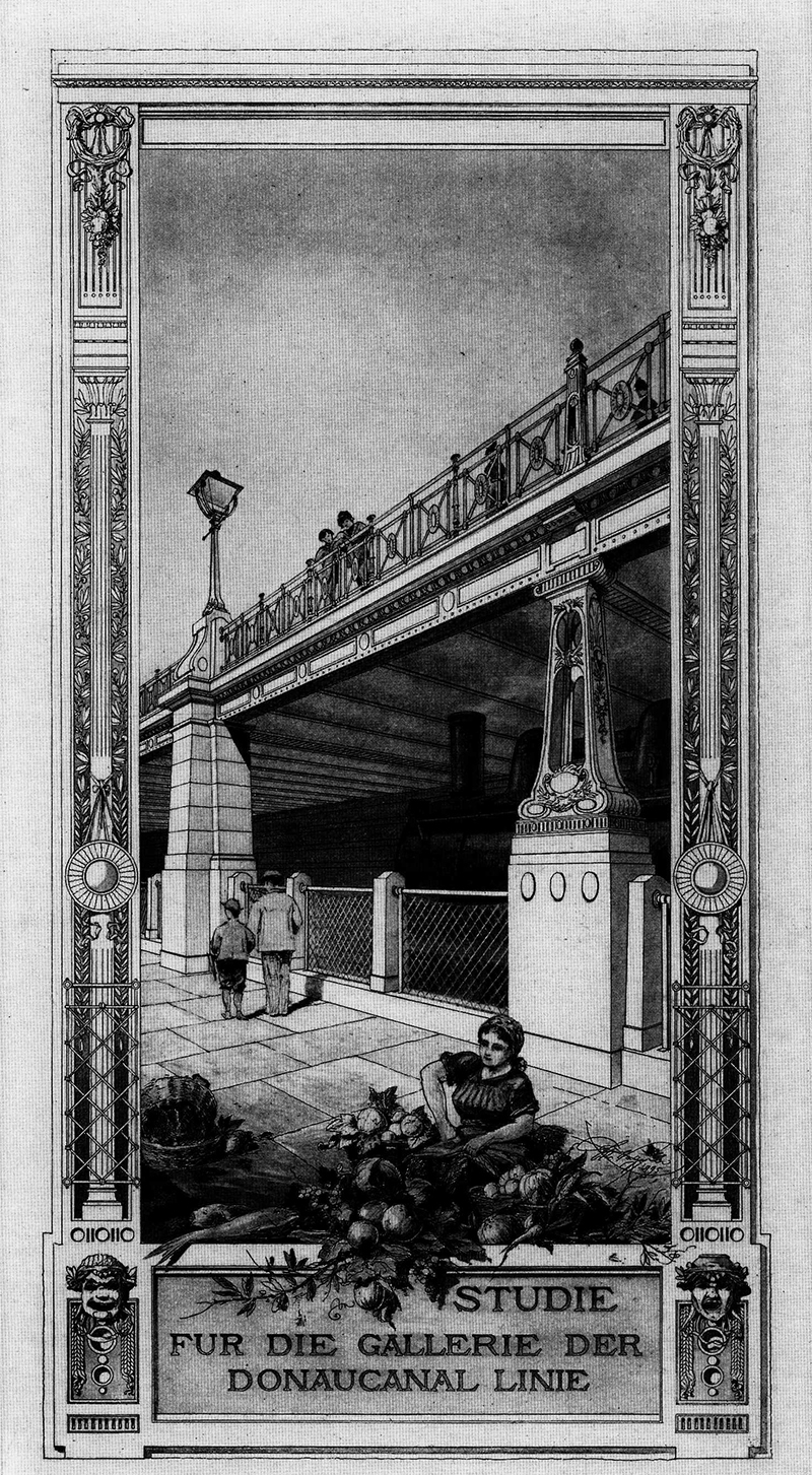
wagner stadtbahn viaduct view sm

This rendering, published in the 1897 edition of Moderne Architektur is strikingly dense for what was, at the time, considered the uncultured work of an engineer. Wagner  and his studio produced incredible draftsmanship, but this rendering stands out because of its sheer uncanniness. Look at the two columns. One is stone, safe and solid. The other is cast iron, modern and delicate. A woman works, men turn their backs, and a locomotive of the Weiner Stadtbahn lurks. There are superhuman things and unseen layers to cities, a fact to be made beautiful.

After the break are two more under-appreciated projects of his, one for an asymmetrical bridge over a lock, and the other is the earliest architectural photomontage I am aware of, from 1906.

For Adjaye’s libraries, seeing is believing

Among the new DC public libraries, the Bellevue and Francis Gregory branches east of the river have the strongest design. Without sacrificing functionality and accessibility, they put sophisticated works of architecture in historically underserved neighborhoods. But photos don’t tell the whole story. You have to go see them yourself.

Designed by British architect David Adjaye, who’s also designing the Museum of African American History, the libraries are a reminder that it’s possible for a work of world-class architecture to also be a comfortable third place.

DSC_0438

Francis Gregory Library.

When the first renderings of the new libraries were published, I was unimpressed by them. But after a day-long excursion to see all of the libraries built under the tenure of library director Ginnie Cooper, I have to admit that I was surprised at how brilliant Bellevue and Francis Gregory are.

What can BIG do for the Smithsonian?

When I heard today that Bjarke Ingels Group will be producing a master plan for the core block of the Smithsonian Institution, I was not really thrilled. Their work is engaging and sharp, but it’s also can come across as trendy and disposable. The buildings I have visited feel cheap and unsubtle in their handling spaces. It’s personal taste thing, but I don’t like what they’ve built.

But then I remembered that the great thing about master plans is that you don’t have to follow them very closely, so you can keep what you want and take what you need. The drawings and guidelines are not permanent impositions on the urban landscape. They’re ideas. Ideas are cheap and BIG is good at rethinking basic  concepts in fresh ways, even going so far as to be able to propose how to realistically bring unconventional projects to reality. I don’t know if I would like to see Morphosis’s intervention in the Arts and Industries building, but it did cause me to look at the building again, to see its qualities and how it might be adapted.

Too much architecture in DC starts out tame and ends up lame. Sometimes its because of design review and sometimes its because of style anxiety. So, it’s important to start thinking big here, and dial it down when it comes to a serious proposal. So, I say we see what BIG proposes for what has to be the most heterogenous block in DC – The Castle, the Hirschorn, the Freer, and the Ripley Center – that’s most of the past two centuries’ movements – and let their ideas challenge whatever architects complete each project.