This is a long post, so click through…
Tenley Library
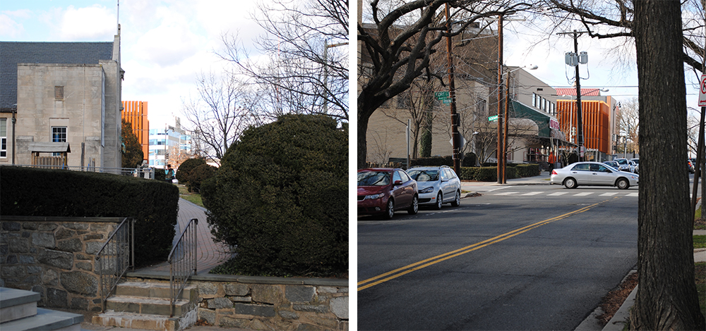
The Tenley-Friendship Library has been published pretty widely, but I was struck by how it fits into the neighborhood. It doesn’t exactly blend in; it’s orange. But that orange looks great against the icy blue sky and gray clouds of winter. You can see it calls attention to itself as the major community space of the area. Standing out is good for this kind of building. At the same time, it has a strong street presence. The louvers that color its façade open the building up to the corner of Albemarle and Wisconsin, but close it to create a functional streetwall to other views.
The only real blight on the project is the barren rear, designed to eventually support several floors of apartments. When they are eventually built, neighbors need to work to ensure a design that addresses and works for Janney better than the facade above. If they are constructive, rather than obstructive, the project will make Tenleytown more sustainable and vibrant than when the site was occupied by a playground.
Janney Renovation:
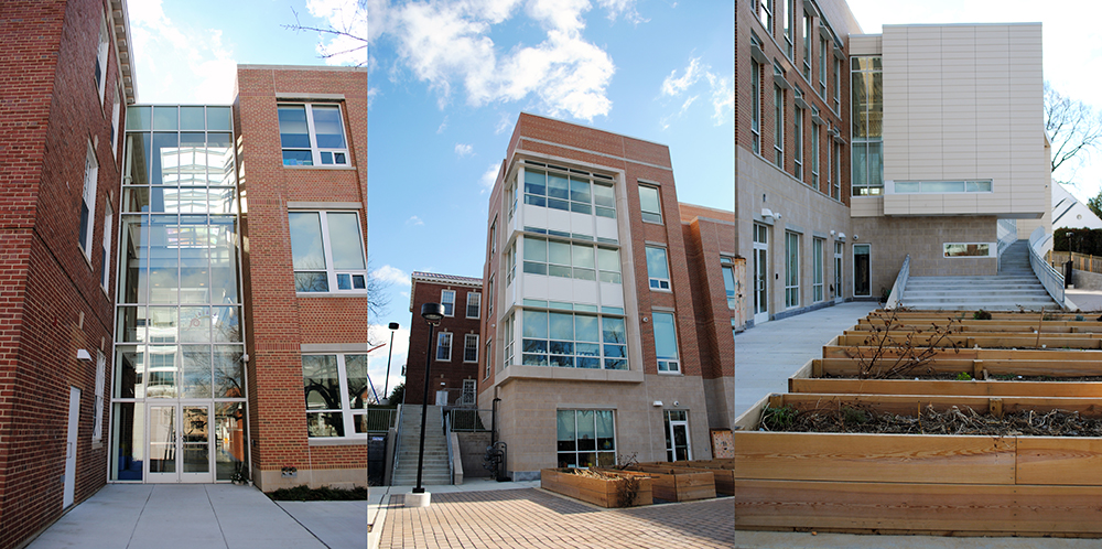
Devrouax + Purnell’s renovation was completed, roughly on schedule, this past fall. All of the design features I discussed in this post are present. The transition from brick to the terracotta rainscreen works about as well as I anticipated. The clear glass break is fine. Whether it functions well is a little uncertain – I don’t have access to the school, but it looks like some of the continuity between the inside and the outside was mostly a graphic trick. The same is true of the pathways through the site.
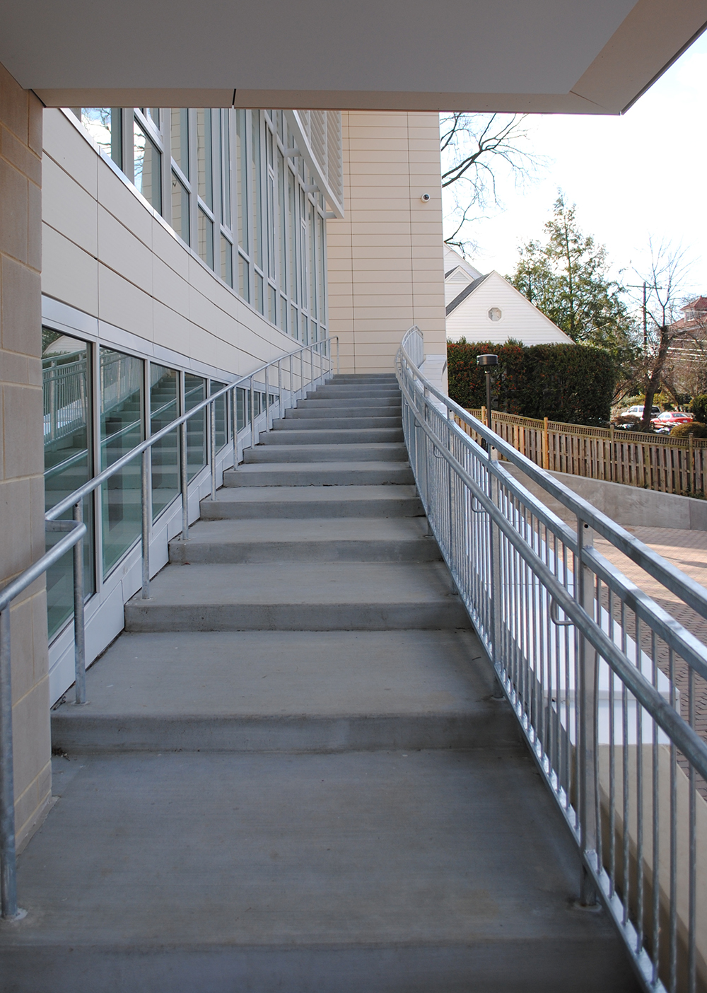
If you have a moment, you should take a walk up from Albemarle to the back of the building, passing up a set of stairs that disrupt the volume of the gym/auditorium. It adds some life to the formal cliché of a glass box with an opaque wrapper. It literally peels the wrapper off in one corner to create a dramatic monumental entrance to the playground in back. The back of the building seems the most clearly resolved and architecturally clear part, also disguising an underground parking structure for teachers.
UDC Student Center
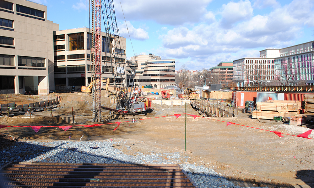
I don’t have much to say about this. I strongly dislike the way the design addresses the public area, but filling in the plaza will definitely be welcome. It is lovely to see the empty plaza being filled in and great to see the city investing in the University. It’s also going to be LEED Platinum, which is about the level of LEED where you can’t just rack up meaningless points. You actually have to address design, use, and building systems. That’s good!
Wilson Renovation:
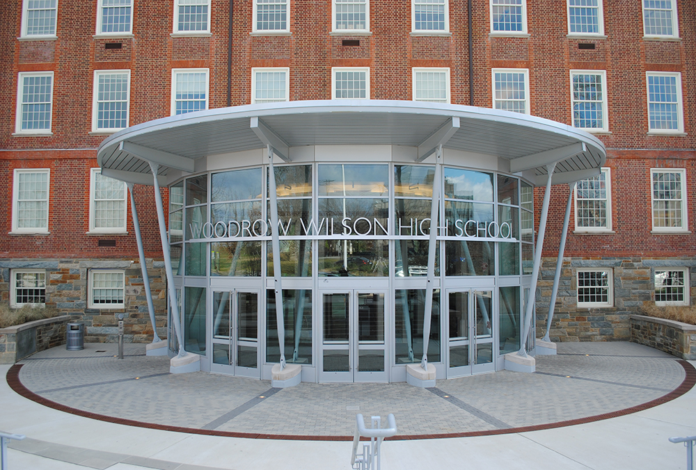
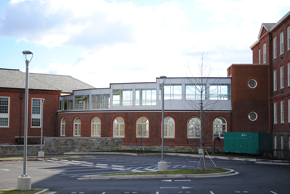
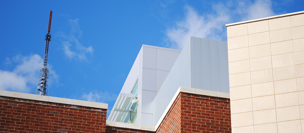
Wilson has also been renovated dramatically. The design by Cox Graae + Spack gutted the building, repurposing the grimy central courtyard as a beautiful common space works well where it intervenes in the existing building. The glass entry pavilion, in particular, solves accessibility issues, opens up the basement, and does not disrupt the historic buildings. Other interventions are less successful. For example, why, if the school is a set of pavilions, is the performing arts complex on Chesapeake a layering of polite postmodern fragments? Why would it not be its own coherent building? In order to make the style contextual, they made the architecture less contextual.
4691 41st Street:
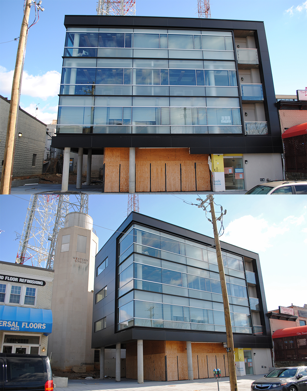
This minor project is a welcome injection of activity to Tenleytown. Years ago, there was a small building here, but it was demolished to build a new antenna tower. The tower was by-right, but neighbors had it stopped before it was half-built. Even before demolition, the block was another half-dead street in Tenleytown. Now, the block supports a revived Dancing Crab, an outpost of Public, and the ever-classy Prince Cafe. The new building has a couple of office floors, what looks to be a residential floor, and a ground floor restaurant space. Permits on the door say that Fork n’ Spade will be establishing a permanent location there.
Architecturally, the design is nothing remarkable, other than the fact that it half-hides the Western Union microwave tower. Even if the leftover space becomes a nice outdoor seating area, it’s a terrible way to preserve the tower, which is one of the most historic structures in Tenleytown. Totally hiding it, like a forgotten beacon, with a tiny, dramatic reveal would have been a better idea. And yet, the infill adds density in an area that needs it. Another of Tenleytown’s missing teeth is gone.
Yuma Study Center:
The Opus Dei-run study center for young women has a neat and unobtrusive addition by Quinn Evans. It’s a highly scenographic addition, blending the local house styles with the materials of the original Bon Secours building, on the right. It’s a very well executed project, forgettable in exactly the right way. You can’t make a city out of blends and references, but you can drop one or two buildings in discreetly, like this.
5333 Connecticut Avenue:
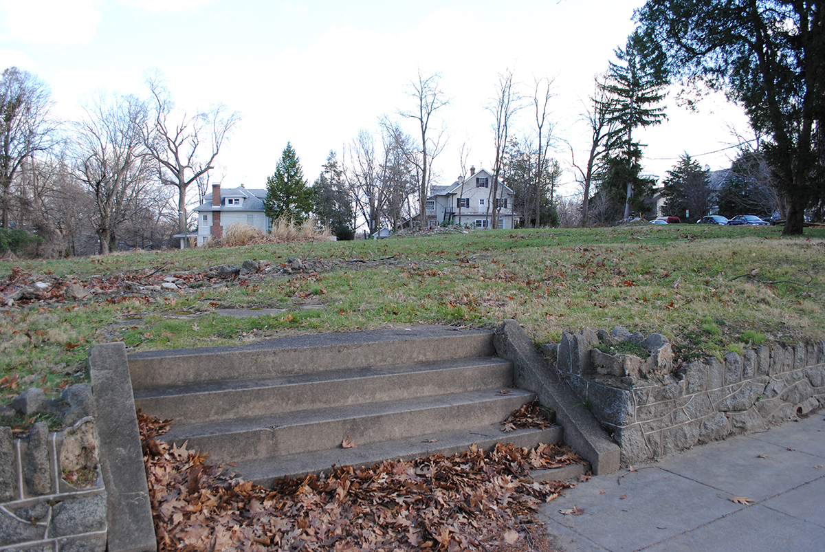
The neighborhood is abuzz about the potential for a new building here. Despite being a by-right project there is some opposition to the project, from design to scale. The Calvin and Jane Cafritz project is as of right, and supported in the 2006 comprehensive plan. If only developers felt comfortable entering into PUDs in Northwest… In the meantime, please enjoy the lot as it currently looks.
Miscellany:
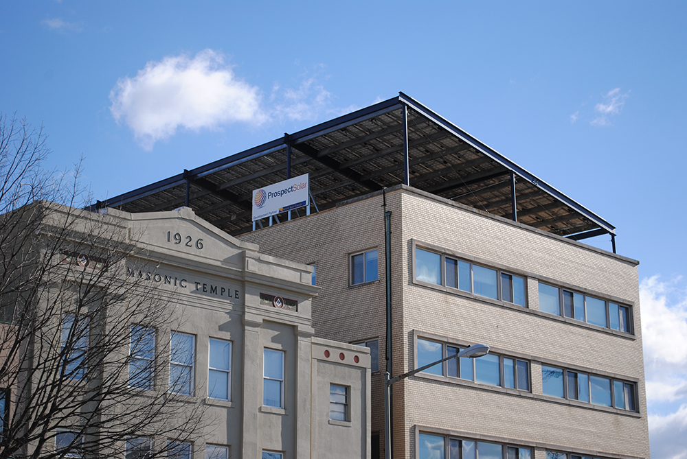
There are a number of other projects that deserve mentioning, like this huge photovoltaic array. It’s big and ugly, but these kinds of projects are what gets people thinking about how and why renewable building systems can be integrated in to their lives.
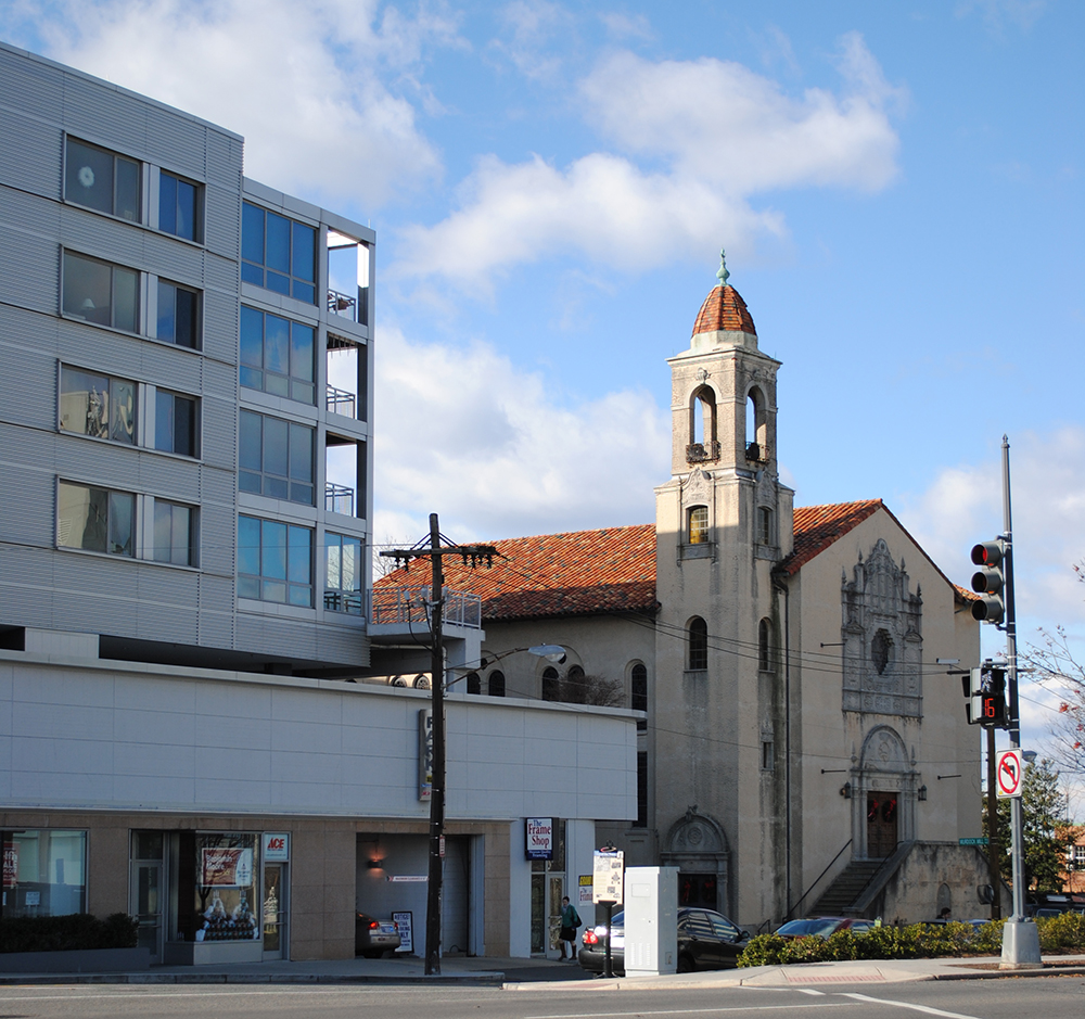
Finally, so I don’t just dump on Tenleytown’s architecture, take a look at this nice detail on Shalom Baranes Associate’s Cityline Tenley. It terminates the building, becoming more transparent, relating to the sky. Just like the belltower on the Methodist Church next door. It is totally possible to put these thoughtful details in residential buildings and in Tenleytown. With the Babe’s project, the Safeway, and the Giant projects underway, let’s hope we seem more enrichment of the area’s architecture and streetscape in the coming years.
