Brutalism’s proclivity for ostentatious grimness evokes something “Soviet” for Americans. But the movement never caught on in the USSR. Whatever it looks like, it didn’t square with the Party. British brutalism was bourgeois in its affected craftsmanship. Once America got to it, Brutalism was dangerously individualistic.
But, Soviet architects did flirt with the aesthetic when they were trying to show off before the 1980 Olympics. That’s when they gave their answer to the Unité D’Habitation.

The House of the Aviators on Begovaya Street, also known as the the House on Legs or the Centipede House, is absolutely Soviet and it’s absolutely inspired by Le Corbusier housing units. It’s built to very specific standards in different climate with a different construction industry from those buildings. They found a lot in the translation.

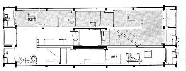
The Unité’s apartments had two-story section that allowed for natural ventilation. Much copied, this came from the Narkomfin building, which is a few miles away. Long before the 1970s, the Soviets had abandoned the collectivist vision for a more conventional one of providing every family with an apartment. They had also adapted a system of prefabricated structural panels, best known in the West as plattenbau.
In Soviet cities, ordinary housing blocks followed a hybrid of Stalinist scenography and Corbusian superblocks. To make the industrialization of construction more cost-effective, multiple towers were assembled into long slabs. Often, a few of these formed a precinct with parks, schools, and general stores called a microrayon.
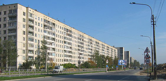
Each tower had a podyezd (entryway) that opened to the street. In Stalinist buildings, the entryways were hidden to emphasize the overall composition. By the 1970s, they were faintly expressed on the ubiquitous, identical bars, like this one in St. Petersburg.
In 1978, Andrei Meyerson was asked to do something more distinctive, on a budget. The challenge was getting cosmopolitan flair out of panel construction and standard apartment configurations. He found a way to do it, with the open-air ground floor, the cast-in-place stair towers, and the brash articulation.

The spindly piloti maybe owe more to Marcel Breuer than the Smithsons, but they actually create a comfortable space underneath. Well, maybe not in the winter, when winds hit the slab above and blow under it.

The stair towers work a little better getting light and air into what are usually pee-soaked claustrophobic spaces. Stairs also don’t need to be air-conditioned or thermally broken, so you can have fun with them, like Richard Rogers at 88 Wood Street.
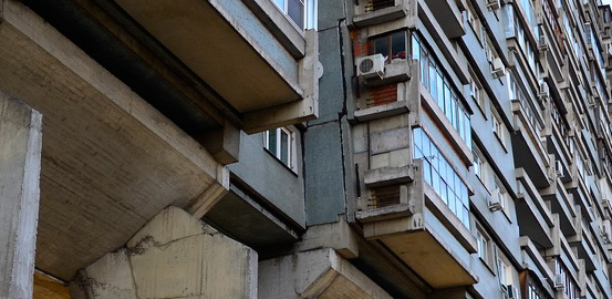
What I’ve never seen anywhere else is how Meyerson assembled the concrete panels. They lean about six inches out from top to bottom, so the building appears shingled. The plattenbau system was cheap and crude. It showed the joints very clearly. Rather than hide that, Meyerson made it interesting. Over 13 stories, it de-emphasizes the vertical seams, accentuates the length of the building and disappears into a texture when you’re not paying attention.
This plays off of the vertical notches and bold stairwells nicely. The south side of the building looks flatter because doesn’t have the stair towers. There, the legs do make it look like a centipede slithering along the Third Transportation Ring.
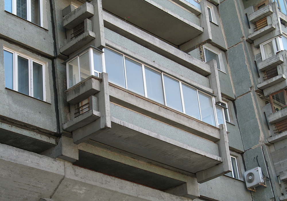
Corner-hugging balconies round out the building. They seem to be pre-cast and hung from the side of the building. Meyerson took a chance and made them out of intersecting slabs, like a constructivist arkhitekton. After the fall of the Soviet Union, the inhabitants glazed in a lot of the balconies, so these photos don’t show it as well as it would have when it opened.
Even with the sculptural towers and striking form, the building suffers from the dreariness of late Soviet projects. Poor quality of construction, bad details, and decades of deferred maintenance have damaged it severely. When I last saw it in 2007, the concrete was spalling badly and the panel joints were cheaply patched up. Like Narkomfin, it needs repairs badly. I’m not sure it’s long for this world.
That’s unfortunate. It may be ugly, but it doesn’t feel placeless.

Nearby are other interesting buildings, the Moscow Hippodrome, by the godfather of Stalinist architecture, Ivan Zholtovsky, the lacework precast of Andrei Burov’s Ajour house, the Vesnin Brothers’ Mantashev Stables, the Hotel Sovietsky, and the demolished Dynamo stadium.


