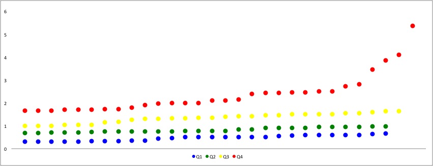
How far apart are Metro’s stations? I think one of the reasons people assume Metro should have express tracks is because the distance between stops varies so much. If you’re a suburban commuter coming in from Franconia-Springfield to Federal Triangle, the long-short-long-short distance must be disorienting. So, even though Metro’s shortest distances barely come close to the New York Subway’s usual local distances.
Matt Johnson has pointed out that Washington’s Metro is a hybrid commuter rail-subway system, most similar to Paris’s RER. With the Silver line opening and the very long gap between Spring Hill Road and Weihle-Reston East, that hybrid nature is only going to get more apparent. The stations in Tysons are fairly close together, but bookended by two of the longest stretches of track.
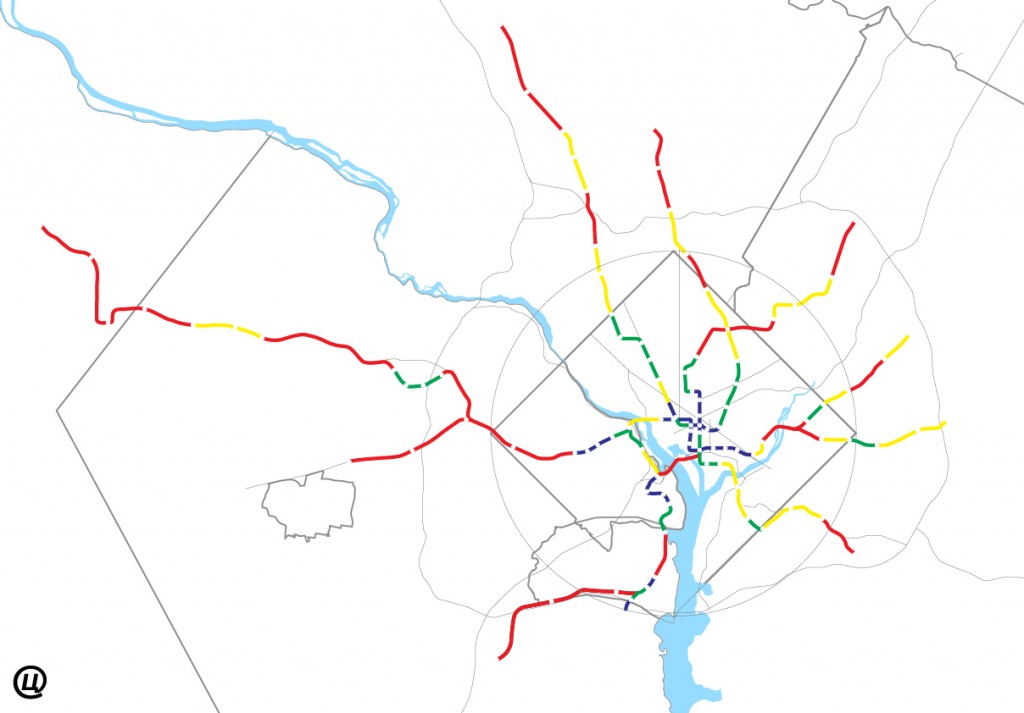
I wanted to see how this broke down, so with an hour to spare, measured the distances (line-of-sight) between stations. Then I calculated the quartiles and represented them using my base map.
For those railfans out there who will take me to task for erring by inches that I’m less interested in track length than distance between stations. I wanted to look at this from a land-use perspective, not an operations. But, I don’t have ArcGIS, so I don’t have the level of precision Metro’s planning staff has.
Above is what I found visually. Obviously most of the distance is between the longer segments:
- Longest Quartile: 66mi, 28 segments, 52% (Red)
- Upper Quartile: 29mi, 22 segments, 23% (Yellow)
- Lower Quartile: 20mi, 23 segments, 16% (Green)
- Shortest Quartile: 11mi, 27 segments, 9% (Blue)
Nothing really groundbreaking, but fun to look at.
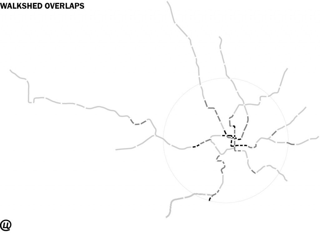
Since redundancy is so important to transportation design, here is another chart showing how much walkability overlap, in increments of ≤.5mi, ≤1.mi, and too damn far:
And below, I’ve broken it down line-by-line.

