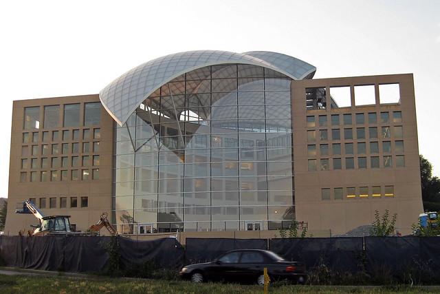
I don’t buy his assessment of Safdie’s career (namely that his only good building was Habitat ’67) or that Safdie is somehow different than Terragni, OMA, Yeang or any other architect that has produced institutional work for a statist client. If anything, his work for these groups is a less seductive option simply by virtue of his staidness. Regardless, Kennicott hones in on the idea that the building is a duck: a work of architecture where all formal characteristics are subsumed into an “overall symbolic form.” Yes, the dove-shaped roof is easily the worst formal decision in the building. Except that in a more important sense, the building is not a duck.

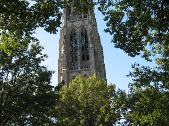
The idea of the duck was developed by Robert Venturi, Denise Scott Brown, and Steven Izenour while teaching at Yale and eventually published. The main target of the critique was not the literal use of symbolism in vernacular structures, but rather the abstracted formal symbolism of “heroic, original” buildings that totalized structure and program into an exploration of space, form, or ideas. This, they said, was more insidious than the overtly ridiculous Long Island Duck.
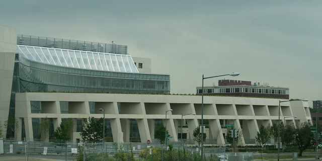
What the building is not is a security duck. Contrast this with Safdie’s other work in DC, the ATF Headquarters Building. That fortress in Northeast is a security system for itself, where its defensive features become an architectural statement. The grand gesture is an enormous, inaccessible pergola developed from the moat, fence, setback, and blast walls required. Other features, like the gateway-within-a-gateway front entrance and the row of shops on 2nd St. reflect the primary design concept: security. Security subsumes form gloriously. But the ATF building has taken enough of a critical beating, so let’s examine two other examples:

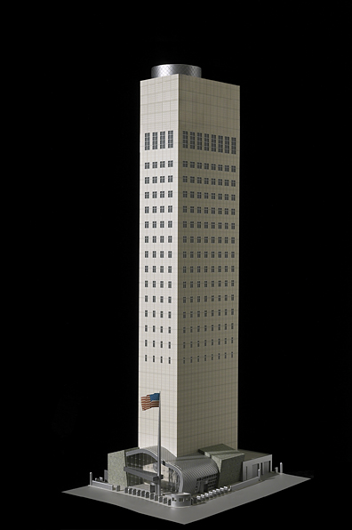
Gwathmey Siegel’s US Mission to the UN indexes the required distance for blast resistance through the size of its windows. The walls of the building simply could not be further from the edge of the small urban site to meet US embassy requirements, so the architects manipulated the windows on a tower already set back into absurd slenderness. The only way you know it’s not the bitter provocation of a grad student is its desperate banality.
More recently, KieranTimberlake’s US Embassy in London, scheduled to be completed in 2017, improves on the ugliness of buffering, but is unable to escape duckhood. The building is set upon a plinth that creates private assembly spaces above, and a security perimeter below. By emphasizing the severe cubic form set within a circle and again in the middle of a field, the architects have called all the attention to the space between the building and its context, at least compared to the looser glancing forms some of the other competitors’ entries. Richard Meier’s design is particularly distinguished because the renderings show bollards: discrete, non-architectural supplements that do not change the fabric or utility of the building.

Venturi & Scott Brown’s alternative to the duck was the decorated shed: a relatively banal structure, with a highly articulated facade conceptually detached from the overall functional design. His examples were renaissance palazzos and the Vegas Strip: big, bold facades loosely related to the interior. Now, Meier’s design may be a formal duck, but the security is attached loosely, a protected shed. The same is true of the USIP building, where Kennicott’s review demonstrates that security was not a conceptual concern for the project. The building has large, clear atria one can get close to. It has relatively good permeability, and its security pavilion is prosthetic to the main building. Perhaps it does not need the security of the Pentagon. But even many of the most effective safety measures at DOD headquarters have not been grand design choices, but rather building system details like laminated glass in windows and column casings.
This applied, rather than integral, security is already common. Like the Las Vegas Studio, we have to look at the disreputable defenses of Washington: the bollards, the planters, and the barriers that are almost all right. Those dumb little planters are an embarrassing icon of Washington, but they have their virtues. Ugly and ordinary, they offer both protection and the symbolism of security. They’re not part and parcel with the architecture, letting designers focus on expressing more important things. Maybe most importantly, they’re temporary. Eventually (theoretically) we can get rid of them and the buildings will not be compromised.

These not-so-great forms of security do not have to be so ugly and haphazard. The classicist bollards and walls around the Capitol and congressional office buildings are an attractive and historically sensitive application to the buildings they defend. They’re not ideal, but for something more innovative, take a look at the IMF’s Headquarters 2 in Foggy Bottom. For all the banality of the aesthetics, Pei Cobb Freed combined the barrier structures with small-scale elements like planters, benches, bike racks, street lights, and even a water feature. It creates a livelier streetscape than setbacks and walls.
The formalization of security is a tempting venue for architectural expression. The culture of the past twenty years has been one where institutions have had to fortify and militarize against threats both real and perceived. Making architecture of that defensibility is a tacit acceptance – if not embrace – of a perpetual security culture. That public buildings need protection against specific threats is undeniable. But that those protections need to exist forever and be manifested significantly in buildings, I believe, is an irresponsible and sad architectural position.

Is there a building you think is a security duck? Suggest it in the comments.
