Legible soundscapes

The New York Times reports on the controversies of the Shot Spotter gunshot locator. The device is a fascinating piece of technology that, in the words of James C. Scott, makes the soundscape “legible.”

In his book, The Tuning of the World, R. Murray Schaefer coined the term “soundscape” to describe the specific ambient conditions of a location. Like a landscape, soundscapes are an aspect of environment that remains relatively constant and which humans adapt to, interpret, and reshape. Schaefer interprets ambient noise as a part of the built environment. Take, for example, the way church bells were used to communicate time and call people to attention. The need to hear became a factor in medieval densification and growth required parishes to bud rather than sprawl. The information they conveyed was too important to do without. But, as we’ve needed bells less, they have shifted from signals into soundscape.

But, perhaps the newest tendency is not to tune ambient noise out, but to process it. Typically, this has been in the name of art, a way of humanizing it through aesthetic effects. Sometimes with simple analog acoustics, such as Lancaster’s Singing Ringing Tree, and other times through algorithms in Yokohama’s Tower of Winds. Both are interesting artworks, but they become still more interesting when seen as containing design choices in the form of the parameters that the artworks transform. The Tree might be more indiscriminate, but it’s aestheticization of wind is very transparent. The wind blows, you hear the howl and the tone at the same time, and one is explicitly the cause of the other.

The Tower of Winds, on the other hand, is controlled through algorithms that process the winds and noise it visualizes. It’s computerized and opaque, and you’d have to see the code to understand the process. I think it’s more beautiful, but it is also bound to the instruments that translate phenomena into machine-readable signals that are then interpreted by a program of more-or-less arbitrary signals. The process of getting from input to light relies, quite literally, on a black box. It is opaque.

So too is the ShotSpotter. It has assigned value to a particular range of frequency and timbre and understood them as probable gunshots. Software locates the source of the sound through trilateration and presents a monitor with a sound clip and a probable location cross-referenced to a GIS model. Further layers or readily processable information are included, hypothetically improving response time.

But, when legibility is so explicit, it also becomes possible to evade the mechanisms of gunfire by evading the identified sound of gunfire. An individual doesn’t have to suppress the sound, just distort it to the point that does not fit the parameters for a “gunshot.” At this point the precision of the system starts to fall apart – and it is the precision that gives police departments a time advantage over human call-in.

All this to say that how you pick parameters matters as much as how you manipulate their content. It’s hard to get criminals to agree to standards.
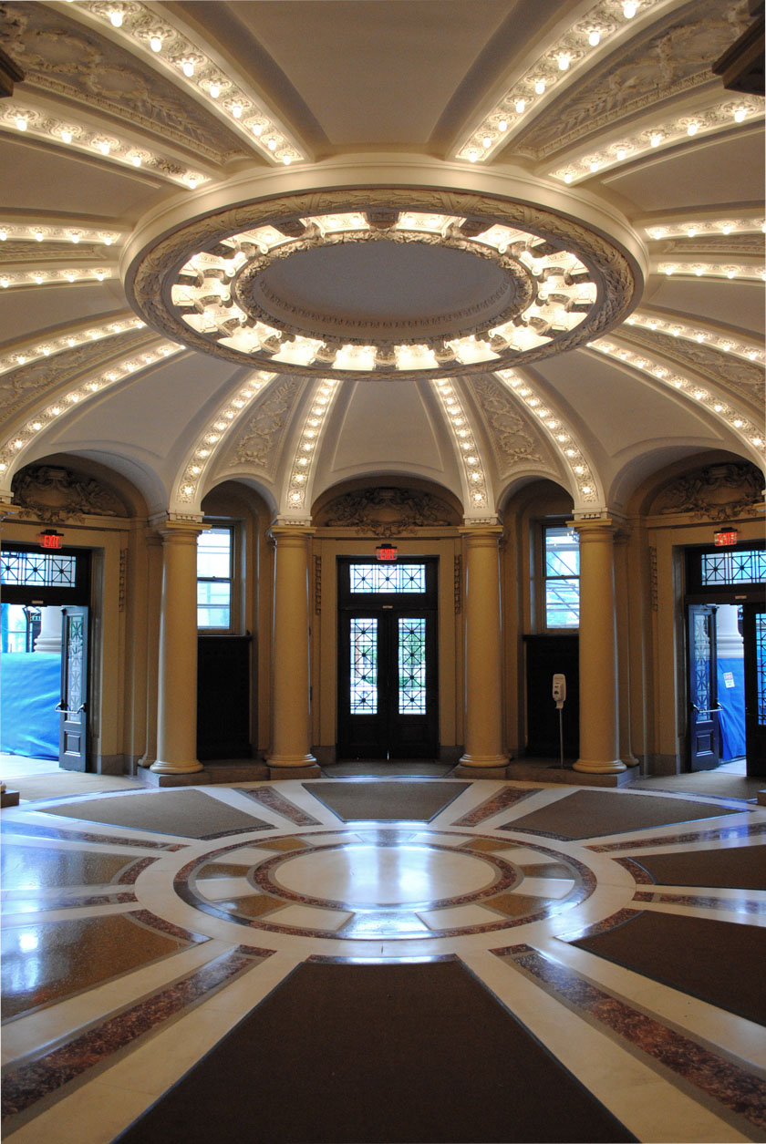
Details, Details: Gizmeaux

In response to a post on Greater Greater Washington, I wondered why the contemporary neotraditionalist movement is so averse to accepting or even embracing technology and innovation. Using, sure, but it’s hidden and tucked away, as if it is an embarrassment among the other monumental parts of the building. This has not always been the case; when traditionalism was not an ideological position but a method, architects were open to experimentation.

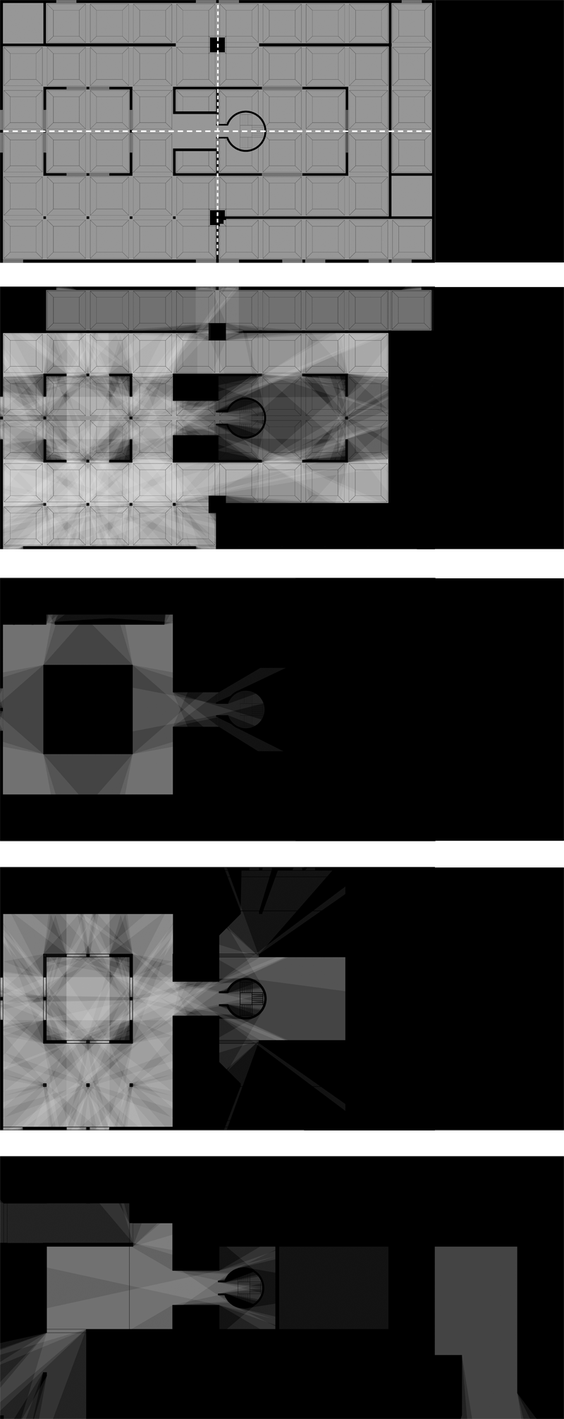
Just as an example, consider the way Carrère and Hastings used what was then the relatively modern gizmo of the light bulb in their 1902 rotunda at Yale. C&H’s calculated eclecticism certainly represents the practice that the Modern Movement considered its antagonist, but here, their flexibility paid off. Without going into theatrical crassness, they play light and molding off of each other in a way that adds intensity to the conventional architectural manipulation of space and articulation. Light, for the designers of this space, was becoming a material and not just an condition taken for granted.

Where is this expansive, flexible attitude now?


Defining “Building Information”

Students at Yale’s Architecture School are invited to propose topics for an annual journal named Perspecta. I co-authored a proposal with my classmate Raven Hardison intending to expand the theoretical background of building information modeling. I find that the discussion over its uses is largely focused on building process improvement, which is itself valuable, but only a narrow band of its potential. The nature of technologies as disruptive and immature as building simulation and information modeling is that we haven’t yet begun to imagine uses for it. See, for example, this week’s article about the Kinect hacking culture in the Times.

Since we were not selected, it seems in the spirit of things to publish the proposal in hopes that it can germinate other ideas in topics we ourselves were blind to. The original proposal included the names of proposed authors, which have been edited out.


A Failed Proposal for Perspecta 48:

BUILDING INFORMATION MODELING

Building information modeling has become fait accompli in the discipline of architecture. Sales of Revit subscriptions steadily rise, while technical facility becomes commonplace. Resignation to BIM’s inevitability has caused a critical blindness toward the nature, forms, and influence of those first two words,building information.”

For Perspecta 48, we propose to step back and investigate unresolved aspects concerning the use of knowledge in design and construction. As a metaphor for the discipline’s approach, consider the parable of the blind monks and an elephant.

A king brings a pachyderm to a few sightless monks as a test. He asks them to reach out and describe this “elephant” they had never before encountered. Unable to perceive the whole creature, each groped at different body parts and returned a correspondingly different answer, all rooted in something familiar. The tail became a whip, the body a granary, the tusk a plow, and one man declared the leg to be a column.

When the king revealed the elephant, he showed their wisdom to be burdened by two key epistemological errors: assuming one has the full scope of information on a subject and, secondly, relying on preconceptions to understanding new information. By approaching the issue from a business side and avoiding theory, the discipline has ceased examining information in a multifaceted way, as it once did.

Forty years ago, researchers like Charles Eastman and Nicholas Negroponte imagined software reminiscent of information modeling and parametricism. Over the next forty years they worked to realize these dreams. But at the same time, the scope of the theoretical aims narrowed from world order to interface to tool and finally to product. In order to produce viable software, designers had to cut back their ambitions to basic commercial goals. Speculation on the radical political uses of data or how digital tools transform our relationship to the physical have been left to coders at the margins.

To reorient the debate, Perspecta 48 looks at “building information” from five key angles. Taking a fundamental perspective, the authors in the first section will examine the epistemology of building. By this we mean what is considered constructional knowledge, and how the discipline organizes it. Another group will look at the ways simulation and dematerialization have transformed humans and their environment.

A third set explores the diverging ends of authority and participation on that building modeling is driving the profession to. Looking at the politicization of knowledge, one group will examine how information multiplies of power and raises new ethical dilemmas. Finally, one collection of essays will discuss the technical difficulties of realizing architecture with digital technologies, and even how to embrace them.

We aspire to reinvigorate the discourse about building information by revealing it to be not merely a technology, but rather as a fundamental element of architecture.


The proposal continues.

Drawing is Dead, Long Live Drawing

This past March, Yale hosted a conference on the role of drawing in architecture in an age where most design occurs in the head and on the computer. “Is Drawing Dead?” I don’t have too much to add, but if you have a few hours of thoughtless labor, listening to it can be surprisingly informative and you don’t really need to see what’s going on. The third session, “The Critical Act,” is much more oriented toward architects themselves.

The highlight of the series, for me, was (go straight to it) was Andrew Witt’s discussion of the much longer use of computer drawings than the architecture profession typically admits. Witt is director of research at Gehry Technologies, and spent a few years studying 19th-century mechanical tools to reliably draw the complex shapes desired by Beaux-arts architects but very challenging to obtain with the accuracy or precision needed to actually construct a building. So it’s a very interesting talk. Patrik Schumacher, on the other  hand, does nothing but embarrass himself and bloviate.

Here are links to all of the sessions, each three hours long, except for the keynote, #4.

  1. The Voice of Drawing: The history of and an apologia for hand drawing.
  2. Burning Bridges, Questioning Practice: New technologies and scientific developments in design.
  3. The Critical Act: What are we trying to do when we design?
  4. Real is Only Halfway There: Peter Cook on how architects draw for each other.

The answer to the question, BTW, was that drafting is dead, but sketching will be around as long as we have bodies. Seems simple enough, right?

New St. Thomas Church Looks Good

I hadn’t heard much news about the new sanctuary in a while, but I came across this video, and the design looks great. The project has definitely improved since I last looked over it in 2010. The architect, Auraform, seems to be using materials very deliberately, so it will be interesting to see how those choices produce and affect and carry the design.

I am particularly fond of the way the roof overhang at the entrance relates to the cross, as a both a sign and as a part of the composition. The visceral handling of the ruins of the old church, towards the end of the video, is certainly reminiscent of Zumthor’s Kolumba Art Museum, with attached exterior windows that owe a lot to Sigurd Lewerentz‘s St. Peter’s, Klippan.  There’s a lot going on in the building.

DC has recently gained a strong set of  exceptional modern churches, of which this building will certainly be one. Jarvis, at least, worked for well-published hermitect Peter Zumthor and the less reclusive local rising  star, David Jameson.


Eisenman/Robertson: The Odd Couple


It’s vacation time around here, and that gets us thinking about the olden days. So let’s take a trip back to the time when the leading proponent of deconstruction in architecture and the Dreihaus Prize-winning designer of Celebration, Florida once worked together. Happy holidays!

Washington’s Fort Circle, now in studios.

The Van Alen Institute and the National Park Service have announced a program that would create new designs for several national parks, Parks for the People. The program is a competition limited to entire studios of architecture students, who will propose designs as part of their education. In the program’s words:

Participating schools will work with park administrators to create model solutions for seven park sites in each geographic region of the U.S., and use these design paradigms to create a stronger national identity for our open space ideals. Throughout the competition, schools will have an opportunity to engage with the Park Service and its rich cultural and historic assets, including access to park leadership, in-depth encounters with park sites, and the chance to build long-term relationships with park staff and resources.

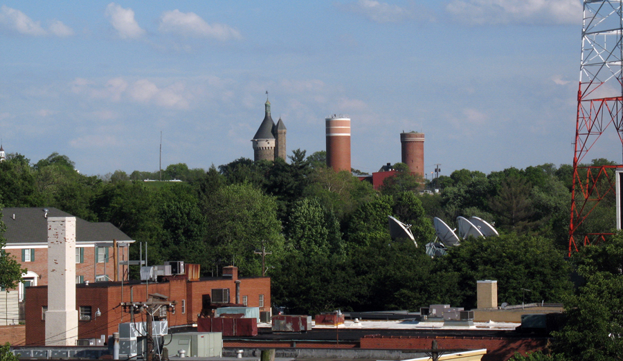
They have selected seven interesting sites, one of which is the Civil War Defenses of Washington, presumably including Fort Reno. It is the only site in a major city and the only site that is used for day-to-day recreational purposes.

Students will have to consider these uses in addition to the interpretive and conservational missions of the NPS. These parks are back yards for some people, and not just precious destinations. There hasn’t been a lot of work in terms of creating commemorative spaces that are also great places to spend time, since memorials shifted from illustrative work to psychologically engaging complexes (even as they got bigger.)

Another program related to DC that I would love to publish is Leon Krier’s Spring 2010 studio at Yale, which asked students to design a monumental replacement for the MLK library on the CityCenter site.

Lewis & Kojo to discuss security architecture

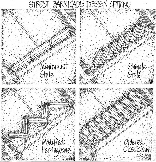
Kojo Nnamdi and Roger Lewis will be discussing security ducks and the finer details of jersey barrier stye today (September 7th) at noon. They will be examining the topic in light of 9/11, but what might be most interesting is the change between the idea of security after 1995, versus the one we have been operating under for the last decade.

The cartoon is by Roger Lewis.  I’m kind of liking Shingle Style nowadays.

Anacostia foot bridge: a pedestrian idea?

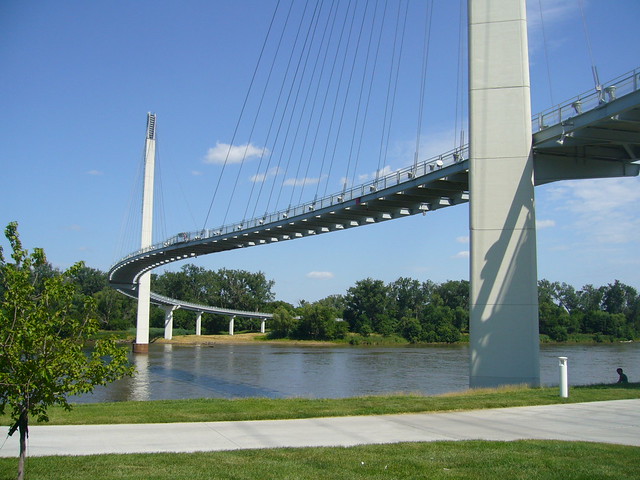
Bob Kerrey Pedestrian Bridge in Omaha/Council Bluffs. Image: Nic221 on flickr.

The bridges over the Potomac, Anacostia, and Rock Creek are very important connections over the strongest boundaries in DC. The relatively few crossings are the bane of commuters and a significant impediment to the development and livability of the DC area. So, it’s no surprise that David Garber has been advocating for a pedestrian bridge across the Anacostia. The most recent iterations have been drawing on the NCPC‘s Extending the Legacy Plan (PDF) and subsequent plans. Plus, there have been a slew of impressive and iconic pedestrian bridges popping up in the US. I think that connecting across the river would be great, but maybe something more than just a fixed link would be best for the Anacostia.

For me, the whiz-bang factor of a bridge is offset by the need for this kind of structure to work as an urban space. Creating a more pleasant route for non-motorized commuters is a good enough end, but for more casual enjoyment, it needs some other qualities. Iconic bridges tend to beautifully express directed motion from one end to another, but not the pauses and distractions of a stroll.

In a way, you create a long pedestrian-only space with no activating buildings. Without a mass of people, those spaces are alienating or unsafe.

There are some relevant examples that approach the concept differently: