For Adjaye’s libraries, seeing is believing

Among the new DC public libraries, the Bellevue and Francis Gregory branches east of the river have the strongest design. Without sacrificing functionality and accessibility, they put sophisticated works of architecture in historically underserved neighborhoods. But photos don’t tell the whole story. You have to go see them yourself.

Designed by British architect David Adjaye, who’s also designing the Museum of African American History, the libraries are a reminder that it’s possible for a work of world-class architecture to also be a comfortable third place.

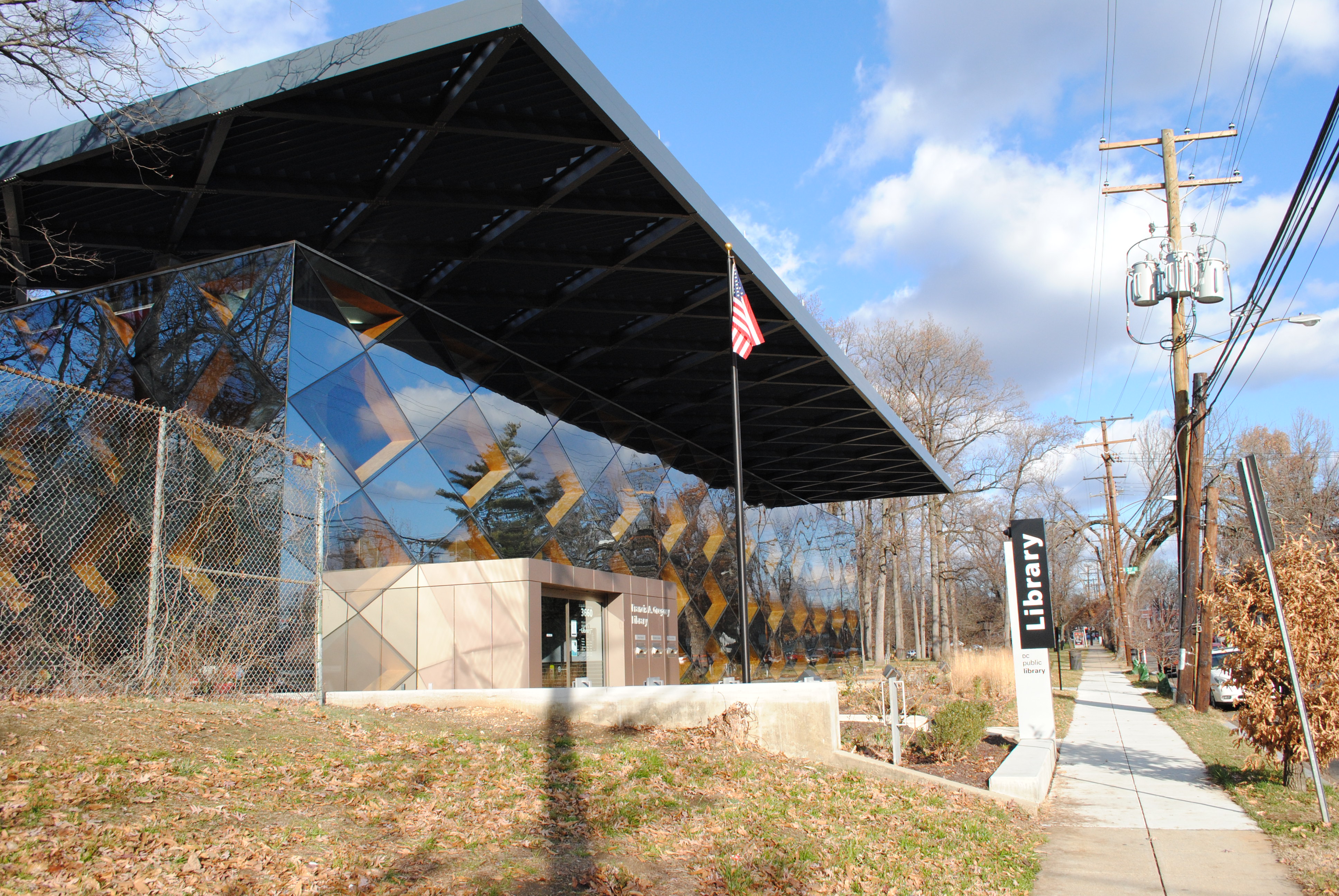
DSC_0438

Francis Gregory Library.

When the first renderings of the new libraries were published, I was unimpressed by them. But after a day-long excursion to see all of the libraries built under the tenure of library director Ginnie Cooper, I have to admit that I was surprised at how brilliant Bellevue and Francis Gregory are.

Defining “Building Information”

Students at Yale’s Architecture School are invited to propose topics for an annual journal named Perspecta. I co-authored a proposal with my classmate Raven Hardison intending to expand the theoretical background of building information modeling. I find that the discussion over its uses is largely focused on building process improvement, which is itself valuable, but only a narrow band of its potential. The nature of technologies as disruptive and immature as building simulation and information modeling is that we haven’t yet begun to imagine uses for it. See, for example, this week’s article about the Kinect hacking culture in the Times.

Since we were not selected, it seems in the spirit of things to publish the proposal in hopes that it can germinate other ideas in topics we ourselves were blind to. The original proposal included the names of proposed authors, which have been edited out.


A Failed Proposal for Perspecta 48:

BUILDING INFORMATION MODELING

Building information modeling has become fait accompli in the discipline of architecture. Sales of Revit subscriptions steadily rise, while technical facility becomes commonplace. Resignation to BIM’s inevitability has caused a critical blindness toward the nature, forms, and influence of those first two words,building information.”

For Perspecta 48, we propose to step back and investigate unresolved aspects concerning the use of knowledge in design and construction. As a metaphor for the discipline’s approach, consider the parable of the blind monks and an elephant.

A king brings a pachyderm to a few sightless monks as a test. He asks them to reach out and describe this “elephant” they had never before encountered. Unable to perceive the whole creature, each groped at different body parts and returned a correspondingly different answer, all rooted in something familiar. The tail became a whip, the body a granary, the tusk a plow, and one man declared the leg to be a column.

When the king revealed the elephant, he showed their wisdom to be burdened by two key epistemological errors: assuming one has the full scope of information on a subject and, secondly, relying on preconceptions to understanding new information. By approaching the issue from a business side and avoiding theory, the discipline has ceased examining information in a multifaceted way, as it once did.

Forty years ago, researchers like Charles Eastman and Nicholas Negroponte imagined software reminiscent of information modeling and parametricism. Over the next forty years they worked to realize these dreams. But at the same time, the scope of the theoretical aims narrowed from world order to interface to tool and finally to product. In order to produce viable software, designers had to cut back their ambitions to basic commercial goals. Speculation on the radical political uses of data or how digital tools transform our relationship to the physical have been left to coders at the margins.

To reorient the debate, Perspecta 48 looks at “building information” from five key angles. Taking a fundamental perspective, the authors in the first section will examine the epistemology of building. By this we mean what is considered constructional knowledge, and how the discipline organizes it. Another group will look at the ways simulation and dematerialization have transformed humans and their environment.

A third set explores the diverging ends of authority and participation on that building modeling is driving the profession to. Looking at the politicization of knowledge, one group will examine how information multiplies of power and raises new ethical dilemmas. Finally, one collection of essays will discuss the technical difficulties of realizing architecture with digital technologies, and even how to embrace them.

We aspire to reinvigorate the discourse about building information by revealing it to be not merely a technology, but rather as a fundamental element of architecture.


The proposal continues.

Mixing New and Old at the Eisenhower Memorial

Yesterday, a panel selected a design concept by Frank Gehry for the Dwight D. Eisenhower Memorial The design is promising.

The large blocks form a circle, enclosing a single tree and a small pool of water. On the faces of the ring of stones, images cast in low relief and quotations in large type speak history to those inside. East and west of the central courtyard, groves of trees canopy informal plazas. At first blush, these spaces feel intimate and beautiful. Rising from just beyond the trees, large stainless steel screens supported by limestone columns enclose the space on the north and south sides. The screens will contain some of the sculptural program through a woven scrim that hides the forgettable Department of Education Building to the south. The street condition is undefined, bounded by the scrims except at three prominent areas.

The axis of Maryland Avenue cuts through the memorial, with the stone ring in the center. Building the memorial without disrupting the viewshed of the Capitol or traffic flow were seen as the two big problems. The Memorial Commission selected a design by Gehry that sidesteps the issue of sightlines, by removing one of eight columns and two sections of the screens. This way, the design frames the primary view of the Capitol with the same structures that fit it into the grid. In terms of the vehicular route, the panel rejected a vehicular road through the monument and instead created a pedestrian plaza. The site was located to move the monumental program off of the Mall. Drawing visitors, most of whom tour on foot, was equally important.

Gehry has tamed his own style is tamed for this project, although the ring of stones exemplifies the blockish forms he had been experimenting with since the opening of Walt Disney Hall. Mercifully, Gehry has also eschewed the dismal expressionism of a younger generation of memorial designers. The design team did not try to assign tremendous meaning to every little detail. Instead, it is a building that can be judged for its power and for its beauty, although people will disagree.

A Look at the Janney Expansion

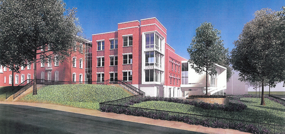
Janney Rendering 1 SE_09 SMALL

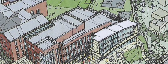
I finally got some images of the proposed Janney School extension. I like it – but it could have been better. With a few objections, I like its conception. Devrouax + Purnell, best known for the Washington Convention Center, the Pepco Building, and Nationals Park, here produced an interesting and attractive school building. However, the location where they have chosen to place the wing results in a lost opportunity for Janney and the community in general. Like too many developers and architects, they approached Tenleytown planning to not upset the status quo. However, any public facility should be designed with an eye to the future – and the current state of Tenleytown cannot last.

The building steps down.

Beginning with the generous setback along 42nd street, the architects attempted to hide the building as much as possible, so as not to intrude on the neighborhood. Although the Albemarle façade extends to the cornice line of the 1923 building, the masses of the building gently diminish into a low white structure that encloses the gym. Moving south along the western face, the building curves gently, from a tower to the first private residence down the block. The architects employed the shape subtly, repeating the curve in each mass to limit its effects. It does successfully integrate into the site.

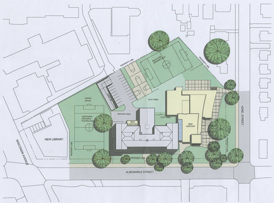
However, this hesitant approach is not appropriate here. The architects should not have set the building back from the street so much. In doing so, they have reduced the feeling of enclosure afforded by a consistent streetwall, produced an marginally useful green space, and missed an opportunity to relocate the playing field at the center of the Tenley Library Public-Private Partnership debacle.

JES_Design_Schematic_20091110-1 SMALL

For the 2007 plan to build a library with several floors of condominiums on top focused on the loss of recreation space (the rightmost field in the image above) for Janney Students. Some of that space would be consumed in the footprint of the condominium structure. However, had the architects located the new wing closer to the property line, they might have opened up space to relocate the eastern soccer field. In a political environment as vicious as Tenleytown’s, a mutually agreeable solution would have been a rare happy ending.

That lost opportunity is my main complaint – but there’s much more review below.

Forest Glen Seminary: An Unintentional Project

So, it’s been a while, right? Well sometimes you get stuck and you just have to back away from the block. If you’ve fortgotten the previous installments, they’re here, and here. One more will follow in about a week. Alright.

back-from-condo

But from the enormous source material of the existing buildings, the Alexander Company took what opportunities it had and exploited them into a quiet celebration of the specific context. The original buildings, despite their conversion to a warren of private apartments and condominiums, have kept of their idiosyncrasies. In spite of sparkling new halogen lights and granite countertops, the apartments retain the unique elements that make the buildings meaningful to residents.

Reburbia and the future of suburbs

Frogs Dream, the winner, brings back the wetlands
Frog's Dream, the winner, brings back the wetlands

Beginning with this post, I’ll be writing on some local and urbanism-related issues at Greater Greater Washington from time to time.

In “Eyes That Do Not See,” Le Corbusier noted that airplane designers were unable to achieve heavier-than air flight until they understood the underlying issues of aeronautics – until they had posed the problem correctly. Until the tinkerers stopped imitating birds and kites and began investigating lift in a scientific way, they just produced spectacular failures and beautiful dreams. So, when looking through the finalists to the Reburbia suburban redesign contest, it was curious to see how, although many projects owe a debt to the Swiss architect, a great deal show confusion about the problems of “suburbia.”

Reburbia was a design competition where designers were invited to remodel, reuse, redevelop, and restructure the landscape of suburban development. Sponsored by Inhabitat and Dwell, the contest presented 20 finalists and a number of other notable entries for public viewing. Although they’ve already announced winners, the issues that appear in the submissions deserve more discussion. These open competitions are like fashion shows, where the offerings exist as inspiration for other designers more than practical solutions. Some of the ideas tossed around here might make their way into an abandoned mall, but the ideas that grow out of Reburbia are more important. As architects, planners, and citizens look for solution, we have to keep in mind what the problems are to judge any given solution.

Edible Parking? Bumper Crop
Edible Parking? "Bumper Crop"

Declaring that the suburbs need to be re-burbed begs the question of how much, and which kinds, of suburban development are unsustainable, undesirable, or inefficient.  Following that line of thought, designers need to consider whether mitigation of costs can solve an issue, whether simply pulling out unfair subsidies would help, or whether a total revamp has to occur. The projects in Reburbia revolved around a handful of issues that are unique to automobile-dependent sprawl, as well as others that all cities face. The entrants posed their problems around land use, energy waste, sustainable energy production, loss of natural habitats, low density, unappealing or unwalkable street design, transportation inefficiency, water runoff, and the legal mandates for development.

Forest Glen Seminary: One Thing Leads to Another

Part two of a four-part essay exploring context, typology, and interpretation. Comments encouraged.

fglinden

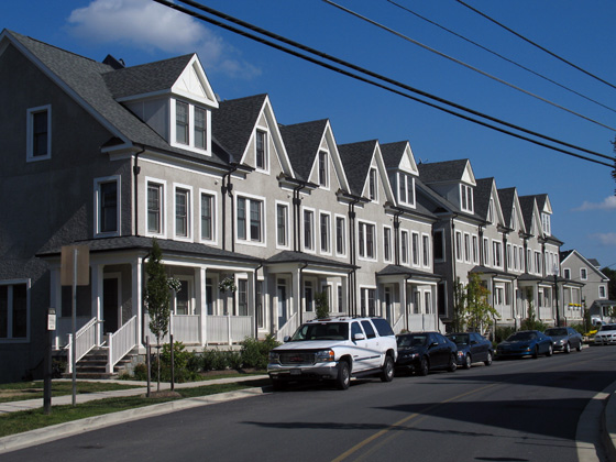
Against rich complexity of the old Seminary, the houses designed by EYA are then a real letdown. They carry the superficial veneer of “context” that is endemic to New Urbanist planning and its most visible error. To be clear, they are not abominations, but they are dull and only stylistically similar to the outré conglomeration across the street. The application of traditional elements here fulfills a requirement that new buildings  respect the architecture of the historic landmark. Okay, sure, sounds good, but the legislation is fairly scant in the details of execution. The easy option, a cynical abdication of artistic responsibility, is to copy the notions of form in hazy facsimile and slap it on off-the-shelf buildings. Even where the designs are competent, the lack of sensitivity results in tepid mediocrity.

Forest Glen Seminary: Into the Woods

Part one of a four-part essay exploring context, typology, and interpretation. Comments encouraged.

Classicism at its horniest

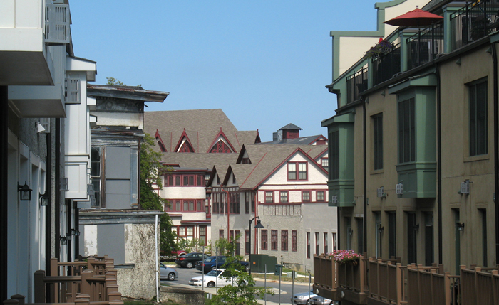
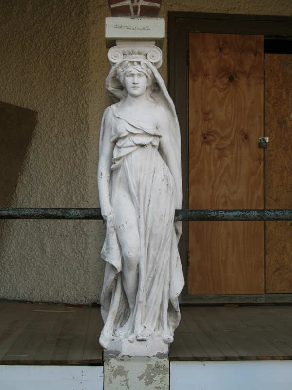
Hidden among a leafy scattering of houses and trees, Forest Glen Seminary is a jumble of vernacular buildings unlike any of the temples of boxes that define Washington. Its buildings, both magnificent and ludicrous amount to a dignified campiness that defies expectations to be one of the most profoundly interesting places encircled by the Beltway. Once constituting a women’s college when that meant a two-year Mrs. degree, the buildings are once again becoming domestic space, the more private areas cut into condos and the core of the complex, rental units. Scattered around the area, turn-of-the-century houses are being renovated and new housing by the urbanist developer EYA has just been finished. Through the site’s history, radical changes have shaped its form, but none so radical as the current shift in context.

Streets through time and place

murdocksignI noticed yesterday that DC has re-signed Murdock Mill Road, down off River Road in Tenleytown. It’s a nice little reminder of history  – and of natural geography – among the rationalist streets of the city plan laid down in 1897. While those straight, predictable lines make navigating the city easy, they did erase the context and history of what was Washington County. By its perseverance, this little snippet of prior use reminds residents of the pre-urban past, adding quiet character to the neighborhood.
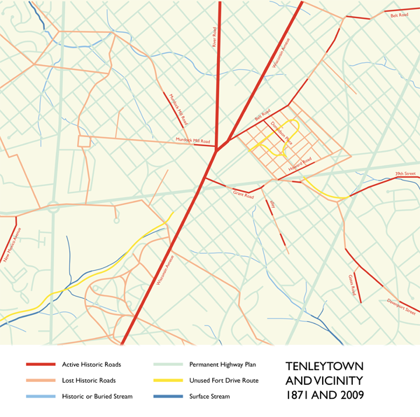
The road itself is no larger than an alley – its form preexists both the automobile age and the dreams of a residential garden city, so there are neither sidewalks nor setbacks. It is discontinuous, with one part behind the old Sears Building and the other appearing a few blocks to the west before becoming Butterworth Street. It’s also completely secondary: Where the narrow eastern section intersects with 42nd Street, the heavy grading on the latter route  necessitates a concrete retaining wall and a stairway down from Murdock Mill Road, ten feet above. It is very dislocated; left inexplicably during the changes of urbanization, along with the Methodist Cemetery, its only active address.

The road once headed down in the direction of Massachusetts Avenue, following a creek of the same name. Before the imposition of the 1897 Permanent Highway Plan, Murdock Mill Creek began at the west of Tenleytown, and cut through a subdivision of small farms registered as part of Friendship, and finally into what is now the Dalecarlia reservoir. Now, the stream is undergrounded, emerging only from underneath 52nd Place in northern Spring Valley. Other streams have been buried; still more roads have disappeared when developers carved up the farms they existed to serve. Murdock Mill Road is only one of these many streets, some of which are still used.

1871-overlays