What can BIG do for the Smithsonian?

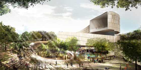
When I heard today that Bjarke Ingels Group will be producing a master plan for the core block of the Smithsonian Institution, I was not really thrilled. Their work is engaging and sharp, but it’s also can come across as trendy and disposable. The buildings I have visited feel cheap and unsubtle in their handling spaces. It’s personal taste thing, but I don’t like what they’ve built.

But then I remembered that the great thing about master plans is that you don’t have to follow them very closely, so you can keep what you want and take what you need. The drawings and guidelines are not permanent impositions on the urban landscape. They’re ideas. Ideas are cheap and BIG is good at rethinking basic  concepts in fresh ways, even going so far as to be able to propose how to realistically bring unconventional projects to reality. I don’t know if I would like to see Morphosis’s intervention in the Arts and Industries building, but it did cause me to look at the building again, to see its qualities and how it might be adapted.

Too much architecture in DC starts out tame and ends up lame. Sometimes its because of design review and sometimes its because of style anxiety. So, it’s important to start thinking big here, and dial it down when it comes to a serious proposal. So, I say we see what BIG proposes for what has to be the most heterogenous block in DC – The Castle, the Hirschorn, the Freer, and the Ripley Center – that’s most of the past two centuries’ movements – and let their ideas challenge whatever architects complete each project.

Mixing New and Old at the Eisenhower Memorial

Yesterday, a panel selected a design concept by Frank Gehry for the Dwight D. Eisenhower Memorial The design is promising.

The large blocks form a circle, enclosing a single tree and a small pool of water. On the faces of the ring of stones, images cast in low relief and quotations in large type speak history to those inside. East and west of the central courtyard, groves of trees canopy informal plazas. At first blush, these spaces feel intimate and beautiful. Rising from just beyond the trees, large stainless steel screens supported by limestone columns enclose the space on the north and south sides. The screens will contain some of the sculptural program through a woven scrim that hides the forgettable Department of Education Building to the south. The street condition is undefined, bounded by the scrims except at three prominent areas.

The axis of Maryland Avenue cuts through the memorial, with the stone ring in the center. Building the memorial without disrupting the viewshed of the Capitol or traffic flow were seen as the two big problems. The Memorial Commission selected a design by Gehry that sidesteps the issue of sightlines, by removing one of eight columns and two sections of the screens. This way, the design frames the primary view of the Capitol with the same structures that fit it into the grid. In terms of the vehicular route, the panel rejected a vehicular road through the monument and instead created a pedestrian plaza. The site was located to move the monumental program off of the Mall. Drawing visitors, most of whom tour on foot, was equally important.

Gehry has tamed his own style is tamed for this project, although the ring of stones exemplifies the blockish forms he had been experimenting with since the opening of Walt Disney Hall. Mercifully, Gehry has also eschewed the dismal expressionism of a younger generation of memorial designers. The design team did not try to assign tremendous meaning to every little detail. Instead, it is a building that can be judged for its power and for its beauty, although people will disagree.

The Future Was Classical

While I finish writing the Forest Glen essay, please enjoy this alternative scheme to the Mc Millan Commission “Kite” Plan, rendered by arch-traditionalist genius/maniac Leon Krier in 1985.

Theres nothing like a fantastical image to start the weekend
There's nothing like a fantastical image to start the weekend, is there?

You can take a gander at other views of the plan here, although you might be surprised at who owns them.  His explanatory drawings and diagrams offer  dead-on critiques of the City Beautiful and Modernist planning that have turned central DC into a lifeless pile of stuttering architectural gigantism.

WMATA’s slight apostrophe problem

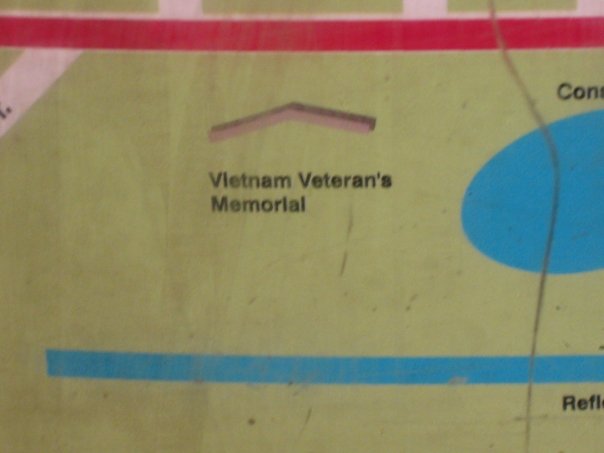
A sharp-eyed and sometimes lost Briton I know noticed this somewhat amusing error on a map in the Navy Yard Station.  It’s a mistake, but it’s pretty bad when a slip-up gets you 4-6 orders of magnitude off. Actually, the official name doesn’t use an apostrophe at all, as it’s a memorial to Vietnam veterans and not so much for them.  While they’re changing it, they might want to add the USIP as well. I presume Jim Graham can resolve up some funds.
veteranss
Photo courtesy Seb Page

At the end of the Mall, hope.


foster1

The six finalists for the design of the National Museum of African-American History and Culture have been revealed, with some very promising and also very disappointing results. There’s not nearly enough information available to see which is really the best building, so I picked the one that I think can be improved upon in a productive way. Remember as you are reading my thoughts that these are in the conceptual design phase, so the architects will be revising the buildings considerably even before the NCPC and CFA get around to prodding the architect for greater contextuality. 

I’ve ranked these in ascending order of quality and appropriateness and then got my buddy Sam Rothstein to handicap each one’s chance at selection. The images are linked to high-res versions on the Smithsonian site