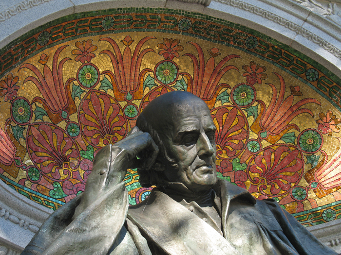
The statue of Samuel Hahnemann at Thomas Circle is one of DC’s many unknown beauties. Although most of the structure is the monumental standard copper-granite-limestone set of hues, the half-dome that frames his head bursts into color as you pass your eye across it. What’s more, because the mosaic is partially hidden, it rewards close examination.
Tag: color
Good Architects: McInturff Architects
To make an unwarranted generalization, DC architects like their buildings heavy and somber. Even in the recent fad of light and clean glass facades, the buildings have been rather self-serious and blockish looking, a consequence of clients demanding efficient floorplans from architects who themselves were trying to be cool and modern without upsetting the polished and poised look DC has in the collective consciousness and legal structure. This fretful indecision can be a bit like the jeans and sportcoat look – crisp but comfortable, hip but conservative.
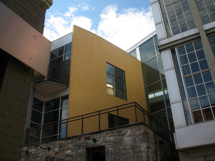
McInturff Architects offer a wholly different approach. They’re (post)modern(ist) but a little witty and also aiming for comfort. Their mostly residential oevure consists of excellently-composed buildings that respond coyly to the conditions of the site. In doing so, it avoids falling into limpid styles while also carefully respecting historic and distinctive architecture elsewhere. As for aesthetics, the practice cleverly contrasts gentle and warm elements with bold minimalism in beautiful light-filled spaces. As their projects are primarily private, it’s trickier to see their work than Esocoff & Associates‘. But down in Georgetown, anyone can at least see three buildings, and go into one of those.
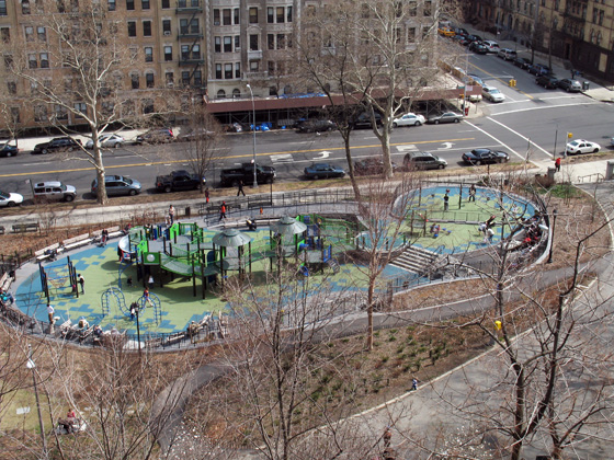
A well designed playground

But what is more interesting in terms of architecture is how the playground was developed: It’s a really good example of both community involvement and responsive government. The new, complex playground is a drastic improvement over the grimy 70s play yard it replaced, but the process took nearly a decade. In 1999, the Friends of Morningside Park began surveying residents, including those with children and those that wanted children, about what they wanted. They took that information, developed a master plan to restore and improve Frederick Law Olmsted’s original design. Using this plan, the neighborhood worked with the City through long-term activism to eventually get it built.
The whole process took ten years and a lot of gentrification happened in that time, but it’s still a great reminder of what is possible if a community organizes to make their common environment a little better. I think, like any good urban space, the results speak for themselves, so do be sure to go up and see it when you’re up in New York or have a look at some of the pictures in the linked blogs.
At the end of the Mall, hope.
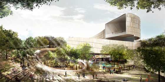
The six finalists for the design of the National Museum of African-American History and Culture have been revealed, with some very promising and also very disappointing results. There’s not nearly enough information available to see which is really the best building, so I picked the one that I think can be improved upon in a productive way. Remember as you are reading my thoughts that these are in the conceptual design phase, so the architects will be revising the buildings considerably even before the NCPC and CFA get around to prodding the architect for greater contextuality.
I’ve ranked these in ascending order of quality and appropriateness and then got my buddy Sam Rothstein to handicap each one’s chance at selection. The images are linked to high-res versions on the Smithsonian site.
Good Architects: Esocoff & Associates
-

Ten Ten Massachusetts Avenue. From Home and Design Magazine.
DC architecture is known for being a little bland and generic. This reputation is not undeserved; there is something in the air since the early 20th century that has caused a stodgy vibe to persist like swamp gas over the city. Beaux-arts to glass-box, anywhere architecture has replaced the unique red city that was once gave DC a humble energy. In particular, the buildings of Adolph Cluss defined the aesthetic character of the city in a bright, practical way. Cluss’s South German heritage led him to design red brick buildings with vibrant decoration, like the Arts and Industries building, that differentiated DC from anywhere else in the country.
The firm of Esocoff & Associates has sort of picked up on his spirit, although they seem less interested in socialism than he. I remember in college returning home from Union Station, dreading the new, gray buildings or quasi-historicist schlock left over from the 90s, and driving down Mass Ave and being startled by the bright cobalt blue mullions of Post Massachusetts Avenue, surrounded by the warm umber brick. It took me a while to figure out who the firm was, and in that time they have built many more residential buildings that are post-modern in the best way, definitely reflecting contemporary values and modern construction, while being context-sensitive, humanistic, and unique. In particular, the Dumont’s sensual and explosive curves break the box with such bravado, it has stopped me on the street. Their handling of color and material is also fantastic.
They have repeated a distinctive style, sure, but haven’t exhausted its possibilities. I believe that their buildings will last as defining architecture of the period. I wish them the best of luck, because with time Esocoff could be come the new Cluss: an architect for the daily lives of the residents of the District of Columbia. God knows we need one.


