The Giant Circle at Fort Reno

tenleytown parks 1902

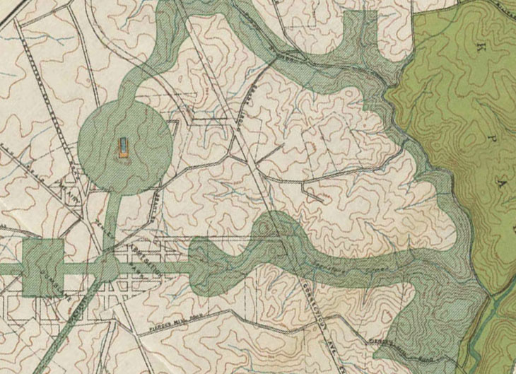
I found the 1910 Parks Commission Plan earlier. Now I’ve been able to find a higher resolution version of the plan, albeit a little different. This one is from the original, famous McMillan Commission report. Click the images to see the whole city.

This is the first time a park at Fort Reno was proposed. Here, it’s imagined as a much bigger circular park centered around the now obliterated, high point of DC. The Black-populated town at Fort Reno was still pretty small; the streetcar had only arrived a few years before. Similarly, you can see that the Chevy Chase Land Company had only begun to make forays into the District. 

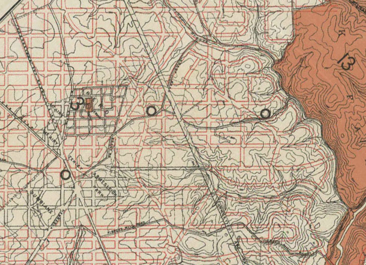
The Nebraska Ave and Yuma street parkways are visible. You can see how large they wanted Soapstone Valley park to be, extending up to 38th Street. They also wanted to acquire the slopes of Broad Branch Valley. That would have linked up with Fort Reno, as part of the first iteration of Fort Drive.  Below is a map showing the rights-of-way for the 1897 Permanent Highway Plan and existing roads.  

Is there anything else you see?

tenleytown highway 1902

After the break, a GIF, a GIF, a GIF, I say, a comparative GIF!

Precedents for the 11th Street Bridge Park

I’ve written up a post on the the 11th Street Bridge Park for Greater Greater Washington. It’s an exciting idea, but it’s important to slow down and consider what’s possible.

The Bridge Park is really more of an elevated park than a bridge. But its bridge-like form means it can be much more than just a deck with greenery. Since it’s elevated over water, it offers something special related to depth. Its section can go up into the sky and down into the water in ways that no other park can. No excavation is required, and people on the deck can interact with what’s below.

Since there is only one precedent for such a structure, the Providence Greenway, perhaps it’s worth looking a things that are typologically adjacent: bridges, linear parks, and buildings that address the water in noteworthy ways.

Bridges

The first kind of bridge that’s worth noting is one that carefully frames the intersection of the stream and a road. The Ponte Alexandre III is a well-known example. It’s a tetrapylon, a marker of the intersection of two equal routes.

Another interesting type is a bridge that’s asymmetrical along the axis of the flow. If you have a road, there typically are two directions of traffic. Each one is usually equal in value. A river, however, does have a direction: downstream, downhill. That by itself can be a source of impressive architectural effects – as how water rushes around bridge piers.

With symbolism, you get something very poetic. Otto Wagner’s Nussdorf bridge-wier seems to fight the force of the water coming down to it. Massive stone pylons, scrolling up against a sturdy truss, support columns topped by lions. The design expresses the strength of the flood protection it offered Vienna.

Linear Parks

In the article, I suggested that the High Line was an inappropriate comparison to the Bridge Park, because one is through dense neighborhoods, while the other is over a river. The level of activation influences the level of activity. The High Line has the luxury of limiting access to create a nice level of calm in the city. The Bridge Park will only ever have two entrances. 

But – James Corner: Field Operations and Diller Scofidio + Renfro, the designers of the High Line, made a few design decisions that are worth examining. For one, they distributed little spaces along the way that focus your attention on city life. Even the most jaded visitors end up gawking at the flow of traffic and people-watching.

Waterfront Buildings

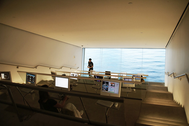
At the ICA Boston, a museum on the outer harbor, DS+R turned guests’ attention to the horizon. Every space, like comfortable main porch to the disorienting research room, makes you look at the sky and the water with fresh eyes. 
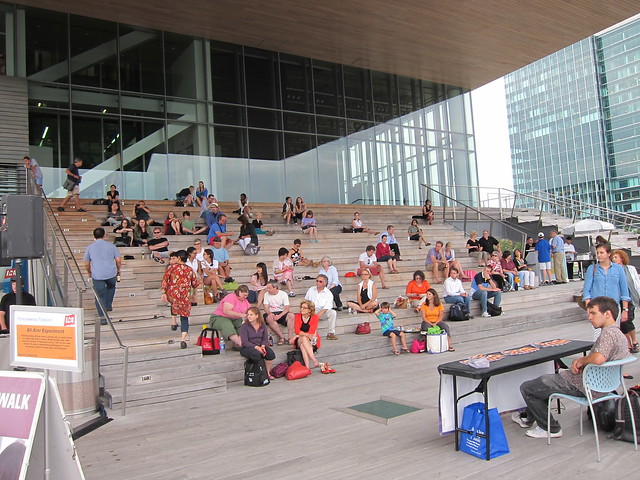
ICA research room by michelvandenbogaard CC-BY-ND
There’s something surreal about water that’s as relentless as the sky. Take a look at James Turrell’s understanding of the sky. Could a basketball player understand what’s going on here:
Sure. We all know the sky and the water.
Plus, if you want to get beyond vision, steps down to the river, like at the Oslo Opera House might form an incredible amphitheater.
There are a lot of options for this park. I look forward to seeing what the designers come up with. What I think will be important, though, is looking for a designer who wants to relate the communities’ prosaic needs – like a play structure – to fundamentals that are so prosaic we’ve forgotten how wonderful they are.
The Social Media of Small Urban Spaces

In the 1950s, it was a commonplace that urban spaces were inherently antisocial. These days, it’s a commonplace that smartphones are degrading the quality of public interactions. How things have changed!

It took the work of a few people to tease out a more nuanced view of urban life. Rather than looking at the form of cities in drawings, they looked at the people from the ground. These amateurs looked at how inhabitants used space and elaborated from there, rather than starting from ungrounded first principles.

A key player in this movement was William H.Whyte, a journalist by training. When senior editor of Forbes Magazine, he commissioned Jane Jacobs to write some of the articles that catapulted her to fame as a keen observer of public space. Seeing that she had discovered a fundamental flaw in urban planning, he built on her work with the kind of empirical discipline that worked wonders on bureaucrats.

Mostly, he looked for patterns and then examined those patterns in more detail. He used photos, film, charts, timers, and a lot of assistants. I’ve mentioned a film that catalogues his examination Mies’s Seagram Building in New York. Why did this tower in a plaza work, when so many others didn’t?

This kind of empiricism is exhausting, so it hasn’t been replicated much. But the New York Times today ran an article on the work of Keith N. Hampton, a sociologist at Rutgers who has tried to replicate William H. Whyte’s studies of how people use public spaces. With one twist: he was looking at how digital devices are affecting things. 

His results, like Whyte’s, significantly disrupt the conventional wisdom that the diffuse presence of social media are harming our relationships. Not refute, just call into question how idyllic things were before, and whether we’re simply seeing a shift, rather than a decline.

It’s definitely worth your time to read it.

Hampton has some further resources available too, such as his video of Kevin Roche’s steps at the Met, a vintage video from Whyte’s Bryant Park project, and a photoessay showing how people use computers in wifi-enabled parks.


American’s Unexceptionalism

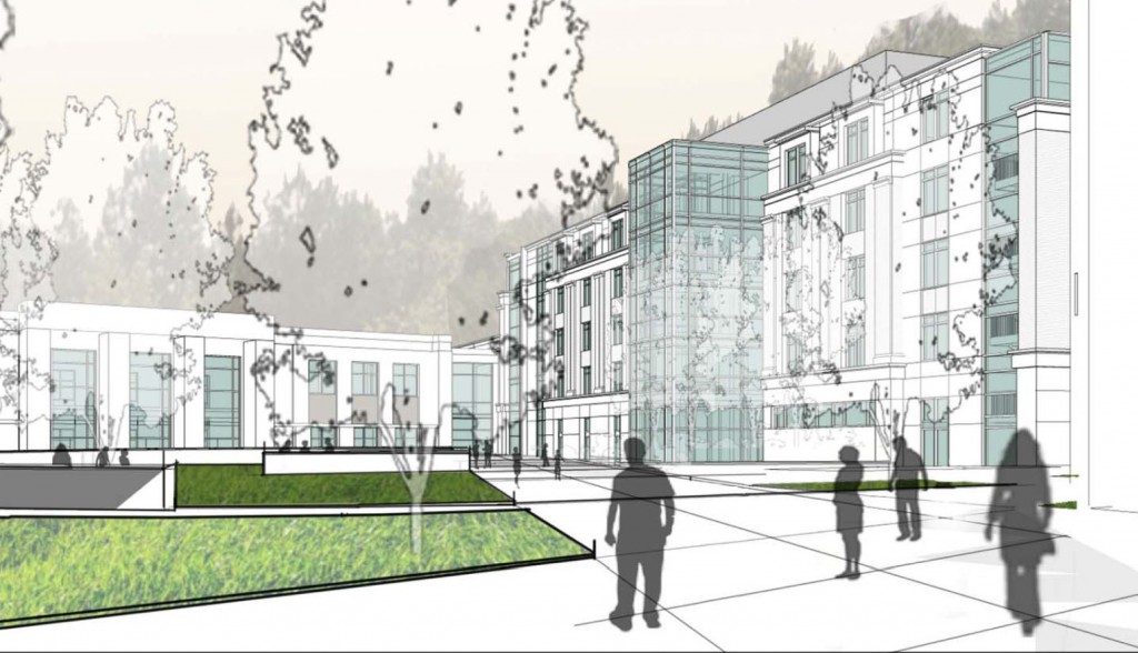
While American University’s campus plan is a net benefit for Ward 3, the architecture currently proposed for the campus is mediocre at best. Beyond the land-use planning, East Campus and North Hall’s proposed buildings offer little in terms of aesthetics. The spaces are disorganized and the forms are uninspiring. On the outside, the buildings don’t relate the street well, and the facades present foggy contextualism.

Instead of well-executed buildings, the design revolves around appeasing neighbors while important aspects are left undeveloped.

For East Campus and some of the Main Campus buildings, AU hired Little Diversified Architectural Consulting, a Charlotte-based firm with offices in Alexandria. They have designed a large dorm at Catholic University, Opus Hall, similar in style and form to AU’s proposed facilities. Other design work was executed by the university’s large in-house architectural group and the firm of McKissack & McKissack.

Reno Park 090725: Property

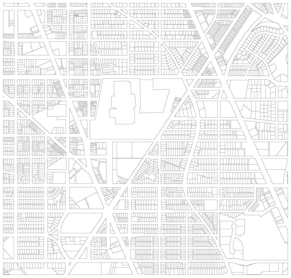
As promised, a map of all of the property lots in the area of Reno/Tenleytown area. Fascinating ain’t it?

property

Even without squinting, you can see diagonal lines that don’t seem to match up with any roads or lots. I’m fairly certain these cuts line up with older borders and roads, putting a whole new volume of evidence of the past fossilized in the modern legal form of the city. The erasure and remainder of various structures as a history appears too. Why did some lines stick around? Perhaps one owner sold out before the other, and a divided lot just went up for sale as two later. More comparisons under the fold.

When a concert isn’t just that

reno-concert-1

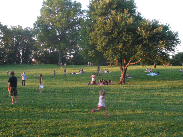
Last night began week five of this summer’s Fort Reno concerts. The annual series of musical triptychs, which take place in an improvised venue in the Tenleytown park, may be the most urbane happening of any place in DC. Amid the mild yellow-orange light of a summer evening, a small local band plays and a few hundred people of various ages watch while they sit on the grass. But beyond that and behind the stage, those less interested in the concert partake in all kinds of leisurely activity. Really, I’ve never seen the park so well used.

A well designed playground

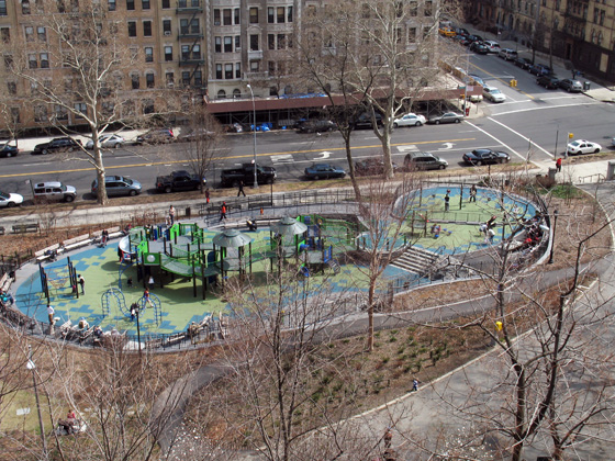
It’s old news to the residents of upper Manhattan, but this six-month-old playground in Morningside Heights seemed to be succeeding in many ways when I visited it recently. To be totally honest it looks like a lot of fun and full of the sort of structures I enjoyed as a kid. The multiple levels, ambiguous spaces that encourage imagination, and little side playgrounds seem to create a little paradise where kids can run free enough to feel free. 

img_6638
The park as seen from Morningside Avenue, near Columbia University and St. John the Divine.

But what is more interesting in terms of architecture is how the playground was developed: It’s a really good example of both community involvement and responsive government. The new, complex playground is a drastic improvement over the grimy 70s play yard it replaced, but the process took nearly a decade. In 1999, the Friends of Morningside Park began surveying residents, including those with children and those that wanted children, about what they wanted. They took that information, developed a master plan to restore and improve Frederick Law Olmsted’s original design. Using this plan, the neighborhood worked with the City through long-term activism to eventually get it built.

The whole process took ten years and a lot of gentrification happened in that time, but it’s still a great reminder of what is possible if a community organizes to make their common environment a little better. I think, like any good urban space, the results speak for themselves, so do be sure to go up and see it when you’re up in New York or have a look at some of the pictures in the linked blogs.