Bear Lawyer v. Lutyens

The Bear Lawyer visited DC last week.

It could have been a real tragedy if he had caused damage to Edwin Lutyen’s only building in the US, the British  Embassy. Lutyens was one of the later examples of the English pattern of idiosyncratic classicists with good plans, along with John Soane and Nicholas Hawksmoor.

Please click through if you get esoteric law jokes… which if you live in DC is quite likely.

I AM A FORTRESS

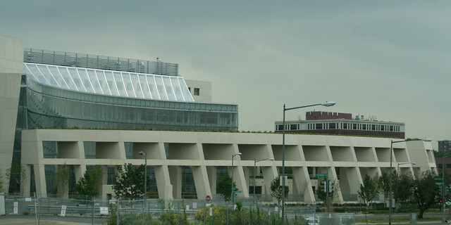
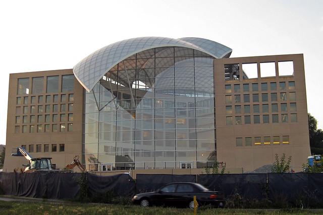
If you haven’t read Phillip Kennicott’s brutal critique of the new USIP building by Moshe Safdie, you probably should. There’s a lot to think about in it.

I don’t buy his assessment of Safdie’s career (namely that his only good building was Habitat ’67) or that Safdie is somehow different than Terragni, OMA, Yeang or any other architect that has produced institutional work for a statist client. If anything, his work for these groups is a less seductive option simply by virtue of his staidness. Regardless, Kennicott hones in on the idea that the building is a duck: a work of architecture where all formal characteristics are subsumed into an “overall symbolic form.” Yes, the dove-shaped roof is easily the worst formal decision in the building. Except that in a more important sense, the building is not a duck.

USIP Headquarters by joelogan on Flickr

The idea of the duck was developed by Robert Venturi, Denise Scott Brown, and Steven Izenour while teaching at Yale and eventually published. The main target of the critique was not the literal use of symbolism in vernacular structures, but rather the abstracted formal symbolism of “heroic, original” buildings that totalized structure and program into an exploration of space, form, or ideas. This, they said, was more insidious than the overtly ridiculous Long Island Duck.

What the building is not is a security duck. Contrast this with Safdie’s other work in DC, the ATF Headquarters Building. That fortress in Northeast is a security system for itself, where its defensive features become an architectural statement. The grand gesture is an enormous, inaccessible pergola developed from the moat, fence, setback, and blast walls required. Other features, like the gateway-within-a-gateway front entrance and the row of shops on 2nd St. reflect the primary design concept: security. Security subsumes form gloriously. But the ATF building has taken enough of a critical beating, so let’s examine two other examples:

US Mission to the UN

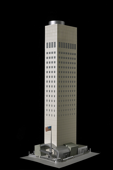
Gwathmey Siegel’s US Mission to the UN indexes the required distance for blast resistance through the size of its windows. The walls of the building simply could not be further from the edge of the small urban site to meet US embassy requirements, so the architects manipulated the windows on a tower already set back into absurd slenderness. The only way you know it’s not the bitter provocation of a grad student is its desperate banality.

More recently, KieranTimberlake’s US Embassy in London, scheduled to be completed in 2017, improves on the ugliness of buffering, but is unable to escape duckhood. The building is set upon a plinth that creates private assembly spaces above, and a security perimeter below. By emphasizing the severe cubic form set within a circle and again in the middle of a field, the architects have called all the attention to the space between the building and its context, at least compared to the looser glancing forms some of the other competitors’ entries. Richard Meier’s design is particularly distinguished because the renderings show bollards: discrete, non-architectural supplements that do not change the fabric or utility of the building.

US Embassy, London

Venturi & Scott Brown’s alternative to the duck was the decorated shed: a relatively banal structure, with a highly articulated facade conceptually detached from the overall functional design. His examples were renaissance palazzos and the Vegas Strip: big, bold facades loosely related to the interior. Now, Meier’s design may be a formal duck, but the security is attached loosely, a protected shed. The same is true of the USIP building, where Kennicott’s review demonstrates that security was not a conceptual concern for the project. The building has large, clear atria one can get close to. It has relatively good permeability, and its security pavilion is prosthetic to the main building. Perhaps it does not need the security of the Pentagon. But even many of the most effective safety measures at DOD headquarters have not been grand design choices, but rather building system details like laminated glass in windows and column casings.

This applied, rather than integral, security is already common. Like the Las Vegas Studio, we have to look at the disreputable defenses of Washington: the bollards, the planters, and the barriers that are almost all right. Those dumb little planters are an embarrassing icon of Washington, but they have their virtues. Ugly and ordinary, they offer both protection and the symbolism of security. They’re not part and parcel with the architecture, letting designers focus on expressing more important things. Maybe most importantly, they’re temporary. Eventually (theoretically) we can get rid of them and the buildings will not be compromised.

Dumb, ugly, replaceable.

These not-so-great forms of security do not have to be so ugly and haphazard. The classicist bollards and walls around the Capitol and congressional office buildings are an attractive and historically sensitive application to the buildings they defend. They’re not ideal, but for something more innovative, take a look at the IMF’s Headquarters 2 in Foggy Bottom. For all the banality of the aesthetics, Pei Cobb Freed combined the barrier structures with small-scale elements like planters, benches, bike racks, street lights, and even a water feature. It creates a livelier streetscape than setbacks and walls.

The formalization of security is a tempting venue for architectural expression. The culture of the past twenty years has been one where institutions have had to fortify and militarize against threats both real and perceived. Making architecture of that defensibility is a tacit acceptance –  if not embrace – of a perpetual security culture. That public buildings need protection against specific threats is undeniable. But that those protections need to exist forever and be manifested significantly in buildings, I believe, is an irresponsible and sad architectural position.

ATF Headquarters by dbking on Flickr

Is there a building you think is a security duck? Suggest it in the comments.

East Campus is Still a Good Idea

American University’s campus plan goes before the Zoning Commission on June 9th. It’s imperfect, but the plan still deserves support.

Last May, I wrote in support of the plan to build a residential complex across Nebraska Avenue from AU’s main campus at Ward Circle. Over that time, the design has changed significantly. In response to overarching objections raised by some neighbors, the design has taken on less of an urban character than it originally had, which reduces its potential. Nonetheless, with architectural alterations, it will be one of the most important developments in Ward 3.
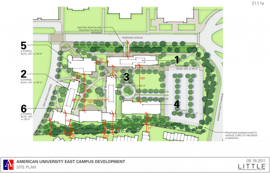
As part of a larger strategy for growth and consolidation of its school, American will replace a parking lot with six buildings of two to six stories. 590 beds, a bookstore, admissions offices, classrooms, administrative spaces, as well as some retail. The benefits for AU have been argued over many times; I’ll let AU speak for itself. But the benefits of the expansion to the neighborhood and the city are public business.

The new facilities will bring students out of neighborhoods. Currently, AU undergrads are spread out, with roughly 2,000 of 6,000 living off-campus. Some of those students do so by choice, but AU only has room to house 67% of its students. Many juniors and seniors have to look to the neighborhood for a place to live. The East Campus would pull students from the neighborhood and the Tenley Campus. Better residential facilities would mean fewer students spread out in the neighborhood, fewer noise disruptions, and less of a demand for vehicular commuting.

That reduction in traffic is no small thing. The new facilities adjacent to the central campus mean fewer trips for students and faculty alike. AU is also reducing the total number of parking spaces on campus, and has promised to expand its existing transportation demand management program. Even so, AU’s transportation study found that its users

The rest of the vehicles are commuters passing through the ward circle area. The three avenues in the area, Nebraska, New Mexico, and Massachusetts currently serve primarily as automobile routes. The new buildings offer the potential to reorient the circle for those who live and work in the area.

Rather than gnarling traffic, as opponents have insisted, the slight uptick in pedestrian activity caused by the new buildings will force drivers to pay better attention to their presence on this urban street. The potential for more stoplights and a redesigned circle opens the opportunity to reduce speeds and dangerous behavior, likewise making the area safer for residents of all ages.

Through commercial frontage and foot traffic, Nebraska Avenue would become a pleasant place for locals to enjoy. Leaving the interior of the campus for students, a commercial perimeter would become another node in the geography of Upper Northwest. It would never become as dense and vibrant as Bethesda, let alone Tenleytown, but as a tertiary urban center, it can merge into the neighborhood.

Finally, the scheme laid out in the university’s plan continues to facilitate the economic activity of American and its affiliates, estimated at $415 million,. Although academic institutions do not pay taxes for noncommercial properties, the Examiner reported last week that students and faculty bring money and talent to the area when they come to the region’s universities. By building on its land efficiently, AU will be making an optimal contribution to the city and enlivening the streetscape through the benefits of density.

There are potential negatives, which AU needs to mitigate. However, in their effort to compromise on objections, AU has layered the new buildings in greenery and minimized certain urban features, compromising potential, while still not satisfying opponents’ demands.

For example, a 40′ buffer of greenery adjacent to Westover Place feathers the campus into the neighborhood, but it’s not good on all four sides. Adding a similar barrier of impenetrable greenery along Nebraska Avenue will separate the campus and retail from the sidewalk. It requires creating a second, separated walkway that will reduce the very urban characteristic of unplanned interactions. It is no small leap to see this buffer as segregating the school from the city.
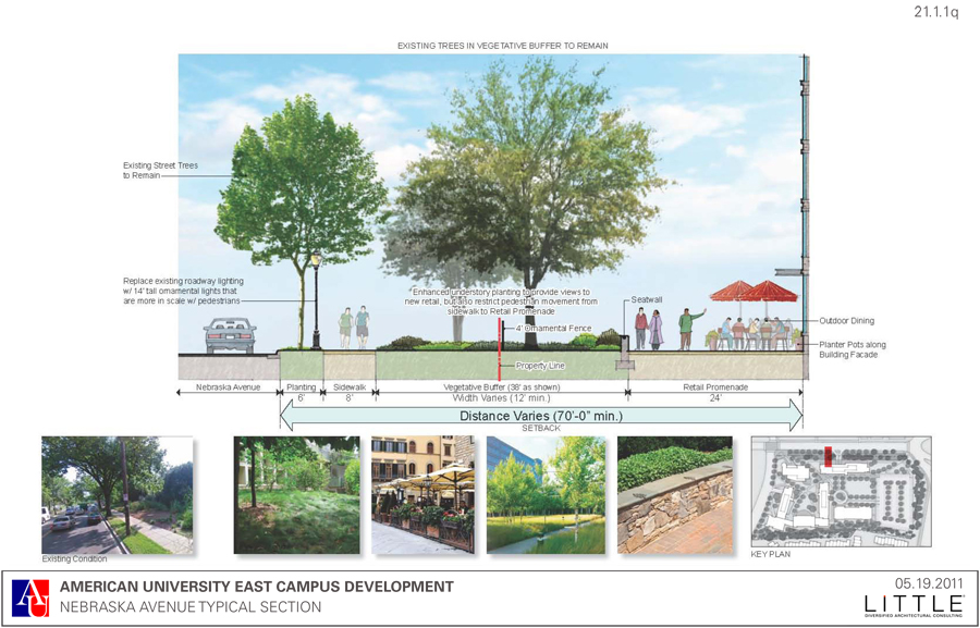
Worsening the Nebraska Avenue elevation, the most recent plans call for a roadway to be punched through building #1 to the interior campus. A roadway in that place would disrupt the crucial urban space at the sidewalk. Instead, the plans should return to the right-in, right-out entrance on Massachusetts Avenue presented in the March 18th Final Plan. This is similar to the one at Westover Place, the Berkshire, and other nearby driveways.

At the least, the university could build on their plans for the Mary Graydon Tunnel and design the proposed road as a woonerf, prioritizing pedestrians in a roadway that runs through what is the students’ front yard.

Likewise, AU should not be advocating for a new actuated signal on Nebraska Avenue. Instead, it should build timed signals that guarantee AU students the opportunity to cross as frequently and in rhythm with the city’s traffic. A new stoplight, combined with the recommended changes to Ward Circle, would make the area safer than any phystical barrier by limiting the incentive to jaywalk. If a physical deterrent is necessary, planters between the street and the sidewalk should be sufficient, as at Bethesda Row.

Finally, the project should serve as a catalyst for alternative transportation in the area. Bike lanes on New Mexico Avenue would mean better safety and better quality of life for students and neighbors alike. On campus, the administration already promotes a progressive Transport Demand Management plan, with dedicated ZipCar spaces, Capitol Bikeshare, carpooling assistance, shuttles, and SmartBenefits. But without adequate facilities, the full benefits of cycling and bus transit will not be realized.

Smart Growth refers to planning that is appropriate not only at the local level, but across multiple scales: architectural, local, metropolitan, and regional. AU’s expansion plan, which would consolidate students, tame traffic, and create a new node of community, works at the larger three scales. Where it fails is in the way that it addresses the street and human scale, compromising enormous potential for solutions that will please no one and will require remediation in the future.

The Zoning commission should endorse AU’s 2011 Campus Plan with alterations at the architectural scale.

“Stop AU” Protest Tomorrow, Parking Provided

Westover Place residents will be protesting the presence of pedestrians at Ward circle Thursday morning during rush hour. But I don’t want to speak for them. Here’s the call to arms they left on the AU Park Listserv:

TRAFFIC IMPACT DEMONSTRATION

A coalition of neighbors surrounding American University will be gathering
together this Thursday morning, May 26th from 8:30 am to 9:00 am to walk around
Ward Circle, crossing Massachusetts and Nebraska Avenues several times to
physically demonstrate the impact 600 or 700 students will have on traffic, if
AU puts the number of beds it wants on the Nebraska Avenue parking lot.

Almost 21,000 vehicles use Mass. Ave. daily and about 24,500 use Nebraska. And
yet, AU’s flawed traffic study, which they are presenting to the Zoning Office
to get approval for their beds, claims that adding to the pedestrian traffic
load will have no impact on traffic at the circle.

Help us show the city AU is wrong.

If we can get a large number of residents to walk around the circle several
times, wearing buttons that say “Stop the AU Campus Plan” and have a couple
more stationed on the sidewalk with signs that say “AU Plan Causes Gridlock”
“Honk if You Hate Gridlock” and put large “Stop the AU Campus Plan” in the
center of the Circle, our case will be self evident. Everyone will see
firsthand the traffic gridlock and noise pollution that will result if AU gets
its way.

We need your commitment now. Join with your friends and neighbors to really do
something to get our plight noticed and have a little fun. We’re not just paying
lawyers to make studied arguments. We’re standing up for ourselves and using
our feet to fight for our neighborhoods!

We’re meeting just inside the gate of Westover Place, in the front courtyard of
4300 Massachusetts Ave, behind the guardhouse at 8:30 Pick up your buttons and
those of you who want signs can get them. Then we’ll go up to the Circle and
cross the street.

The guard at the gate will be alerted. Secret Code is “Stop AU”. There are
several guest parking spaces behind the Mass. Ave. wall which will work if we
all carpool.

Yep, the issues here do seem pretty self evident. So, if you’re in the area, think about talking to the poor folks. But just do mind to not inconvenience drivers. It’s their street.

Caracas

The New York Times reports on the appropriation of an unfinished building in Caracas by squatters. It has more in common with opportunistic slums than the politically minded squats that make news in Europe, in that it’s a isocosm for the outside. In addition to the poor and jobless, bankers make do in an economy that isn’t helping any income bracket.

Once one of Latin America’s most developed cities, Caracas now grapples with an acute housing shortage of about 400,000 units, breeding building invasions. In the area around the Tower of David, squatters have occupied 20 other properties, including the Viasa and Radio Continente towers. White elephants occupying the cityscape, like the Sambil shopping mall close to the Tower of David and seized by the government, now house flood victims.

This heterogenous mix of lives is spread over a limited vertical circulation, that than the interconnected mat of housing and streets and sewers. It’s actually a bit like the linear city or the city-building, the Unité. Particularly in its provision of upper-level bodegas:

A beauty salon operates on one floor. On another, an unlicensed dentist applies the brightly coloured braces that are the rage in Caracas street fashion. Nearly every floor has a small bodega.

…without the designer.

Duany on Landscape Urbanism

This lecture by Andres Duany is probably the most important lecture on the topic of Landscape Urbanism this year. The essential takeaway of the talk is that New Urbanism has become aware of the landscape-informed design practices that have been percolating up into practice and academia – and the better practitioners are about to engage them, either as an opponent or an ally. It’s easy to dismiss the lecture as a retardaire hit job on the movement, but the critique heralds the conflict and dialogue that will come along with the completion of landscape urbanist projects, the dissemination of its ideas, and the reaction of architects outside of academia.

I could write reams about his perspective on history or the take on form or why he excludes so much of the interest in infrastructure. I am tempted to get into a CNU kremlinology of what compliments are genuine (he was, after all, the co-founder of Arquitectonica) and which are the clever rhetorical devices of a very smart and charismatic man. Instead, it’s just better if you watched it yourself.

Hat tip:  John Massengale.

AU Dorms Earn an Easy A

This post was originally published in 2010 on Greater Greater Washington.

With its 2011 Campus Plan, American University has a once-in-a-century chance to reshape Upper Northwest.

The Plan offers two opportunities to local residents. The first is for a beautiful, sustainable, and safe Nebraska Avenue. The second is for a diminished impact on the lives and communities of neighbors. However, in order to reach a mutual solution, residents must give up outdated concerns over traffic flow and urban density.

The Campus Plan, as presented in May, only builds on university land. In addition to the relocation of the law school to Tenleytown, American proposes adding 2,000 new dormitory beds, constructing of a handful academic buildings, upgrading athletic facilities, and vacating leased properties.

Most significantly, the plan would partially eliminate the vast parking lot on the east side of Nebraska. In its place, administrators are asking to build a few dormitories, a row of townhouses, and an eventual “signature” academic building. Even more so than the relocated law school, the dormitory upgrades will benefit the neighborhood.

Housing AU’s students poses problems for administrators and locals alike. The university currently has 6,124 undergraduate students, with only half students housed on-campus. The remaining half live in houses and apartment dispersed throughout the surrounding neighborhoods. Even on-campus housing is less than ideal. Students live in cramped triples and in the Berkshire apartment building.

Having students live in the surrounding neighborhoods causes complications and occasional conflicts. Among other things, some students drive to campus. Moving more students into walking distance will save energy, reduce needless traffic, and cut drunk driving. But more importantly, it may help diffuse tensions between locals and students.

AU is offering a variety of housing styles in their new buildings. Suites and apartment style living join most of the social benefits of group houses with the conveniences of dorms. Moreover, with nicer facilities and fewer cramped rooms, students will be even more inclined to live in university housing. Once they have rooms to party in, students have fewer reasons to form off-campus party houses and fewer reasons to negatively impact the neighborhood.

The new beds will benefit the community by themselves. The buildings that contain those beds and the campus surrounding them can also benefit all other residents of the DC area, through good design.

West of Ward Circle, university buildings will flank Nebraska avenue, opening up potential for a remarkable space that extends the original campus onto the new one. Already, he elimination of the ugly parking lots will improve the area. Good design would make it world-class.

With thoughtful space planning and attractive details, the campus can be a joy to inhabit and pleasant for non-students to pass through. It is possible to design to minimize light and noise pollution. As for density, the floor-area-ratio for the whole campus will only increase from 0.5 to 0.8. There will be plenty of park space left over.

Redesigning Nebraska is in the mutual interest of the city and the university. Nebraska connects American’s campuses and it connects the school to the city. A boulevardized street with multiple pedestrian crossings, improved bicycle facilities, and a usable Ward Circle would transform Nebraska from a dull arterial to the great avenue planners imagined it would be.

The ANCs, neighborhood groups and the university need to work together to craft a plan that matches American University’s needs with a refined implementation that benefits the community. Constructive dialogue, formal commitments, and community benefits will make an acceptable plan into one tat could be a model of academic planning.