In Moscow, a revolution for transportation
Велодорожки МГУ from Alexander Tugunov on Vimeo.

The city of Moscow opened its first on-street bike path in September. It’s a small sign of a strategic change in the urban development of a city that has become legendary for bad traffic.

According to the article, behavior on the trail isn’t perfect: people are parking in the bike path! Unthinkable! But, also unthinkably, the police has promised to enforce the laws and educate drivers. Now, when I lived in Moscow, I saw the city rip up Leningradsky Prospekt to convert it into a highway. That remains unchanged, but now dedicated trolleybus lanes will run along the highway. The entire transportation and land use strategies are being upended because the mayor, Sergei Sobyanin, and the Kremlin have realized that you cannot build yourself out of congestion with still more roads.

If there’s any doubt as to whether this is a token effort, Sobyanin’s comments here and there are explicit commitment to a complete transportation strategy. Take this interview on Lenta.ru:

SOBYANINThe easiest option we could offer is: “Let’s build more roads and interchanges, at two levels, three levels, and, sure, everything will be wonderful.”

Lenta.ru : Yes, like in Tokyo, Beijing and other Asian cities.

SOBYANIN: Yes, but it’s a dead end. It is impossible, even if we had a lot of money. And, there can never be enough money, because the building of highways and interchanges costing absurd sums.

That is just the beginning. There’s trams, trolleys, and a hundred miles of metro construction after the break.

Quick Thought: Generation X-over-Y

While writing about AU expansion, I’ve been getting a sense that one reason I’ve been having a hard time writing arguments that will resonate  is that the opposing perspective is approaching the topic with a totally different paradigm of what it is.

My (undeveloped) conjecture is: the older generation sees environmental problems from an intuitive (fishkills & pesticide) perspective, whereas the later generations see the issue in terms of abstractions (%CO2 over 10,000 years). I think I can say that ecology is based on systems thinking. “Ecosystem,” after all, precisely refers to an interrelated organization. That complex activity can only be understood through abstractions that make consequences more intuitively threatening.

But the older generation seems to approach an environmental issue as perceptible, in that anyone can readily see the links and the loops and understand their consequences. You cut down a tree, and this directly harms the environment and limits one’s access to it. A particular, standing in for the general, is irrevocably lost. Building where there once was a grassy patch is paving over paradise, and a building that brings any cars to the neighborhood is causing pollution.

The primary enemies of the 1960s were intensely graphic horrors such as the burning Cuyahoga, broken bird eggs, and the disfiguration wrought by thalidomide. The problems were so obvious, you could see them with your eyes, and that his how we noticed in the first place. For the generation brought up during an era of global warming, the agents are more nefarious. How does one picture a rise of water over decades? How do you draw the cancer cluster caused by dioxins in an aquifer? You have to rely on the numbers.

Thus, cutting one tree here can save ten elsewhere, the understory is better than a lawn, and a building that brings traffic to one area might reduce car trips on a regional scale is a ethical imperative.

I don’t want to nail the intuitive position as inferior. The aesthetics of an environment contribute to its quality, particularly trees and greenery. They’re an essential part of good urban design, and remembering that humans have an inborn relationship to nature, they almost certainly contribute to the well-being of residents.

However, it is much easier to accommodate the perceivable sense of nature within an abstracted framework than vice versa. I.e., you can plant trees in a city where you don’t have to drive, but it’s hard to fix the numbers on pollution when you have to drive everywhere to and from your 2.3 acres.

Washington’s Fort Circle, now in studios.

The Van Alen Institute and the National Park Service have announced a program that would create new designs for several national parks, Parks for the People. The program is a competition limited to entire studios of architecture students, who will propose designs as part of their education. In the program’s words:

Participating schools will work with park administrators to create model solutions for seven park sites in each geographic region of the U.S., and use these design paradigms to create a stronger national identity for our open space ideals. Throughout the competition, schools will have an opportunity to engage with the Park Service and its rich cultural and historic assets, including access to park leadership, in-depth encounters with park sites, and the chance to build long-term relationships with park staff and resources.

They have selected seven interesting sites, one of which is the Civil War Defenses of Washington, presumably including Fort Reno. It is the only site in a major city and the only site that is used for day-to-day recreational purposes.

Students will have to consider these uses in addition to the interpretive and conservational missions of the NPS. These parks are back yards for some people, and not just precious destinations. There hasn’t been a lot of work in terms of creating commemorative spaces that are also great places to spend time, since memorials shifted from illustrative work to psychologically engaging complexes (even as they got bigger.)

Another program related to DC that I would love to publish is Leon Krier’s Spring 2010 studio at Yale, which asked students to design a monumental replacement for the MLK library on the CityCenter site.

Lewis & Kojo to discuss security architecture

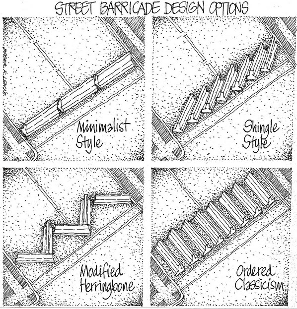
Kojo Nnamdi and Roger Lewis will be discussing security ducks and the finer details of jersey barrier stye today (September 7th) at noon. They will be examining the topic in light of 9/11, but what might be most interesting is the change between the idea of security after 1995, versus the one we have been operating under for the last decade.

The cartoon is by Roger Lewis.  I’m kind of liking Shingle Style nowadays.

Anacostia foot bridge: a pedestrian idea?

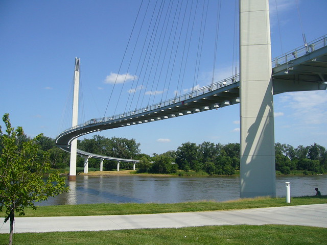
Bob Kerrey Pedestrian Bridge in Omaha/Council Bluffs. Image: Nic221 on flickr.

The bridges over the Potomac, Anacostia, and Rock Creek are very important connections over the strongest boundaries in DC. The relatively few crossings are the bane of commuters and a significant impediment to the development and livability of the DC area. So, it’s no surprise that David Garber has been advocating for a pedestrian bridge across the Anacostia. The most recent iterations have been drawing on the NCPC‘s Extending the Legacy Plan (PDF) and subsequent plans. Plus, there have been a slew of impressive and iconic pedestrian bridges popping up in the US. I think that connecting across the river would be great, but maybe something more than just a fixed link would be best for the Anacostia.

For me, the whiz-bang factor of a bridge is offset by the need for this kind of structure to work as an urban space. Creating a more pleasant route for non-motorized commuters is a good enough end, but for more casual enjoyment, it needs some other qualities. Iconic bridges tend to beautifully express directed motion from one end to another, but not the pauses and distractions of a stroll.

In a way, you create a long pedestrian-only space with no activating buildings. Without a mass of people, those spaces are alienating or unsafe.

There are some relevant examples that approach the concept differently:

“Death and Life” Published in Russian

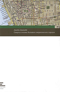
Jane Jacobs’ seminal work, The Death and Life of Great American Cities, is now available in Russian by the house Novoe Izdatelstvo. I think this is pretty remarkable that it took so long, but the editor says that it’s appearing at the right time.

In translation, the title is Смерть и жизнь больших американских городов. Literally, that means “The Death and Life of big American cities.” That, to me, loses the valorizing nuance of the word “Great,” but maybe the fancier translation of the word, “великие” has too much Stalinist baggage, or perhaps my reading of the title is wrong. Either way,they say translation is tricky.

In an interview with the Strelka Institute’s blog, the editor of Novoe Izdatelstvo provides his own example:

This issue arises first and foremost with relation to one of the central concepts of Jacobs’s book: the neighbourhood (in our book, “okrug“, or “district”). The word “neighborhood” taken literally means something like one’s personal area, an urban habitat, the borders of which are determined not by the government but by one’s own typical routes of travel, one’s everyday needs and habits, and so on. This word is difficult to translate into Russian precisely because this way of conceiving space doesn’t really exist in our cities.

For the unfamiliar, the term “okrug” is much more of a legal category, like an ANC, that reached its modern meaning during the era of hyper-centralized Soviet housing estates. One other part of the interview stood out to me, where the editor, Andrey Kurilkin remarks:

I would say that this book is like a new optical instrument that allows you to see complex processes where only yesterday you noticed nothing at all. Our intuitive conceptions of a conveniently designed city, with small streets, parks, a local butcher shop across the way, old buildings, and a convivial street life are given a logical and vigorous theoretical foundation.

Jacobs and her work have suffered from creeping hagiography, so it’s good to see the author reinforcing the intention that the book be a tool for understanding, rather than a prescriptive manual.

You can read the introduction here (PDF), and I recommend the other book mentioned in the interview, Seeing Like a State.

Don’t Just Preserve History at Tenley Campus, Interpret It.

With a more creative approach to preservation, American University’s plan for its Tenley Campus could produce better urban design and a more compelling presentation of the site’s history.

Capital Hall and its lawn. Image: Wikipedia.

AU has agreed to preserve several structures on the site: the a former farmhouse called Dunblane House, Capital Hall the main building visible from Tenley Circle, and a Chapel. Together, these buildings form an axis that the Historic Preservation Office has insisted on preserving.

The Historic Preservation Office is right to emphasize this axis; it is probably the most interesting part of the site. The architects at SmithGroup have worked within these requirements to create a private quadrangle between the old house and Capital Hall, which looks good so far.

But AU has also decided to build on the footprints of the existing 1950s buildings and not construct anything that would obscure Capital Hall. The buildings are preserved, but no part of the campus will feel different from the others, even if they are in a slightly different style. The new buildings offer no key to understand on the site they inherit.


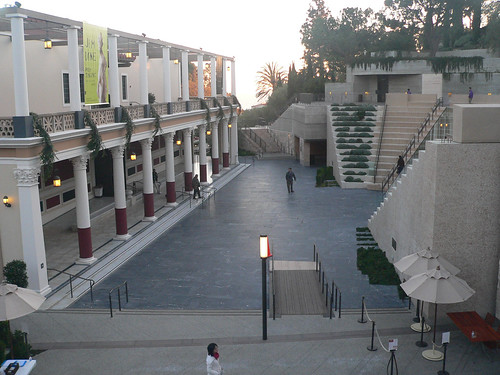
An abstracted amphitheater frames the Getty Villa. Image: The Consortium/Flickr

To understand what I mean by interpretation, take a look at Machado & Silvetti’s renovation of the Getty Villa. They combined the pragmatic need for an an entry stairway with architectural promenade that helps visitors understand the museum’s curatorial approach. Treating the 1970s replica of a roman villa as an object in a collection, stairs and pathways frame the building in a sequence that calls to mind an excavation. The stair gives visitors a lens with which to understand the building and clears their minds of the drive out to Malibu.

AU’s Tenley Campus is Pinned to the Past

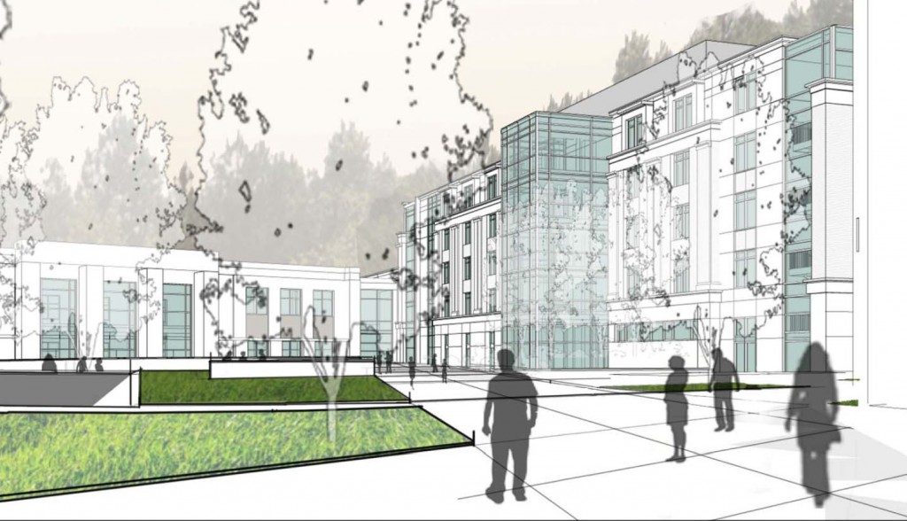
American University’s plan for the Washington College of Law not quite right. Designed to minimize conflicts in the short-term, the current plans are not the right kind of development for Tenleytown.

While AU continues to present its east campus plan before the Zoning Commission, they left out plans for the Law School campus at Tenley Circle, promising to submit them in August. But even with that deadline far off, it is possible to tell that the design is wrongheaded. The site is more urban and has more potential than the East Campus site, so it must be held to a higher standard.

Last year, when AU announced a plan to relocate the two blocks from the Tenleytown Metro and at the intersection of Wisconsin and Nebraska Avenues, the potential for progressive campus seemed overwhelming. As at East Campus, political expediency got in the way of good design. The plan is a recapitulation of suburban design principles hemmed in by unwarranted preservation concerns.


Site Plan as of June. Image courtesy AU.

What is good about the design is how it pairs the program to the site. The law school has a non-residential program, where faculty and students live off campus and commute to the school. Many maintain jobs downtown, requiring a direct link into the city, which the metro can provide. Bus lines in eight directions fill in the transit gaps including an express bus on Wisconsin Avenue, which received a TIGER grant for more improvements. It would be very easy to graduate without ever parking a car on local streets.

It is near two functional but underdeveloped commercial strips on Wisconsin Avenue. These have been struggling for years, although most storefronts are occupied as of July 2011. The project could energize the South Tenley and Tenleytown strips by creating a bridge of activity where there is now just a narrow sidewalk and an empty field. The project might add a few customers too, since most students don’t have a meal plan.


Change in lot coverage. Blue areas are new area, yellow is removed, gray is no change. Dark gray represents preserved buildings.

As of July, the designs do not meet of the location’s potential. AU asked the architects, SmithGroup, to mass the building in the footprints of the 1950s campus: objects in relation to each other, but not in relation to the city. As the ground plan has evolved, its forms have become more sophisticated, but its relationship to the streets has remained pinned to the footprints and the outdated ideologies that prescribed them.

American’s Unexceptionalism

While American University’s campus plan is a net benefit for Ward 3, the architecture currently proposed for the campus is mediocre at best. Beyond the land-use planning, East Campus and North Hall’s proposed buildings offer little in terms of aesthetics. The spaces are disorganized and the forms are uninspiring. On the outside, the buildings don’t relate the street well, and the facades present foggy contextualism.

Instead of well-executed buildings, the design revolves around appeasing neighbors while important aspects are left undeveloped.

For East Campus and some of the Main Campus buildings, AU hired Little Diversified Architectural Consulting, a Charlotte-based firm with offices in Alexandria. They have designed a large dorm at Catholic University, Opus Hall, similar in style and form to AU’s proposed facilities. Other design work was executed by the university’s large in-house architectural group and the firm of McKissack & McKissack.