Details, Details: Gizmeaux

In response to a post on Greater Greater Washington, I wondered why the contemporary neotraditionalist movement is so averse to accepting or even embracing technology and innovation. Using, sure, but it’s hidden and tucked away, as if it is an embarrassment among the other monumental parts of the building. This has not always been the case; when traditionalism was not an ideological position but a method, architects were open to experimentation.

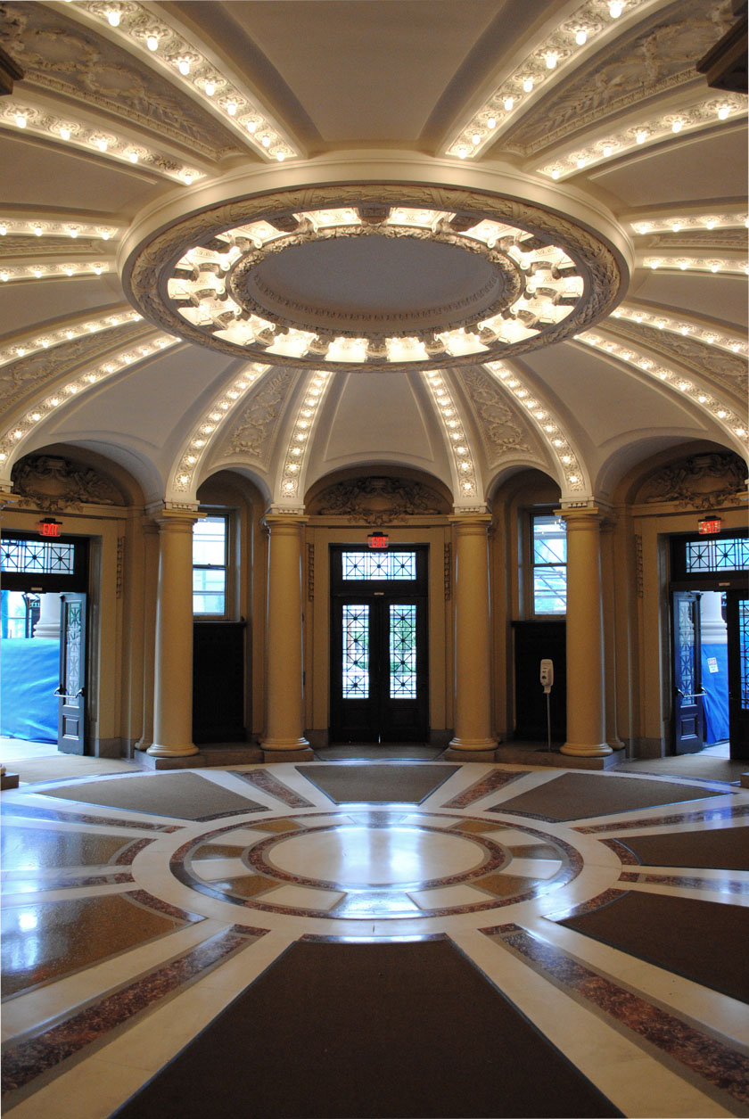
Just as an example, consider the way Carrère and Hastings used what was then the relatively modern gizmo of the light bulb in their 1902 rotunda at Yale. C&H’s calculated eclecticism certainly represents the practice that the Modern Movement considered its antagonist, but here, their flexibility paid off. Without going into theatrical crassness, they play light and molding off of each other in a way that adds intensity to the conventional architectural manipulation of space and articulation. Light, for the designers of this space, was becoming a material and not just an condition taken for granted.

Where is this expansive, flexible attitude now?
 

Details, Details: Hahnemann

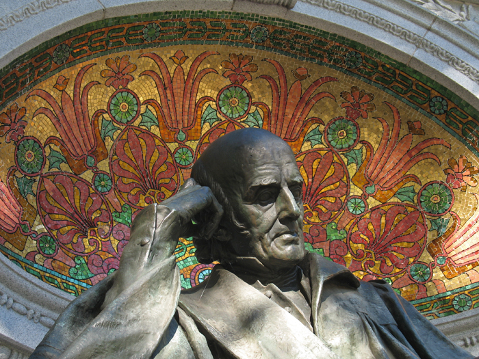
The statue of Samuel Hahnemann at Thomas Circle is one of DC’s many unknown beauties. Although most of the structure is the monumental standard copper-granite-limestone  set of hues, the half-dome that frames his head bursts into color as you pass your eye across it. What’s more, because the mosaic is partially hidden, it rewards close examination.

Details, Details: Light & Shadow

white brick

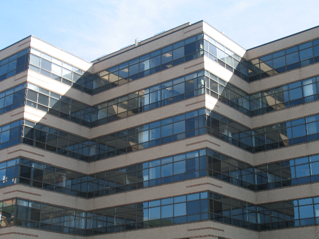
A lot of architectural design deals with modifying light and shadows to make an interesting form. For example, the moulding on a neoclassical building is designed to create a specific shadow profile. Meanwhile, glass buildings tend to play with reflections. But you don’t see much of them together, like you do here.

Details, Details: Sustainability is so 1983

In the recent controversy over the energy efficiency of LEED-rated buildings, most commentary placed blame on glass, users, the LEED credit system, ASHRAE, expectations, models, etc.  Few people mentioned simple design decisions. Take a look at this picture of 4250 Connecticut Avenue:

van-ness-windows

Designed by Hartman+Cox before they went traditional, it’s pretty unremarkable – except that it shows an uncommon sensitivity to site particulars. In the picture, you can see that about 3/4 of each wall is window space and mullions. Elsewhere on the building, however, less than half of the floor height is glass. Why? The above side faces North-Northwest, with the angled shape exposing most of the wall area to due north. The primary energy problems with glass walls cresults from solar heat gain and glare, but daylighting can also save a lot of energy. On the north side of the building, where there is rarely any direct light, the offices can get some daylight but not catch too much heat.

Details, Details: Georgetown Stable

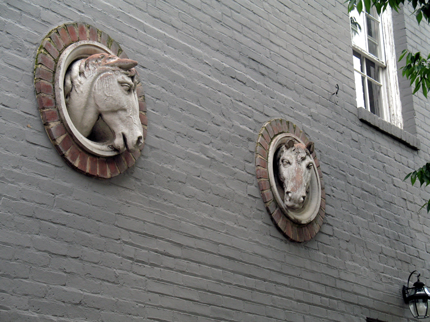
Just across Cady’s Alley from the Ukranian Embassy is a little building that I assume served as stables until the 20th century. On the wall are these two equine tondi.

gtown-horses

It’s simple, humble ornament that conveys the function of the building. With a little humor, it almost suggests that the horses are popping their somber heads out to have a look around.