For Adjaye’s libraries, seeing is believing

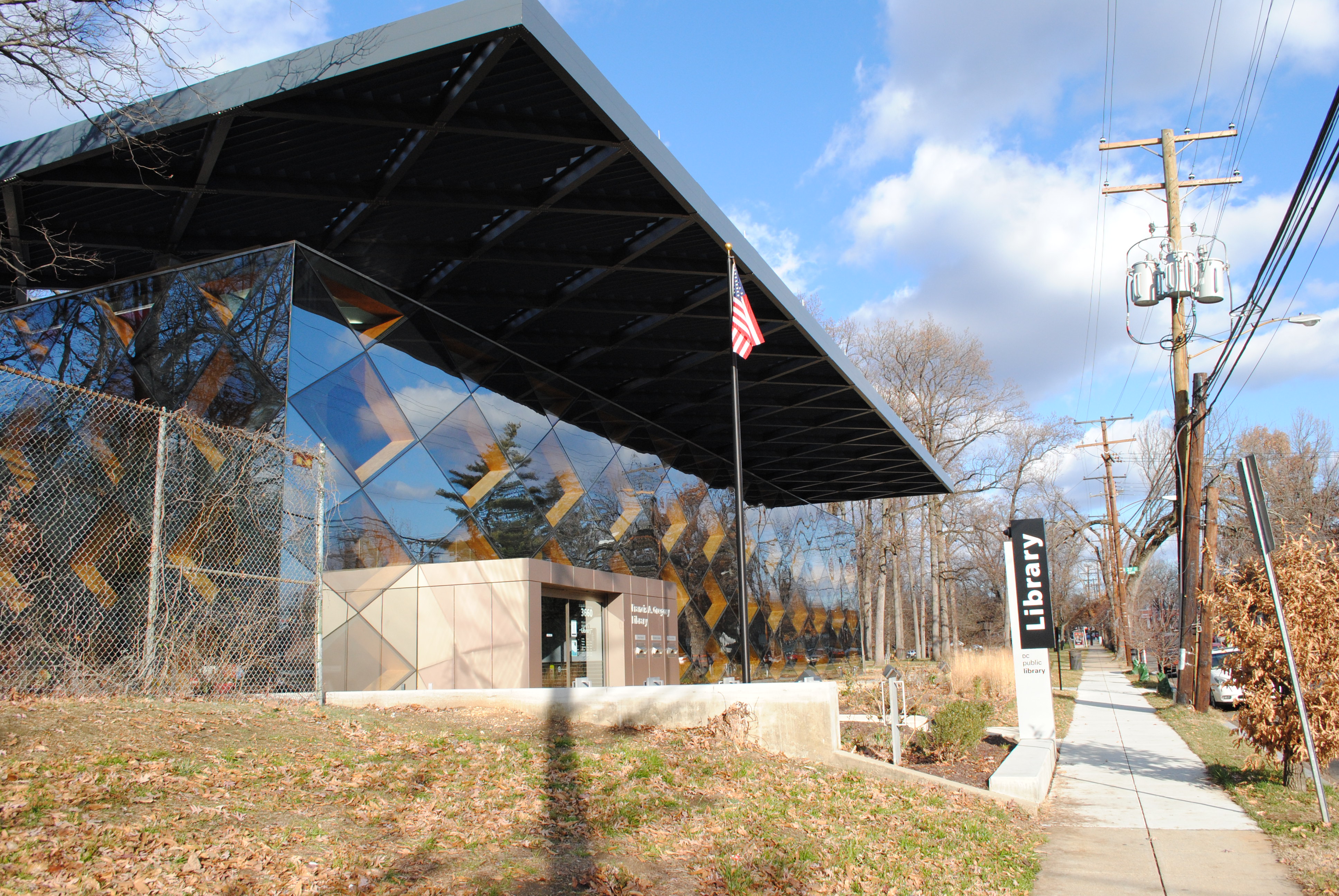
Among the new DC public libraries, the Bellevue and Francis Gregory branches east of the river have the strongest design. Without sacrificing functionality and accessibility, they put sophisticated works of architecture in historically underserved neighborhoods. But photos don’t tell the whole story. You have to go see them yourself.

Designed by British architect David Adjaye, who’s also designing the Museum of African American History, the libraries are a reminder that it’s possible for a work of world-class architecture to also be a comfortable third place.

DSC_0438

Francis Gregory Library.

When the first renderings of the new libraries were published, I was unimpressed by them. But after a day-long excursion to see all of the libraries built under the tenure of library director Ginnie Cooper, I have to admit that I was surprised at how brilliant Bellevue and Francis Gregory are.

900 New York Avenue at CityCenter

If you look at a map of the old convention center site, there are six blocks. The southern three are owned by Hines-Archstone and are being designed by Foster + Partners and Shalom Baranes. Buildings there are now well above ground, destined for opening in 2013. A park by Gustafson Guthrie Nichol will eventually enliven New York Avenue and the middle block will probably be a hotel once the market shakes out.  The last block, though, has been mysterious for years, appropriately noted in this map with a question mark.


The mystery property is owned by the Gould Property Group, headed by well-bearded parking magnate Kingdon Gould, III. It turns out that the project is much further along in development than I had expected: Gould has hired Pickard  Chilton to design a rental office building, named 900 New York Avenue. You can find the plans here. Renderings reveal a gold-colored building with expressed floorplates and lots of glass.
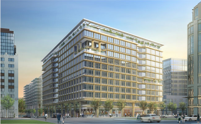
Seems like a bit of retro-eighties work, which is odd since Pickard Chilton are known for their glass. Considering that it’s such a massive building it’s unfortunate PCA chose to not express vertical elements to break up the length of the block. The central atrium, on the other hand, looks like a really great opportunity for social space, while the “urban layer” bottom seems primed to enliven the streets. Putting aside my aesthetic preferences, the project will really add vitality to the area. In particular, the large atrium, shown here in ground plan and rendering, looks promising as a space that engages the pedestrian alley.
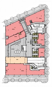
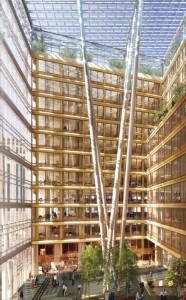
It’s interesting that the building cantilevers about five feet out over the sidewalk above the second floor. I wonder if this is meant to open up sidewalk space, or if it is a strange reading of the projections law. More renderings here.

All images courtesy Gould Property Group/Pickard Chilton.
 

Best anti-glare solution ever.

So the room you work in has a large glass wall. It brings in a bit of glare during the day, and this is messing up the view of your computer screen. What do you do? Buy shades? Pff.  Sue the architect? Complain to the faculty advisor? No, of course not – you work in an MIT robotics lab.

Meet Shady, the sunshade robot. Developed by the MIT Distributed Robotics Lab, it actually does many other things, particularly climbing trusses, which they say is hard to do, and I’m in no position to disagree. That is a finely sharpened solution.

via Dwell, which  has been profiling people who live in pieces of starchitecture (only at MIT so far, though).

Details, Details: Sustainability is so 1983

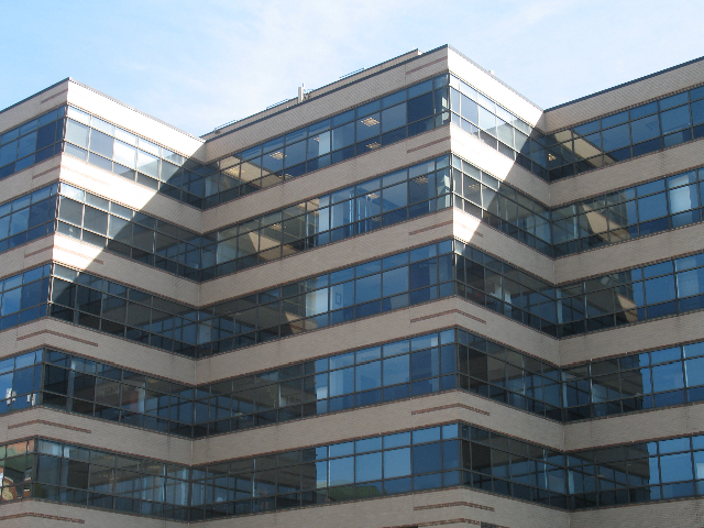
In the recent controversy over the energy efficiency of LEED-rated buildings, most commentary placed blame on glass, users, the LEED credit system, ASHRAE, expectations, models, etc.  Few people mentioned simple design decisions. Take a look at this picture of 4250 Connecticut Avenue:

van-ness-windows

Designed by Hartman+Cox before they went traditional, it’s pretty unremarkable – except that it shows an uncommon sensitivity to site particulars. In the picture, you can see that about 3/4 of each wall is window space and mullions. Elsewhere on the building, however, less than half of the floor height is glass. Why? The above side faces North-Northwest, with the angled shape exposing most of the wall area to due north. The primary energy problems with glass walls cresults from solar heat gain and glare, but daylighting can also save a lot of energy. On the north side of the building, where there is rarely any direct light, the offices can get some daylight but not catch too much heat.