A look at the new Czech Embassy

The Embassy of the Czech Republic has announced a design for a new building to replace an aging facility on Tilden Street in Northwest Washington. The current embassy is a not-quite-modernist structure at the edge of Rock Creek Park near Peirce Mill. The new structure will be a postmodern landscraper in a y-shape that clings to the site, in a flattened valley. The architects are Prague-based Chalupa Architekti; I think this is a definite improvement.
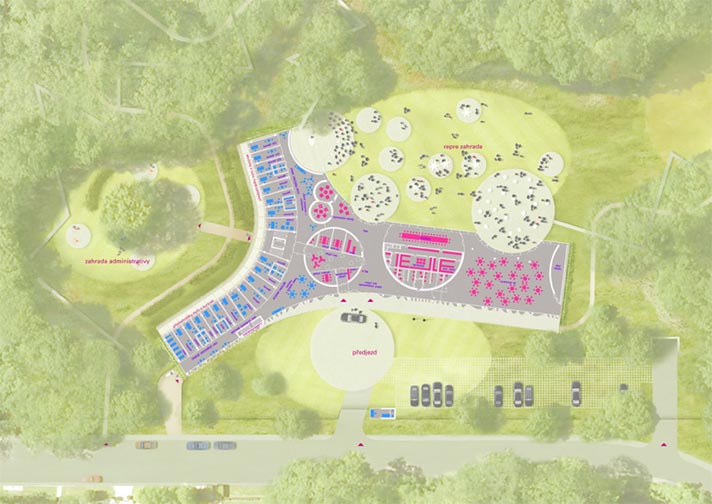
This is going to be a really great building for nighttime parties. The designers conceived of a theatrical center for élite receptions. I like the circular pods that are scattered inside and out and in between. They refresh the old Modernist idea of dissolving barriers between the interior and exterior, nature and environment, by bringing it back to the original idea of passing volumes through an envelope. The front (north) façade is a beautiful composition of frosted glass formed into a curtain. From the side of practicality, the east-facing façade of the office wing is fenestrated and shaded reasonably well for actual daylighting.

The architects fell into some contemporary tropes I dislike. I find some of the lines to be arbitrarily harsh and unanimated. The glass curtain in front ends bluntly at the roof slab. Likewise, the entrance doesn’t stand out on a building that already doesn’t address the street well. Admittedly, it is a diplomatic building, so security concerns will cause designers to skew fortress-like and the surrounding neighborhood is hilly and wooded, full of detached mansions like the Hillwood.

So, maybe disappearing into the environment is the best course here. The grass roof slips the building into its site. And if it’s not near public transit, it is near great bicycle resources. The shady Rock Creek trail is just feet from the entrance. If the Czechs get on the same bike as the Danes and install some changing facilities (it’s not clear from the published images if they have them), then it could be a pretty forward-thinking building.

What do you think?

As seen on Dezeen.


Mixing New and Old at the Eisenhower Memorial

Yesterday, a panel selected a design concept by Frank Gehry for the Dwight D. Eisenhower Memorial The design is promising.

The large blocks form a circle, enclosing a single tree and a small pool of water. On the faces of the ring of stones, images cast in low relief and quotations in large type speak history to those inside. East and west of the central courtyard, groves of trees canopy informal plazas. At first blush, these spaces feel intimate and beautiful. Rising from just beyond the trees, large stainless steel screens supported by limestone columns enclose the space on the north and south sides. The screens will contain some of the sculptural program through a woven scrim that hides the forgettable Department of Education Building to the south. The street condition is undefined, bounded by the scrims except at three prominent areas.

The axis of Maryland Avenue cuts through the memorial, with the stone ring in the center. Building the memorial without disrupting the viewshed of the Capitol or traffic flow were seen as the two big problems. The Memorial Commission selected a design by Gehry that sidesteps the issue of sightlines, by removing one of eight columns and two sections of the screens. This way, the design frames the primary view of the Capitol with the same structures that fit it into the grid. In terms of the vehicular route, the panel rejected a vehicular road through the monument and instead created a pedestrian plaza. The site was located to move the monumental program off of the Mall. Drawing visitors, most of whom tour on foot, was equally important.

Gehry has tamed his own style is tamed for this project, although the ring of stones exemplifies the blockish forms he had been experimenting with since the opening of Walt Disney Hall. Mercifully, Gehry has also eschewed the dismal expressionism of a younger generation of memorial designers. The design team did not try to assign tremendous meaning to every little detail. Instead, it is a building that can be judged for its power and for its beauty, although people will disagree.

A Look at the Janney Expansion

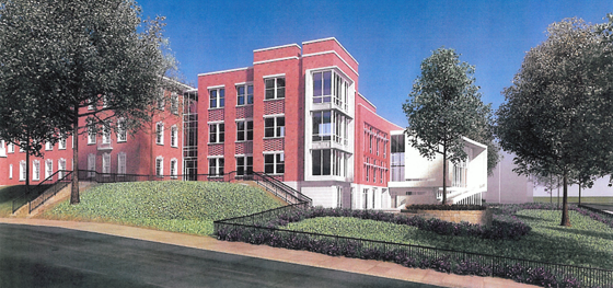
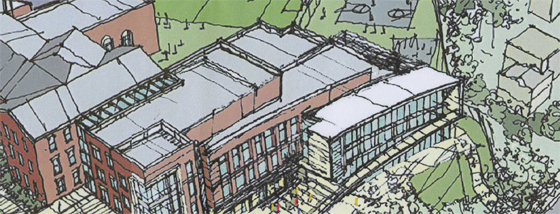
Janney Rendering 1 SE_09 SMALL

I finally got some images of the proposed Janney School extension. I like it – but it could have been better. With a few objections, I like its conception. Devrouax + Purnell, best known for the Washington Convention Center, the Pepco Building, and Nationals Park, here produced an interesting and attractive school building. However, the location where they have chosen to place the wing results in a lost opportunity for Janney and the community in general. Like too many developers and architects, they approached Tenleytown planning to not upset the status quo. However, any public facility should be designed with an eye to the future – and the current state of Tenleytown cannot last.

The building steps down.

Beginning with the generous setback along 42nd street, the architects attempted to hide the building as much as possible, so as not to intrude on the neighborhood. Although the Albemarle façade extends to the cornice line of the 1923 building, the masses of the building gently diminish into a low white structure that encloses the gym. Moving south along the western face, the building curves gently, from a tower to the first private residence down the block. The architects employed the shape subtly, repeating the curve in each mass to limit its effects. It does successfully integrate into the site.

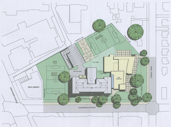
However, this hesitant approach is not appropriate here. The architects should not have set the building back from the street so much. In doing so, they have reduced the feeling of enclosure afforded by a consistent streetwall, produced an marginally useful green space, and missed an opportunity to relocate the playing field at the center of the Tenley Library Public-Private Partnership debacle.

JES_Design_Schematic_20091110-1 SMALL

For the 2007 plan to build a library with several floors of condominiums on top focused on the loss of recreation space (the rightmost field in the image above) for Janney Students. Some of that space would be consumed in the footprint of the condominium structure. However, had the architects located the new wing closer to the property line, they might have opened up space to relocate the eastern soccer field. In a political environment as vicious as Tenleytown’s, a mutually agreeable solution would have been a rare happy ending.

That lost opportunity is my main complaint – but there’s much more review below.

Details, Details: Sustainability is so 1983

In the recent controversy over the energy efficiency of LEED-rated buildings, most commentary placed blame on glass, users, the LEED credit system, ASHRAE, expectations, models, etc.  Few people mentioned simple design decisions. Take a look at this picture of 4250 Connecticut Avenue:

van-ness-windows

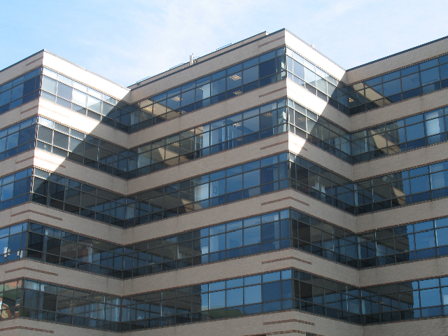
Designed by Hartman+Cox before they went traditional, it’s pretty unremarkable – except that it shows an uncommon sensitivity to site particulars. In the picture, you can see that about 3/4 of each wall is window space and mullions. Elsewhere on the building, however, less than half of the floor height is glass. Why? The above side faces North-Northwest, with the angled shape exposing most of the wall area to due north. The primary energy problems with glass walls cresults from solar heat gain and glare, but daylighting can also save a lot of energy. On the north side of the building, where there is rarely any direct light, the offices can get some daylight but not catch too much heat.

Good Architects: McInturff Architects

cadys-alley1

To make an unwarranted generalization, DC architects like their buildings heavy and somber. Even in the recent fad of light and clean glass facades, the buildings have been rather self-serious and blockish looking, a consequence of clients demanding efficient floorplans from architects who themselves were trying to be cool and modern without upsetting the polished and poised look DC has in the collective consciousness and legal structure. This fretful indecision can be a bit like the jeans and sportcoat look – crisp but comfortable, hip but conservative.

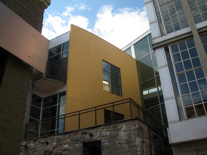
McInturff Architects offer a wholly different approach. They’re (post)modern(ist) but a little witty and also aiming for comfort. Their mostly residential oevure consists of excellently-composed buildings that respond coyly to the conditions of the site. In doing so, it avoids falling into limpid styles while also carefully respecting historic and distinctive architecture elsewhere. As for aesthetics, the practice cleverly contrasts gentle and warm elements with bold minimalism in beautiful light-filled spaces. As their projects are primarily private, it’s trickier to see their work than Esocoff & Associates‘. But down in Georgetown, anyone can at least see three buildings, and go into one of those.