Travis Price on the Height Limit

Lloyd’s of London building, Richard Rogers, and Willis Building, Foster + Partners

Greater Greater Washington asked accomplished DC architects to weigh in on the positives and negatives of the height limit. This comment is part of that series

Will more height bring better architecture? Yes and no. Initially, on the one hand, I would say no for 2 reasons. The current height in concert with the street widths has a major influence on keeping human scale paramount and thus makes great street in a friendly city.

Scale is an immensely powerful design directive on human behavior. It also forces development to expand at a human scale inside the city limits. This tends to fill the city with better living and a better ecological footprint instead of leaving vast areas of land squandered while nondescript high-rises further alienation.

On the other hand, the boredom of boxes is equally discouraging. Flatness contributes to a banal and far too homogenous city. Some fun and upward joyful shapes could readily dance with the civic memorials such as the National Cathedral, the Capitol, and the Washington Monument. Arlington’s taller boxes are exactly what we don’t need in DC.

Chimneys on the roof of by Antoní Gaudi’s Casa Mila

I would propose a future approach. For each city block, each building gets a moment of roof delight by allowing additional partial floors stepping back 15 feet per floor from the parapets, up to 5 stories and with 50% reductions in footprint per step. This would give us some refreshing chaos and rhythm to the city scape without overwhelming us with high boxes.

This is much like [former New York mayor John] Lindsay’s incentive zoning approach for Manhattan but at a much smaller scale. Let the architects go wild with this one. Incentivize a bit of freedom for creative developers and architects to break heavy thumbs of symmetry and repetition whenever possible.

So, no on big heights, and yes on complex delights! To paraphrase Churchill as many do: First we shape our buildings, thereafter they shape us. Let’s shake up the shapes and shake down the boxes! Let a few stories happen with a fun jury of outside reviewers and not just only well-intended public officials under the heavy thumb of conformity and regulations. Perhaps along with Fine Arts Commission, let’s have a Fun Architects Commission.

Travis Price, FAIA is director of Travis Price Architects in Georgetown.


David Haresign, Mary Fitch and Bill Bonstra on the Height Limit

Greater Greater Washington asked accomplished DC architects to weigh in on the positives and negatives of the height limit. This official statement of the DC Chapter of the American Institutes of Architecture is part of that series

The 1910 Height Act was necessary to insure the safety of the citizens of the District of Columbia. It was an appropriate response to a very real threat to fire safety. But since then, the District has enacted zoning and building codes that go well beyond the 1910 Act, and in many cases, provide more protection to the city’s unique skyline than the Act does.

Moreover, the language of the Act is limited to the architectural technology and building science of the early 20th century. For example, in 1910 it was not possible to include life safety equipment in a mechanical penthouse, so occupancy of a penthouse was prohibited. Many of the Act’s other requirements include similarly archaic language that is at odds with modern building and life safety codes.

It is our conclusion that this outmoded language should be brought up to date to reference modern building codes in place in the District. We held a workshop with NCPC staff this summer to help draft language to make the Act more consistent. Furthermore, we strongly agree with the recommendations included in DC’s Height Master Plan that protecting Washington’s cultural resources and physical character is the job of the District of Columbia and not that of the federal government.

We believe that the federal interest in the height of buildings should be limited to areas immediately adjacent to the Monumental Core and critical view corridors. We believe that current building and zoning codes in the District now provide better protection for non-federal areas of the city than the Act.

Finally, with respect to the alternatives described in the study, we believe additional height may be possible in carefully selected spots, with adequate public input, around the District. Moreover, we believe that the proposed 200-foot cap used in the study is arbitrary and that additional height above that cap may also be appropriate for areas outside the Monumental Core and its environs.

While we respect the horizontal character that makes Washington DC unique, we believe well-designed, taller structures will provide an interesting counterpoint and add visual interest and variety to the skyline. This would, of course, require a thorough, in-depth study.

David Haresign, FAIA is the current president of the Washington Chapter of The American Institute of Architects. He and Bill Bonstra, FAIA are principals of Bonstra|Haresign. Mary Fitch, AICP Hon. AIA, is the executive director of AIA DC.

How can Fort Reno’s history come to life?

Fort Reno Park is not a great park. It’s mostly unstructured green space: empty and unpleasant. It does have a great community garden, tennis courts, and two playing fields. But, those uses collectively occupy only a fraction of the land. And they don’t really draw anyone in. Even Fort Reno’s most popular event, the summer concerts, are a lucky accident.

In fact, the only users who really enjoy the park are dogs. The empty fields at Fort Reno are great for letting dogs run free. The only problem is that it’s illegal. Dogs must be on a leash on NPS land. There is just nothing right with Fort Reno Park, is there?

renodogs

Now, it’s easy to spitball amenities to fix the park, but Fort Reno is uniquely charged with history. There’s was a Civil War Fort and then a Black town bound up in its formation. Buried under the grass are vast possibilities to impregnate our lives with history. On the other hand, as more and more residents return to the district, we will really need useful parks.

So, how do you take this kind of site and interpret it while also making it a great urban place?

A recent project in Brooklyn shows us a few ways.

photo copyright nic lehoux

Strategy One: Put a frame on it 

Take a look at the Weeksville Heritage Centerlocated in northeastern Brooklyn. Not so much of an open space as a corner of East New York, the site preserves five houses from a historical Black settlement. Most of Weeksville came down for projects during Urban Renewal, but a tiny portion remained, wedged laterally into a block.

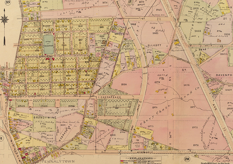
Like Tenleytown, Weeksville was quite some distance away from the city (Brooklyn), but was later absorbed by urbanization. Unlike Tenleytown, none of the roads were converted into the grid, and few of the houses were. Tenleytown used to be two settlements: a largely White area near the Wisconsin-River intersection, and the Black town occupying what is now Fort Reno Park. Very little of both remains.

1907 tenleytown baist s

Weeksville was “rediscovered” in the 1960s by an extension class at the Pratt Institute. Residents were still floating around, but its history was unofficial and uncollected. In the same sense, Tenleytown was rediscovered in the 1970s, as the last people to remember it tried to collect their memories. Weeksville has been slowly doing the same for years.

Washington College of Law animation

I came across this animation of the new Washington College of Law. I think SmithGroup did a very good job with the brief they were given and the attitudes of the HPRB. The only thing that could be improved is the lawn fronting Tenley Circle, which could still become an exceptional space where law students could interface with permanent residents amicably.

In a related development, however, the DC Court of Appeals found that the Zoning Commission miscounted the number of students added to the “Campus,” i.e. the residential portions includes to be 1,000 people higher than claimed. The Zoning Commission will have to reconsider this issue.

Construction continues at the Tenley Campus.

See Toyo Ito speak at the NBM

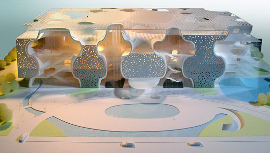
ito_taichung

I think it’s worth the time of every Washingtonian who thinks they know what’s up in architecture to hear Toyo Ito speak at the National Building Museum. Ito won the 2013 Pritzker Prize, and has produced some pretty astonishing buildings, most notably the Taichung Opera House, sponge-like chunk of an infinite minimal surface algorithmically drawn around the program. Were it not for a few doors, the building would be two separate spaces, absolutely enmeshed in each other. Even with the breaks, the surface segregates spaces so that there’s neither figure nor ground and there is no evidence for the other mirror-image space. There’s a similar manipulation of space in the unbuilt Berkeley Art Museum.

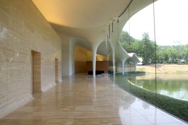
ito_meiso

The Meiso no Mori funeral hall  (above) was a point of departure for one of my projects, along with other projects by Ito, Akihisa Hirata, SANAA, and Junya Ishigami’s KAIT workshop.  Their buildings precisely emulate natural phenomena with a spare aesthetic. Their anti-iconic and open-ended spaces they produce are a nice respite from DC’s inclination.

Wednesday, October 16th, 6:30PM. National Building Museum. Judiciary Square Metro. 

Modernity, rushing towards him

July 13th is the 172nd birthday of Otto Wagner. Wagner is one of the first people to use the term “modern architecture,” although his work doesn’t embody the theoretical or stylistic connotations of that term. Nonetheless, he was more than aware of the strangeness of modernity.

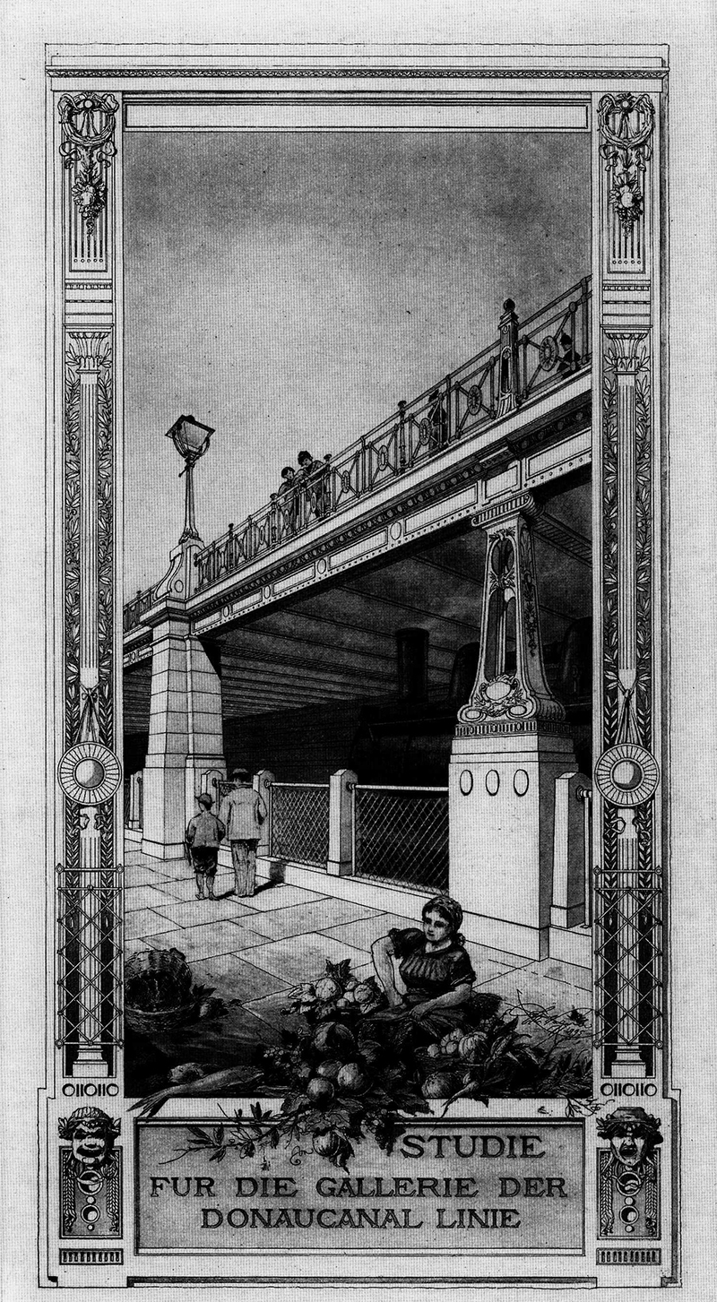
wagner stadtbahn viaduct view sm

This rendering, published in the 1897 edition of Moderne Architektur is strikingly dense for what was, at the time, considered the uncultured work of an engineer. Wagner  and his studio produced incredible draftsmanship, but this rendering stands out because of its sheer uncanniness. Look at the two columns. One is stone, safe and solid. The other is cast iron, modern and delicate. A woman works, men turn their backs, and a locomotive of the Weiner Stadtbahn lurks. There are superhuman things and unseen layers to cities, a fact to be made beautiful.

After the break are two more under-appreciated projects of his, one for an asymmetrical bridge over a lock, and the other is the earliest architectural photomontage I am aware of, from 1906.

Socialism in One Building: Moscow, 1930


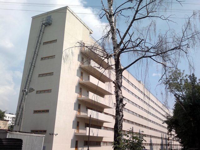
The Commune-House on Ordzhonikidze street in south-central Moscow is one of those Soviet projects is a hidden gem of Soviet Rationalist architecture, with heavy Corbusian influences. Designed by Ivan Nikolayev when he was 27, it neatly encapsulates the ideological goals of the revolutionary avant-garde. take a look at the first and second floor plans:

Via sovarch


The Commune-House is not just a communal apartment. It’s a type that only flourished for a few years during the radical period of the Soviet Union, when architects saw a need to reproduce the collectivized society of the kolkhoz in urban settings. All of the employees of a bureaucracy, factory, or university would live and work together as a mass collective. The most famous is the Narkomfin Building, which was built to house the workers of the Commissariat of Finance. NarKomFin is an abbreviation of the Russian name.

This dormitory was built for the State Institute of Textiles, to be “socialism in one building,” where people would act collectively, in a mass. As a result, the building’s functions are completely segregated. The plan above shows how Nikolaev divided the building into three sections. One: a 200-meter-long, eight-story bar of 1000 10-square-foot apartments, each meant for two students. Two: a three-story building containing classrooms, a cafeteria, a library, and physical culture facilities. Three: Joining and perpendicular to the two main buildings was a “sanitary wing” containing all of the bathrooms, the showers, balconies for mass exercises, and a set of ramps.

So, the building is laid out much like an apartment, only at the scale of thousands of people. Emerging from their rooms at a set time, the students would perform a mass exercise, shower, dress, and proceed to classes. All food was prepared in the cafeteria, liberating women from “kitchen slavery.” All bedrooms had sliding doors, like train compartments, because privacy needed to be minimized. Compared to the Narkomfin building’s family units and distributed bathrooms and kitchens, Nikolaev’s building is much more radical.

Nikolaev described his program this way:

Eradication of coercion from a man’s life is the first step. Household collectivization and reorganization of study is the second. The third step is the improvement of hygiene and daily life. The fourth the transition to self-sustainence in the home and the mechanization of harvesting. The fifth step is the socialization of the child rearing.

This kind of attitude was common among theoreticians at the time. Unfortunately, it was unpopular with most of the public, who didn’t complain when the ideological underpinnings of mass housing changed under Stalin.

Aesthetically, I think Nikolaev captured the relentless uniformity as beautifully as possible on the exterior, but it is now just a shell. After years of neglect, the building is being restored, with 12-person suites containing bathrooms and kitchens.

Check out the original post at SovArch.

Also take a look at these photographs of the ruined building in 2007.

And, don’t forget the Nazi equivalent! Do you see why Leon Krier deems Nazi architecture modernist architecture?

For Adjaye’s libraries, seeing is believing

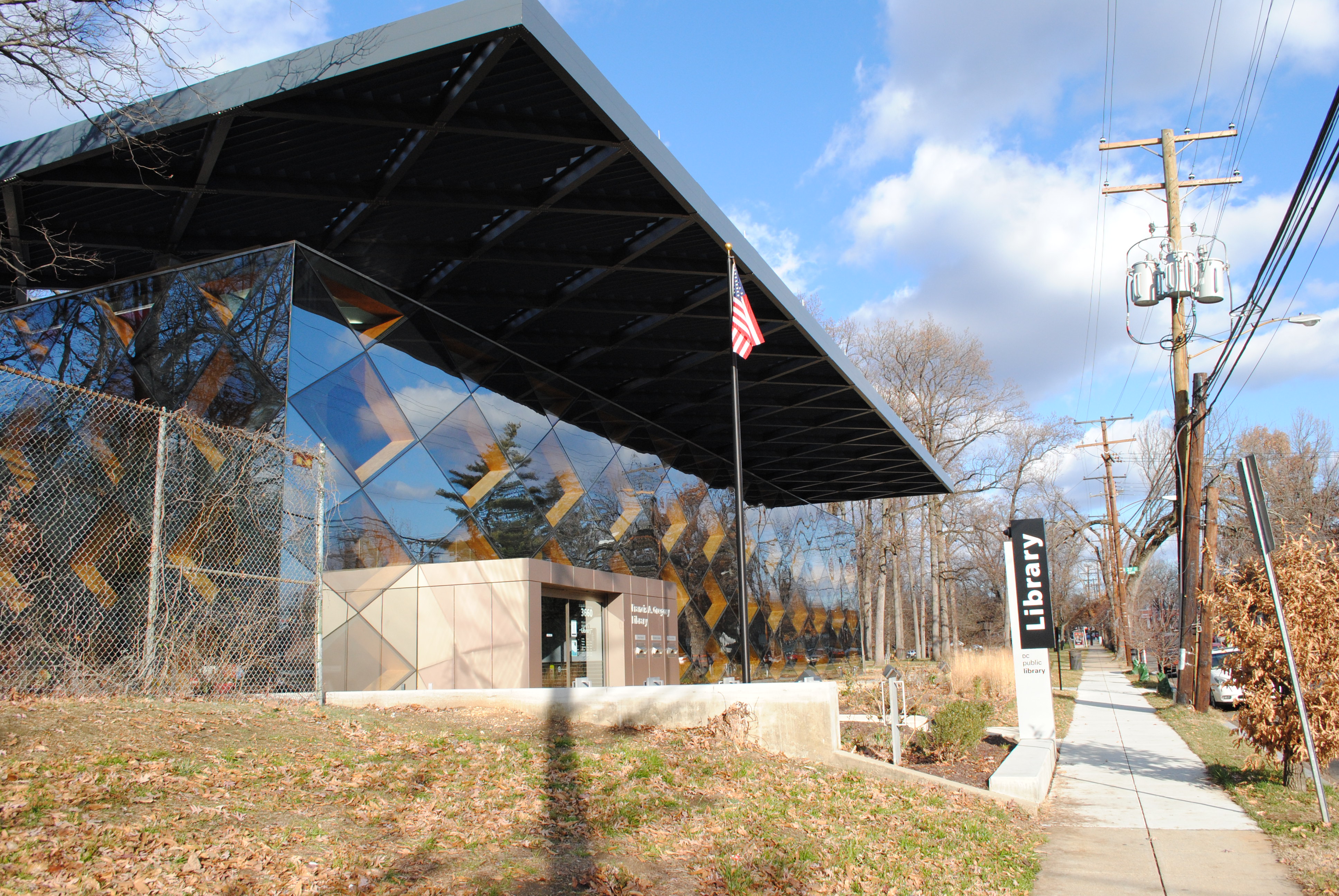
Among the new DC public libraries, the Bellevue and Francis Gregory branches east of the river have the strongest design. Without sacrificing functionality and accessibility, they put sophisticated works of architecture in historically underserved neighborhoods. But photos don’t tell the whole story. You have to go see them yourself.

Designed by British architect David Adjaye, who’s also designing the Museum of African American History, the libraries are a reminder that it’s possible for a work of world-class architecture to also be a comfortable third place.

DSC_0438

Francis Gregory Library.

When the first renderings of the new libraries were published, I was unimpressed by them. But after a day-long excursion to see all of the libraries built under the tenure of library director Ginnie Cooper, I have to admit that I was surprised at how brilliant Bellevue and Francis Gregory are.