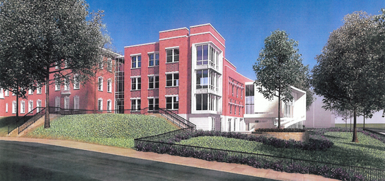
I finally got some images of the proposed Janney School extension. I like it – but it could have been better. With a few objections, I like its conception. Devrouax + Purnell, best known for the Washington Convention Center, the Pepco Building, and Nationals Park, here produced an interesting and attractive school building. However, the location where they have chosen to place the wing results in a lost opportunity for Janney and the community in general. Like too many developers and architects, they approached Tenleytown planning to not upset the status quo. However, any public facility should be designed with an eye to the future – and the current state of Tenleytown cannot last.
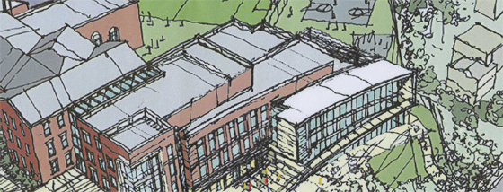
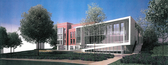
Beginning with the generous setback along 42nd street, the architects attempted to hide the building as much as possible, so as not to intrude on the neighborhood. Although the Albemarle façade extends to the cornice line of the 1923 building, the masses of the building gently diminish into a low white structure that encloses the gym. Moving south along the western face, the building curves gently, from a tower to the first private residence down the block. The architects employed the shape subtly, repeating the curve in each mass to limit its effects. It does successfully integrate into the site.
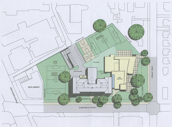
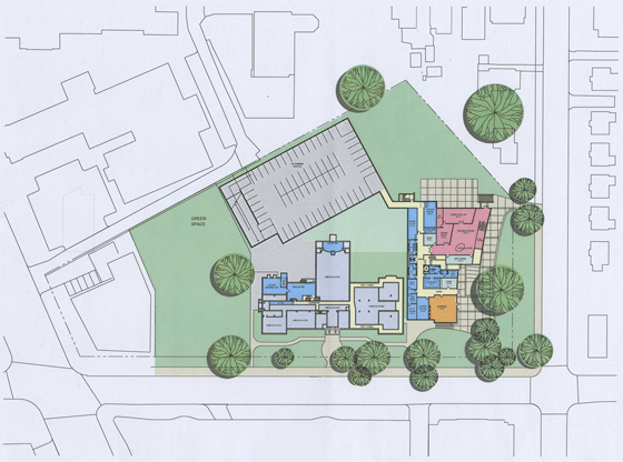
However, this hesitant approach is not appropriate here. The architects should not have set the building back from the street so much. In doing so, they have reduced the feeling of enclosure afforded by a consistent streetwall, produced an marginally useful green space, and missed an opportunity to relocate the playing field at the center of the Tenley Library Public-Private Partnership debacle.
For the 2007 plan to build a library with several floors of condominiums on top focused on the loss of recreation space (the rightmost field in the image above) for Janney Students. Some of that space would be consumed in the footprint of the condominium structure. However, had the architects located the new wing closer to the property line, they might have opened up space to relocate the eastern soccer field. In a political environment as vicious as Tenleytown’s, a mutually agreeable solution would have been a rare happy ending.
That lost opportunity is my main complaint – but there’s much more review below.
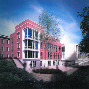
Although the site configuration disappoints, its integration into the historical context comes off better. And when the architects employed their own mode, as at the south end of the addition, they produced a refined and beautiful modern structure that outshines the original structure.
I’ve never thought that Janney was a particularly beautiful or notable building, so I don’t have strong opinions about its preservation. The original architect, Albert Harris, designed many finer buildings, such as the nearby Murch and Deal Schools, and even the Engine 31 Firehouse over on Connecticut. Nonetheless, the architects took a delicate approach to fitting the addition into its context.
Marshall Purnell and his design team placed a glass atrium between the new building and the original. The space distances the original structure from the new and preserves the western façade, which parents wanted to save. Here, glass performs at its best: it either reflects its surroundings or disappears through transparency. This shadow joint allows for more design freedom by preventing a clash of styles.
That freedom was necessary here. Harris’s building coheres through strict symmetry, so adding an identical extension to one side presents a challenge. There had to be a break in the massing. Rather than upsetting the order of the existing building, a contrast in both form and style lets the extension excel on its own. In spite of the opportunity to attempt something independent, they tried to create an intermediate detail. The result is too different to blend in, but too similar to stand up.
A short expanse of brick, followed by a tower structure forms a somewhat heavy base. Facing the building, another joint passes through the middle of the tower. To the right is a fantastic building; to the left is a stiff attempt at merging the old with the new. If the feathered massing worked, the feathered aesthetics do not. Nine square windows penetrate the wall in a large square grid. Three of those windows sit in a tower meant to turn the corner, while another six are on the main mass a few feet back.
The window grid overlaps the physical bulk, squashing the perception of motion and disrupting the tower’s thrust. The grid has the sturdy proportions of a center of focus. Why is it split up? And why are there patterned bricks between stories, emphasizing verticality? Similarly, the tower’s bulk invites comparison to the south wing of the building. Too small.
On the left side of the joint, a large window breaks the corner. Here, the feathering works. One can immediately draw a connection between the mullions of the glass atrium and turn the corner to the very successful west side.
What I see in the rendering above is a building that stands on its own. The cleverly asymmetrical structure wraps around an elegant window treatment, shifting from wall to roof to wall to floor. The ambiguity lends one to perceive an incomplete, open volume that appears filled with potential while also safe. Plus, the design neatly integrates an arcade and gateway into the staircase. All together, the structure is a dramatic entryway to the schoolyard.
The short section of brick just to the north of the gym succeeds aesthetically. The recent vogue for asymmetric, arbitrary fenestration appears – but is adapted. On a few condos downtown, the randomness looks and feels messy, but here, the architects encapsulated the apparent disorder within a well-proportioned volume, and penetrated the forms with crisp brise-soleils. Indeed, on the west and south faces, the building bristles with beautiful examples of sustainability through design.
An arcade on the south side cuts down on the direct summer sunlight entering the gym, while ambient light still enters the gym through the glass walls. The fenestration and massing similarly shade the building and reduce glare. The open corner and the larger windows on the north similarly let in ambient light, but their position limits heat gain. The building has not received LEED certification, however both energy and materials credits are required by the specification.
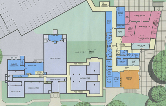
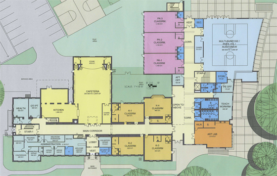
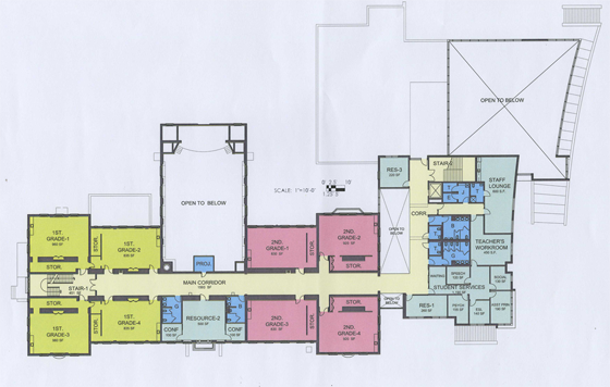
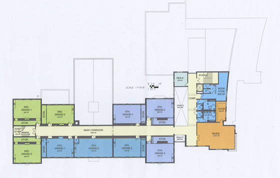
I only feel qualified looking at the exterior of the building and its urban conditions. I know parents are very opinionated about the layout of educational spaces. I do not feel prepared to critique those too much. Nonetheless, I’ll take a quick tour. In these images, north is at the bottom.
Here’s the plan of the lower level and basement. It’s unfortunate Janney called for so many parking spaces. With a metro stop nearby, DCPS should be encouraging its employees to take public transit most days. It would be a public service, from public servants.
Now, the actual basement is interesting. The lower floor contains a library and a science classroom. I like the potential of taking a science class outside. The library is moved to the glassy part of the lower level from the main building. Its floorplan includes a sunken storytelling area. I’d like to see more about this space. Also, note the presence of a backup generator in the east wing (left).
The first floor seems good to me. The addition contains The strong circulation axes that blend into alcoves and open spaces handle large volumes of traffic well, but I can’t speak about orderly lines of kids. Administrative spaces are clustered in the east wing and near the door. Kindergarten classes are in the west wing, while pre-K classes occupy three new classrooms in the addition. Although the cafeteria remains in the current building and retains its stage. Only the gym moves out to the new wing from the current space.
One floor above, the second and first grade classes occupy most of the space. On the west side, the plan removes the staircase to make a path to the new wing. The second-floor connection to the new building passes through the atrium on a bridge, over to rooms for ESL, therapy, and other student needs facilities that are now expected in schools.
Likewise, the large bathrooms and staircases in the new wing are emblematic of changing needs. Much renovation work done over the past twenty years has been to bring public buildings up to more rigorous accessibility and lifesafety codes. Updating the technology and infrastructure is still more obligatory work required for an existing building.
Finally, the third floor. The third, fourth and fifth grade classrooms occupy the original building. A good amount of room was vacated by moving the sixth grade to Deal Middle School, which is being expanded by Quinn Evans Architects and now serves grades 6-9. Also on the top floor, students will find the music classroom, which I believe is currently housed in a demountable on the site of the future new wing.
That is all. I hope Devrouax and Purnell continues to refine the project. With some revisions and continued input from residents, the new wing could end up as something great, and another step in the right direction for Tenleytown.
The school looks good but it would have been much better with the mixed-use library next to it.
Seriously, Ben. I like the building (except for the north side), but damn, is it in the wrong place. This great walkable neighborhood at tenleytown has got some suburban headcrab running it.
Neil– do you have renderings of the proposal from Douglas Development for Babe’s Billiards? I don’t know if it is beyond your ability but it would be interesting to see how Janney, the library, a mixed-use Safeway, new AU buildings and Douglas Development’s condos look together. Again, this argues for the need for the Office of Planning to do a new comprehensive plan for Tenley.
I don’t think we’ll see plans for that building until they’re ready to present them.
And I don’t have accurate enough plans to do any of that. AU hasn’t even released real plans. Just planning diagrams. We won’t have to wait long for much. It’s spring, and that means it’s construction season.