When I heard today that Bjarke Ingels Group will be producing a master plan for the core block of the Smithsonian Institution, I was not really thrilled. Their work is engaging and sharp, but it’s also can come across as trendy and disposable. The buildings I have visited feel cheap and unsubtle in their handling spaces. It’s personal taste thing, but I don’t like what they’ve built.
But then I remembered that the great thing about master plans is that you don’t have to follow them very closely, so you can keep what you want and take what you need. The drawings and guidelines are not permanent impositions on the urban landscape. They’re ideas. Ideas are cheap and BIG is good at rethinking basic concepts in fresh ways, even going so far as to be able to propose how to realistically bring unconventional projects to reality. I don’t know if I would like to see Morphosis’s intervention in the Arts and Industries building, but it did cause me to look at the building again, to see its qualities and how it might be adapted.
Too much architecture in DC starts out tame and ends up lame. Sometimes its because of design review and sometimes its because of style anxiety. So, it’s important to start thinking big here, and dial it down when it comes to a serious proposal. So, I say we see what BIG proposes for what has to be the most heterogenous block in DC – The Castle, the Hirschorn, the Freer, and the Ripley Center – that’s most of the past two centuries’ movements – and let their ideas challenge whatever architects complete each project.
In the intervening years between my departure from DC and the moment that you are reading these words, a number of things have changed in Tenleytown. So it’s worth showing how upper northwest has unfrozen and opened up to a modest amount of growth. Rather than focus on the ongoing political developments, take a look at projects that have finally become buildings.
While back in DC recently, I took a look around Southwest DC. There’s much to see, but not much to say. So let me highlight two interesting projects. The first is Hense Brewer’s repainting of the Friendship Baptist Church building behind the old Randall School. I think it’s a pretty cool way to wait out a development project, at the least.
The Randall School itself has been intermittently poised to become a boutique something or another since 2006, when the Corcoran and Monument Realty bought it. Neither of those institutions is doing so well right now, but Telesis and the Rubell Foundation, a major contemporary art collection, have plans to put an apartment-museum building behind the heritage buildings, with Bing Thom designing. We shall see, yes? The other is Capitol Park Plaza, a midcentury building, which has a surprisingly warm facade for the period.
No surprise to discover that this is one of the buildings in the area designed by Chloethiel Woodard Smith. A noted local architect who happened to be a woman at the time when that raised eyebrows, Smith was quite shrewd here, registering the slab form with details that let humans comfortably occupy austere forms. First, she used tiles to enclose private porches. These balconies are massed in vertical lines at either end and staggered in the middle. This detail diminishes the monotony and overwhelming scale of the building without losing the exhilaration of long lines. The balconies also allow the roof to extend over the building envelope, reducing leaks, while keeping a strong outer volumetric edge that expresses the modernist formal fixation of a flat, uniform edge. The pure geometry of modernist architecture can be difficult or expensive to register in actual building, so in a compromise, Smith simply implies it.
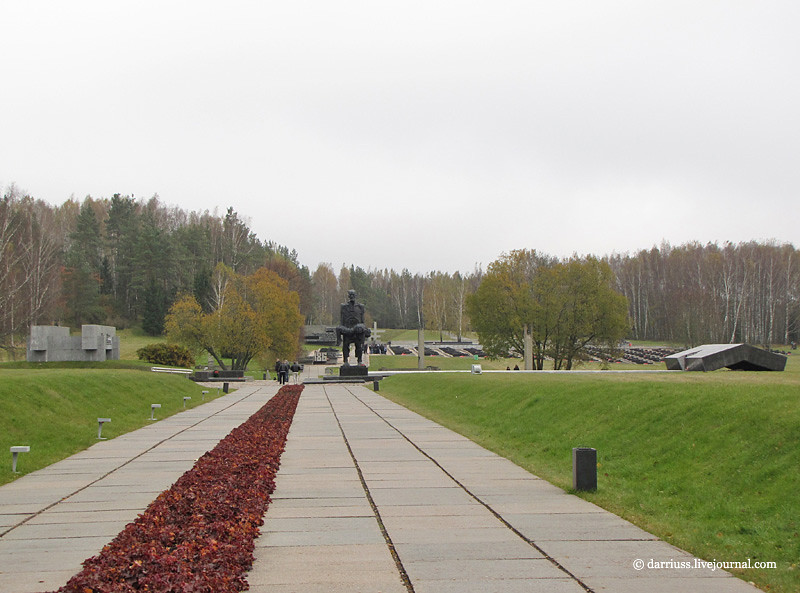
Sov-arch continues to continues to offer up unknown treasures of the FSU. Take a look at these three incredible memorials built during the Brezhnev era, published by LJ user dariuss.
The first is a monument to the victims of the Salaspis concentration camp, not far from Riga, Latvia. The photographs are evocative enough to not need the Russian text in the original post, but I’ll provide a short description for non-slavofils.
You enter the complex through the woods and travel under a massive concrete bar, which appears to have come to rest askew on a black granite block. It is referred to as the “Border between Life and Death.” Beyond it is a set of allegorical statues, including “Humiliation,” “The Mother,” and “Unbroken.” The concrete foundations of the barracks remain in the ground, contrasting with brutalist concrete beams that hover, cantilevered from memorial markers. Permeating the site is the deep ticking of a metronome, meant to evoke the passage of time, a heartbeat, and death.
Having walked around the site, the massive concrete beam reveals itself to be a building. Passing over a razor-thin concrete stairway, you enter a long, skylit hall, walking up a monumental stair to a viewing area and back down into a small exhibit. The allegory is a little too heavy-handed for my taste, but I think the images speak for themselves.
The second site is Khatyn, in Belarus. The site is a little bit more complex, covering the extents of a former town named Khatyn, which was obliterated by the invading Nazi army for harboring partizan activity in 1943. The site should not be confused with the location of the Katyn massacre – more on that later.
Khatyn is explicitly a landscape memorial, employing the strong gestures of Brezhnev-era architecture over large expanses of ground and without a strong central focus. It’s less iconic than Salaspils, but its architecture still has the same grim impact.
Down a ramp, visitors are greeted by a monumental statue of a man holding a dead child, entitled the “Unconquered Man.” The image is apparently based on the one survivor of the down, a blacksmith, who found his son shot in a barn. So, you have a great example of socialist realist use of a real person idealized to represent a larger population. The whole site, in fact, is a synecdoche for all of the towns massacred by the German army. A man is to Man as Khatyn is to the Motherland.
Adjacent to the statue is a white slab that caps the mass grave and there is a bent slab of black marble meant to remind visitors of the barn where most of the town was burned. Beyond this is a wall of remembrance and a “Cemetery of Villages” commemorating the 186 Belorussian towns lost during World War II. 186 black marble urns filled with ground from their respective villages stretch out into a huge field. A black platform contains three birch trees and an eternal flame to symbolize the 1/4 of all Belorussians who died during the war.
All around the memorial axis are monuments on the site of each structure that existed at the time of the massacre. Paths follow the original streets, symbols of an index, like the Cretto di Burri. The former house sites are bounded by concrete beams. Bell towers inscribed with the names of residents stand in for the chimneys. Even wells are marked with marble platforms and concrete roofs.
Finally, The third is the tiny Dalva complex, located about ninteen miles to the north. Its architectural elements are similar to Khatyn’s, but I think that the concrete beams surrounding former sites are more elegantly abstract. On the other hand, the beam assemblages are punctuated with bronze recreations of household objects like vases or teddy bears.
Photos from Khatyn and Dalva are in the same post.
These three memorials, built from 1967-1973 are emblematic of Soviet design at that time. What distinguishes these memorials from earlier Stalinist is the emphasis of human suffering and the effort to instill a sense of loss in other people. The strong emphasis on representation seen in Stalinism remains, but the new generation adds expressionist gestures and compositional abstraction to Socialist Realism.
Like all memorials, they also reflect the political ideology of the time. Part of the purpose of building such extravagant memorials was to focus regional antagonism towards German Fascism and away from Stalinist repression without overtly denying that anything happened. This is particularly in the case of the Khatyn memorial, where the names were similar enough between Katyn (Катынь) and Khatyn (Хатынь) to misdirect people.
Yet on the other hand, these sites mark legitimate sites of atrocities that occurred to people who were caught in world history. So, the ambiguity of architecture, that it generally means nothing external to its own form, works to its advantage. Even as the ambiguity between Khatyn and Katyn casts a shadow over the memorial, the ambiguity also prevents it from being simply a political tool of the regime. Compare this to the Stalinist memorials in the Tiergarten or Vienna, whose message and representation cannot be mistaken.
Douglas Development’s planned building at Brandywine and Wisconsin NW.
A building proposed for Tenleytown deserves praise for putting density in the right spot, but its design is too fragile to contribute to the character of Tenleytown. Although the building fills the majority of the lot and is lined with retail, its architecture misses the mark. Consisting of a set of boxy volumes organized through contextual relationships, the building is neither an interesting work of architecture nor a quiet background building.
The Bond at Tenley suffers from overcomposition. In order to break up the bulk, designers at Shalom Baranes Associates have used large-scale overlapping formal figures to break down the sense that the building is a single, solid object. These shapes mostly refer to differences in the urban context. The architects, Shalom Baranes and Associates, then intersected and manipulated them into each other in order to diminish the presence of the building’s mass.
However, at smaller scales and different locations, the same figures are repeated: blocks and grids that overlap and glance by each other, repeating the same general patterns. Rather than using the shifts of scale to contradict figures or develop simplicity, Baranes have jostled oversized parts to produce the architecture.
PUD filings and renderings made available on the project’s website show the facades forming principally forming a thick bar along Wisconsin Avenue. From this block a pane of gray metal splits out to match the north-south orientation of the city’s grid and the Brandywine Street façade. By itself, he scissor neatly registers the odd angle formed between the old Georgetown Pike and the city’s grid, while opening up to the street. But then there’s the brick elevator tower and a separate set of bay windows and the parapet, and a dozen different windows.
But that’s not it. The retail strip is articulated as entirely separate from the top of the building. A second color of terracotta runs up the middle of the Wisconsin side, implying another, imaginary volume. Then, there are several tiny balconies protruding from the front, some of which are created by the formal moves, and others seem arbitrary. A look at the floorplans reveals a tortured façade that generally adds up to nothing in particular.
With all of these inflections, what do any of them mean? What part of the context or urban form does the building highlight? A more limited number of operations, with a greater depth of detail would produce a better environment for passers-by. A building with more depth would stand on its own, even as other buildings fill up the neighboring lots and residents become inured to its presence.
Consider the difference between the sounds of two popular summer pastimes: crashing waves and fireworks. One is a repetitive, muffled noise with numerous subtleties, such that the slightest change in timing can make you hold your breath. The other is loud, arranged for variety and effect, and very, very loud. Worse, Baranes’ design is like a fireworks show where every explosion is meant to drown out the noise of every other explosion, so you can’t pin a boom to a flash or react to one before the other. Which one would you rather live in?
It’s not entirely fair to pick on this building, but it is representative of the city’s reputation. When national publications criticize Washington for its conservatism, they are not talking about the traditionalist works, they are talking about the endless formalized reference to context, uncommitted postmodernism, high-end banal glass, and the architectural equivalent of the Rickey, the plaid grid of featureless panels.
However, the towards something more lively is already embedded in the design. The architects at SBA have called for a terracotta rainscreen for the Wisconsin Avenue facade. The systems used offer opportunity for more variety and greater sustainability. Baranes have already successfully employed this kind of exterior curtainwall system at Waterfront Station. On a smaller project like this one, they could be more experimental.
Modern terracotta screen systems have the potential to permit greater architectural variation than what is be possible with glass panels or brick veneer. In addition to a variable texture over the surface, dimensions and spacing and profile of each individual panel can vary. It is possible to use well-established fabrication technology to control the variability precisely, what architects tend to call “parametric.” These mass-producible systems that permit subtle differentiation along the façade, such that buildings could take on an approach with roots as much in the Singer Loft Building as 290 Mulberry Street.
The design of this particular building is important, because it will set the tone for the coming development of this neighborhood, as it diversifies and intensifies. More generally, the building represents a particular fixation of Washington architects: design from context. SBA is one of the a-list architecture firms of the DC area, and already has a presence in Tenleytown, the excellent Cityline. A clean design that develops complexity without ostentatiousness is entirely possible.
If Tenleytown is to look different from Downtown, this is where the distinction can start to be made. This is the first building of a coming regeneration. The importance of setting the tone is important. Tenleytown needs transit oriented development with enough cohesion and activity to maintain grow its identity. Simply deferring to the mediocre context will not develop the neighborhood, but merely perpetuate the present state in nicer materials.
Rather than use its influence to oppose all design, ANC 3E and Tenleytown should work with the developer to produce a better design, one with rhythms and scale that relate to the street and surroundings while bringing something new and vital to the area. In a phrase, the building should be the amenity.
If you look at a map of the old convention center site, there are six blocks. The southern three are owned by Hines-Archstone and are being designed by Foster + Partners and Shalom Baranes. Buildings there are now well above ground, destined for opening in 2013. A park by Gustafson Guthrie Nichol will eventually enliven New York Avenue and the middle block will probably be a hotel once the market shakes out. The last block, though, has been mysterious for years, appropriately noted in this map with a question mark.
The mystery property is owned by the Gould Property Group, headed by well-bearded parking magnate Kingdon Gould, III. It turns out that the project is much further along in development than I had expected: Gould has hired Pickard Chilton to design a rental office building, named 900 New York Avenue. You can find the plans here. Renderings reveal a gold-colored building with expressed floorplates and lots of glass.
Seems like a bit of retro-eighties work, which is odd since Pickard Chilton are known for their glass. Considering that it’s such a massive building it’s unfortunate PCA chose to not express vertical elements to break up the length of the block. The central atrium, on the other hand, looks like a really great opportunity for social space, while the “urban layer” bottom seems primed to enliven the streets. Putting aside my aesthetic preferences, the project will really add vitality to the area. In particular, the large atrium, shown here in ground plan and rendering, looks promising as a space that engages the pedestrian alley.
It’s interesting that the building cantilevers about five feet out over the sidewalk above the second floor. I wonder if this is meant to open up sidewalk space, or if it is a strange reading of the projections law. More renderings here.
All images courtesy Gould Property Group/Pickard Chilton.
The newest edition of the AIA Guide to the Architecture of Washington, DC has been published. This came as a surprise to me, since I bought the last edition just two months before the new one came out. Alas. The rate that the guides are reappearing has been shrinking by half. The Second Edition came out in 1974, Third in 1994, Fourth in 2006, and now Fifth in 2012, with guidebook singularity expected sometime in 2018. This may seem excessive, but it kind of makes sense. DC was losing buildings left and right in 1994, but between 2006 and 2012, DC has seen an unprecedented boom in high-end buildings. Flipping through my sad, obsolescent 4th edition, it’s clear there’s a lot missing.
For example, the 2006 guide has these inadequacies:
There is only one building by Phil Esocoff with a wavy wall. Two, if you count the more pomo 2401 Pennsylvania Avenue from before he opened his own practice. Either way, a visitor would have no idea what Massachusetts Avenue looks like.
The National Money Hole, a prime example of what Rem Koolhaas calls “Junkspace” had not been outfitted in the luxurious marbles we expect of the nation’s Capitol, and was mostly an actual hole.
Division 1 no longer universally evokes military service.
Bing Thom is now the architect everyone pretends to know all about, but back then, he was just a faint goblin told to scare the locals who were sure they’d get a crack at Harry Weese’s Arena Stage.
H Street? Where’s that? David Adjaye? Where’s he from?
No, actually, there have been a lot of architecturally notable buildings built in DC over the past six years. Looking back, it’s kind of insane how much capital was invested in DC real estate. If you’re more interested, G. Martin Moeller, the author, was on Kojo Nnamdi’s show last week. The interview is worth listening to, if you’re unfamiliar with the guide. And the guide is definitely worth having and understandable to the laity.
If you’re like me, you have a perverse fascination with Stalinist architecture. You know all the competitions, who what was getting built, and who was getting condemned in Pravda any given week. So when a project that you’ve overlooked shows up on the internet, you just want to share it with the world.
So, thanks to Arkhobzor, take a look at this forgotten gem: the Soviet Pavilion at the 1939 New York Worlds Fair.
The building is pretty exemplary of Stalinist architecture as executed in a post-constructivist style. Designed by Boris Iofan, it fulfills the representational goals of Socialist Realism with marble statuary, murals, and an amphitheater for informational films. The composition is still rationalist, with a simple circular plan opened unclassically by intersecting it with a square. Massive pylons turn into entry propylea, facing a courtyard and a blood red granite tower supporting a statue dubbed “Joe the Worker” in the American press.
The original plan called for a muscular man to be clad like a classical sculpture, holding up a red star. That changed in the execution, with a man in a jumpsuit replacing the Stakhanovite demigod.
Inside the building, there were dioramas, paintings, and models that showed off the cultural and economic might of the prewar Soviet Union. Perhaps most notably, it included a full-scale mockup of the spectacular moderne Mayakovskaya metro station, mirrored to create the effect of repeated bays. Also present were statues of Stalin and Lenin. The statue of Stalin is a smaller version of the one that stands in the Muzeon park, defaced.
I don’t have much else to say, but I’d take a look at the following posts about the building for the incredible images.
All-singing, all-dancing design giant AECOM is sponsoring a student design contest for urban-scale interventions in cities with complicated relationships to their borders:
This year, we are seeking integrated design, planning, environmental restoration and engineering responses that address border, gateway and edge/fringe conditions in cities worldwide. Proposals should address urban sites currently facing chronic liveability challenges that are largely the result of a city’s location on a physical, political, cultural or economic border.
Now, I bet they’re are talking about urban centers near international borders, because those borders are much more absolute and lead to fascinating instances of disparity and extrastratecraft as business and humanity grind against governmental systems. Nonetheless, given the expectation of feasibility, I see an opportunity for proposals involving DC because its unusual legal condition is so intensified by its small size, unique economy, and structural formation.
Consider the consequences of legislative boundaries around DC: voting rights, income tax losses, diminished school funding, job opportunity, metro funding, etc. Or the geographic limitations of the Potomac, Anacostia, and Rock Creek Park: income distribution, commuting bottlenecks, racial division, and so on. Finally, what about the relationship of DC to the rest of the United States and the world? DC requires the usual things cities import, like food, but it also transfers enormous amounts of wealth, power, and human capital globally. Just because this infrastructure is not physical, does not mean that it does not have physical consequences, e.g. the security duck and the extensive but inadequate infrastructure.
I suppose that the crises are less severe in DC, but I don’t think design will solve these problems. Instead, the curiousness of Greater Washington’s legal structure can be a much more subtle way of understanding the mechanics of government.