Forest Glen Seminary: An Unintentional Project
So, it’s been a while, right? Well sometimes you get stuck and you just have to back away from the block. If you’ve fortgotten the previous installments, they’re here, and here. One more will follow in about a week. Alright.

back-from-condo

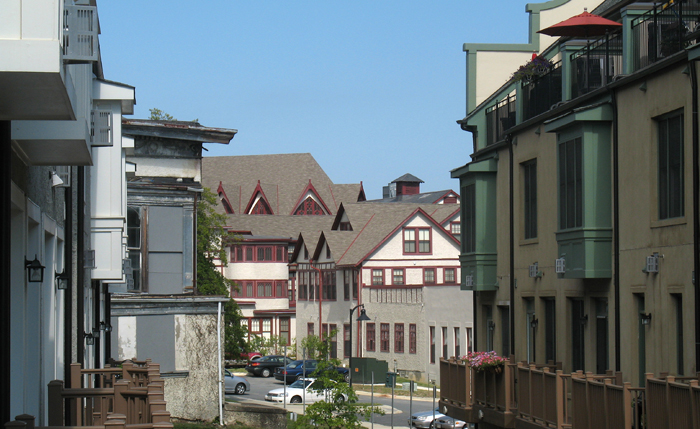
But from the enormous source material of the existing buildings, the Alexander Company took what opportunities it had and exploited them into a quiet celebration of the specific context. The original buildings, despite their conversion to a warren of private apartments and condominiums, have kept of their idiosyncrasies. In spite of sparkling new halogen lights and granite countertops, the apartments retain the unique elements that make the buildings meaningful to residents.

Veazey Walgreens

veazy walgreens
Arbitrarily messy and unconsidered.

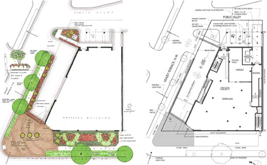
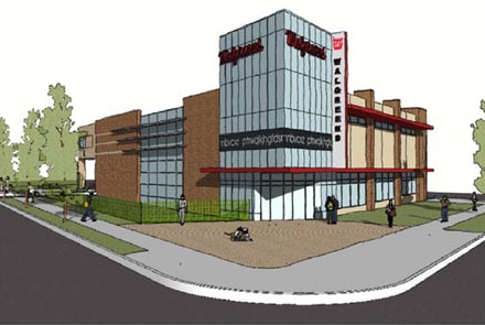
Seen here is the new Walgreens in Van Ness, at Veazey & Connecticut. A big improvement on the gas station that’s there, and an even bigger improvement over the previous plans. In terms of land use, the site would be better as a multistory building, and not as another chain convenience store, but it’s also limited by zoning.

Plantings and floorplan.

Designed by Rust|Orling, I think the building is a really poor imitation of a mid-mod style, an eyesore in a place where we don’t need any more. R|O are otherwise a good firm with a keen ability to manifest architectural diversity, but it looks like modern architecture is not their strong suite.  They’re also restoring the art deco Walgreens in Cleveland Park and are the designers of Potomac Yards.

Construction has not begun, and these are working renderings.

Forest Glen Seminary: One Thing Leads to Another

Part two of a four-part essay exploring context, typology, and interpretation. Comments encouraged.

fglinden

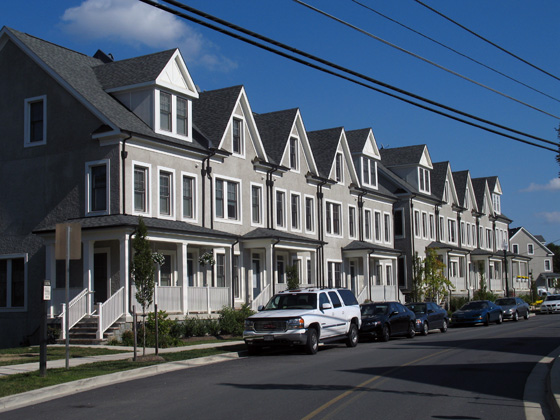
Against rich complexity of the old Seminary, the houses designed by EYA are then a real letdown. They carry the superficial veneer of “context” that is endemic to New Urbanist planning and its most visible error. To be clear, they are not abominations, but they are dull and only stylistically similar to the outré conglomeration across the street. The application of traditional elements here fulfills a requirement that new buildings  respect the architecture of the historic landmark. Okay, sure, sounds good, but the legislation is fairly scant in the details of execution. The easy option, a cynical abdication of artistic responsibility, is to copy the notions of form in hazy facsimile and slap it on off-the-shelf buildings. Even where the designs are competent, the lack of sensitivity results in tepid mediocrity.

Forest Glen Seminary: Into the Woods

Part one of a four-part essay exploring context, typology, and interpretation. Comments encouraged.

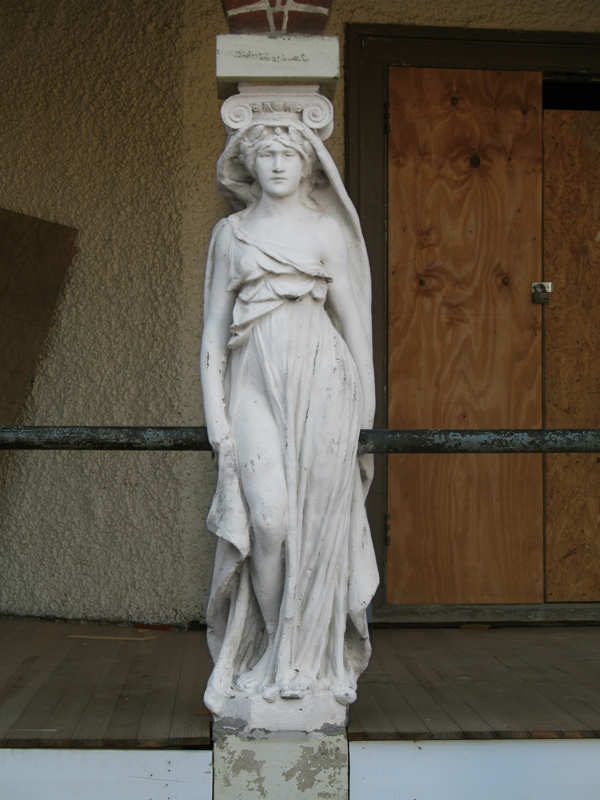
Classicism at its horniest

Hidden among a leafy scattering of houses and trees, Forest Glen Seminary is a jumble of vernacular buildings unlike any of the temples of boxes that define Washington. Its buildings, both magnificent and ludicrous amount to a dignified campiness that defies expectations to be one of the most profoundly interesting places encircled by the Beltway. Once constituting a women’s college when that meant a two-year Mrs. degree, the buildings are once again becoming domestic space, the more private areas cut into condos and the core of the complex, rental units. Scattered around the area, turn-of-the-century houses are being renovated and new housing by the urbanist developer EYA has just been finished. Through the site’s history, radical changes have shaped its form, but none so radical as the current shift in context.