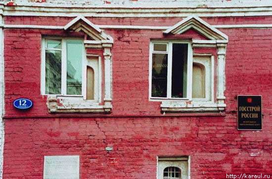
The sign reads “Russian State Department of Buildings.”

Landscape-oriented architecture blog Pruned is carrying an excellent post about the wastewater-recovering wetland installed at the center of their new campus. The LEED Platinum building, which opened in 2007, was designed by KieranTimberlake of Philadelphia. The firm designed the building to recycle all of its graywater and brownwater through an elaborate wetland, as one of its many sustainable features. If you go visit the building, the trickle filter is wrapped with a sign that explains how the system works. The sign rests at a child’s height and leads readers around and around with arrows, which I find a little obnoxious. Luckily, Pruned has explained the process more clearly, so without further ado, go read their article.
Pruned also notes a very important civic issue this solves: the cost of runoff on municipalities and local watersheds. This beautiful oasis reduces the amount of water that flows out of the building, or flows off the hard surfaces of the building (there is a separate rainwater recycling system), and into Rock Creek and the White Plains treatment facility. Among the general public, a lot is made of water conservation (which this building also assists), but the strain on public facilities caused by sewage and stormwater is quite severe. At least up in Cleveland Park and Tobago, we do not have combined sewer overflow systems, like the do downtown.
For elite Washingtonians worried that their children will become astronauts or mutant mer-men, the recycled water is dyed blue with a non-toxic coloring agent and reused in toilets and janitorial sinks. Meanwhile, St. Albans School’s non-LEED Marriott Hall, by SOM is in the interior-fit out phase, and has just gained its green roofs. More on that some other time.
Against rich complexity of the old Seminary, the houses designed by EYA are then a real letdown. They carry the superficial veneer of “context” that is endemic to New Urbanist planning and its most visible error. To be clear, they are not abominations, but they are dull and only stylistically similar to the outré conglomeration across the street. The application of traditional elements here fulfills a requirement that new buildings respect the architecture of the historic landmark. Okay, sure, sounds good, but the legislation is fairly scant in the details of execution. The easy option, a cynical abdication of artistic responsibility, is to copy the notions of form in hazy facsimile and slap it on off-the-shelf buildings. Even where the designs are competent, the lack of sensitivity results in tepid mediocrity.
Continue reading ➞ Forest Glen Seminary: One Thing Leads to Another