Small Town Politics: No dialogue with Safeway

seatingAfter the heated debate at the November ANC 3E meeting, you might have expected an even fiercer confrontation this past Thursday.  There were even promises of it.
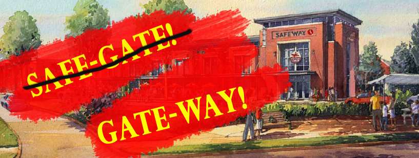
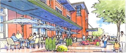
But it wasn’t. Instead, anger had been supplanted with dismayed grouchiness. While Avis Black, the regional real estate manager attended the meeting, she entrusted the presentation to Brian O’Looney, an associate principal at the architecture firm Torti Gallas. In a series of slides, he demonstrated the great lengths the architects had gone to in making the bulk of the structure as unobtrusive as possible without sacrificing the program of the store.
Yet, that program, the functional concept of the store, is precisely the problem. The grocery store, and all its subsidiary stores, such as a Starbucks, would face inward, contained in one enormous envelope with a unitary entrance. To their credit, the architects have tried to address neighbor’s concerns, but their efforts are like putting a rhinoceros in a corset. When called to cut down the size of the proposed store by 1,000 square feet, around 2% of the total area, Ms. Black simply refused.
The other sources of contention revolved around automobility. Noise emandating from the garage concerned one 43rd street resident in particular. Out front, it became clear that Safeway did not want to remove a slip lane between Wisconsin and 42nd St. because they intended it use it for cars to idle for grocery pick up. That a reconfigured intersection would be safer for pedestrians, produce a better pocket park, and reduce the amount of speeding on 42nd was not worth the change.
Unfortunately, critics of the store could not put up a consistent front, entering tangents about a number of minor elements – some of which were created by other halfhearted concessions.  Whose interests does the store need to address? The hottest moment of a debate came when an irate Georgetown Day teacher called out the proposal to move the controversial rear walkway, which ran from the school to the store entrance, inside the garage. The teacher declared, indignantly, that GDS was a neighbor too.
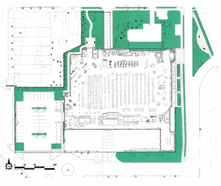
And beyond that, how about the residents of a few blocks away – or the region? At what point does a corporation that entered into public debate, as part of the Planned Unit Development process, have to address the public benefits. Safeway has tried to reduce the impact on adjacent neighbors. However, the store needs to take into consideration public issues, like regional planning, street life, and future growth in the area. A beautiful wall like the one to be built along 42nd is still just a wall. With the currently proposed monolithic store, Safeway cannot be urban.
What did appear was a conclusive sense that dialogue had failed between neighbors and the store. Safeway had made no promises and now promised even less. The neighbors in attendance seemed to not expect any changes. So the potential for mixed use and sustainable neighborhood design is lost, unless Safeway reconsiders their plans, or the zoning commission rejects them. The site has much potential, but Safeway is choosing to  squander that.
After the heated debate at the November ANC 3E meeting, you might have expected an even fiercer confrontation this past Thursday.  There were even promises of it.

But it wasn’t. Instead, anger had been supplanted with dismayed grouchiness. While Avis Black, the regional real estate manager attended the meeting, she entrusted the presentation to Brian O’Looney, an associate principal at the architecture firm Torti Gallas. In a series of slides, he demonstrated the great lengths the architects had gone to in making the bulk of the structure as unobtrusive as possible without sacrificing the program of the store.

Yet, that program, the functional concept of the store, is precisely the problem. The grocery store, and all its subsidiary stores, such as a Starbucks, would face inward, contained in one enormous envelope with a unitary entrance. To their credit, the architects have tried to address neighbor’s concerns, but their efforts are like putting a rhinoceros in a corset. When called to cut down the size of the proposed store by 1,000 square feet, around 2% of the total area, Ms. Black simply refused.

The other sources of contention revolved around automobility. Noise emandating from the garage concerned one 43rd street resident in particular. Out front, it became clear that Safeway did not want to remove a slip lane between Wisconsin and 42nd St. because they intended it use it for cars to idle for grocery pick up. That a reconfigured intersection would be safer for pedestrians, produce a better pocket park, and reduce the amount of speeding on 42nd was not worth the change.

Unfortunately, critics of the store could not put up a consistent front, entering tangents about a number of minor elements – some of which were created by other halfhearted concessions.  Whose interests does the store need to address? The hottest moment of a debate came when an irate teacher at the adjacent Georgetown Day School called out the proposal to move the controversial rear walkway, which ran from the school to the store entrance, inside the garage. The teacher declared, indignantly, that GDS was a neighbor too.

Just a little too large.
Just a little too large for anyone's good.

And beyond that, how about the residents of a few blocks away – or the region? At what point does a corporation that entered into public debate, as part of the Planned Unit Development process, have to address the public benefits. Safeway has tried to reduce the impact on adjacent neighbors. However, the store needs to take into consideration public issues, like regional planning, street life, and future growth in the area. A beautiful wall like the one to be built along 42nd is still just a wall. With the currently proposed monolithic store, Safeway cannot be urban.

What did appear was a conclusive sense that dialogue had failed between neighbors and the store. Safeway had made no promises and now promised even less. The neighbors in attendance seemed to not expect any changes. So the potential for mixed use and sustainable neighborhood design is lost, unless Safeway reconsiders their plans, or the zoning commission rejects them. The site has much potential, but Safeway is choosing to  squander that.

Reno Park Update 091017: Nolli Fails

davenport-street-murch

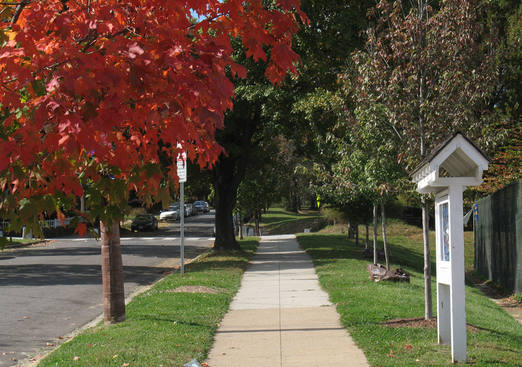
This is what the average street looks like in Tobago. 30 foot setback, grass, buildings.

can-nolli

This is a part of the Nolli Plan. It’s a famous figure-ground drawing of Rome by a man of the same name that makes a visual comparison between structures and open space. There had been many drawings of Rome before, but Nolli’s particular drawing innovates on the others by showing the ground floor interior spaces or courtyards as part of the white space. It revealed columns and arcades, relating architecture to the urban form.

Reburbia and the future of suburbs

Frogs Dream, the winner, brings back the wetlands
Frog's Dream, the winner, brings back the wetlands

Beginning with this post, I’ll be writing on some local and urbanism-related issues at Greater Greater Washington from time to time.

In “Eyes That Do Not See,” Le Corbusier noted that airplane designers were unable to achieve heavier-than air flight until they understood the underlying issues of aeronautics – until they had posed the problem correctly. Until the tinkerers stopped imitating birds and kites and began investigating lift in a scientific way, they just produced spectacular failures and beautiful dreams. So, when looking through the finalists to the Reburbia suburban redesign contest, it was curious to see how, although many projects owe a debt to the Swiss architect, a great deal show confusion about the problems of “suburbia.”

Reburbia was a design competition where designers were invited to remodel, reuse, redevelop, and restructure the landscape of suburban development. Sponsored by Inhabitat and Dwell, the contest presented 20 finalists and a number of other notable entries for public viewing. Although they’ve already announced winners, the issues that appear in the submissions deserve more discussion. These open competitions are like fashion shows, where the offerings exist as inspiration for other designers more than practical solutions. Some of the ideas tossed around here might make their way into an abandoned mall, but the ideas that grow out of Reburbia are more important. As architects, planners, and citizens look for solution, we have to keep in mind what the problems are to judge any given solution.

Edible Parking? Bumper Crop
Edible Parking? "Bumper Crop"

Declaring that the suburbs need to be re-burbed begs the question of how much, and which kinds, of suburban development are unsustainable, undesirable, or inefficient.  Following that line of thought, designers need to consider whether mitigation of costs can solve an issue, whether simply pulling out unfair subsidies would help, or whether a total revamp has to occur. The projects in Reburbia revolved around a handful of issues that are unique to automobile-dependent sprawl, as well as others that all cities face. The entrants posed their problems around land use, energy waste, sustainable energy production, loss of natural habitats, low density, unappealing or unwalkable street design, transportation inefficiency, water runoff, and the legal mandates for development.