Don’t Just Preserve History at Tenley Campus, Interpret It.

With a more creative approach to preservation, American University’s plan for its Tenley Campus could produce better urban design and a more compelling presentation of the site’s history.

Capital Hall and its lawn. Image: Wikipedia.

AU has agreed to preserve several structures on the site: the a former farmhouse called Dunblane House, Capital Hall the main building visible from Tenley Circle, and a Chapel. Together, these buildings form an axis that the Historic Preservation Office has insisted on preserving.

The Historic Preservation Office is right to emphasize this axis; it is probably the most interesting part of the site. The architects at SmithGroup have worked within these requirements to create a private quadrangle between the old house and Capital Hall, which looks good so far.

But AU has also decided to build on the footprints of the existing 1950s buildings and not construct anything that would obscure Capital Hall. The buildings are preserved, but no part of the campus will feel different from the others, even if they are in a slightly different style. The new buildings offer no key to understand on the site they inherit.
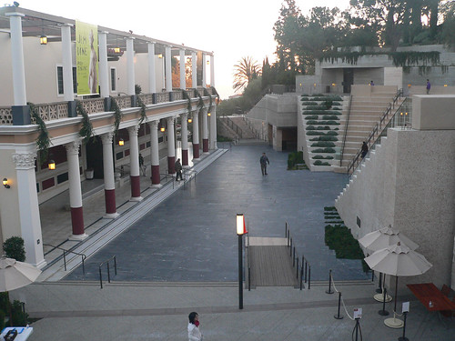
 

An abstracted amphitheater frames the Getty Villa. Image: The Consortium/Flickr

To understand what I mean by interpretation, take a look at Machado & Silvetti’s renovation of the Getty Villa. They combined the pragmatic need for an an entry stairway with architectural promenade that helps visitors understand the museum’s curatorial approach. Treating the 1970s replica of a roman villa as an object in a collection, stairs and pathways frame the building in a sequence that calls to mind an excavation. The stair gives visitors a lens with which to understand the building and clears their minds of the drive out to Malibu.

McMillan Two envisions a Classical Anacostia

mcmillan-two-anacostia-quay

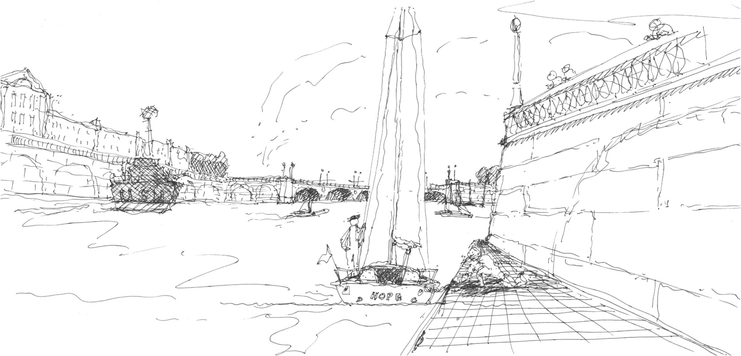
The public character of Washington has grown around two grand plans. First, Charles L’Enfant laid out the city as a sacred grove for the marking of America’s history. One century later, the McMillan Commission restored and expanded upon that original design to include the history of the Nineteenth Century. Now, The city center has grown up in the second hundred years since then, enough for Congress to declare the Mall closed to new development. Meanwhile, the rest of the city has built up or spread out into suburbs. In light of the last fifty years, a group of traditional Washingtonian architects have developed an audacious proposal for the next lifetime of growth, McMillan Two. Fulfilling some less-known intentions of the McMillan Plan with slight modifications, this plan essentially calls for bringing Paris, mansard , Seine and all, to the Capital of the United States.

Developed by the Build DC Initiative and architect Nir Buras in particular, the design has been sponsored by the Mid-Atlantic chapter of the Institute of Classical Architecture and Classical America, the National Civic Arts Society, with some support from the DC chapter of the Congress for New Urbanism. Buras’s philosophy draws hard from tradition: we know what is beautiful and what works – and we should do that. Downplaying strident formal innovation, the relationship buildings have to precedents in a cultural tradition guides design. For McMillan Two, France provides that tradition, particularly L’Enfant’s garden models and the Beaux-arts education of Burnham, McKim, and Olmsted. Though the partners have kept much of the project under wraps, Buras has recently begun sharing the outlines of this radical rethinking of DC’s future, namely that “Washington remains the most beautiful city in the nation.”

current-anacostia-plan
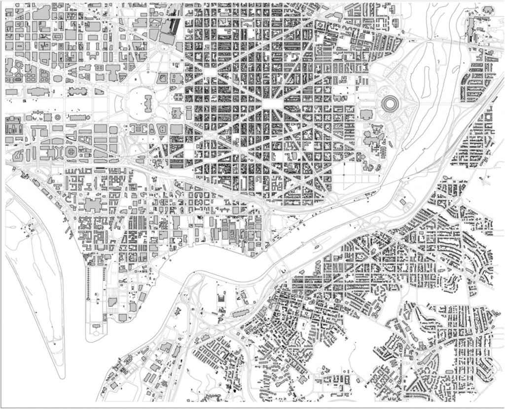
Near Southeast today. All images courtesy Nir Buras.

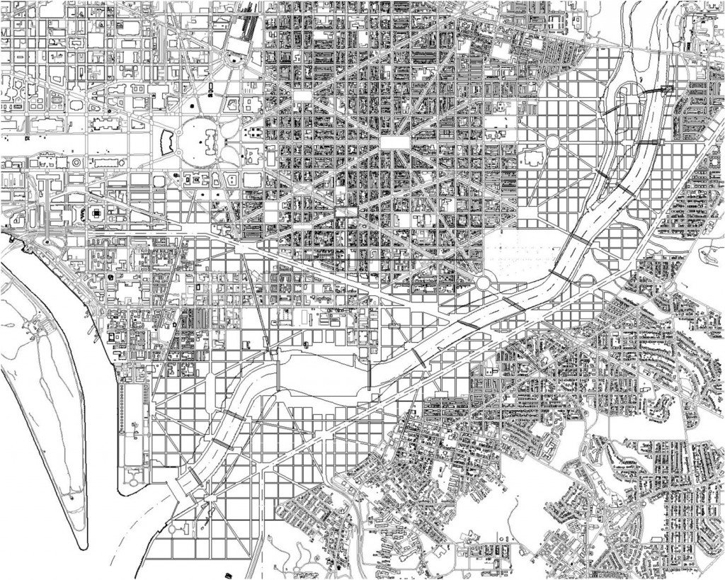
The McMillan Two plan

Two Steps Forward and One Step Back

Cross-posted at Greater Greater Washington.
This past week, Safeway revealed their plans to renovate the Safeway at 42nd and Ellicott Streets, along Wisconsin Avenue in the northern reaches of Tenleytown. What they propose (huge PDF) is a dramatic improvement over the bunker-like current building, and will enliven a dreary section of the neighborhood. However, the project includes no residential or commercial component on top of the new stores, despite its location roughly one-half mile from both the Tenleytown-AU and Friendship Heights Metro stations. Like the TD Banknorth building across Wisconsin Avenue, these patches in the urban fabric will better the community, but without more of a plan, they are just patches.

The new Safeway will activate 42nd Street, which is separated from Wisconsin Avenue by just a small triangular park. Instead of a forbidding blank wall, Safeway plans some outdoor seating for an in-store Starbucks. Residential Ellicott Street will get a landscaped park in front of the store’s substantial setback. The surface parking lot will become an enclosed one-story parking wing, and the loading dock will move to Davenport Street, adjacent to Georgetown Day School, screened from the street by a brick wall.

Courtesy the ARD (how nice of them) and Torti Gallas
Courtesy the ARD and Torti Gallas

Unfortunately, Safeway wanted to be expedient with the design and worked with one of the five neighborhood organizations that claims to represent the community, the Alliance for Rational Development. As their double-plus inaccurate name implies, ARD opposes most, if not all development of sites along Wisconsin and in Tenleytown. Their policies are transit-oriented-denialist, insisting that the area is optimally zoned and built up, and that any more growth will only have negative effects, primarily on the supply of parking.

Some of their concerns for any given project can seem legitimate when viewed without context, ignoring of the multiple benefits of well-designed areas with mixed uses. But Tenleytown’s zoning only allows for densities along a very narrow band on Wisconsin Avenue, closer in form to a suburban arterial than an interconnected city neighborhood. Many other lots, just a block or two from the Metro have no opportunities for development at any scale, because they are zoned as low-density in spite of their location at a major node in the city’s infrastructure network.

Reburbia and the future of suburbs

Frogs Dream, the winner, brings back the wetlands
Frog's Dream, the winner, brings back the wetlands

Beginning with this post, I’ll be writing on some local and urbanism-related issues at Greater Greater Washington from time to time.

In “Eyes That Do Not See,” Le Corbusier noted that airplane designers were unable to achieve heavier-than air flight until they understood the underlying issues of aeronautics – until they had posed the problem correctly. Until the tinkerers stopped imitating birds and kites and began investigating lift in a scientific way, they just produced spectacular failures and beautiful dreams. So, when looking through the finalists to the Reburbia suburban redesign contest, it was curious to see how, although many projects owe a debt to the Swiss architect, a great deal show confusion about the problems of “suburbia.”

Reburbia was a design competition where designers were invited to remodel, reuse, redevelop, and restructure the landscape of suburban development. Sponsored by Inhabitat and Dwell, the contest presented 20 finalists and a number of other notable entries for public viewing. Although they’ve already announced winners, the issues that appear in the submissions deserve more discussion. These open competitions are like fashion shows, where the offerings exist as inspiration for other designers more than practical solutions. Some of the ideas tossed around here might make their way into an abandoned mall, but the ideas that grow out of Reburbia are more important. As architects, planners, and citizens look for solution, we have to keep in mind what the problems are to judge any given solution.

Edible Parking? Bumper Crop
Edible Parking? "Bumper Crop"

Declaring that the suburbs need to be re-burbed begs the question of how much, and which kinds, of suburban development are unsustainable, undesirable, or inefficient.  Following that line of thought, designers need to consider whether mitigation of costs can solve an issue, whether simply pulling out unfair subsidies would help, or whether a total revamp has to occur. The projects in Reburbia revolved around a handful of issues that are unique to automobile-dependent sprawl, as well as others that all cities face. The entrants posed their problems around land use, energy waste, sustainable energy production, loss of natural habitats, low density, unappealing or unwalkable street design, transportation inefficiency, water runoff, and the legal mandates for development.