The six finalists for the design of the National Museum of African-American History and Culture have been revealed, with some very promising and also very disappointing results. There’s not nearly enough information available to see which is really the best building, so I picked the one that I think can be improved upon in a productive way. Remember as you are reading my thoughts that these are in the conceptual design phase, so the architects will be revising the buildings considerably even before the NCPC and CFA get around to prodding the architect for greater contextuality.
I’ve ranked these in ascending order of quality and appropriateness and then got my buddy Sam Rothstein to handicap each one’s chance at selection. The images are linked to high-res versions on the Smithsonian site.
Devrouax + Purnell and Pei Cobb Freed & Partners
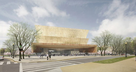
This building is just boring. Where the geometric hardness of the East Wing building works because of amazing edges and perfectly executed details, this building seems to lack them. The wall is a nice Corbusian touch, via the New York Five, and bronzed metal could probably work well in such a monumental space, but it does put me to sleep like some soft twinkling on a piano. Additionally, the rear wall and roof structure is oddly proportioned and mindlessly dull. So, what does this have to do with African-Americans? The roof looks like a quilt… Perhaps this is a concession to the Google Earth era, but this seems like a weak effort from a dying legend. To be honest, I don’t see any aspects of Devrouax and Purnell’s work here.
The take away: Richard Meier wants his wavy wall back.
Odds: Unfortunately, 10:1
Diller Scofidio + Renfro with KlingStubbins
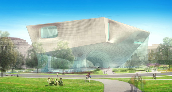
This building, in addition to being way more “conceptual” than the other buildings is horrendously ugly. A lot of my anger at DS+R is also that the renderings don’t show anything close to what it would finally look like, even given a limitless budget. Like watercolors, the renderings present an image that will never be anything close to reality. It floats on glass over a shapeless entry lobby with a dancing Jemima? Their signature rendering style is really beginning to grate as well, especially when executed so poorly. Some of the curves seem to be drawn over again and again sloppily, and the clear superfluousness of the selectively pencilled lines became stupid after it stopped being edgily post-futuristic. It’s like the indie-rock look for architecture. So stop it. Same goes for you, Lewis.Tsurumaki.Lewis.
But all is not lost. They seem to be using Stubbins’ famous aluminum paneling in a totally new, distorted way that does excite and offer a rather fun reference. Similarly, their plan to basically elevate the building over a path from 14th street is a fun touch, if one that is too light for a cultural building.
The take away: Too weird for the mall and probably ugly in real life.
Odds: 1,000,000:1
Antoine Predock and Moody-Nolan
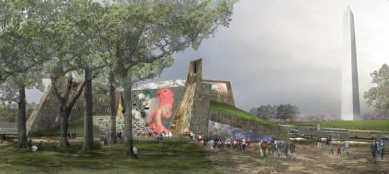
Similar in design concept to Douglas Cardinal‘s National Museum of the American Indian, this option looks a lot like other Predock buildings, just like the NMAI looks like a number of Cardinal buildings. So, it’s cool – cool enough to not look dated after years of flaunting earthiness to the boxes around DC. Yet its formalist expressionism-meets-Great-Falls look doesn’t suggest anything about African-American heritage, so what exactly is being expressed? The location? Perhaps this ersatz naturalism could have a place in DC, but it’s too wild for the mall’s rigid formality. On the other hand, the insertion of a wetland onto the Mall does cause a little smirk to appear on my face. The new swampoodle! So, I’d love to see this building somewhere else in DC just not here.
The take away: Too weird for the mall, not weird enough to be an underdog.
Odds: 10,000,000:1
Philip Freelon and David Adjaye with SmithGroup.
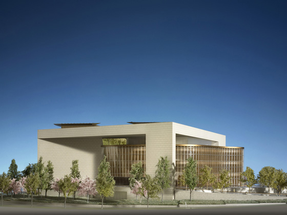
Designed by the architects of some of DC’s new libraries, this is a rather elegant building, with some very sensitive and soft envelope treatments, but ultimately uninspiring. My immediate reaction is that the lobby’s ceiling design is a somewhat better version of the Hall of Memory and Grief in the Museum of the Great Patriotic War in Moscow, but that is a little unfair. The ceiling acts as a continuation of the beautiful copper-enclosed volumes into the lobby from above. It’s fairly attractive, although the base/roof is a bit dull. It really just doesn’t move me, in spite of its sophistication. Proportions are also decidedly non-grand for such a treasure box.
Takeaway: Just not all there.
Odds: 10:1
Moshe Safdie & Associates
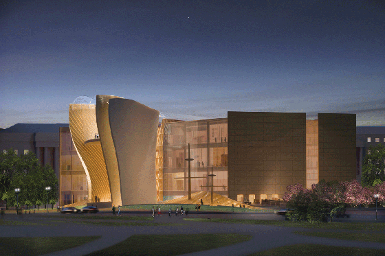
An elegant, careful juxtaposition of shapes that reflects the origin of African descendants while also transforming that pain into beautiful waves. Safdie is one of a few hard-line modernist architects who has really tried to imbue his buildings with sensuous beauty. In many cases he has succeeded, and he does here again. It’s a good final image that actually looks like it tries to relate to the textures, colors, and masses of the neighboring buildings. It’s nice in that it’s just a beautiful building with a few cleverly placed sculptural and symbolic elements that tease at the content inside. It balances the symbolism with expressionistic spaces in a way that will age well.
Unfortunately, its concept seems to emphasize slavery too much. The building, perhaps trying to transform symbols of the crimes against blacks historically becomes mired in the past with its design. Strangely, it apparently has a section for musicians and sports players, which is nice, but a little leaden with connotation. It’s a box of exhibition space, so its concept can be changed, but it’s not looking good in this department.
The take away: I’d be fine if the panel chose this museum.
Odds: 4:1
Foster + Partners with URS Group
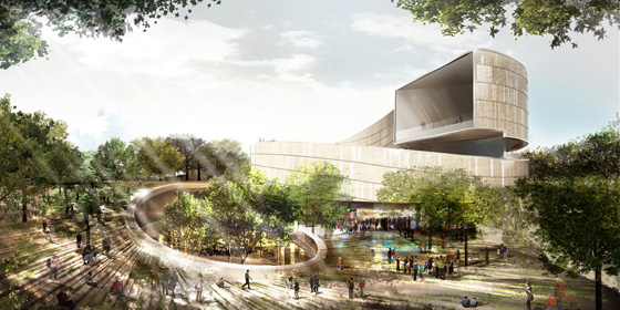
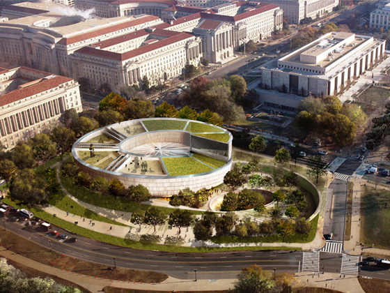
Foster’s design is not perfect, but of all of these projects his concept, form, and aesthetic fits the site the best. Essentially consisting of two spirals, its stone form is a monumental building that goes out of its way to respect the vistas of the Mall and also opens up onto them. Its volume and massing are not quite square with the site, but the roundness closes the line of objects that the museums form, just like the East Wing.
Underground buildings are a reality in DC. All of these projects have underground parts, but this one really uses it for a strong effect by taking visitors into the dark history of slavery before sending them back up again. Similarly, the imperfect curved plans of BMW Welt and the Guggenheim in New York are definitely improved upon. Walking down into a section about slavery and only then beginning the long spiral up makes the process a quiet reaffirmation of the possibility of progress in spite of hardship. Rather than screaming labels, the process of moving through the building recapitulates the struggle at 1/1000th scale, ending on a note of reflection and hope. As long as it is possible to see the exhibits without the narrative as well, the scheme will work.
The most important aspect here is that the idea is so simple, the design can be improved considerably. In fact, Foster’s firm’s historical sensitivity and delicate handling of materials and scale has so far kept his buildings from being awkward in historic settings. Moreover, Foster’s personal behavior during the review process for 980 Madison Avenue in New York has shown that he is quite polite and willing to innovate and compromise. If he softens the bluntness of the spiral and adds more windows somehow, I think this has the potential to be a really classical monument.
The take away: Solid core, with room for perfection.
Odds: 2:1
I tried to avoid superficial judgements, but I don’t like to judge buildings until I’ve been in them. So until the NMUAAHC is built We’ll just have to go see what they have down at the Castle.
And no, the Odds don’t add up. Sam Rothstein isn’t real.
1 thought on “At the end of the Mall, hope.”