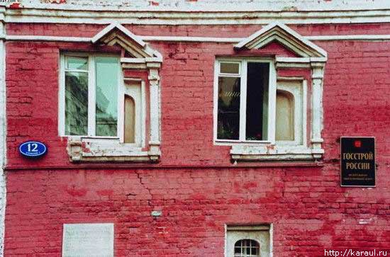
The sign reads “Russian State Department of Buildings.”
Just as an example, consider the way Carrère and Hastings used what was then the relatively modern gizmo of the light bulb in their 1902 rotunda at Yale. C&H’s calculated eclecticism certainly represents the practice that the Modern Movement considered its antagonist, but here, their flexibility paid off. Without going into theatrical crassness, they play light and molding off of each other in a way that adds intensity to the conventional architectural manipulation of space and articulation. Light, for the designers of this space, was becoming a material and not just an condition taken for granted.
Where is this expansive, flexible attitude now?

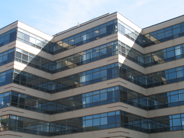
Designed by Hartman+Cox before they went traditional, it’s pretty unremarkable – except that it shows an uncommon sensitivity to site particulars. In the picture, you can see that about 3/4 of each wall is window space and mullions. Elsewhere on the building, however, less than half of the floor height is glass. Why? The above side faces North-Northwest, with the angled shape exposing most of the wall area to due north. The primary energy problems with glass walls cresults from solar heat gain and glare, but daylighting can also save a lot of energy. On the north side of the building, where there is rarely any direct light, the offices can get some daylight but not catch too much heat.
To make an unwarranted generalization, DC architects like their buildings heavy and somber. Even in the recent fad of light and clean glass facades, the buildings have been rather self-serious and blockish looking, a consequence of clients demanding efficient floorplans from architects who themselves were trying to be cool and modern without upsetting the polished and poised look DC has in the collective consciousness and legal structure. This fretful indecision can be a bit like the jeans and sportcoat look – crisp but comfortable, hip but conservative.
McInturff Architects offer a wholly different approach. They’re (post)modern(ist) but a little witty and also aiming for comfort. Their mostly residential oevure consists of excellently-composed buildings that respond coyly to the conditions of the site. In doing so, it avoids falling into limpid styles while also carefully respecting historic and distinctive architecture elsewhere. As for aesthetics, the practice cleverly contrasts gentle and warm elements with bold minimalism in beautiful light-filled spaces. As their projects are primarily private, it’s trickier to see their work than Esocoff & Associates‘. But down in Georgetown, anyone can at least see three buildings, and go into one of those.