Watch NPR and OK Go follow downtown’s edge

When NPR moved its headquarters in April, the music division had little fun with the trip. They called up the band OK Go to make an episode of the Tiny Desk Concert series. The results are pretty cute:

But, being a writer for GGW, I couldn’t help but notice all of the recent construction and development! You get a great look at the variety of the city as they move from Mt. Vernon Square to North Capitol Street.

NPR’s real estate history matches Washington’s economic changes over the past 40 years. When it was founded in 1971, its offices were at 16th & I Streets, next to the brutalist First Church, which was the core of DC’s declining downtown. It’s first purpose-built offices were on M Street in the West End, which lasted until NPR moved to the then-dilapidated Mt. Vernon Square in 1994. Now that downtown real estate prices spread north and east, they’ve relocated to a building in NoMa, designed by DC-based firm Hickock Cole.

Also, the drunk history of DC is hilarious. They desperately need one for Col. L’Enfant’s sad, sad story.


Socialism in One Building: Moscow, 1930


The Commune-House on Ordzhonikidze street in south-central Moscow is one of those Soviet projects is a hidden gem of Soviet Rationalist architecture, with heavy Corbusian influences. Designed by Ivan Nikolayev when he was 27, it neatly encapsulates the ideological goals of the revolutionary avant-garde. take a look at the first and second floor plans:

Via sovarch


The Commune-House is not just a communal apartment. It’s a type that only flourished for a few years during the radical period of the Soviet Union, when architects saw a need to reproduce the collectivized society of the kolkhoz in urban settings. All of the employees of a bureaucracy, factory, or university would live and work together as a mass collective. The most famous is the Narkomfin Building, which was built to house the workers of the Commissariat of Finance. NarKomFin is an abbreviation of the Russian name.

This dormitory was built for the State Institute of Textiles, to be “socialism in one building,” where people would act collectively, in a mass. As a result, the building’s functions are completely segregated. The plan above shows how Nikolaev divided the building into three sections. One: a 200-meter-long, eight-story bar of 1000 10-square-foot apartments, each meant for two students. Two: a three-story building containing classrooms, a cafeteria, a library, and physical culture facilities. Three: Joining and perpendicular to the two main buildings was a “sanitary wing” containing all of the bathrooms, the showers, balconies for mass exercises, and a set of ramps.

So, the building is laid out much like an apartment, only at the scale of thousands of people. Emerging from their rooms at a set time, the students would perform a mass exercise, shower, dress, and proceed to classes. All food was prepared in the cafeteria, liberating women from “kitchen slavery.” All bedrooms had sliding doors, like train compartments, because privacy needed to be minimized. Compared to the Narkomfin building’s family units and distributed bathrooms and kitchens, Nikolaev’s building is much more radical.

Nikolaev described his program this way:

Eradication of coercion from a man’s life is the first step. Household collectivization and reorganization of study is the second. The third step is the improvement of hygiene and daily life. The fourth the transition to self-sustainence in the home and the mechanization of harvesting. The fifth step is the socialization of the child rearing.

This kind of attitude was common among theoreticians at the time. Unfortunately, it was unpopular with most of the public, who didn’t complain when the ideological underpinnings of mass housing changed under Stalin.

Aesthetically, I think Nikolaev captured the relentless uniformity as beautifully as possible on the exterior, but it is now just a shell. After years of neglect, the building is being restored, with 12-person suites containing bathrooms and kitchens.

Check out the original post at SovArch.

Also take a look at these photographs of the ruined building in 2007.

And, don’t forget the Nazi equivalent! Do you see why Leon Krier deems Nazi architecture modernist architecture?

For Adjaye’s libraries, seeing is believing

Among the new DC public libraries, the Bellevue and Francis Gregory branches east of the river have the strongest design. Without sacrificing functionality and accessibility, they put sophisticated works of architecture in historically underserved neighborhoods. But photos don’t tell the whole story. You have to go see them yourself.

Designed by British architect David Adjaye, who’s also designing the Museum of African American History, the libraries are a reminder that it’s possible for a work of world-class architecture to also be a comfortable third place.

DSC_0438

Francis Gregory Library.

When the first renderings of the new libraries were published, I was unimpressed by them. But after a day-long excursion to see all of the libraries built under the tenure of library director Ginnie Cooper, I have to admit that I was surprised at how brilliant Bellevue and Francis Gregory are.

What can BIG do for the Smithsonian?

When I heard today that Bjarke Ingels Group will be producing a master plan for the core block of the Smithsonian Institution, I was not really thrilled. Their work is engaging and sharp, but it’s also can come across as trendy and disposable. The buildings I have visited feel cheap and unsubtle in their handling spaces. It’s personal taste thing, but I don’t like what they’ve built.

But then I remembered that the great thing about master plans is that you don’t have to follow them very closely, so you can keep what you want and take what you need. The drawings and guidelines are not permanent impositions on the urban landscape. They’re ideas. Ideas are cheap and BIG is good at rethinking basic  concepts in fresh ways, even going so far as to be able to propose how to realistically bring unconventional projects to reality. I don’t know if I would like to see Morphosis’s intervention in the Arts and Industries building, but it did cause me to look at the building again, to see its qualities and how it might be adapted.

Too much architecture in DC starts out tame and ends up lame. Sometimes its because of design review and sometimes its because of style anxiety. So, it’s important to start thinking big here, and dial it down when it comes to a serious proposal. So, I say we see what BIG proposes for what has to be the most heterogenous block in DC – The Castle, the Hirschorn, the Freer, and the Ripley Center – that’s most of the past two centuries’ movements – and let their ideas challenge whatever architects complete each project.

McLean Gardens Loop

I was shown this photo by the nostalgeologists at Old Time DC:

Can you recognize where this was taken? Evidently, there was a track loop in the streetcar network just to the south of McLean Gardens, to allow the vehicles to turn around. It’s now the construction site for Cathedral Commons, and was the site of this Suntrust Bank during the intervening years.

The loop was there, at least until 1957, when aerial photo on the left was taken. On the left is October 12th, 2012. If modest developments like Cathedral Commons are successful enough, perhaps we will see streetcars on Wisconsin Avenue when we look down in 2023.

North of Tilden: Checking in.

In the intervening years between my departure from DC and the moment that you are reading these words, a number of things have changed in Tenleytown. So it’s worth showing how upper northwest has unfrozen and opened up to a modest amount of growth. Rather than focus on the ongoing political developments, take a look at projects that have finally become buildings.

This is a long post, so click through…

Something old and something new in Southwest

While back in DC recently, I took a look around Southwest DC. There’s much to see, but not much to say. So let me highlight two interesting projects. The first is Hense Brewer’s repainting of the Friendship Baptist Church building behind the old Randall School. I think it’s a pretty cool way to wait out a development project, at the least.

The Randall School itself has been intermittently poised to become a boutique something or another since 2006, when the Corcoran and Monument Realty bought it. Neither of those institutions is doing so well right now, but Telesis and the Rubell Foundation, a major contemporary art collection,  have plans to put an apartment-museum building behind the heritage buildings, with Bing Thom designing. We shall see, yes? The other is Capitol Park Plaza, a midcentury building, which has a surprisingly warm facade for the period.

No surprise to discover that this is one of the buildings in the area designed by Chloethiel Woodard Smith. A noted local architect who happened to be a woman at the time when that raised eyebrows, Smith was quite shrewd here, registering the slab form with details that let humans comfortably occupy austere forms. First, she used tiles to enclose private porches. These balconies are massed in vertical lines at either end and staggered in the middle. This detail diminishes the monotony and overwhelming scale of the building without losing the exhilaration of long lines. The balconies also allow the roof to extend over the building envelope, reducing leaks, while keeping a strong outer volumetric edge that expresses the modernist formal fixation of a flat, uniform edge.  The pure geometry of modernist architecture can be difficult or expensive to register in actual building, so in a compromise, Smith simply implies it.


Three Soviet Memorials to Massacres

Sov-arch continues to continues to offer up unknown treasures of the FSU. Take a look at these three incredible memorials built during the Brezhnev era, published by LJ user dariuss.


The first is a monument to the victims of the Salaspis concentration camp, not far from Riga, Latvia. The photographs are evocative enough to not need the Russian text in the original post, but I’ll provide a short description for non-slavofils.


You enter the complex through the woods and travel under a massive concrete bar, which appears to have come to rest askew on a black granite block. It is referred to as the “Border between Life and Death.” Beyond it is a set of allegorical statues, including “Humiliation,” “The Mother,” and “Unbroken.”  The concrete foundations of the barracks remain in the ground, contrasting with brutalist concrete beams that hover, cantilevered from memorial markers. Permeating the site is the deep ticking of a metronome, meant to evoke the passage of time, a heartbeat, and death.

Having walked around the site, the massive concrete beam reveals itself to be a building. Passing over a razor-thin concrete stairway, you enter a long, skylit hall, walking up a monumental stair to a viewing area and back down into a small exhibit. The allegory is a little too heavy-handed for my taste, but I think the images speak for themselves.

The second site is Khatyn, in Belarus. The site is a little bit more complex, covering the extents of a former town named Khatyn, which was obliterated by the invading Nazi army for harboring partizan activity in 1943. The site should not be confused with the location of the Katyn massacre – more on that later.

Khatyn is explicitly a landscape memorial, employing the strong gestures of Brezhnev-era architecture over large expanses of ground and without a strong central focus. It’s less iconic than Salaspils, but its architecture still has the same grim impact.

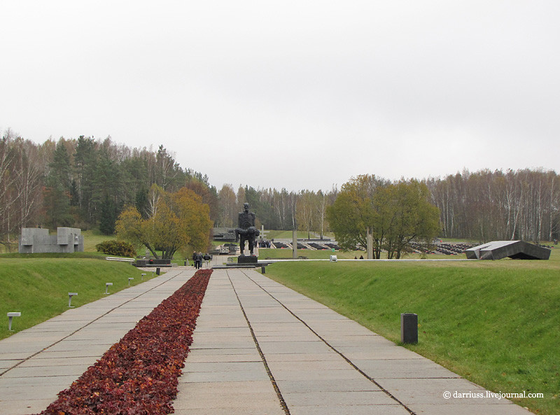
Down a ramp, visitors are greeted by a monumental statue of a man holding a dead child, entitled the “Unconquered Man.” The image is apparently based on the one survivor of the down, a blacksmith, who found his son shot in a barn. So, you have a great example of socialist realist use of a real person idealized to represent a larger population. The whole site, in fact, is a synecdoche for all of the towns massacred by the German army. A man is to Man as Khatyn is to the Motherland.

Adjacent to the statue is a white slab that caps the mass grave and there is a bent slab of black marble meant to remind visitors of the barn where most of the town was burned. Beyond this is a wall of remembrance and a “Cemetery of Villages” commemorating the 186 Belorussian towns lost during World War II. 186 black marble urns filled with ground from their respective villages stretch out into a huge field. A black platform contains three birch trees and an eternal flame to symbolize the 1/4 of all Belorussians who died during the war.

All around the memorial axis are monuments on the site of each structure that existed at the time of the massacre. Paths follow the original streets, symbols of an index, like the Cretto di Burri. The former house sites are bounded by concrete beams. Bell towers inscribed with the names of residents stand in for the chimneys. Even wells are marked with marble platforms and concrete roofs.

Finally, The third is the tiny Dalva complex, located about ninteen miles to the north. Its architectural elements are similar to Khatyn’s, but I think that the concrete beams surrounding former sites are more elegantly abstract. On the other hand, the beam assemblages are punctuated with bronze recreations of household objects like vases or teddy bears.

Photos from Khatyn and Dalva are in the same post.

These three memorials, built from 1967-1973 are emblematic of Soviet design at that time. What distinguishes these memorials from earlier Stalinist is the emphasis of human suffering and the effort to instill a sense of loss in other people. The strong emphasis on representation seen in Stalinism remains, but the new generation adds expressionist gestures and compositional abstraction to Socialist Realism.

Like all memorials, they also reflect the political ideology of the time. Part of the purpose of building such extravagant memorials was to focus regional antagonism towards German Fascism and away from Stalinist repression without overtly denying that anything happened. This is particularly in the case of the Khatyn memorial, where the names were similar enough between Katyn (Катынь) and Khatyn (Хатынь) to misdirect people.

Yet on the other hand, these sites mark legitimate sites of atrocities that occurred to people who were caught in world history. So, the ambiguity of architecture, that it generally means nothing external to its own form, works to its advantage. Even as the ambiguity between Khatyn and Katyn casts a shadow over the memorial, the ambiguity also prevents it from being simply a political tool of the regime. Compare this to the Stalinist memorials in the Tiergarten or Vienna, whose message and representation cannot be mistaken.

Broad Branch Road could include all users

The badly deteriorated Broad Branch Road in northwest Washington could become a more complete street that will accommodate pedestrians and cyclists as well as drivers, as part of a much-needed restoration.

Winding west from Rock Creek to Chevy Chase, the 2-mile-long route does double duty for recreation and commuting. It’s necessary link between upper northwest’s neighborhoods, Rock Creek Park, and downtown.

Originally a market road for local farmers, most of its current infrastructure dates to the early 20th century. Patchwork fixes have only staved off a century of deterioration. Flooding has undermined the road’s substructure, most dramatically in 2011, when the bridge over Soapstone Creek collapsed. Since it needs to replace the roadbed anyway, DDOT has taken the opportunity to update the design for modern uses.

Design the next Moscow Metro map

The City’s Department of Transportation has announced a contest to redesign the cartography of the Moscow Metro, one of the busiest and longest urban rail systems in the world. The impetus for the redesign seems to be the limitations of the current system diagram, which is light on information, and already quite dense with stations. More importantly, that map is about to get more confusing, because the Metro plans to grow 150% in size, with 70 stations to be added by 2025. So, there is a lot of material to work with.

I say cartography, because the brief asks for a tiered wayfinding system, where the diagram on the trains is expanded for each station to include relevant ground transportation and sites, at that particular station.

I am generally negative about designers doing work for free, but the restriction that this contest only be open to individuals ensures that the playing field is at least level, even if only one person is paid for the work that they do.

Submissions are due as PDFs by December 23rd, 2012.