Soviet Pavilion at the 1939 World’s Fair

If you’re like me, you have a perverse fascination with Stalinist architecture. You know all the competitions, who what was getting built, and who was getting condemned in Pravda any given week. So when a project that you’ve overlooked shows up on the internet, you just want to share it with the world.

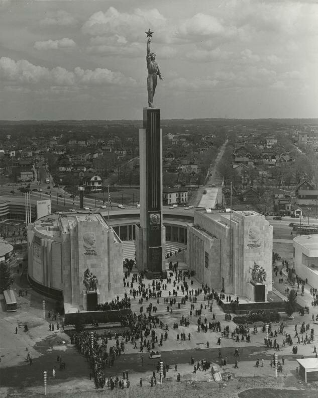
So, thanks to Arkhobzor, take a look at this forgotten gem: the Soviet Pavilion at the 1939 New York Worlds Fair.

The building is pretty exemplary of Stalinist architecture as executed in a post-constructivist style. Designed by Boris Iofan, it fulfills the representational goals of Socialist Realism with marble statuary, murals, and an amphitheater for informational films. The composition is still rationalist, with a simple circular plan opened unclassically by intersecting it with a square. Massive pylons turn into entry propylea, facing a courtyard and a blood red granite tower supporting a statue dubbed “Joe the Worker” in the American press.

The original plan called for a muscular man to be clad like a classical sculpture, holding up a red star. That changed in the execution, with a man in a jumpsuit replacing the Stakhanovite demigod.

Inside the building, there were dioramas, paintings, and models that showed off the cultural and economic might of the prewar Soviet Union. Perhaps most notably, it included a full-scale mockup of the spectacular moderne Mayakovskaya metro station, mirrored to create the effect of repeated bays. Also present were statues of Stalin and Lenin. The statue of Stalin is a smaller version of the one that stands in the Muzeon park, defaced.

I don’t have much else to say, but I’d take a look at the following posts about the building for the incredible images.

Looking back after the Cold War and its end, it feels pretty strange that something this thoroughly Stalinist ever stood on US soil.
 

Mixing New and Old at the Eisenhower Memorial

Yesterday, a panel selected a design concept by Frank Gehry for the Dwight D. Eisenhower Memorial The design is promising.

The large blocks form a circle, enclosing a single tree and a small pool of water. On the faces of the ring of stones, images cast in low relief and quotations in large type speak history to those inside. East and west of the central courtyard, groves of trees canopy informal plazas. At first blush, these spaces feel intimate and beautiful. Rising from just beyond the trees, large stainless steel screens supported by limestone columns enclose the space on the north and south sides. The screens will contain some of the sculptural program through a woven scrim that hides the forgettable Department of Education Building to the south. The street condition is undefined, bounded by the scrims except at three prominent areas.

The axis of Maryland Avenue cuts through the memorial, with the stone ring in the center. Building the memorial without disrupting the viewshed of the Capitol or traffic flow were seen as the two big problems. The Memorial Commission selected a design by Gehry that sidesteps the issue of sightlines, by removing one of eight columns and two sections of the screens. This way, the design frames the primary view of the Capitol with the same structures that fit it into the grid. In terms of the vehicular route, the panel rejected a vehicular road through the monument and instead created a pedestrian plaza. The site was located to move the monumental program off of the Mall. Drawing visitors, most of whom tour on foot, was equally important.

Gehry has tamed his own style is tamed for this project, although the ring of stones exemplifies the blockish forms he had been experimenting with since the opening of Walt Disney Hall. Mercifully, Gehry has also eschewed the dismal expressionism of a younger generation of memorial designers. The design team did not try to assign tremendous meaning to every little detail. Instead, it is a building that can be judged for its power and for its beauty, although people will disagree.

ConX: Modular steel construction

ConXTech is a Bay Area company that has finally brought the steel frame into the 21st century.

Now, that phrase trite, but what they have mass-customized the design of steel beams and then greatly simplify the assembly. It reduces design time, reduces the amount of labor needed, reduces energy expenditures, and provides a sturdier and more flexible alternative to wooden frame structures. Those stick-built structures are the most common design of 1-5 story residential construction, however, ConXTech is looking to make 5-12 story structures affordable as well. To do so, they have approached the whole building process in a slightly different way.

With ConX, the architect must involve the manufacturer in the design process, as the company custom builds the structure offsite in a factory. ConXTech needs to schedule the amount of work and materials necessary, while the architect needs access to their computer components at the schematic design phase. Still, it’s really not unlike the conventional process in which plans are sent to a structural engineer for engineering work, just that the engineer is the manufacturer too. Integrating the manufacturer reduces overhead, while entering the design development phase with a working model of the structure keeps the building lean and reduces the number of design changes that result from unexpected structural revisions.

So, once the project does reach construction, the CNC robots cut out pre-designed structure members to specification, as each piece is needed on the job site, delivering the product only as necessary. The system consists of vertical and horizontal beams, joining elements, wall panels, whole flights of stairs, and various other parts for specialized situations. Because the factory environment allows for meticulous control and use of accurate cutting, the frame and all other elements are extremely precise, resulting in better quality and speedy assembly. The frame itself is put together using snap-in-place fittings that a steelworker then bolts into place to meet code.

It’s a persistent myth, perpetuated by traditionalists, that steel is not a sustainable construction material, due to its embodied energy, which is around eight times that of wood. However, embodied energy, that is, the amount of energy required to make the materials and then assemble them on-site, rarely exceeds 20% of the total energy required for a building torn down after only 50 years. Steel frames overwhelmingly outlast that timeframe (steel-framed buildings from the 1880s are still around, and we have no idea how long they will ultimately last), so the percent of energy the frame requires diminishes in relation to heating, cooling, and interior renovation costs. They also use much less material, allow for greater density, and when they are torn down they can be wholly recycled, but I’m digressing here.

Forest Hills’ Brown House

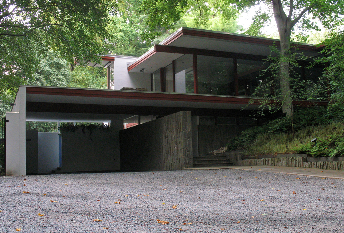
Upper Northwest has a reputation for having bland architecture, with the exception of pre-Depression Chevy Chase. But that’s proving itself to be a not completely true perception.  Down at the eastern end of Audubon Terrace in Forest Hills there’s a real treasure of modern architecture, almost completely buried the trees of  Soapstone Valley.  Although it’s been a house I’ve admired since a stopping a run in the valley back in high school, Modern Capital clued me in to the house’s authorship by the definitive SoCal architect, Richard Neutra.

neutra-graham-house-1

The residence, known as the Brown House, was built in 1968, only two years before the architect’s death. It is the only example of that architect’s work in DC, and one of only a few on the East Coast. More photos under the fold.

Good Architects: McInturff Architects

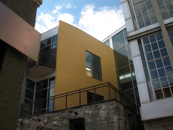
cadys-alley1

To make an unwarranted generalization, DC architects like their buildings heavy and somber. Even in the recent fad of light and clean glass facades, the buildings have been rather self-serious and blockish looking, a consequence of clients demanding efficient floorplans from architects who themselves were trying to be cool and modern without upsetting the polished and poised look DC has in the collective consciousness and legal structure. This fretful indecision can be a bit like the jeans and sportcoat look – crisp but comfortable, hip but conservative.

McInturff Architects offer a wholly different approach. They’re (post)modern(ist) but a little witty and also aiming for comfort. Their mostly residential oevure consists of excellently-composed buildings that respond coyly to the conditions of the site. In doing so, it avoids falling into limpid styles while also carefully respecting historic and distinctive architecture elsewhere. As for aesthetics, the practice cleverly contrasts gentle and warm elements with bold minimalism in beautiful light-filled spaces. As their projects are primarily private, it’s trickier to see their work than Esocoff & Associates‘. But down in Georgetown, anyone can at least see three buildings, and go into one of those.

Veazey Walgreens

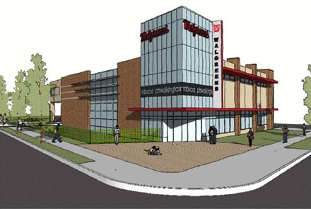
veazy walgreens
Arbitrarily messy and unconsidered.

Seen here is the new Walgreens in Van Ness, at Veazey & Connecticut. A big improvement on the gas station that’s there, and an even bigger improvement over the previous plans. In terms of land use, the site would be better as a multistory building, and not as another chain convenience store, but it’s also limited by zoning.

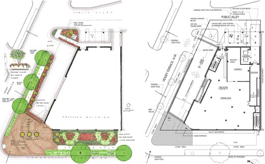
Plantings and floorplan.

Designed by Rust|Orling, I think the building is a really poor imitation of a mid-mod style, an eyesore in a place where we don’t need any more. R|O are otherwise a good firm with a keen ability to manifest architectural diversity, but it looks like modern architecture is not their strong suite.  They’re also restoring the art deco Walgreens in Cleveland Park and are the designers of Potomac Yards.

Construction has not begun, and these are working renderings.