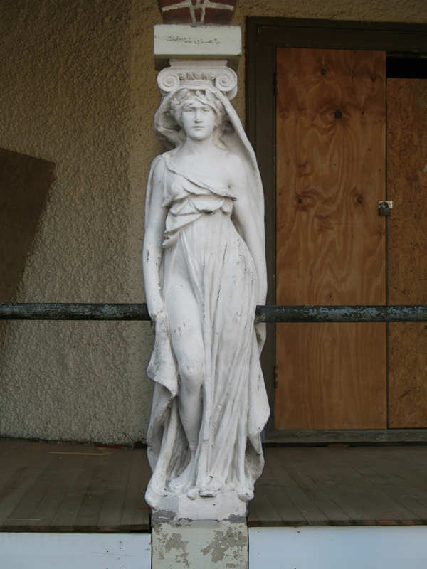
Hidden among a leafy scattering of houses and trees, Forest Glen Seminary is a jumble of vernacular buildings unlike any of the temples of boxes that define Washington. Its buildings, both magnificent and ludicrous amount to a dignified campiness that defies expectations to be one of the most profoundly interesting places encircled by the Beltway. Once constituting a women’s college when that meant a two-year Mrs. degree, the buildings are once again becoming domestic space, the more private areas cut into condos and the core of the complex, rental units. Scattered around the area, turn-of-the-century houses are being renovated and new housing by the urbanist developer EYA has just been finished. Through the site’s history, radical changes have shaped its form, but none so radical as the current shift in context.
Architecture
Legos used to build things
Career-inspiring plaything manufacturer Lego has announced a line of rather small models of iconic buildings, called simply LEGO Architecture (with mock construction lines to tell you that it’s architecture). The first two released are Fallingwater and a tiny Guggenheim, but if their teaser page is any indication, it will soon be possible to realize the mad genius of the Onion’s conceptual terrorists.
Three interesting things
But back wen DB were just getting started, a depraved genius named Zak Smith managed to produce illustrations of each page of the book Gravity’s Rainbow. Somehow, he managed to sit down and produce 760 works of art, in multiple media, depicting pretty much everything that happens in the book, in some way or another. I haven’t had a look at the whole thing, but the sheer amount of creativity would make an edition of Thomas Pynchon’s book with these drawings a worthwhile purchase.
And also terms of good (early) works, Metropolis has nicely been hosting blog posts about Yale’s First-year house project, where they also design-build a house for a local rent-to-own program.
Height is not an urban strategy

Yglesias makes three arguments: taller buildings with will increase tax revenue, improve livability, and reduce what he calls “job-sprawl.” In each case, he is partially correct, but also misses broader issues of urban land use and planning. Primarily, he misunderstands the qualities and causes of density, mistaking the unique and exceptional conditions that created metropolises like New York, Chicago, Tokyo, and Paris for natural growth.
A well designed playground
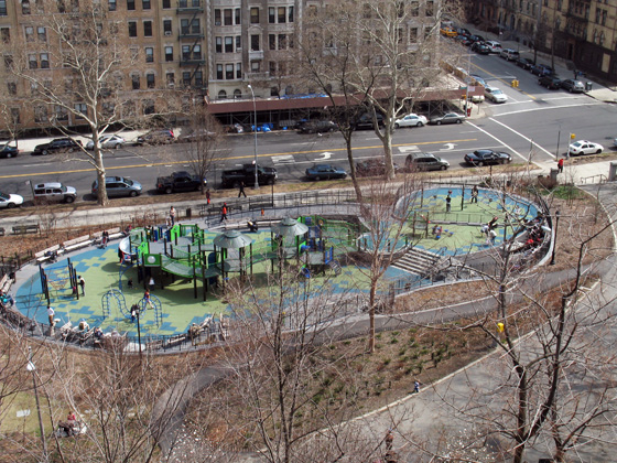
But what is more interesting in terms of architecture is how the playground was developed: It’s a really good example of both community involvement and responsive government. The new, complex playground is a drastic improvement over the grimy 70s play yard it replaced, but the process took nearly a decade. In 1999, the Friends of Morningside Park began surveying residents, including those with children and those that wanted children, about what they wanted. They took that information, developed a master plan to restore and improve Frederick Law Olmsted’s original design. Using this plan, the neighborhood worked with the City through long-term activism to eventually get it built.
The whole process took ten years and a lot of gentrification happened in that time, but it’s still a great reminder of what is possible if a community organizes to make their common environment a little better. I think, like any good urban space, the results speak for themselves, so do be sure to go up and see it when you’re up in New York or have a look at some of the pictures in the linked blogs.
Why Design Matters for the Stimulus: Architects
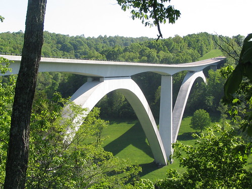
Unless they are receiving unemployment benefits, the stimulus package is not something that will benefit most architects in any direct way. Mostly consisting of spending for non-physical programs, the ≈$94,000,000,000 that is there for infrastructure and construction is not going to any public projects that conventionally get the high-end architecture treatment. Yet if governments and agencies receive grants for utilities or other community assets and approach these structures with an eye to aesthetics, there is the potential for incredible additions to the fabric of our of towns and cities.
If the average architect wants to get design into these buildings, they’re going to have to look to practice architecture differently than they currently do. Firstly, they need to embrace building information modeling. Secondly, they need to emphasize designing details rather than looking at sophisticated conceptual schemes as justifications for form. Thirdly, architects need to look for different opportunities than what they have conventionally seen as prestige architecture projects.
Continue reading ➞ Why Design Matters for the Stimulus: Architects
At the end of the Mall, hope.
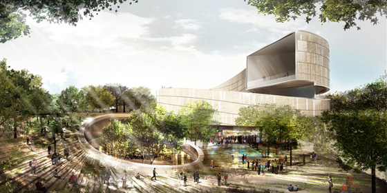
The six finalists for the design of the National Museum of African-American History and Culture have been revealed, with some very promising and also very disappointing results. There’s not nearly enough information available to see which is really the best building, so I picked the one that I think can be improved upon in a productive way. Remember as you are reading my thoughts that these are in the conceptual design phase, so the architects will be revising the buildings considerably even before the NCPC and CFA get around to prodding the architect for greater contextuality.
I’ve ranked these in ascending order of quality and appropriateness and then got my buddy Sam Rothstein to handicap each one’s chance at selection. The images are linked to high-res versions on the Smithsonian site.
Why Design Matters for the Stimulus: The Government
In choosing to spend so much money to build new infrastructure, Congress and the President have committed to constructing utilities and transportation for the next fifty years. Consequently, all of these structures and systems must reflect this long-term goal, not only in the quality of construction but also in the quality of design. As they allocate the federal funding, governments and agencies should consider the very real need for public projects to employ an architecture of civic responsibility. Architects, in turn, should be ready to adapt their practices to meet the need for basic public design, a major shift many are eager to try.
First off, it’s worth explaining what the stimulus bill offers architects and agencies? There are two major categories: firstly, sustainable or “green” renovations and expansions of housing, schools, and government offices, and secondly, the money granted to local utilities chance to be creative with unconventional programs and types with a thin budget. The former type of project is not too different from what they’d be doing most days, although those firms would benefit greatly from improving technological capabilities, such as employing building information modeling, which reduces cost and improves quality by reducing errors, simplifying design, and allowing for sophisticated environmental testing. The government should encourage the use of these programs, setting a standard for 21st-century architecture and construction.

In the second category, there are many types of buildings that have been neglected aesthetically or financially that are now receiving large grants as part of the stimulus. Transportation, power plants and electrical systems, water treatment facilities, housing projects, and port facilities will all be receiving funding for improvements. The government owes it to the people who live by, pass through, or otherwise see the underside of public infrastructure to improve quality. More attractive overpasses, wind farms, and customs houses will make a small but important improvement of the built environment, definitely impacting the daily lives of Americans.
Similarly, funding for transit organizations can go to better bus shelters or bike stands. As the recent competition in New York showed, small firms are ready to make simple but interesting designs for little bits and pieces on the street. Both proponents and opponents of spending are fixated on monumental projects, things that will last. However, wide projects of small improvements might make just as much of an economic and physical improvement. Planting thousands of trees would pay off far more than another highway resurfacing, especially as part of a greater streetscape improvement plan. Moreover, agencies should set aside a small portion of their funds to ensure that a little art and a little design make it into every project, improving the quality and distinctiveness of each and every location. Many of these facilites are in people’s backyards; planners need to respect the neighbors.
A notable exception to the recent pattern of charmless public architecture is the Newtown Creek Wastewater Treatment Plant, in Queens. Designed by the ever-pragmatic and flexible Polshek Partnership Architects of Newseum fame, the multi-million dollar project has met with universal praise and become an icon of the area, while still efficiently treating blackwater sewage. Polshek designed it with a modern industrial look, simplifying and beautifying the fascinating shapes of anaerobic digesters and aeration buildings. Additionally, the building is designed for tours and educational visits, while a 1% allotment for art has allowed for bold lighting that stands in contrast to the dull orange glow of the city.
Through all the praise for both the Newtown Creek plant, critics and officials have emphasized how different they look from conventional buildings and how much more attractively these massive plants interact with the rest of the neighborhood. People are surprised that the buildings aren’t ugly, as though this is an innovation that took a genius. However, architects have historically approached such facilities as civic assets, building them out in a monumental fashion. Likewise, the New Deal introduced art and architecture to almost every project it executed, from libraries to TVA dams. These buildings reflected the cultures and programs of their builders. It would reflect poorly on our time if we settle for bare function and apathy.
Government’s role in improving and stewarding common places means that it must provide and demand attractive, functional facilities for its people. For this reason, renewing America means not only fixing it up at basic levels, but also making it more beautiful at the same time. Architects are ready and eager to improve the country, but they will have to adapt to new conditions. Indeed, they may be better for it if they grow creatively in response to limitations and employ technology in making practice faster and more transparent. But they have to get the work. If agencies set aside only a small portion of funds for architecture, lay out the goals, pick like-minded architects, and insist on good results, the resulting cultural effusion would boost the resolve of Americans and leave a long-lasting improvements in the most desperately needed places.
In Part Two, some thoughts on how architects should approach Stimulus design.
From an urban design standpoint, this parodies itself!
Good Architects: Esocoff & Associates
-

Ten Ten Massachusetts Avenue. From Home and Design Magazine.
DC architecture is known for being a little bland and generic. This reputation is not undeserved; there is something in the air since the early 20th century that has caused a stodgy vibe to persist like swamp gas over the city. Beaux-arts to glass-box, anywhere architecture has replaced the unique red city that was once gave DC a humble energy. In particular, the buildings of Adolph Cluss defined the aesthetic character of the city in a bright, practical way. Cluss’s South German heritage led him to design red brick buildings with vibrant decoration, like the Arts and Industries building, that differentiated DC from anywhere else in the country.
The firm of Esocoff & Associates has sort of picked up on his spirit, although they seem less interested in socialism than he. I remember in college returning home from Union Station, dreading the new, gray buildings or quasi-historicist schlock left over from the 90s, and driving down Mass Ave and being startled by the bright cobalt blue mullions of Post Massachusetts Avenue, surrounded by the warm umber brick. It took me a while to figure out who the firm was, and in that time they have built many more residential buildings that are post-modern in the best way, definitely reflecting contemporary values and modern construction, while being context-sensitive, humanistic, and unique. In particular, the Dumont’s sensual and explosive curves break the box with such bravado, it has stopped me on the street. Their handling of color and material is also fantastic.
They have repeated a distinctive style, sure, but haven’t exhausted its possibilities. I believe that their buildings will last as defining architecture of the period. I wish them the best of luck, because with time Esocoff could be come the new Cluss: an architect for the daily lives of the residents of the District of Columbia. God knows we need one.
