A Look at the Janney Expansion

Janney Rendering 1 SE_09 SMALL

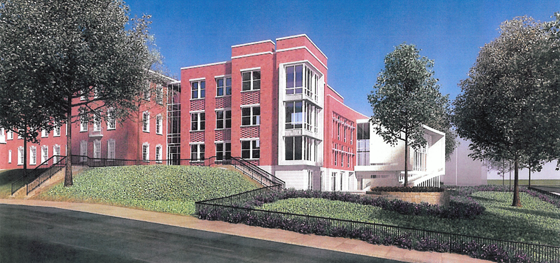
I finally got some images of the proposed Janney School extension. I like it – but it could have been better. With a few objections, I like its conception. Devrouax + Purnell, best known for the Washington Convention Center, the Pepco Building, and Nationals Park, here produced an interesting and attractive school building. However, the location where they have chosen to place the wing results in a lost opportunity for Janney and the community in general. Like too many developers and architects, they approached Tenleytown planning to not upset the status quo. However, any public facility should be designed with an eye to the future – and the current state of Tenleytown cannot last.
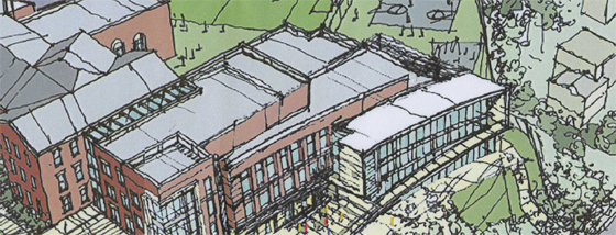
The building steps down.

Beginning with the generous setback along 42nd street, the architects attempted to hide the building as much as possible, so as not to intrude on the neighborhood. Although the Albemarle façade extends to the cornice line of the 1923 building, the masses of the building gently diminish into a low white structure that encloses the gym. Moving south along the western face, the building curves gently, from a tower to the first private residence down the block. The architects employed the shape subtly, repeating the curve in each mass to limit its effects. It does successfully integrate into the site.

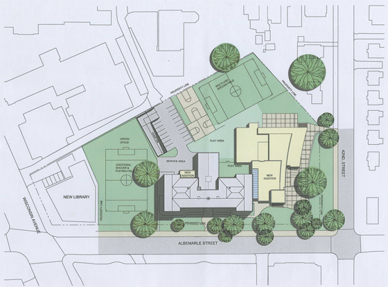
However, this hesitant approach is not appropriate here. The architects should not have set the building back from the street so much. In doing so, they have reduced the feeling of enclosure afforded by a consistent streetwall, produced an marginally useful green space, and missed an opportunity to relocate the playing field at the center of the Tenley Library Public-Private Partnership debacle.

JES_Design_Schematic_20091110-1 SMALL

For the 2007 plan to build a library with several floors of condominiums on top focused on the loss of recreation space (the rightmost field in the image above) for Janney Students. Some of that space would be consumed in the footprint of the condominium structure. However, had the architects located the new wing closer to the property line, they might have opened up space to relocate the eastern soccer field. In a political environment as vicious as Tenleytown’s, a mutually agreeable solution would have been a rare happy ending.

That lost opportunity is my main complaint – but there’s much more review below.
A Momentary Synchronization

Tower of Winds, Tokyo

I looked up from my desk this evening to see a handful of blue lights in the neatly stacked windows of the apartment building that sits across the street. Deep blue, as though the world was experiencing a collective computer crash. The color changed and I realized it was the Grammies. For a few hours, the building changed colors to reflect the shared culture of this consumerist happening.

I’m reminded of Toyo Ito’s Tower of Winds and its synesthetic translation of Tokyo’s Hubbub. And I’m reminded of my external hard drives. They have a large blue light on the front that signifies that they are on. So too do blue flickers in windows; they  indicate that the households are turned on as well.

Details, Details: Light & Shadow

white brick

A lot of architectural design deals with modifying light and shadows to make an interesting form. For example, the moulding on a neoclassical building is designed to create a specific shadow profile. Meanwhile, glass buildings tend to play with reflections. But you don’t see much of them together, like you do here.

Five Things, Arranged by Size and Scope

A few found ideas.

One: First, let’s start with what’s in the room. My friend Anna at NOMOFOMO informed me of the publishing of a rather serious book about John Cage’s rather infamous piece 4’33”. The plainly titled book, it turns out, is by Kyle Gann, probably one of the most famous people ever driven off of Wikipedia. Hopefully the book will cool some of the really obnoxious commentary that trots its tired ass out whenever you mention the piece. On a related note, I was at the Smithsonian American Art Museum when some man wearing a North Face vest walked into the room with his brood and began ridiculing the works as “The Painter who Couldn’t draw curves, The Painter who Couldn’t Draw Faces, the Painter Who Didn’t Care,” repeated smugly for several minutes. Unfortunately for his smugness, we were in a gallery entitled, GRAPHIC MASTERS III. There were no paintings so … no painters either, boss.

Two: Anyway, over in my neighborhood, Richard Layman wrote a simple piece in regard to the recent efforts to build a streetcar on Wisconsin Avenue – and the consequent vicious opposition. The arguments are not that new, but he does break down the current bogeyman that guided transit will be hopelessly snarled up by obstructions. His point: it happens more often on highways, and can be minimized with design. On that note, and getting much bigger (153 comments at writing), is the thread on DCMud about the Safegate Pause.

Three: Moving out to the general idea of the neighborhood,  Kaid Benfield penned a remarkably concise and thoughtful definition of Transit-Oriented Development. He emphasizes the oriented part, making the point that it’s the way the neighborhood and buildings facilitate transit use and walkability that is most important. It’s worth a read.

Via Elemental/Mammoth
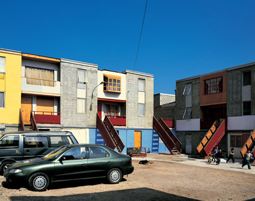
Quinta Monroy, via Elemental/Mammoth

Four: Getting a lot bigger, Mammoth covers mammothly (as they promised) the best architecture of the decade. Unlike so many lists of flashy blingitechture and navelgazing critiques of said blingitechture and excess, the list contains projects emblematic of new directions in architecture. Included is the Large Hadron Collider, cheap manifest-traditional housing, Chinese High Speed Rail, geoengineering, and using good design to recover from years of terror. After reading it, I feel like calling this next decade for Latin America.

Five: Finally, getting into centuries and abstract ideas, Kirk Savage will be doing a live chat tomorrow on Greater Washington.  Savage is the author of Monument Wars and Standing Soldiers Kneeling Slaves. The latter book is about the depiction of slavery in public art. The former traces the role of the monument in America over two hundred years as the changes played out in Washington, DC. I’m only about halfway through the book, but it is really good. He puts an impressive amount of information about monuments, memory, and architecture into a genuinely enjoyable read. I don’t have enough thoughts at the moment, but there will be more coming from it.

Until 1 PM Tuesday, you can always submit questions at this page, and I’ll let you go with some bonus Eames:

Would You McMillan II?

Nir Buras is looking to redouble work on his McMillan II plan.  He asked me to post this little ad, so of course I obliged.

Recent construction in DC dilutes the character of the City’s built environment and it is on the verge of loosing its identity.  Obviously the City and its citizens deserve better.  The order and principles of the L’enfant Plan provided the “DNA” of the City. The McMillan Commission (1902) invented the National Mall and created many if not most of the beautiful buildings and landscapes of DC including the Lincoln Memorial, Federal Triangle, Rock Creek Park, the GW Parkway and more. The McMillan II Initiative proposes architecture and City Building principles commensurate with DC’s legacy and its world role. It will enable healthy “green” growth for DC, provide longevity and promote timeless beauty into the 22nd Century and make DC a WorldClass City.

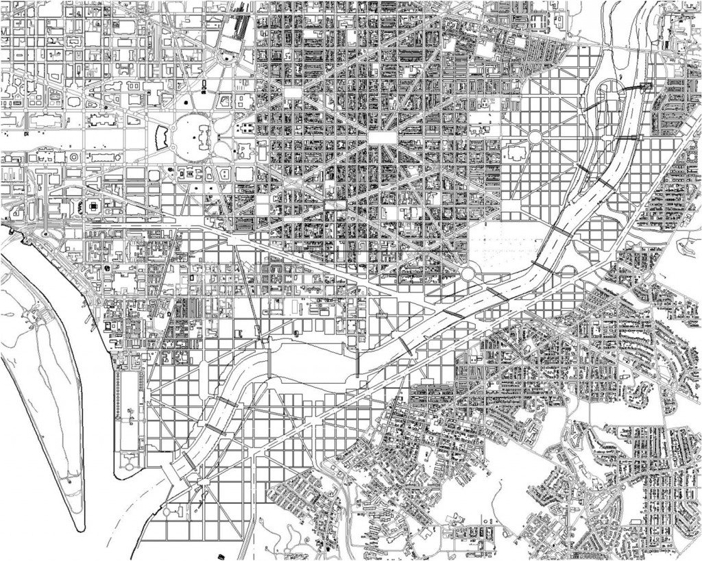
The first round of McMillan II recognized the mile-wide no-man’s land of freeways and underused parks existing along the Anacostia River, much of it on Federal land. This disconnection is the City’s urban, social and political nightmare. DC needs a healing act, both literally and figuratively, stitching together this urban gash for the social, economic and civic benefit of all. The first round of McMillan II was recently made public on the Kojo Nnamdi show and numerous blogs. In the second round we seek participants to assist in further detailing the plan and ground it in the best sustainable, economic, hydrological, financial, urban planning and design practices. Skills sought include collegiality, reading, writing, drafting and computer graphics, modeling and animation, video, sketching and water coloring to further develop and repackage the project.

For participation, please contact Dr. Nir Buras at info@buras-classical.com and state your relevant interests, skills and experience.

Additionally, he and I are intending to hold a salon to discuss the plan, its underpinnings, and its consequences at some point in the future. If you’re not interested in working on the project, or if you’re like me and enjoy a good debate about architecture, that might be more your thing. Stay posted.

Two accomplishments

I just saw these two things last night and thought they were impressive enough about what is possible with some elbow grease, a Ph.D, and a few billion dollars. So learn what it’s like to stand on the top of the Burj Dubai: It’s wobbly and tall. And it warms my heart to the hellhole that is Dubai. (gizmodo)

Closer to home, DARPA is paying the University of Maryland to weaponize maple seeds or samaras. That might seem insane, but watch the whole video to see what 3 years of research on single-wing rotary aircraft can get you. Go terps!?    (hackaday)

Don’t get “samara” confused with the city in Russia, or samsara, or you may experience endless cycles of misunderstanding.

Best anti-glare solution ever.

So the room you work in has a large glass wall. It brings in a bit of glare during the day, and this is messing up the view of your computer screen. What do you do? Buy shades? Pff.  Sue the architect? Complain to the faculty advisor? No, of course not – you work in an MIT robotics lab.

Meet Shady, the sunshade robot. Developed by the MIT Distributed Robotics Lab, it actually does many other things, particularly climbing trusses, which they say is hard to do, and I’m in no position to disagree. That is a finely sharpened solution.

via Dwell, which  has been profiling people who live in pieces of starchitecture (only at MIT so far, though).

McMillan Two gets some feedback

Last week, I published the McMillan Two concept, after hearing about it on the Kojo Nnamdi show and interviewing the designer, Nir Buras. I’ve been pretty excited by the dialogue – the post of GGW received 88 comments and several thousand views. Others have jumped in.

First was the excellent constructive criticism by Alex Block. But he outdid himself with another article arguing for an ecologically balanced solution, which built on a post by…

…Mammoth, who delivered a strident critique of the more Eurocentric and anti-wetland flaws in the proposal. I commented on the article, and the exchanges between me, J.D. Hammond, and Rob Holmes are all good dialogue. The example of the Port Lands project in Toronto is worth examining in depth.

Straßgefühl, the only other blog whose name rivals mine, offers a counter-proposal based on the Sumidagawa river in Tokyo. The post opens up a new direction of thought, but it’s marred by insisting that Buras would be building a pseudo-historical development,  since the proposal has no pretensions of history.

Obviously there was the news coverage too. BDC offered his thoughts, Ryan Avent jumped in with a skeptical but enthusiastic reception, JDLand noted that the plan exists, and DCist had its usual commentary.

If you’re still thirsty for information, you can look at the earlier reactions: City Block’s initial thoughts and then a look at precedents.  Straßgefühl kinda-sorta liked it before; and Spencer Lepler was generally ok as well.

But it is great to see this kind of dialogue happening. The issues of nature, tradition, environment, autonomy, and culture have a lot of intersections not yet explored. The only thing everyone agreed on: tear down the highways. Interesting, no?

Bonus: Here’s an in depth article about Buras from Las Vegas Weekly. Read it!

McMillan Two envisions a Classical Anacostia

mcmillan-two-anacostia-quay

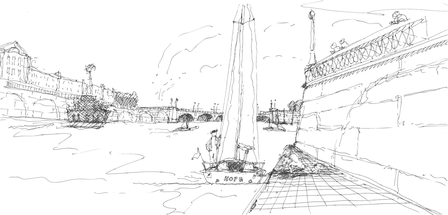
The public character of Washington has grown around two grand plans. First, Charles L’Enfant laid out the city as a sacred grove for the marking of America’s history. One century later, the McMillan Commission restored and expanded upon that original design to include the history of the Nineteenth Century. Now, The city center has grown up in the second hundred years since then, enough for Congress to declare the Mall closed to new development. Meanwhile, the rest of the city has built up or spread out into suburbs. In light of the last fifty years, a group of traditional Washingtonian architects have developed an audacious proposal for the next lifetime of growth, McMillan Two. Fulfilling some less-known intentions of the McMillan Plan with slight modifications, this plan essentially calls for bringing Paris, mansard , Seine and all, to the Capital of the United States.

Developed by the Build DC Initiative and architect Nir Buras in particular, the design has been sponsored by the Mid-Atlantic chapter of the Institute of Classical Architecture and Classical America, the National Civic Arts Society, with some support from the DC chapter of the Congress for New Urbanism. Buras’s philosophy draws hard from tradition: we know what is beautiful and what works – and we should do that. Downplaying strident formal innovation, the relationship buildings have to precedents in a cultural tradition guides design. For McMillan Two, France provides that tradition, particularly L’Enfant’s garden models and the Beaux-arts education of Burnham, McKim, and Olmsted. Though the partners have kept much of the project under wraps, Buras has recently begun sharing the outlines of this radical rethinking of DC’s future, namely that “Washington remains the most beautiful city in the nation.”

current-anacostia-plan
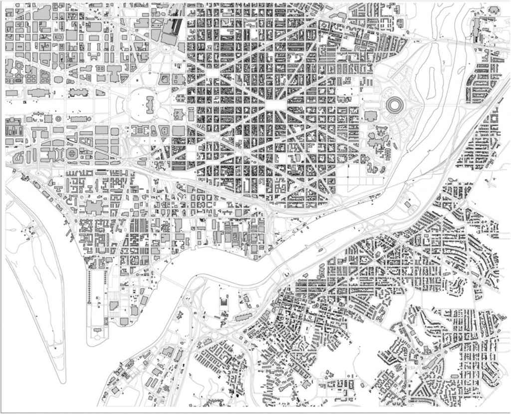
Near Southeast today. All images courtesy Nir Buras.

The McMillan Two plan

Details, Details: Sustainability is so 1983

In the recent controversy over the energy efficiency of LEED-rated buildings, most commentary placed blame on glass, users, the LEED credit system, ASHRAE, expectations, models, etc.  Few people mentioned simple design decisions. Take a look at this picture of 4250 Connecticut Avenue:

van-ness-windows

Designed by Hartman+Cox before they went traditional, it’s pretty unremarkable – except that it shows an uncommon sensitivity to site particulars. In the picture, you can see that about 3/4 of each wall is window space and mullions. Elsewhere on the building, however, less than half of the floor height is glass. Why? The above side faces North-Northwest, with the angled shape exposing most of the wall area to due north. The primary energy problems with glass walls cresults from solar heat gain and glare, but daylighting can also save a lot of energy. On the north side of the building, where there is rarely any direct light, the offices can get some daylight but not catch too much heat.