A simpler design will strengthen the Bond at Tenley

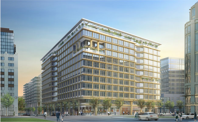
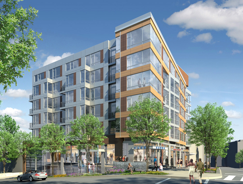
Douglas Development’s planned building at Brandywine and Wisconsin NW.

A building proposed for Tenleytown deserves praise for putting density in the right spot, but its design is too fragile to contribute to the character of Tenleytown. Although the building fills the majority of the lot and is lined with retail, its architecture misses the mark. Consisting of a set of boxy volumes organized through contextual relationships, the building is neither an interesting work of architecture nor a quiet background building.

The Bond at Tenley suffers from overcomposition. In order to break up the bulk, designers at Shalom Baranes Associates have used large-scale overlapping formal figures to break down the sense that the building is a single, solid object. These shapes mostly refer to differences in the urban context. The architects, Shalom Baranes and Associates, then intersected and manipulated them into each other in order to diminish the presence of the building’s mass.

However, at smaller scales and different locations, the same figures are repeated: blocks and grids that overlap and glance by each other, repeating the same general patterns. Rather than using the shifts of scale to contradict figures or develop simplicity, Baranes have jostled oversized parts to produce the architecture.

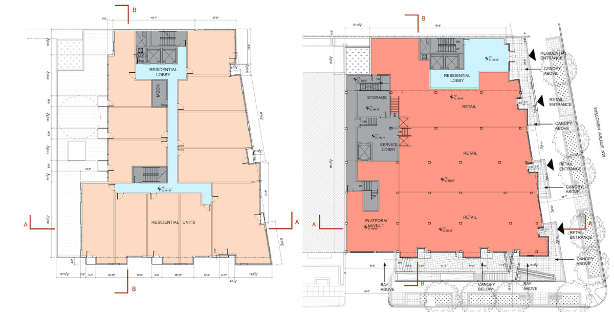
PUD filings and renderings made available on the project’s website show the facades forming principally forming a thick bar along Wisconsin Avenue. From this block a pane of gray metal splits out to match the north-south orientation of the city’s grid and the Brandywine Street façade. By itself, he scissor neatly registers the odd angle formed between the old Georgetown Pike and the city’s grid, while opening up to the street. But then there’s the brick elevator tower and a separate set of bay windows and the parapet, and a dozen different windows.

But that’s not it. The retail strip is articulated as entirely separate from the top of the building. A second color of terracotta runs up the middle of the Wisconsin side, implying another, imaginary volume. Then, there are several tiny balconies protruding from the front, some of which are created by the formal moves, and others seem arbitrary. A look at the floorplans reveals a tortured façade that generally adds up to nothing in particular.

With all of these inflections, what do any of them mean? What part of the context or urban form does the building highlight? A more limited number of operations, with a greater depth of detail would produce a better environment for passers-by. A building with more depth would stand on its own, even as other buildings fill up the neighboring lots and residents become inured to its presence.

Consider the difference between the sounds of two popular summer pastimes: crashing waves and fireworks. One is a repetitive, muffled noise with numerous subtleties, such that the slightest change in timing can make you hold your breath. The other is loud, arranged for variety and effect, and very, very loud. Worse, Baranes’ design is like a fireworks show where every explosion is meant to drown out the noise of every other explosion, so you can’t pin a boom to a flash or react to one before the other. Which one would you rather live in?

It’s not entirely fair to pick on this building, but it is representative of the city’s reputation. When national publications criticize Washington for its conservatism, they are not talking about the traditionalist works, they are talking about the endless formalized reference to context, uncommitted postmodernism, high-end banal glass, and the architectural equivalent of the Rickey, the plaid grid of featureless panels.

However, the towards something more lively is already embedded in the design. The architects at SBA have called for a terracotta rainscreen for the Wisconsin Avenue facade. The systems used offer opportunity for more variety and greater sustainability. Baranes have already successfully employed this kind of exterior curtainwall system at Waterfront Station. On a smaller project like this one, they could be more experimental.

Modern terracotta screen systems have the potential to permit greater architectural variation than what is be possible with glass panels or brick veneer. In addition to a variable texture over the surface, dimensions and spacing and profile of each individual panel can vary. It is possible to use well-established fabrication technology to control the variability precisely, what architects tend to call “parametric.” These mass-producible systems that permit subtle differentiation along the façade, such that buildings could take on an approach with roots as much in the Singer Loft Building as 290 Mulberry Street.

The design of this particular building is important, because it will set the tone for the coming development of this neighborhood, as it diversifies and intensifies. More generally, the building represents a particular fixation of Washington architects: design from context. SBA is one of the a-list architecture firms of the DC area, and already has a presence in Tenleytown, the excellent Cityline. A clean design that develops complexity without ostentatiousness is entirely possible.

If Tenleytown is to look different from Downtown, this is where the distinction can start to be made. This is the first building of a coming regeneration. The importance of setting the tone is important. Tenleytown needs transit oriented development with enough cohesion and activity to maintain grow its identity. Simply deferring to the mediocre context will not develop the neighborhood, but merely perpetuate the present state in nicer materials.

Rather than use its influence to oppose all design, ANC 3E and Tenleytown should work with the developer to produce a better design, one with rhythms and scale that relate to the street and surroundings while bringing something new and vital to the area. In a phrase, the building should be the amenity.
 

900 New York Avenue at CityCenter

If you look at a map of the old convention center site, there are six blocks. The southern three are owned by Hines-Archstone and are being designed by Foster + Partners and Shalom Baranes. Buildings there are now well above ground, destined for opening in 2013. A park by Gustafson Guthrie Nichol will eventually enliven New York Avenue and the middle block will probably be a hotel once the market shakes out.  The last block, though, has been mysterious for years, appropriately noted in this map with a question mark.


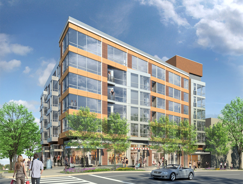
The mystery property is owned by the Gould Property Group, headed by well-bearded parking magnate Kingdon Gould, III. It turns out that the project is much further along in development than I had expected: Gould has hired Pickard  Chilton to design a rental office building, named 900 New York Avenue. You can find the plans here. Renderings reveal a gold-colored building with expressed floorplates and lots of glass.

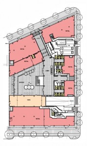
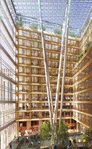
Seems like a bit of retro-eighties work, which is odd since Pickard Chilton are known for their glass. Considering that it’s such a massive building it’s unfortunate PCA chose to not express vertical elements to break up the length of the block. The central atrium, on the other hand, looks like a really great opportunity for social space, while the “urban layer” bottom seems primed to enliven the streets. Putting aside my aesthetic preferences, the project will really add vitality to the area. In particular, the large atrium, shown here in ground plan and rendering, looks promising as a space that engages the pedestrian alley.


It’s interesting that the building cantilevers about five feet out over the sidewalk above the second floor. I wonder if this is meant to open up sidewalk space, or if it is a strange reading of the projections law. More renderings here.

All images courtesy Gould Property Group/Pickard Chilton.


Designing for DC’s borders

All-singing, all-dancing design giant AECOM is sponsoring a student design contest for urban-scale interventions in cities with complicated relationships to their borders:

This year, we are seeking integrated design, planning, environmental restoration and engineering responses that address border, gateway and edge/fringe conditions in cities worldwide. Proposals should address urban sites currently facing chronic liveability challenges that are largely the result of a city’s location on a physical, political, cultural or economic border.

Now, I bet they’re are talking about urban centers near international borders, because those borders are much more absolute and lead to fascinating instances of disparity and extrastratecraft as business and humanity grind against governmental systems. Nonetheless, given the expectation of feasibility, I see an opportunity for proposals involving DC because its unusual legal condition is so intensified by its small size, unique economy, and structural formation.

Consider the consequences of legislative boundaries around DC: voting rights, income tax losses, diminished school funding, job opportunity, metro funding, etc. Or the geographic limitations of the Potomac, Anacostia, and Rock Creek Park: income distribution, commuting bottlenecks, racial division, and so on. Finally, what about the relationship of DC to the rest of the United States and the world? DC requires the usual things cities import, like food, but it also transfers enormous amounts of wealth, power, and human capital globally. Just because this infrastructure is not physical, does not mean that it does not have physical consequences, e.g. the security duck and  the extensive but inadequate infrastructure.

I suppose that the crises are less severe in DC, but I don’t think design will solve these problems. Instead, the curiousness of Greater Washington’s legal structure can be a much more subtle way of understanding the mechanics of government.

Defining “Building Information”

Students at Yale’s Architecture School are invited to propose topics for an annual journal named Perspecta. I co-authored a proposal with my classmate Raven Hardison intending to expand the theoretical background of building information modeling. I find that the discussion over its uses is largely focused on building process improvement, which is itself valuable, but only a narrow band of its potential. The nature of technologies as disruptive and immature as building simulation and information modeling is that we haven’t yet begun to imagine uses for it. See, for example, this week’s article about the Kinect hacking culture in the Times.

Since we were not selected, it seems in the spirit of things to publish the proposal in hopes that it can germinate other ideas in topics we ourselves were blind to. The original proposal included the names of proposed authors, which have been edited out.


A Failed Proposal for Perspecta 48:

BUILDING INFORMATION MODELING

Building information modeling has become fait accompli in the discipline of architecture. Sales of Revit subscriptions steadily rise, while technical facility becomes commonplace. Resignation to BIM’s inevitability has caused a critical blindness toward the nature, forms, and influence of those first two words,building information.”

For Perspecta 48, we propose to step back and investigate unresolved aspects concerning the use of knowledge in design and construction. As a metaphor for the discipline’s approach, consider the parable of the blind monks and an elephant.

A king brings a pachyderm to a few sightless monks as a test. He asks them to reach out and describe this “elephant” they had never before encountered. Unable to perceive the whole creature, each groped at different body parts and returned a correspondingly different answer, all rooted in something familiar. The tail became a whip, the body a granary, the tusk a plow, and one man declared the leg to be a column.

When the king revealed the elephant, he showed their wisdom to be burdened by two key epistemological errors: assuming one has the full scope of information on a subject and, secondly, relying on preconceptions to understanding new information. By approaching the issue from a business side and avoiding theory, the discipline has ceased examining information in a multifaceted way, as it once did.

Forty years ago, researchers like Charles Eastman and Nicholas Negroponte imagined software reminiscent of information modeling and parametricism. Over the next forty years they worked to realize these dreams. But at the same time, the scope of the theoretical aims narrowed from world order to interface to tool and finally to product. In order to produce viable software, designers had to cut back their ambitions to basic commercial goals. Speculation on the radical political uses of data or how digital tools transform our relationship to the physical have been left to coders at the margins.

To reorient the debate, Perspecta 48 looks at “building information” from five key angles. Taking a fundamental perspective, the authors in the first section will examine the epistemology of building. By this we mean what is considered constructional knowledge, and how the discipline organizes it. Another group will look at the ways simulation and dematerialization have transformed humans and their environment.

A third set explores the diverging ends of authority and participation on that building modeling is driving the profession to. Looking at the politicization of knowledge, one group will examine how information multiplies of power and raises new ethical dilemmas. Finally, one collection of essays will discuss the technical difficulties of realizing architecture with digital technologies, and even how to embrace them.

We aspire to reinvigorate the discourse about building information by revealing it to be not merely a technology, but rather as a fundamental element of architecture.


The proposal continues.

Quick Thought: Generation X-over-Y

While writing about AU expansion, I’ve been getting a sense that one reason I’ve been having a hard time writing arguments that will resonate  is that the opposing perspective is approaching the topic with a totally different paradigm of what it is.

My (undeveloped) conjecture is: the older generation sees environmental problems from an intuitive (fishkills & pesticide) perspective, whereas the later generations see the issue in terms of abstractions (%CO2 over 10,000 years). I think I can say that ecology is based on systems thinking. “Ecosystem,” after all, precisely refers to an interrelated organization. That complex activity can only be understood through abstractions that make consequences more intuitively threatening.

But the older generation seems to approach an environmental issue as perceptible, in that anyone can readily see the links and the loops and understand their consequences. You cut down a tree, and this directly harms the environment and limits one’s access to it. A particular, standing in for the general, is irrevocably lost. Building where there once was a grassy patch is paving over paradise, and a building that brings any cars to the neighborhood is causing pollution.

The primary enemies of the 1960s were intensely graphic horrors such as the burning Cuyahoga, broken bird eggs, and the disfiguration wrought by thalidomide. The problems were so obvious, you could see them with your eyes, and that his how we noticed in the first place. For the generation brought up during an era of global warming, the agents are more nefarious. How does one picture a rise of water over decades? How do you draw the cancer cluster caused by dioxins in an aquifer? You have to rely on the numbers.

Thus, cutting one tree here can save ten elsewhere, the understory is better than a lawn, and a building that brings traffic to one area might reduce car trips on a regional scale is a ethical imperative.

I don’t want to nail the intuitive position as inferior. The aesthetics of an environment contribute to its quality, particularly trees and greenery. They’re an essential part of good urban design, and remembering that humans have an inborn relationship to nature, they almost certainly contribute to the well-being of residents.

However, it is much easier to accommodate the perceivable sense of nature within an abstracted framework than vice versa. I.e., you can plant trees in a city where you don’t have to drive, but it’s hard to fix the numbers on pollution when you have to drive everywhere to and from your 2.3 acres.

Washington’s Fort Circle, now in studios.

The Van Alen Institute and the National Park Service have announced a program that would create new designs for several national parks, Parks for the People. The program is a competition limited to entire studios of architecture students, who will propose designs as part of their education. In the program’s words:

Participating schools will work with park administrators to create model solutions for seven park sites in each geographic region of the U.S., and use these design paradigms to create a stronger national identity for our open space ideals. Throughout the competition, schools will have an opportunity to engage with the Park Service and its rich cultural and historic assets, including access to park leadership, in-depth encounters with park sites, and the chance to build long-term relationships with park staff and resources.

They have selected seven interesting sites, one of which is the Civil War Defenses of Washington, presumably including Fort Reno. It is the only site in a major city and the only site that is used for day-to-day recreational purposes.

Students will have to consider these uses in addition to the interpretive and conservational missions of the NPS. These parks are back yards for some people, and not just precious destinations. There hasn’t been a lot of work in terms of creating commemorative spaces that are also great places to spend time, since memorials shifted from illustrative work to psychologically engaging complexes (even as they got bigger.)

Another program related to DC that I would love to publish is Leon Krier’s Spring 2010 studio at Yale, which asked students to design a monumental replacement for the MLK library on the CityCenter site.

Anacostia foot bridge: a pedestrian idea?

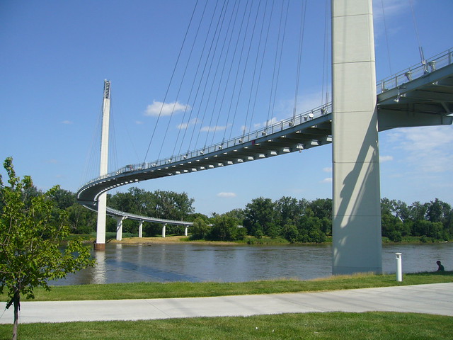
Bob Kerrey Pedestrian Bridge in Omaha/Council Bluffs. Image: Nic221 on flickr.

The bridges over the Potomac, Anacostia, and Rock Creek are very important connections over the strongest boundaries in DC. The relatively few crossings are the bane of commuters and a significant impediment to the development and livability of the DC area. So, it’s no surprise that David Garber has been advocating for a pedestrian bridge across the Anacostia. The most recent iterations have been drawing on the NCPC‘s Extending the Legacy Plan (PDF) and subsequent plans. Plus, there have been a slew of impressive and iconic pedestrian bridges popping up in the US. I think that connecting across the river would be great, but maybe something more than just a fixed link would be best for the Anacostia.

For me, the whiz-bang factor of a bridge is offset by the need for this kind of structure to work as an urban space. Creating a more pleasant route for non-motorized commuters is a good enough end, but for more casual enjoyment, it needs some other qualities. Iconic bridges tend to beautifully express directed motion from one end to another, but not the pauses and distractions of a stroll.

In a way, you create a long pedestrian-only space with no activating buildings. Without a mass of people, those spaces are alienating or unsafe.

There are some relevant examples that approach the concept differently:

American’s Unexceptionalism

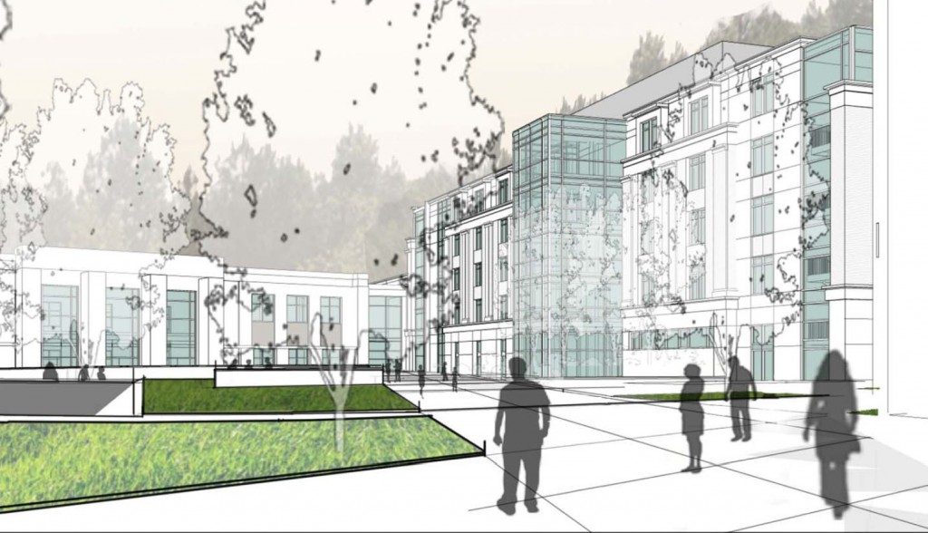
While American University’s campus plan is a net benefit for Ward 3, the architecture currently proposed for the campus is mediocre at best. Beyond the land-use planning, East Campus and North Hall’s proposed buildings offer little in terms of aesthetics. The spaces are disorganized and the forms are uninspiring. On the outside, the buildings don’t relate the street well, and the facades present foggy contextualism.

Instead of well-executed buildings, the design revolves around appeasing neighbors while important aspects are left undeveloped.

For East Campus and some of the Main Campus buildings, AU hired Little Diversified Architectural Consulting, a Charlotte-based firm with offices in Alexandria. They have designed a large dorm at Catholic University, Opus Hall, similar in style and form to AU’s proposed facilities. Other design work was executed by the university’s large in-house architectural group and the firm of McKissack & McKissack.

A look at the new Czech Embassy

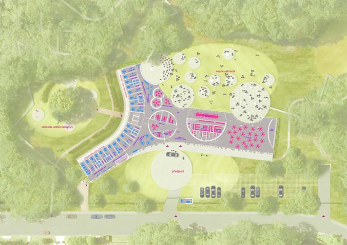
The Embassy of the Czech Republic has announced a design for a new building to replace an aging facility on Tilden Street in Northwest Washington. The current embassy is a not-quite-modernist structure at the edge of Rock Creek Park near Peirce Mill. The new structure will be a postmodern landscraper in a y-shape that clings to the site, in a flattened valley. The architects are Prague-based Chalupa Architekti; I think this is a definite improvement.

This is going to be a really great building for nighttime parties. The designers conceived of a theatrical center for élite receptions. I like the circular pods that are scattered inside and out and in between. They refresh the old Modernist idea of dissolving barriers between the interior and exterior, nature and environment, by bringing it back to the original idea of passing volumes through an envelope. The front (north) façade is a beautiful composition of frosted glass formed into a curtain. From the side of practicality, the east-facing façade of the office wing is fenestrated and shaded reasonably well for actual daylighting.

The architects fell into some contemporary tropes I dislike. I find some of the lines to be arbitrarily harsh and unanimated. The glass curtain in front ends bluntly at the roof slab. Likewise, the entrance doesn’t stand out on a building that already doesn’t address the street well. Admittedly, it is a diplomatic building, so security concerns will cause designers to skew fortress-like and the surrounding neighborhood is hilly and wooded, full of detached mansions like the Hillwood.

So, maybe disappearing into the environment is the best course here. The grass roof slips the building into its site. And if it’s not near public transit, it is near great bicycle resources. The shady Rock Creek trail is just feet from the entrance. If the Czechs get on the same bike as the Danes and install some changing facilities (it’s not clear from the published images if they have them), then it could be a pretty forward-thinking building.

What do you think?

As seen on Dezeen.


A Look at the Janney Expansion

Janney Rendering 1 SE_09 SMALL

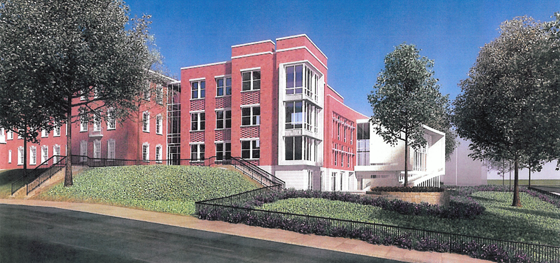
I finally got some images of the proposed Janney School extension. I like it – but it could have been better. With a few objections, I like its conception. Devrouax + Purnell, best known for the Washington Convention Center, the Pepco Building, and Nationals Park, here produced an interesting and attractive school building. However, the location where they have chosen to place the wing results in a lost opportunity for Janney and the community in general. Like too many developers and architects, they approached Tenleytown planning to not upset the status quo. However, any public facility should be designed with an eye to the future – and the current state of Tenleytown cannot last.

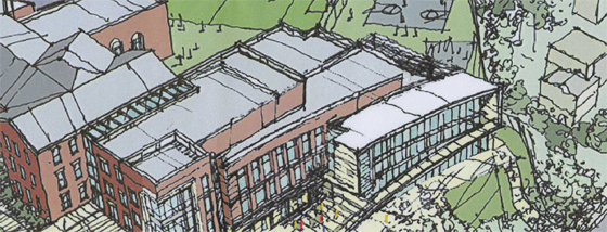
The building steps down.

Beginning with the generous setback along 42nd street, the architects attempted to hide the building as much as possible, so as not to intrude on the neighborhood. Although the Albemarle façade extends to the cornice line of the 1923 building, the masses of the building gently diminish into a low white structure that encloses the gym. Moving south along the western face, the building curves gently, from a tower to the first private residence down the block. The architects employed the shape subtly, repeating the curve in each mass to limit its effects. It does successfully integrate into the site.

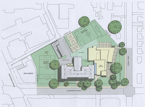
However, this hesitant approach is not appropriate here. The architects should not have set the building back from the street so much. In doing so, they have reduced the feeling of enclosure afforded by a consistent streetwall, produced an marginally useful green space, and missed an opportunity to relocate the playing field at the center of the Tenley Library Public-Private Partnership debacle.

JES_Design_Schematic_20091110-1 SMALL

For the 2007 plan to build a library with several floors of condominiums on top focused on the loss of recreation space (the rightmost field in the image above) for Janney Students. Some of that space would be consumed in the footprint of the condominium structure. However, had the architects located the new wing closer to the property line, they might have opened up space to relocate the eastern soccer field. In a political environment as vicious as Tenleytown’s, a mutually agreeable solution would have been a rare happy ending.

That lost opportunity is my main complaint – but there’s much more review below.