Veazey Walgreens

veazy walgreens
Arbitrarily messy and unconsidered.

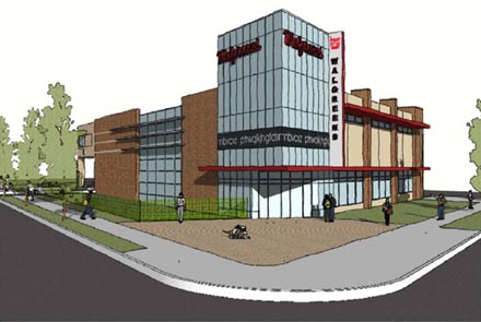
Seen here is the new Walgreens in Van Ness, at Veazey & Connecticut. A big improvement on the gas station that’s there, and an even bigger improvement over the previous plans. In terms of land use, the site would be better as a multistory building, and not as another chain convenience store, but it’s also limited by zoning.

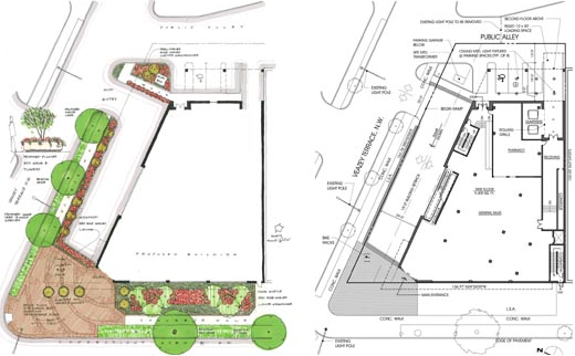
Plantings and floorplan.

Designed by Rust|Orling, I think the building is a really poor imitation of a mid-mod style, an eyesore in a place where we don’t need any more. R|O are otherwise a good firm with a keen ability to manifest architectural diversity, but it looks like modern architecture is not their strong suite.  They’re also restoring the art deco Walgreens in Cleveland Park and are the designers of Potomac Yards.

Construction has not begun, and these are working renderings.

The Future Was Classical

While I finish writing the Forest Glen essay, please enjoy this alternative scheme to the Mc Millan Commission “Kite” Plan, rendered by arch-traditionalist genius/maniac Leon Krier in 1985.

Theres nothing like a fantastical image to start the weekend
There's nothing like a fantastical image to start the weekend, is there?

You can take a gander at other views of the plan here, although you might be surprised at who owns them.  His explanatory drawings and diagrams offer  dead-on critiques of the City Beautiful and Modernist planning that have turned central DC into a lifeless pile of stuttering architectural gigantism.

Sidwell’s Machine for Environmentalism

Rain garden with wetlands in rear.

Landscape-oriented architecture blog Pruned is carrying an excellent post about the wastewater-recovering wetland installed at the center of their new campus. The LEED Platinum building, which opened in 2007, was designed by KieranTimberlake of Philadelphia. The firm designed the building to recycle all of its graywater and brownwater through an elaborate wetland, as one of its many sustainable features. If you go visit the building, the trickle filter is wrapped with a sign that explains how the system works. The sign rests at a child’s height and leads readers around and around with arrows, which I find a little obnoxious. Luckily, Pruned has explained the process more clearly, so without further ado, go read their article

Pruned also notes a very important civic issue this solves: the cost of runoff on municipalities and local watersheds. This beautiful oasis reduces the amount of water that flows out of the building, or flows off the hard surfaces of the building (there is a separate rainwater recycling system), and into Rock Creek and the White Plains treatment facility. Among the general public, a lot is made of water conservation (which this building also assists), but the strain on public facilities caused by sewage and stormwater is quite severe. At least up in Cleveland Park and Tobago, we do not have combined sewer overflow systems, like the do downtown. 

For elite Washingtonians worried that their children will become astronauts or mutant mer-men, the recycled water is dyed blue with a non-toxic coloring agent and reused in toilets and janitorial sinks. Meanwhile, St. Albans School’s non-LEED Marriott Hall, by SOM is in the interior-fit out phase, and has just gained its green roofs. More on that some other time.

Macomb Giant: Where to from here?

The Zoning Commission has approved the Macomb-Wisconsin Giant project, after a difficult and involved process that began in 1619 1998.  Jeff Davis posted on the Cleveland Park Listserv about it this morning:

Last night, the Zoning Commission voted unanimously (4 to 0) to approve the
Giant PUD Application. The zoning process was robust, transparent, and fair and it yielded a terrific overall result.

He’s right, the overall result is excellent urban planning and competent architecture that  adds considerably more and better density to a major thoroughfare, while also managing to unite a mottled context of various building types and styles. The architects, Street-Works, have produced excellent cityscapes work in Shirlington, Reston, and Bethesda. Based on their prior experience, it’s safe to predict that the project will be a success. More than that, I predict that the already thriving area will become a new locality, a broad place that people will perceive intuitively as distinct from Cleveland Park and Cathedral Heights. 

And that’s a good thing, because Wisconsin Avenue needs more of this healthy density. The example that this sets will be a lesson to Ward 3, demonstrating how a few stores and few more stories can create an enjoyable neighborhood center. Not only will the extreme non-failure of the site be ammunition for people who support smart growth, it will serve as a billboard for those who are not engaged in debates, that urbanism is possible in Northwest. But it will be some time before the buildings are built and the storefronts occupied, so until then, activists for urban neighborhoods will have to focus on two things.

  1. Getting there. One of the criticisms of  the new project stemmed from the limited mass transit options in the proposal, legitimate concerns that need to be addressed. WMATA needs to step up bus service and introduce an express line on Wisconsin, either to Georgetown or Woodley Park. Bus facilities such as bus bulbs need to be added to Wisconsin, even at the expense of roadway space. Likewise, DC ought to facilitate the placement of SmartBike facilities, bike racks, and carsharing spaces.
  2. Connecting the surrounding neighborhoods. People must be able to walk to the new development. The current plans emphasize pedestrian traffic, but DDOT needs to improve the streetscape around Macomb, to lure neighborhood residents off of side streets. Without buffering from Wisconsin or new signals along Wisconsin, pedestrians lose the calmness that makes walking so appealing. 

Those who fought hard to get the right kind of development should not give up the momentum they have now, and instead should fight for even better facilities. This includes opponents, who should still look to make the area as leafy as possible, and ensure that Giant sticks to its promises. Resident involvement is one of the most crucial parts of developing community, so although the fight over the Giant has been so acrimonious, it’s important to realize that it will happen, and anyone interested must remain involved in working to ensure good growth elsewhere in the neighborhood.
Biggest urban gamble of the past 20 years opens

The High Line opened today. The much-vaunted and extremely chic park built on a former railroad viaduct south of Penn Station will be a test of both urban design theories and the exceptionality of New York. Diller Scofidio + Renfro have built what appears to be a truly beautiful modern park that appeals to theorists as much as hipsters and bankers. It’s also an elevated pedestrian structure, with limited access and some other design decisions that contradict basic public space design practice. But it’s popular and it’s going to get a lot of attention; many cities are already looking to copy it. 

There hasn’t been a place in New York that deserves close  observation since the West Village in 1961. The degree to which this works could change the way governments approach marginal spaces, just as the Embarcadero and the Central Artery/Tunnel projects have show the civic potential of highway removal. We’ll just have to wait and see if this is the same.

Forest Glen Seminary: One Thing Leads to Another

Part two of a four-part essay exploring context, typology, and interpretation. Comments encouraged.

fglinden

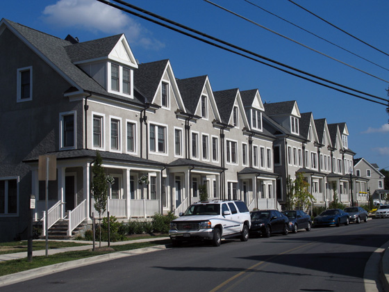
Against rich complexity of the old Seminary, the houses designed by EYA are then a real letdown. They carry the superficial veneer of “context” that is endemic to New Urbanist planning and its most visible error. To be clear, they are not abominations, but they are dull and only stylistically similar to the outré conglomeration across the street. The application of traditional elements here fulfills a requirement that new buildings  respect the architecture of the historic landmark. Okay, sure, sounds good, but the legislation is fairly scant in the details of execution. The easy option, a cynical abdication of artistic responsibility, is to copy the notions of form in hazy facsimile and slap it on off-the-shelf buildings. Even where the designs are competent, the lack of sensitivity results in tepid mediocrity.

Forest Glen Seminary: Into the Woods

Part one of a four-part essay exploring context, typology, and interpretation. Comments encouraged.

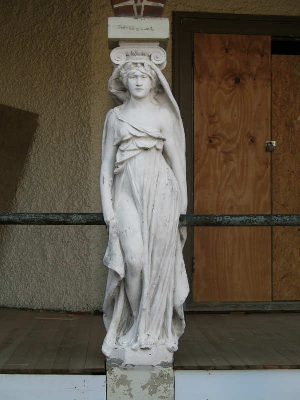
Classicism at its horniest

Hidden among a leafy scattering of houses and trees, Forest Glen Seminary is a jumble of vernacular buildings unlike any of the temples of boxes that define Washington. Its buildings, both magnificent and ludicrous amount to a dignified campiness that defies expectations to be one of the most profoundly interesting places encircled by the Beltway. Once constituting a women’s college when that meant a two-year Mrs. degree, the buildings are once again becoming domestic space, the more private areas cut into condos and the core of the complex, rental units. Scattered around the area, turn-of-the-century houses are being renovated and new housing by the urbanist developer EYA has just been finished. Through the site’s history, radical changes have shaped its form, but none so radical as the current shift in context.

Legos used to build things

searsgo

Career-inspiring plaything manufacturer Lego has announced a line of rather small models of iconic buildings, called simply LEGO Architecture (with mock construction lines to tell you that it’s architecture). The first two released are Fallingwater and a tiny Guggenheim, but if their teaser page is any indication, it will soon be possible to realize the mad genius of the Onion’s conceptual terrorists.

Three interesting things

Metropolis ran an article online discussing the unorthodox business model the firm Delle Valle Bernheimer employs. They have begun integrating development into their portfolio, realizing that controlling all elements of a project essentially cuts a lot of inefficiency from the process of getting something you care about built. In addition to giving them a high degree of control in regards to design and quality, it tempered their exuberance by bringing issues of engineering, cost, budgeting, and dealing with problems into their realm, on their bottom line.  Their strategy is not new – it’s a standard practice called design-build-operate/maintain – but this is one of the first boutique architecture firms to employ it. 

But back wen DB were just getting started, a depraved genius named Zak Smith managed to produce illustrations of each page of the book Gravity’s Rainbow. Somehow, he  managed to sit down and produce 760 works of art, in multiple media, depicting pretty much everything that happens in the book, in some way or another. I haven’t had a look at the whole thing, but the sheer amount of creativity would make an edition of Thomas Pynchon’s book with these drawings a worthwhile purchase.

And also terms of good (early) works, Metropolis has nicely been hosting blog posts about Yale’s First-year house project, where they also design-build a house for a local rent-to-own program.

Resolution and a little denouement

With the considerable help of Thomas Allen of 703Designs and Alexandra Silverthorne, I was able to get the bad code out and get things back to normal. It was a simple error, buried in a couple of posts, but it’s not exactly clear how it got in there. You might also be interested in Alexandra’s photography installation series, The Parks Project, which has placed photographic plaques in several parks around the city, including Fort Reno.

In the meantime, I’ve changed to a theme that displays text better and loads more quickly. I’ve also revised a number of posts for clarity:

I’ll also be updating the blogroll to be more local soon. So czech that out.

And I’ll leave you with a quotation about the New Art Institute of Chicago building, by Nicky O:

It’s hard to know how these qualities will play out amid the gloom and doom of the new economy. In some ways Mr. Piano’s refined, risk-averse architecture may be more appealing than ever. He is not out to start a revolution. His designs are about tranquillity, not conflict. The serenity of his best buildings can almost make you believe that we live in a civilized world.

A calm, comfortable building that uses modern materials in a rational, humane way. Sounds good to me.