Architecture
Out-of-District Experience: New Orleans, Louisiana
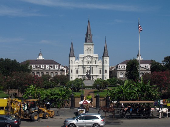
Toward the end of his career, Pablo Picasso lamented that he had stopped being creative and was merely “doing Picasso.” New Orleans has followed suit sometime in the past fifty years, becoming the image of the idea of itself. That doesn’t mean the jazz or the culture has disappeared, just that a simulacrum of itself has been interpolated into the French Quarter in such a way that a visitor can’t get a sense of the beast for all the taxidermy. I only had a morning to spend in the area due to nuptials elsewhere, but my perception was that there was a very livable area there, but what I saw did not inspire me to live there. I’ll need to go back and give the whole city a better look.
Continue reading ➞ Out-of-District Experience: New Orleans, Louisiana
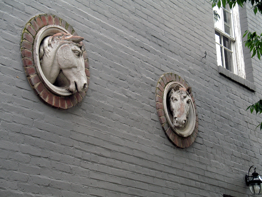
Details, Details: Georgetown Stable
It’s simple, humble ornament that conveys the function of the building. With a little humor, it almost suggests that the horses are popping their somber heads out to have a look around.
Good Architects: McInturff Architects
To make an unwarranted generalization, DC architects like their buildings heavy and somber. Even in the recent fad of light and clean glass facades, the buildings have been rather self-serious and blockish looking, a consequence of clients demanding efficient floorplans from architects who themselves were trying to be cool and modern without upsetting the polished and poised look DC has in the collective consciousness and legal structure. This fretful indecision can be a bit like the jeans and sportcoat look – crisp but comfortable, hip but conservative.
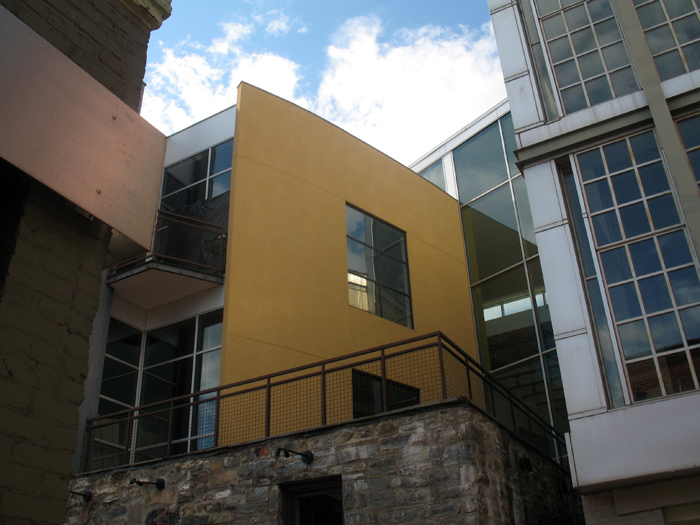
McInturff Architects offer a wholly different approach. They’re (post)modern(ist) but a little witty and also aiming for comfort. Their mostly residential oevure consists of excellently-composed buildings that respond coyly to the conditions of the site. In doing so, it avoids falling into limpid styles while also carefully respecting historic and distinctive architecture elsewhere. As for aesthetics, the practice cleverly contrasts gentle and warm elements with bold minimalism in beautiful light-filled spaces. As their projects are primarily private, it’s trickier to see their work than Esocoff & Associates‘. But down in Georgetown, anyone can at least see three buildings, and go into one of those.
Great Interview with Ada Louise Huxtable
Charlie Rose is one of the few people on TV who actually gives any attention to architecture. At the same time, he’s still a dilettante, so it’s interesting to see him gush over buildings while she cooly discharges years of wisdom. There’s some good chatter about Gehry and Mies, and why they’re much better than even their fans think.
Veazey Walgreens
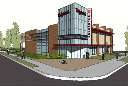
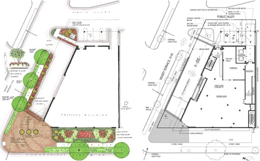
Seen here is the new Walgreens in Van Ness, at Veazey & Connecticut. A big improvement on the gas station that’s there, and an even bigger improvement over the previous plans. In terms of land use, the site would be better as a multistory building, and not as another chain convenience store, but it’s also limited by zoning.
Designed by Rust|Orling, I think the building is a really poor imitation of a mid-mod style, an eyesore in a place where we don’t need any more. R|O are otherwise a good firm with a keen ability to manifest architectural diversity, but it looks like modern architecture is not their strong suite. They’re also restoring the art deco Walgreens in Cleveland Park and are the designers of Potomac Yards.
Construction has not begun, and these are working renderings.
The Future Was Classical

You can take a gander at other views of the plan here, although you might be surprised at who owns them. His explanatory drawings and diagrams offer dead-on critiques of the City Beautiful and Modernist planning that have turned central DC into a lifeless pile of stuttering architectural gigantism.
Sidwell’s Machine for Environmentalism

Landscape-oriented architecture blog Pruned is carrying an excellent post about the wastewater-recovering wetland installed at the center of their new campus. The LEED Platinum building, which opened in 2007, was designed by KieranTimberlake of Philadelphia. The firm designed the building to recycle all of its graywater and brownwater through an elaborate wetland, as one of its many sustainable features. If you go visit the building, the trickle filter is wrapped with a sign that explains how the system works. The sign rests at a child’s height and leads readers around and around with arrows, which I find a little obnoxious. Luckily, Pruned has explained the process more clearly, so without further ado, go read their article.
Pruned also notes a very important civic issue this solves: the cost of runoff on municipalities and local watersheds. This beautiful oasis reduces the amount of water that flows out of the building, or flows off the hard surfaces of the building (there is a separate rainwater recycling system), and into Rock Creek and the White Plains treatment facility. Among the general public, a lot is made of water conservation (which this building also assists), but the strain on public facilities caused by sewage and stormwater is quite severe. At least up in Cleveland Park and Tobago, we do not have combined sewer overflow systems, like the do downtown.
For elite Washingtonians worried that their children will become astronauts or mutant mer-men, the recycled water is dyed blue with a non-toxic coloring agent and reused in toilets and janitorial sinks. Meanwhile, St. Albans School’s non-LEED Marriott Hall, by SOM is in the interior-fit out phase, and has just gained its green roofs. More on that some other time.
Biggest urban gamble of the past 20 years opens
There hasn’t been a place in New York that deserves close observation since the West Village in 1961. The degree to which this works could change the way governments approach marginal spaces, just as the Embarcadero and the Central Artery/Tunnel projects have show the civic potential of highway removal. We’ll just have to wait and see if this is the same.
Forest Glen Seminary: One Thing Leads to Another
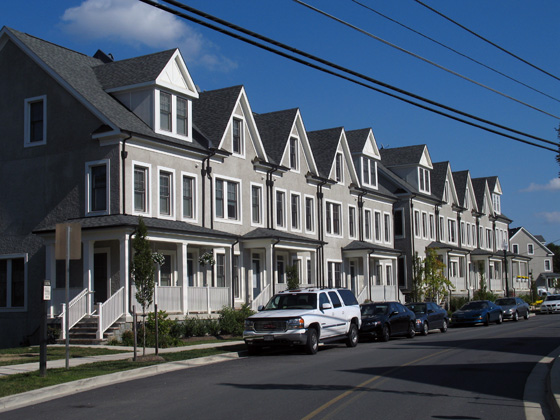
Against rich complexity of the old Seminary, the houses designed by EYA are then a real letdown. They carry the superficial veneer of “context” that is endemic to New Urbanist planning and its most visible error. To be clear, they are not abominations, but they are dull and only stylistically similar to the outré conglomeration across the street. The application of traditional elements here fulfills a requirement that new buildings respect the architecture of the historic landmark. Okay, sure, sounds good, but the legislation is fairly scant in the details of execution. The easy option, a cynical abdication of artistic responsibility, is to copy the notions of form in hazy facsimile and slap it on off-the-shelf buildings. Even where the designs are competent, the lack of sensitivity results in tepid mediocrity.
Continue reading ➞ Forest Glen Seminary: One Thing Leads to Another
