This is a long post, so click through…
Tag: context
A simpler design will strengthen the Bond at Tenley
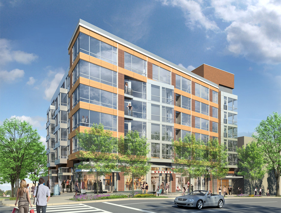
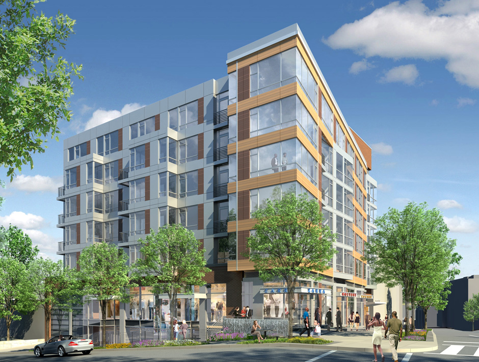
A building proposed for Tenleytown deserves praise for putting density in the right spot, but its design is too fragile to contribute to the character of Tenleytown. Although the building fills the majority of the lot and is lined with retail, its architecture misses the mark. Consisting of a set of boxy volumes organized through contextual relationships, the building is neither an interesting work of architecture nor a quiet background building.
The Bond at Tenley suffers from overcomposition. In order to break up the bulk, designers at Shalom Baranes Associates have used large-scale overlapping formal figures to break down the sense that the building is a single, solid object. These shapes mostly refer to differences in the urban context. The architects, Shalom Baranes and Associates, then intersected and manipulated them into each other in order to diminish the presence of the building’s mass.
However, at smaller scales and different locations, the same figures are repeated: blocks and grids that overlap and glance by each other, repeating the same general patterns. Rather than using the shifts of scale to contradict figures or develop simplicity, Baranes have jostled oversized parts to produce the architecture.
PUD filings and renderings made available on the project’s website show the facades forming principally forming a thick bar along Wisconsin Avenue. From this block a pane of gray metal splits out to match the north-south orientation of the city’s grid and the Brandywine Street façade. By itself, he scissor neatly registers the odd angle formed between the old Georgetown Pike and the city’s grid, while opening up to the street. But then there’s the brick elevator tower and a separate set of bay windows and the parapet, and a dozen different windows.
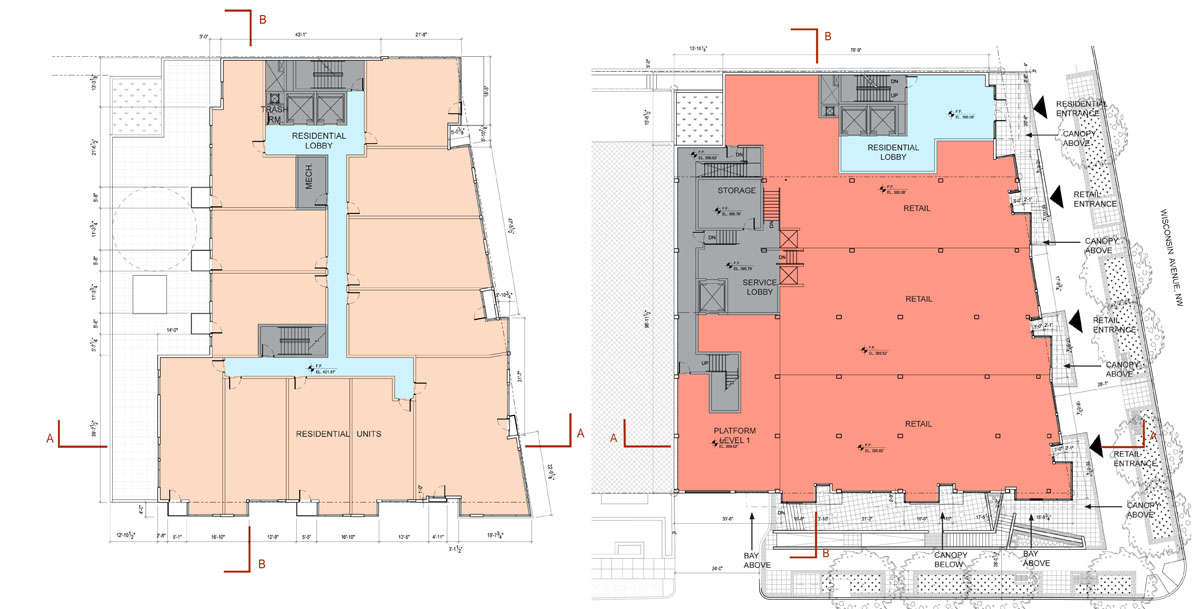
But that’s not it. The retail strip is articulated as entirely separate from the top of the building. A second color of terracotta runs up the middle of the Wisconsin side, implying another, imaginary volume. Then, there are several tiny balconies protruding from the front, some of which are created by the formal moves, and others seem arbitrary. A look at the floorplans reveals a tortured façade that generally adds up to nothing in particular.
With all of these inflections, what do any of them mean? What part of the context or urban form does the building highlight? A more limited number of operations, with a greater depth of detail would produce a better environment for passers-by. A building with more depth would stand on its own, even as other buildings fill up the neighboring lots and residents become inured to its presence.
Consider the difference between the sounds of two popular summer pastimes: crashing waves and fireworks. One is a repetitive, muffled noise with numerous subtleties, such that the slightest change in timing can make you hold your breath. The other is loud, arranged for variety and effect, and very, very loud. Worse, Baranes’ design is like a fireworks show where every explosion is meant to drown out the noise of every other explosion, so you can’t pin a boom to a flash or react to one before the other. Which one would you rather live in?
It’s not entirely fair to pick on this building, but it is representative of the city’s reputation. When national publications criticize Washington for its conservatism, they are not talking about the traditionalist works, they are talking about the endless formalized reference to context, uncommitted postmodernism, high-end banal glass, and the architectural equivalent of the Rickey, the plaid grid of featureless panels.
However, the towards something more lively is already embedded in the design. The architects at SBA have called for a terracotta rainscreen for the Wisconsin Avenue facade. The systems used offer opportunity for more variety and greater sustainability. Baranes have already successfully employed this kind of exterior curtainwall system at Waterfront Station. On a smaller project like this one, they could be more experimental.
Modern terracotta screen systems have the potential to permit greater architectural variation than what is be possible with glass panels or brick veneer. In addition to a variable texture over the surface, dimensions and spacing and profile of each individual panel can vary. It is possible to use well-established fabrication technology to control the variability precisely, what architects tend to call “parametric.” These mass-producible systems that permit subtle differentiation along the façade, such that buildings could take on an approach with roots as much in the Singer Loft Building as 290 Mulberry Street.
The design of this particular building is important, because it will set the tone for the coming development of this neighborhood, as it diversifies and intensifies. More generally, the building represents a particular fixation of Washington architects: design from context. SBA is one of the a-list architecture firms of the DC area, and already has a presence in Tenleytown, the excellent Cityline. A clean design that develops complexity without ostentatiousness is entirely possible.
If Tenleytown is to look different from Downtown, this is where the distinction can start to be made. This is the first building of a coming regeneration. The importance of setting the tone is important. Tenleytown needs transit oriented development with enough cohesion and activity to maintain grow its identity. Simply deferring to the mediocre context will not develop the neighborhood, but merely perpetuate the present state in nicer materials.
Rather than use its influence to oppose all design, ANC 3E and Tenleytown should work with the developer to produce a better design, one with rhythms and scale that relate to the street and surroundings while bringing something new and vital to the area. In a phrase, the building should be the amenity.
Don’t Just Preserve History at Tenley Campus, Interpret It.

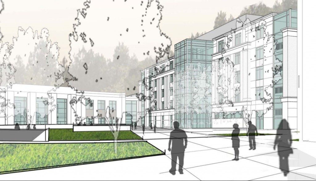
AU has agreed to preserve several structures on the site: the a former farmhouse called Dunblane House, Capital Hall the main building visible from Tenley Circle, and a Chapel. Together, these buildings form an axis that the Historic Preservation Office has insisted on preserving.
The Historic Preservation Office is right to emphasize this axis; it is probably the most interesting part of the site. The architects at SmithGroup have worked within these requirements to create a private quadrangle between the old house and Capital Hall, which looks good so far.
But AU has also decided to build on the footprints of the existing 1950s buildings and not construct anything that would obscure Capital Hall. The buildings are preserved, but no part of the campus will feel different from the others, even if they are in a slightly different style. The new buildings offer no key to understand on the site they inherit.
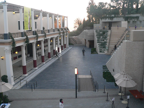
To understand what I mean by interpretation, take a look at Machado & Silvetti’s renovation of the Getty Villa. They combined the pragmatic need for an an entry stairway with architectural promenade that helps visitors understand the museum’s curatorial approach. Treating the 1970s replica of a roman villa as an object in a collection, stairs and pathways frame the building in a sequence that calls to mind an excavation. The stair gives visitors a lens with which to understand the building and clears their minds of the drive out to Malibu.
Continue reading ➞ Don’t Just Preserve History at Tenley Campus, Interpret It.
American’s Unexceptionalism
While American University’s campus plan is a net benefit for Ward 3, the architecture currently proposed for the campus is mediocre at best. Beyond the land-use planning, East Campus and North Hall’s proposed buildings offer little in terms of aesthetics. The spaces are disorganized and the forms are uninspiring. On the outside, the buildings don’t relate the street well, and the facades present foggy contextualism.
Instead of well-executed buildings, the design revolves around appeasing neighbors while important aspects are left undeveloped.
For East Campus and some of the Main Campus buildings, AU hired Little Diversified Architectural Consulting, a Charlotte-based firm with offices in Alexandria. They have designed a large dorm at Catholic University, Opus Hall, similar in style and form to AU’s proposed facilities. Other design work was executed by the university’s large in-house architectural group and the firm of McKissack & McKissack.
Forest Glen Seminary: An Unintentional Project
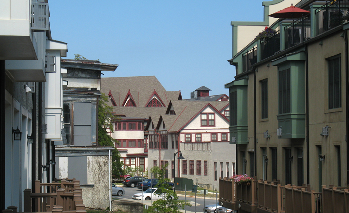
But from the enormous source material of the existing buildings, the Alexander Company took what opportunities it had and exploited them into a quiet celebration of the specific context. The original buildings, despite their conversion to a warren of private apartments and condominiums, have kept of their idiosyncrasies. In spite of sparkling new halogen lights and granite countertops, the apartments retain the unique elements that make the buildings meaningful to residents.
Continue reading ➞ Forest Glen Seminary: An Unintentional Project
Good Architects: McInturff Architects
To make an unwarranted generalization, DC architects like their buildings heavy and somber. Even in the recent fad of light and clean glass facades, the buildings have been rather self-serious and blockish looking, a consequence of clients demanding efficient floorplans from architects who themselves were trying to be cool and modern without upsetting the polished and poised look DC has in the collective consciousness and legal structure. This fretful indecision can be a bit like the jeans and sportcoat look – crisp but comfortable, hip but conservative.
McInturff Architects offer a wholly different approach. They’re (post)modern(ist) but a little witty and also aiming for comfort. Their mostly residential oevure consists of excellently-composed buildings that respond coyly to the conditions of the site. In doing so, it avoids falling into limpid styles while also carefully respecting historic and distinctive architecture elsewhere. As for aesthetics, the practice cleverly contrasts gentle and warm elements with bold minimalism in beautiful light-filled spaces. As their projects are primarily private, it’s trickier to see their work than Esocoff & Associates‘. But down in Georgetown, anyone can at least see three buildings, and go into one of those.
Forest Glen Seminary: One Thing Leads to Another
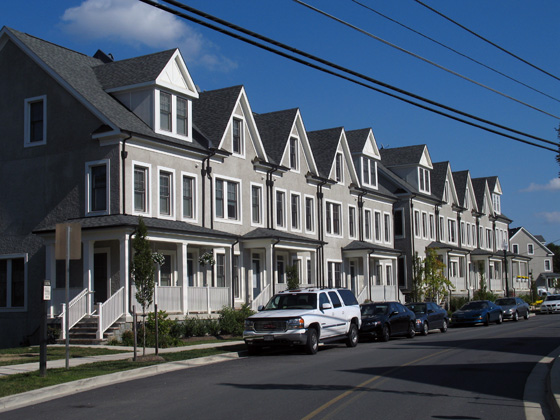
Against rich complexity of the old Seminary, the houses designed by EYA are then a real letdown. They carry the superficial veneer of “context” that is endemic to New Urbanist planning and its most visible error. To be clear, they are not abominations, but they are dull and only stylistically similar to the outré conglomeration across the street. The application of traditional elements here fulfills a requirement that new buildings respect the architecture of the historic landmark. Okay, sure, sounds good, but the legislation is fairly scant in the details of execution. The easy option, a cynical abdication of artistic responsibility, is to copy the notions of form in hazy facsimile and slap it on off-the-shelf buildings. Even where the designs are competent, the lack of sensitivity results in tepid mediocrity.
Continue reading ➞ Forest Glen Seminary: One Thing Leads to Another
Forest Glen Seminary: Into the Woods
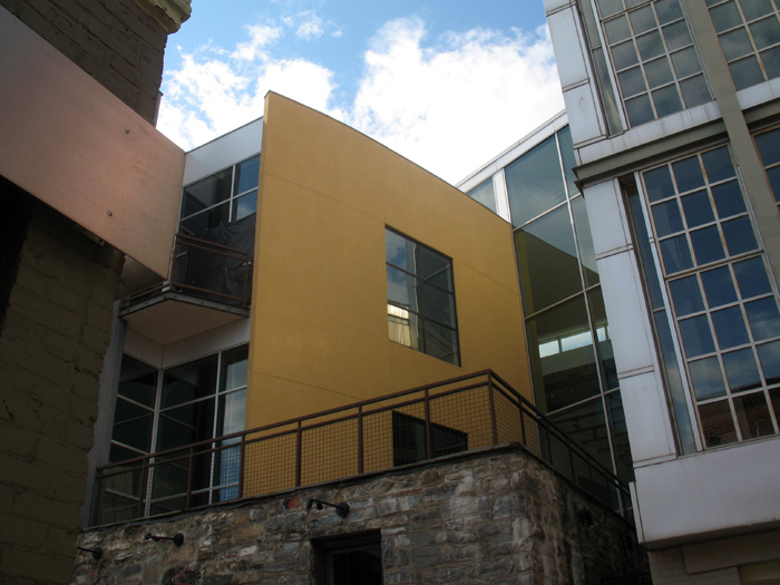
Hidden among a leafy scattering of houses and trees, Forest Glen Seminary is a jumble of vernacular buildings unlike any of the temples of boxes that define Washington. Its buildings, both magnificent and ludicrous amount to a dignified campiness that defies expectations to be one of the most profoundly interesting places encircled by the Beltway. Once constituting a women’s college when that meant a two-year Mrs. degree, the buildings are once again becoming domestic space, the more private areas cut into condos and the core of the complex, rental units. Scattered around the area, turn-of-the-century houses are being renovated and new housing by the urbanist developer EYA has just been finished. Through the site’s history, radical changes have shaped its form, but none so radical as the current shift in context.
At the end of the Mall, hope.
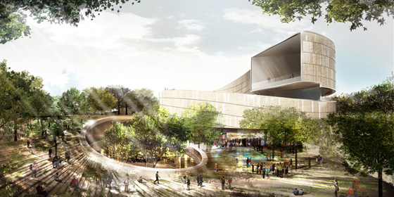
The six finalists for the design of the National Museum of African-American History and Culture have been revealed, with some very promising and also very disappointing results. There’s not nearly enough information available to see which is really the best building, so I picked the one that I think can be improved upon in a productive way. Remember as you are reading my thoughts that these are in the conceptual design phase, so the architects will be revising the buildings considerably even before the NCPC and CFA get around to prodding the architect for greater contextuality.
I’ve ranked these in ascending order of quality and appropriateness and then got my buddy Sam Rothstein to handicap each one’s chance at selection. The images are linked to high-res versions on the Smithsonian site.
Streets through time and place
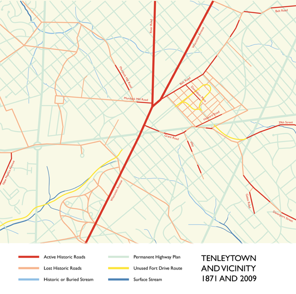
 I noticed yesterday that DC has re-signed Murdock Mill Road, down off River Road in Tenleytown. It’s a nice little reminder of history – and of natural geography – among the rationalist streets of the city plan laid down in 1897. While those straight, predictable lines make navigating the city easy, they did erase the context and history of what was Washington County. By its perseverance, this little snippet of prior use reminds residents of the pre-urban past, adding quiet character to the neighborhood.
The road itself is no larger than an alley – its form preexists both the automobile age and the dreams of a residential garden city, so there are neither sidewalks nor setbacks. It is discontinuous, with one part behind the old Sears Building and the other appearing a few blocks to the west before becoming Butterworth Street. It’s also completely secondary: Where the narrow eastern section intersects with 42nd Street, the heavy grading on the latter route necessitates a concrete retaining wall and a stairway down from Murdock Mill Road, ten feet above. It is very dislocated; left inexplicably during the changes of urbanization, along with the Methodist Cemetery, its only active address.
The road once headed down in the direction of Massachusetts Avenue, following a creek of the same name. Before the imposition of the 1897 Permanent Highway Plan, Murdock Mill Creek began at the west of Tenleytown, and cut through a subdivision of small farms registered as part of Friendship, and finally into what is now the Dalecarlia reservoir. Now, the stream is undergrounded, emerging only from underneath 52nd Place in northern Spring Valley. Other streams have been buried; still more roads have disappeared when developers carved up the farms they existed to serve. Murdock Mill Road is only one of these many streets, some of which are still used.
