Reburbia and the future of suburbs

Frogs Dream, the winner, brings back the wetlands
Frog's Dream, the winner, brings back the wetlands

Beginning with this post, I’ll be writing on some local and urbanism-related issues at Greater Greater Washington from time to time.

In “Eyes That Do Not See,” Le Corbusier noted that airplane designers were unable to achieve heavier-than air flight until they understood the underlying issues of aeronautics – until they had posed the problem correctly. Until the tinkerers stopped imitating birds and kites and began investigating lift in a scientific way, they just produced spectacular failures and beautiful dreams. So, when looking through the finalists to the Reburbia suburban redesign contest, it was curious to see how, although many projects owe a debt to the Swiss architect, a great deal show confusion about the problems of “suburbia.”

Reburbia was a design competition where designers were invited to remodel, reuse, redevelop, and restructure the landscape of suburban development. Sponsored by Inhabitat and Dwell, the contest presented 20 finalists and a number of other notable entries for public viewing. Although they’ve already announced winners, the issues that appear in the submissions deserve more discussion. These open competitions are like fashion shows, where the offerings exist as inspiration for other designers more than practical solutions. Some of the ideas tossed around here might make their way into an abandoned mall, but the ideas that grow out of Reburbia are more important. As architects, planners, and citizens look for solution, we have to keep in mind what the problems are to judge any given solution.

Edible Parking? Bumper Crop
Edible Parking? "Bumper Crop"

Declaring that the suburbs need to be re-burbed begs the question of how much, and which kinds, of suburban development are unsustainable, undesirable, or inefficient.  Following that line of thought, designers need to consider whether mitigation of costs can solve an issue, whether simply pulling out unfair subsidies would help, or whether a total revamp has to occur. The projects in Reburbia revolved around a handful of issues that are unique to automobile-dependent sprawl, as well as others that all cities face. The entrants posed their problems around land use, energy waste, sustainable energy production, loss of natural habitats, low density, unappealing or unwalkable street design, transportation inefficiency, water runoff, and the legal mandates for development.
PSA: Prefabrication and You!

One topic I want to talk about more, but don’t have a good enough grasp of, is offsite prefabrication for construction. That is, building parts of buildings into larger assemblies in controlled factory environments and bringing the assemblies out to sites. It’s been saving money, reducing mistakes, and making life easier for workers in other industries for a few years now, and it’s coming into the building world slowly, primarily through structure and building system contractors.
Anyway, I can’t give you the details, but watch this video, where some people with New York and Boston accents explain how they and KlingStubbins made prefabrication work for Autodesk’s new Trapelo Road office in Waltham, MA.  Via (BIM)x.

Reno Park Update 090827: Uses

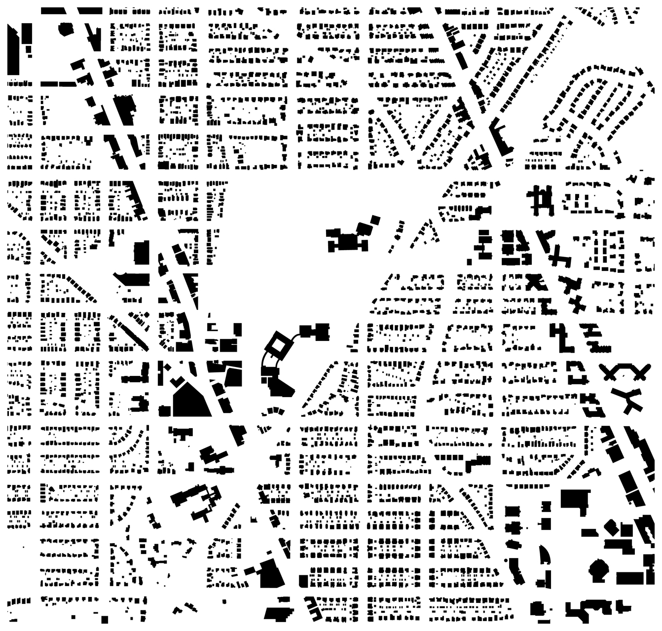
After some awesome long nights, the map of buildings is ready. This was a major hurdle in the project, so expect a slew of posts over the next few days. All I have left are the pedestrian paths, before it’s all analysis and design. So:

all

This is a figure-ground drawing of all the buildings, by use. Keep reading for breakdowns by use.

Forest Hills’ Brown House

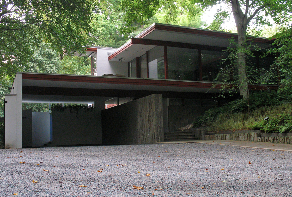
Upper Northwest has a reputation for having bland architecture, with the exception of pre-Depression Chevy Chase. But that’s proving itself to be a not completely true perception.  Down at the eastern end of Audubon Terrace in Forest Hills there’s a real treasure of modern architecture, almost completely buried the trees of  Soapstone Valley.  Although it’s been a house I’ve admired since a stopping a run in the valley back in high school, Modern Capital clued me in to the house’s authorship by the definitive SoCal architect, Richard Neutra.

neutra-graham-house-1

The residence, known as the Brown House, was built in 1968, only two years before the architect’s death. It is the only example of that architect’s work in DC, and one of only a few on the East Coast. More photos under the fold.

Out-of-District Experience: New Orleans, Louisiana

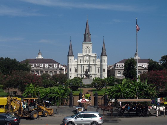
jackson square and St louis cathedral

Toward the end of his career, Pablo Picasso lamented that he had stopped being creative and was merely “doing Picasso.” New Orleans has followed suit sometime in the past fifty years, becoming the image of the idea of itself. That doesn’t mean the jazz or the culture has disappeared, just that a simulacrum of itself has been interpolated into the French Quarter in such a way that a visitor can’t get a sense of the beast for all the taxidermy. I only had a morning to spend in the area due to nuptials elsewhere, but my perception was that there was a very livable area there, but what I saw did not inspire me to live there. I’ll need to go back and give the whole city a better look.

Good Architects: McInturff Architects

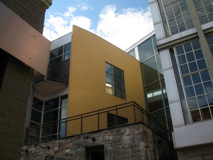
cadys-alley1

To make an unwarranted generalization, DC architects like their buildings heavy and somber. Even in the recent fad of light and clean glass facades, the buildings have been rather self-serious and blockish looking, a consequence of clients demanding efficient floorplans from architects who themselves were trying to be cool and modern without upsetting the polished and poised look DC has in the collective consciousness and legal structure. This fretful indecision can be a bit like the jeans and sportcoat look – crisp but comfortable, hip but conservative.

McInturff Architects offer a wholly different approach. They’re (post)modern(ist) but a little witty and also aiming for comfort. Their mostly residential oevure consists of excellently-composed buildings that respond coyly to the conditions of the site. In doing so, it avoids falling into limpid styles while also carefully respecting historic and distinctive architecture elsewhere. As for aesthetics, the practice cleverly contrasts gentle and warm elements with bold minimalism in beautiful light-filled spaces. As their projects are primarily private, it’s trickier to see their work than Esocoff & Associates‘. But down in Georgetown, anyone can at least see three buildings, and go into one of those.

The Future Was Classical

While I finish writing the Forest Glen essay, please enjoy this alternative scheme to the Mc Millan Commission “Kite” Plan, rendered by arch-traditionalist genius/maniac Leon Krier in 1985.

Theres nothing like a fantastical image to start the weekend
There's nothing like a fantastical image to start the weekend, is there?

You can take a gander at other views of the plan here, although you might be surprised at who owns them.  His explanatory drawings and diagrams offer  dead-on critiques of the City Beautiful and Modernist planning that have turned central DC into a lifeless pile of stuttering architectural gigantism.

Sidwell’s Machine for Environmentalism

Rain garden with wetlands in rear.

Landscape-oriented architecture blog Pruned is carrying an excellent post about the wastewater-recovering wetland installed at the center of their new campus. The LEED Platinum building, which opened in 2007, was designed by KieranTimberlake of Philadelphia. The firm designed the building to recycle all of its graywater and brownwater through an elaborate wetland, as one of its many sustainable features. If you go visit the building, the trickle filter is wrapped with a sign that explains how the system works. The sign rests at a child’s height and leads readers around and around with arrows, which I find a little obnoxious. Luckily, Pruned has explained the process more clearly, so without further ado, go read their article

Pruned also notes a very important civic issue this solves: the cost of runoff on municipalities and local watersheds. This beautiful oasis reduces the amount of water that flows out of the building, or flows off the hard surfaces of the building (there is a separate rainwater recycling system), and into Rock Creek and the White Plains treatment facility. Among the general public, a lot is made of water conservation (which this building also assists), but the strain on public facilities caused by sewage and stormwater is quite severe. At least up in Cleveland Park and Tobago, we do not have combined sewer overflow systems, like the do downtown. 

For elite Washingtonians worried that their children will become astronauts or mutant mer-men, the recycled water is dyed blue with a non-toxic coloring agent and reused in toilets and janitorial sinks. Meanwhile, St. Albans School’s non-LEED Marriott Hall, by SOM is in the interior-fit out phase, and has just gained its green roofs. More on that some other time.

Three interesting things

Metropolis ran an article online discussing the unorthodox business model the firm Delle Valle Bernheimer employs. They have begun integrating development into their portfolio, realizing that controlling all elements of a project essentially cuts a lot of inefficiency from the process of getting something you care about built. In addition to giving them a high degree of control in regards to design and quality, it tempered their exuberance by bringing issues of engineering, cost, budgeting, and dealing with problems into their realm, on their bottom line.  Their strategy is not new – it’s a standard practice called design-build-operate/maintain – but this is one of the first boutique architecture firms to employ it. 

But back wen DB were just getting started, a depraved genius named Zak Smith managed to produce illustrations of each page of the book Gravity’s Rainbow. Somehow, he  managed to sit down and produce 760 works of art, in multiple media, depicting pretty much everything that happens in the book, in some way or another. I haven’t had a look at the whole thing, but the sheer amount of creativity would make an edition of Thomas Pynchon’s book with these drawings a worthwhile purchase.

And also terms of good (early) works, Metropolis has nicely been hosting blog posts about Yale’s First-year house project, where they also design-build a house for a local rent-to-own program.

Fort Reno project 090424: Topography

So I want to study the park with as much detail as possible. I’ve been spending a lot of time there just observing, which is always the cornerstone of good design, but I’ve also been trying to understand the area objectively. Logically, the place to start is with the ground, so here is a topographic map I’ve put together.

s-topomap
Topographic maps represent altitude using lines called contours. The closer contours are to each other, the steeper the slope, the further, the flatter. The contours start here at 62m and end at 130m.

After the fold, there are other, cooler maps that show height using shading.